

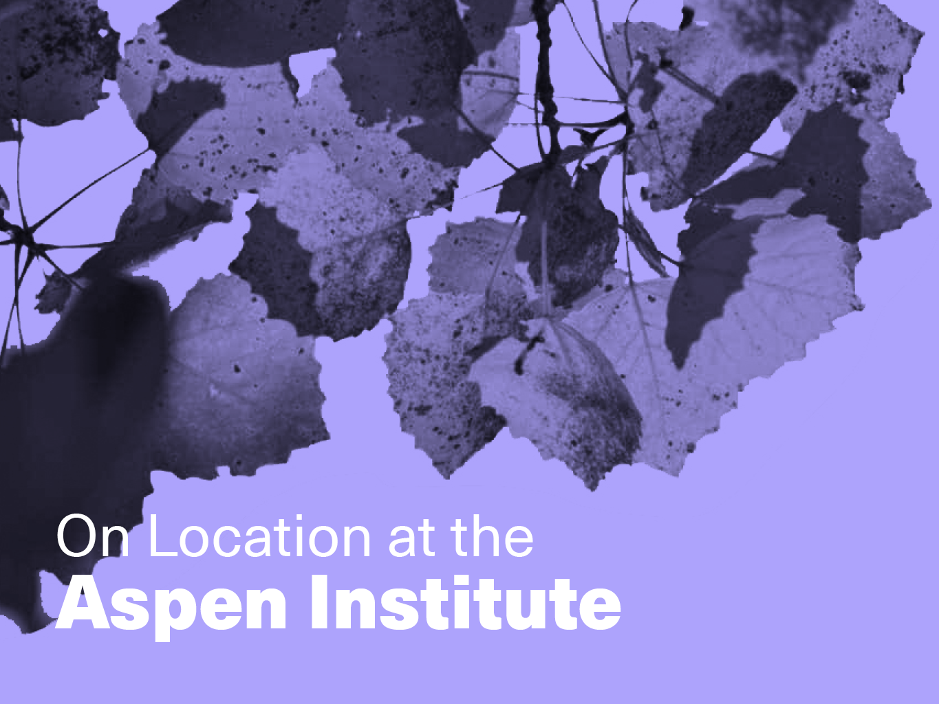
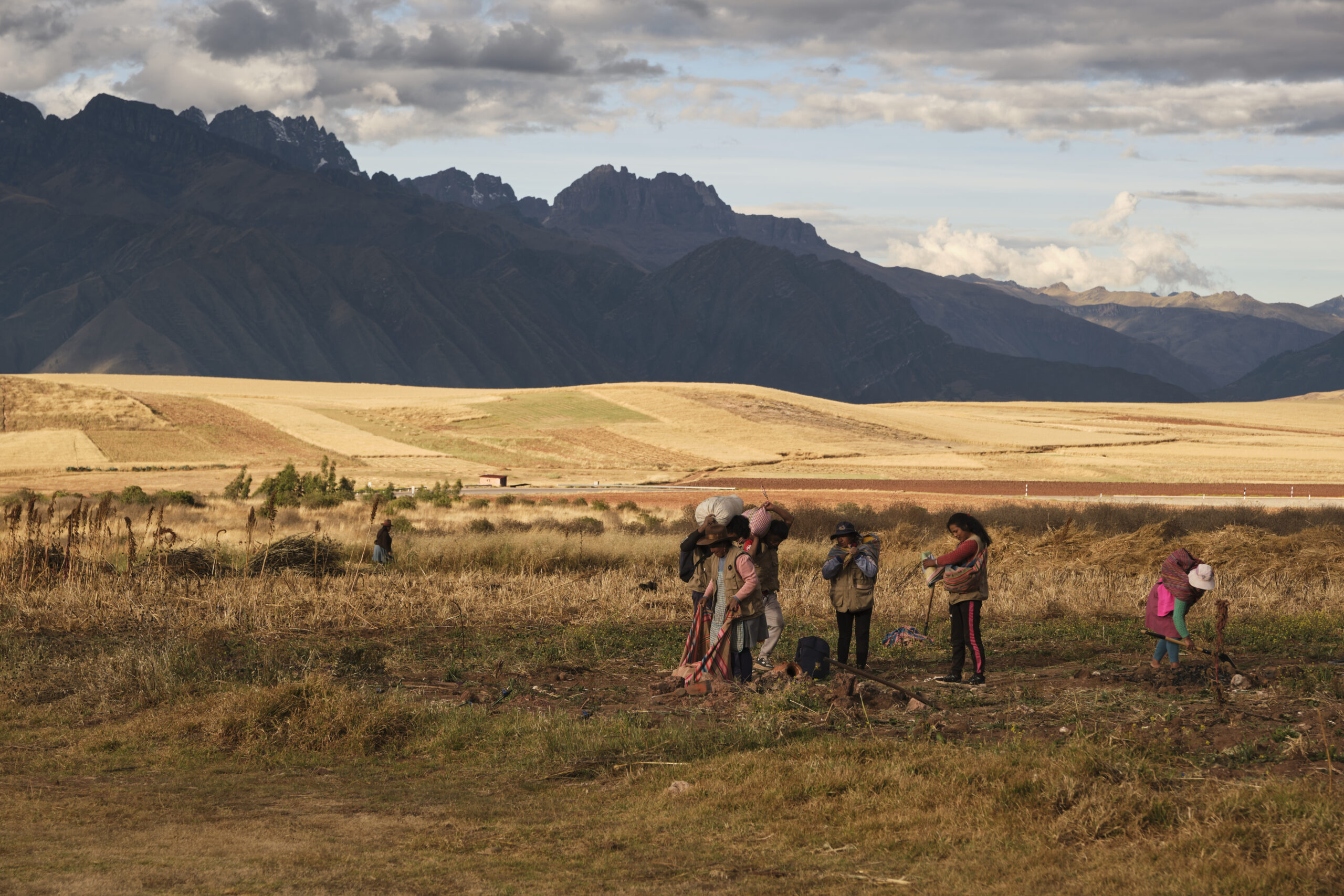
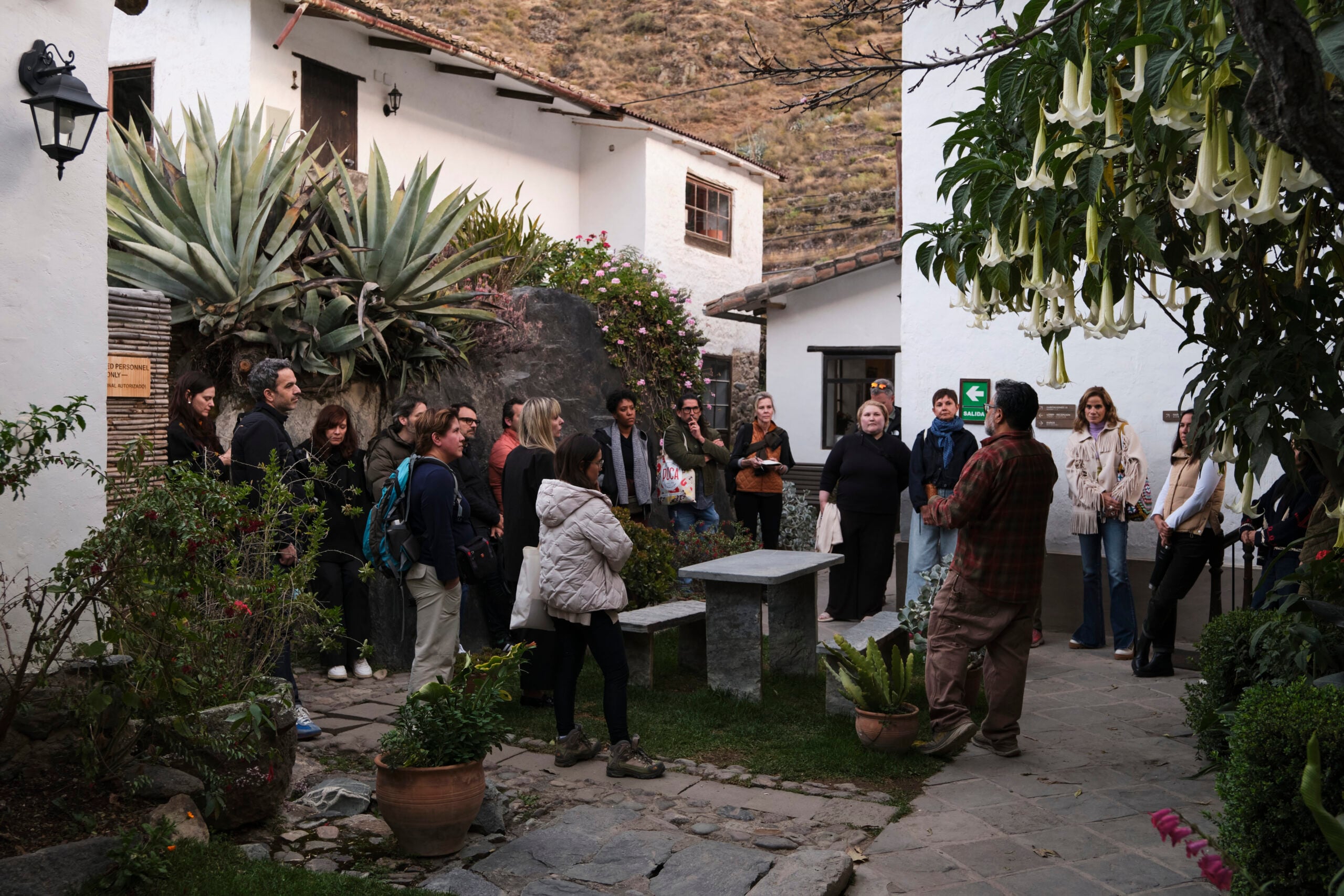
Arts + Culture
Ashley Lukasik|Peru’s Sacred Valley
Foraging design futures in Peru
A four-day cultural immersion in Peru’s Sacred Valley fosters four principles for the future of design, informed by the region’s centuries-old Indigenous philosophies
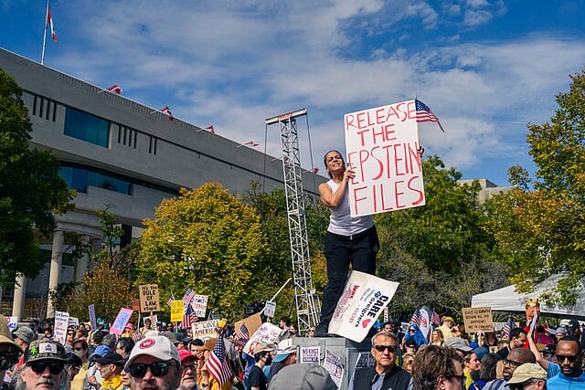
Civic Life
Jessie McGuire|Opinions
Power is designed
The Epstein files expose how systems are built to shield the influential from scandal. Accountability requires a different blueprint: making power visible and open to scrutiny.
Arts + Culture
Nila Rezaei|Essays
“Dear mother, I made us a seat”: a tribute to the women of Iran
Iran is teaching us anew: the world is shaped by mothers and daughters. In September 2022, a 22-year-old Kurdish-Iranian woman Mahsa (Zhina) Amini died in a Tehran hospital following her arrest by Iran’s religious “morality” police. Amini was accused of failing to wear her headscarf in accordance with Iran’s compulsory veiling laws. Government officials claimed … Continued


Subscribe to The Observatory
The Observatory Home Page
Observed

Special Series
View all
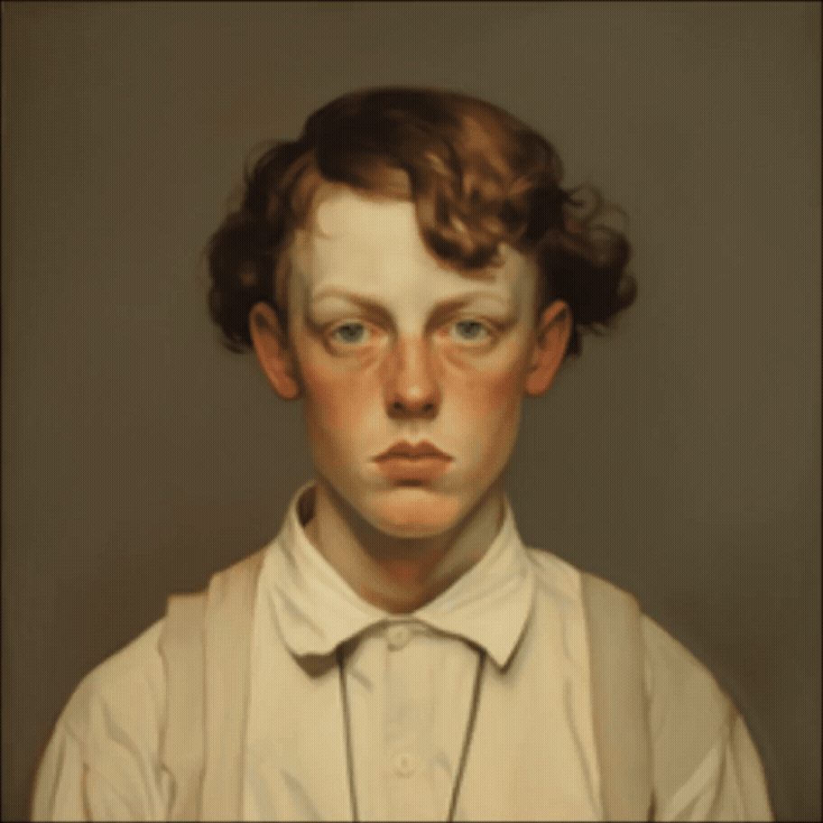
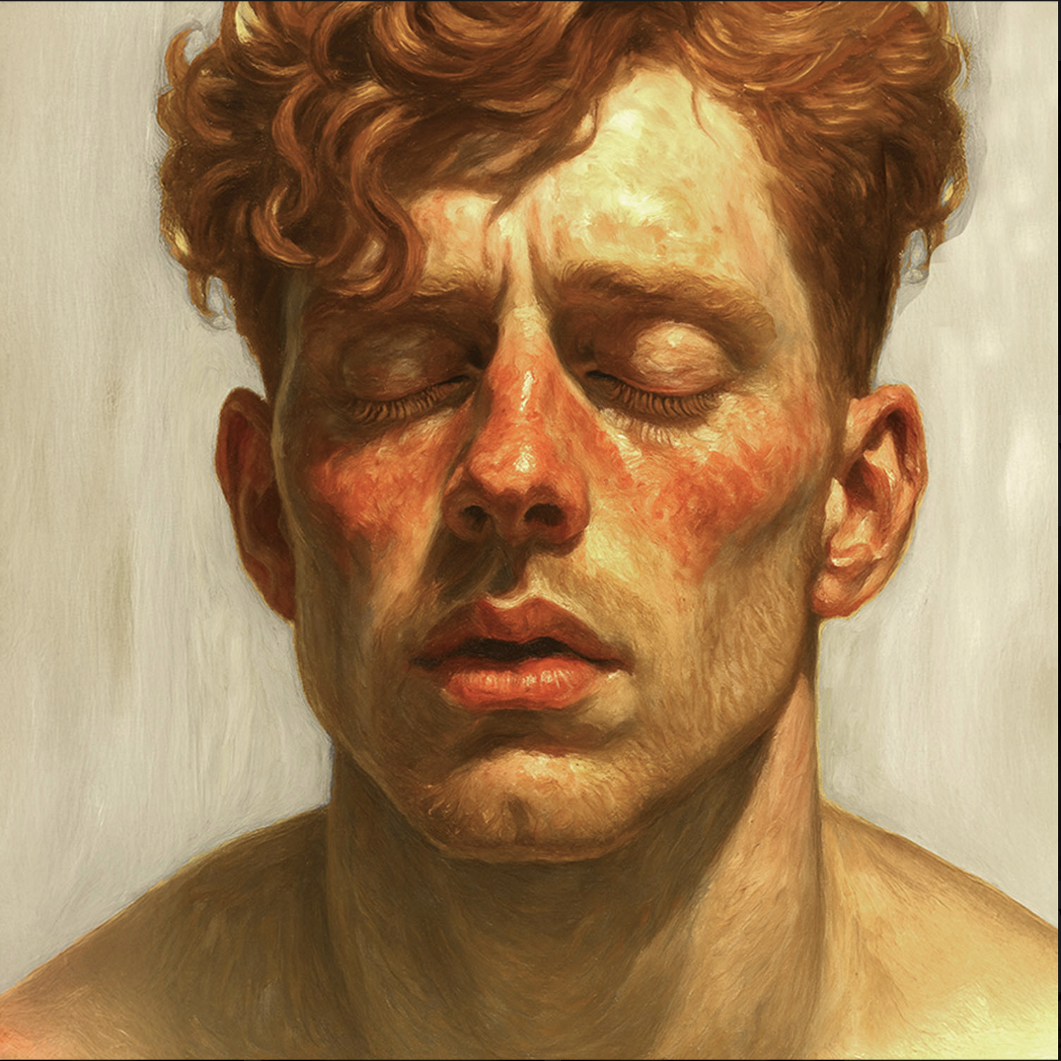
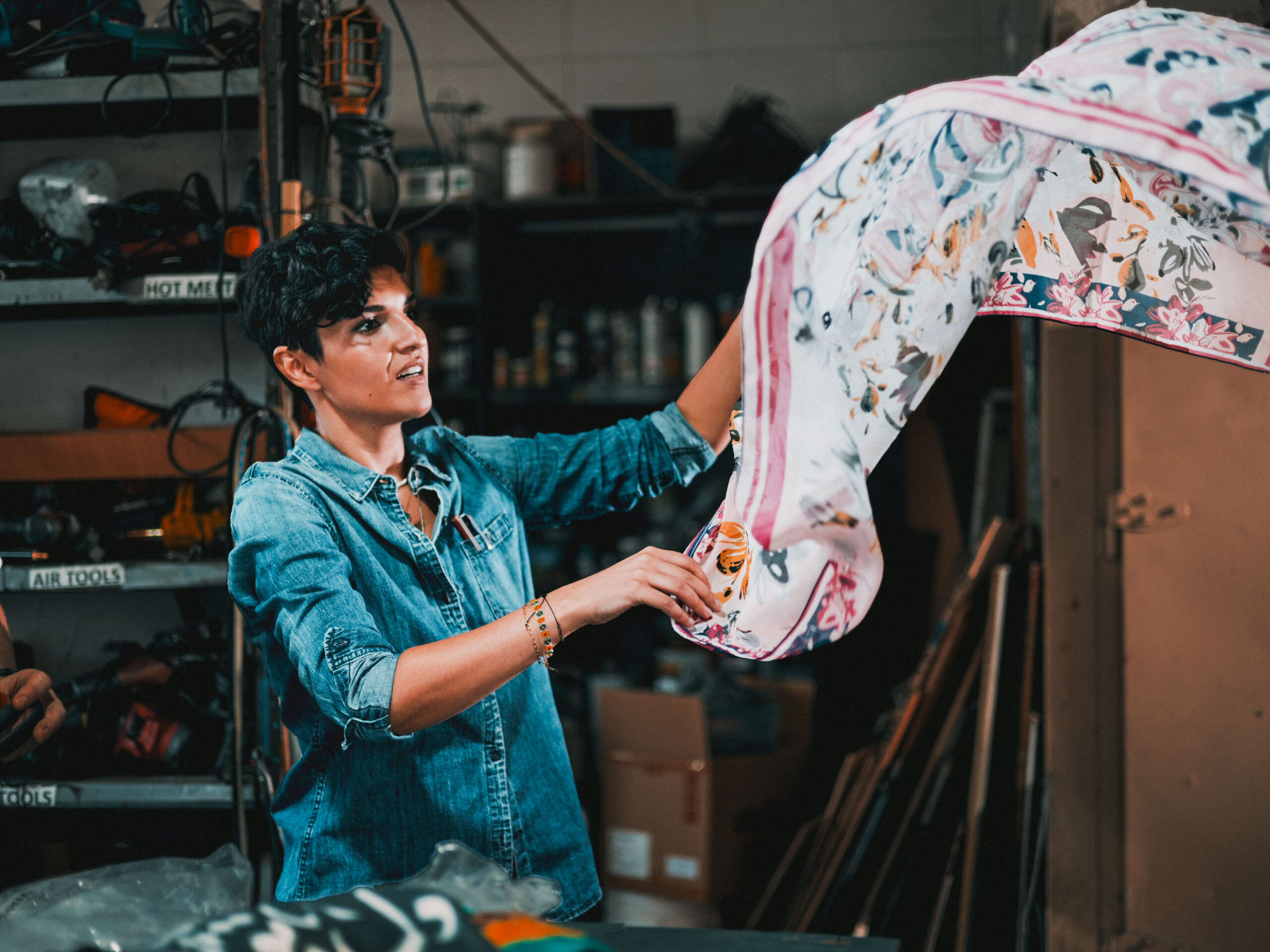
Arts + Culture
Ellen McGirt|Interviews
The face, reconsidered

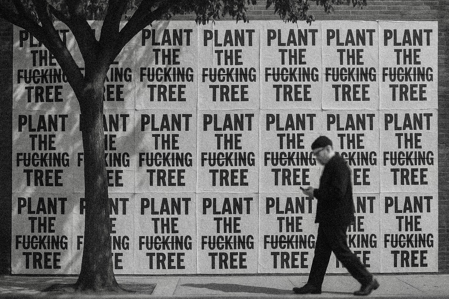
Civic Life
Bert de Muynck|Essays
Walkie talkie: An architect-turned-tour guide on designing presence in Lisbon
Design Juice
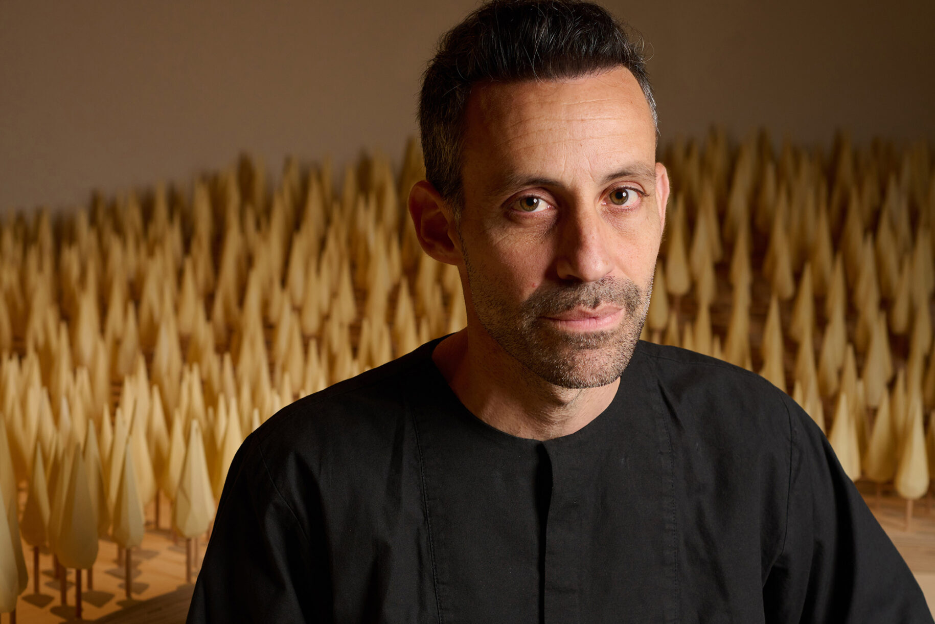
Delaney Rebernik|Books
‘Designed Forests’ author Dan Handel says design is behind our experiences in nature

Architecture
Delaney Rebernik|Fresh Ink