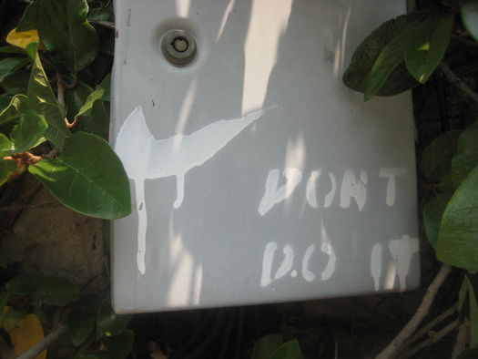
Anti-Swoosh graffiti, just around the corner from my house.
Earlier this year, someone asked me for my “take” on Nike’s logo, and its “enduring power.” That sounded a little over the top to me at the time, and I didn't know what to say. But upon reflection I actually agree with the question's premise: The “swoosh” turned 40 in 2011, and it does have enduring power. In fact it’s one of those rare logos that can serve as a sort of metalogo, signifying branding in general, for better and for worse. (It’s arguably as useful in that role for anti-advertising zealots who want to subvert something instantly recognizable as it is for the Nike Corporation itself.)
Is the Swoosh, then, the ultimate example of why graphic design matters — a symbol so cunningly crafted that its aesthetics lodge themselves in every brain at a mere glance? I think this is what my inquisitor wanted me to say. (And if that's the point of view you find reassuring, don't miss this feel-good video on "how to make a brand iconic through design.") But really I think that the graphic virtues of the swoosh can be disposed of in a few sentences. It’s simple. It’s an unusual shape, but only slightly so: With the look of a fleet-yet-muscular checkmark, it suggests motion and achievement in a way that borders on being too obvious. "I don't love it," Phil Knight famously responded when it was first presented to him, "but maybe it will grow on me."
It not only grew on Knight, it grew all over the culture — like kudzu with a profit motive. And this, in fact, is the more compelling reason for this particular logo’s “enduring power”: repetition. You can say all you like about the graphic properties of this commercial symbol or any other, but logos are a distinct category of visual, partly because of their specific relationship with repetition.
An art image like the Mona Lisa or Warhol's Tomato Soup Can may be repeated endlessly because it is iconic in the way that a landmark (the Grand Canyon; the Eiffel Tower; Angkor Wat) is iconic: everyone wants to see it. The Swoosh, on the other hand, is an example of a commercial image that it is iconic because it has been repeated endlessly -- because everyone has seen it, whether we wanted to or not. Surely repetition matters to any logo's success, but few commercial entities have proven quite so effective in propagating a single graphic mark as Nike.
This is partly a matter of sheer volume, but also of context. The Swoosh, through the decades, has appeared over and over and over: as the punctuation mark to some of the most powerful commercials ever made, often amplified via massive media buys; on the uniforms and gear of some of the greatest athletes of all time, frequently transmitted via global broadcasts; and, of course, on millions and millions of pairs of sneakers (multiple times on the same shoe) and other garments worn by all kinds of people, everywhere. If you haven’t seen a Swoosh yet today, you will.
But why might being exposed to the same image repeatedly make that image more potent? Does repetition really make a qualitative difference to perception? Here are two thoughts about that.
A particularly good Radiolab segment from a couple years back concerned the research of Diana Deutsch, a professor who studies the psychology of music at UC-San Diego. In the course of editing the voiceover for a CD about musical illusions, Deutsch stepped away from her studio and left the phrase “sometimes behaves so strangely” running in a loop. Making tea in her kitchen, she heard something that sounded like music. It was the looped phrase. Somehow the mere repetition of that phrase had transformed spoken words into something that sounded like a tune. A really catchy tune. The Radiolab crew even got a choir to perform a full-on musical version of it.
The other thought is maybe a little less upbeat: It involves a paper (PDF) published in the Journal of Personality and Social Psychology in 2007, titled “Inferring the popularity of an opinion from its familiarity.” The underlying study built on the intuitive and well-established notion that if a lot of people express belief in some idea or point of view, we tend to figure there is likely some legitimacy to it. In this set of experiments, researchers presented subjects with homeowners’ opinions about a land-use proposal. As expected, those exposed to more positive opinions had a more positive assessment. More surprisingly, that turned out to be true even when the positive bias came by way of the same homeowner expressing the same favorable opinion multiple times. And it wasn’t a case of mistaking the source of the repetitive voice; indeed, the effect even held up when a statement was repeated merely by way of what looked to subjects like a software glitch. The paper’s subtitle sums up the implication: “A repetitive voice can sound like a chorus.”
Obviously I don’t mean to suggest that either of these comparison points can be carried directly into the realm of a repeated graphic mark. But something about the success of the Swoosh, and the way the brain apparently relates to repetition, does seem relevant to logo design. After all, we’re constantly hearing about this or that brand hoping to boost “awareness,” thus sales, by freshening up, tweaking, or flat-out re-inventing its logo. Maybe they lesson of the mighty Swoosh is: Just don’t do it.
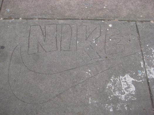
Vernacular Swoosh, four blocks from my house.


Comments [5]
01.02.12
02:53
01.03.12
11:36
01.03.12
11:38
01.03.12
01:42
01.03.12
11:02