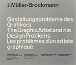
Switzerland was then the Mecca of European Modernism and Joseph Muller-Brockmann, one if its key practitioners, had just published what might have been the first pedagogical book on the subject: The Graphic Artist and His Design Problems.
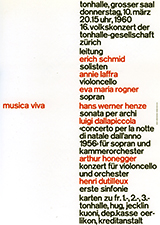
I opened it up and there on page 124 was this amazing poster from 1960:
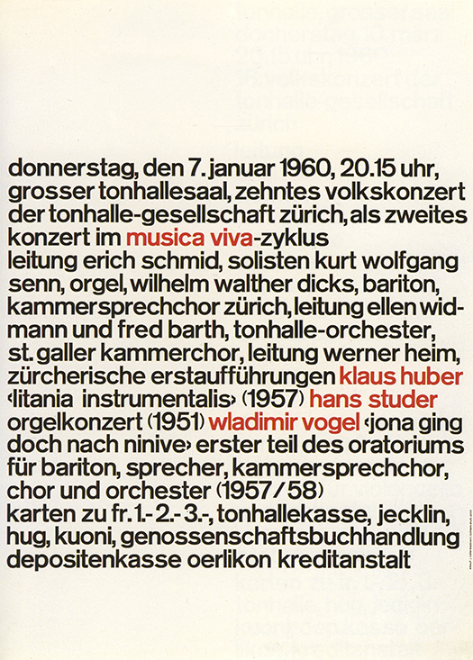
1960
I was jolted, because it seemed to me to represent the irreducible, can’t-get-more-basic-than-this exemplar of Swiss Modernism.
It was as if every Swiss poster of the previous decade was reverse-engineered, gradually eliminating all pictorial elements and all hierarchical and clarifying typographic signals until the only thing left was one un-inflected, flush left, ragged right, one size, one weight, run-on block of text. And then, into this distractingly dense message, the bare minimum of clarity was added: commas between phrases; a faint hint that it contained three paragraphs; and then those four red pairs denoting the content: the name of the concert series and the three performers.
Gone are Muller-Brockmann’s geometric illustrations and iconic photographic images of the 50’s.
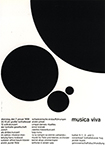 1958
1958 1955
1955From this baseline, type-as-image-re-boot, sprang a series of beguiling and increasingly complex, but at the same time more legible, typographic compositions for Musica Viva.
 1960
1960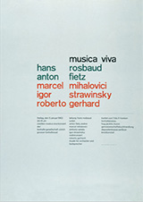 1962
1962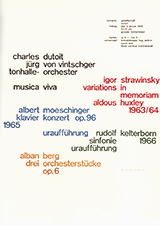 1968
1968For me this deliberate process of moving from simple/un-inflected/opaque, to complex/articulated/clear, informed my own early typography as a teacher and encouraged me in my own work to see typography itself as an image.
A version of this article was previously published in I Heart Design, edited by Steven Heller, Rockport Publishers, 2011.


Comments [1]
01.16.14
07:39