If you are a student attending a program in Graphic Design, you may be lucky enough to visit a working printers’ workshop during your academic training. But if you want to make your own luck, check out Ireland’s National College of Art and Design, with perhaps the only master’s level program (in what they call Visual Communications) that has an on-site fully functioning letterpress print shop at the disposal of its students.
Appropriately named Distillers Press, owing to the location of the school in the former Powers Whiskey distillery situated off of Thomas Street and just a stone’s throw from the river Liffey, the shop boasts several presses, including an 1833 Columbian Press, a pair of proofing presses, a clamshell treadle platen press, and a tabletop press.
Appropriately named Distillers Press, owing to the location of the school in the former Powers Whiskey distillery situated off of Thomas Street and just a stone’s throw from the river Liffey, the shop boasts several presses, including an 1833 Columbian Press, a pair of proofing presses, a clamshell treadle platen press, and a tabletop press.
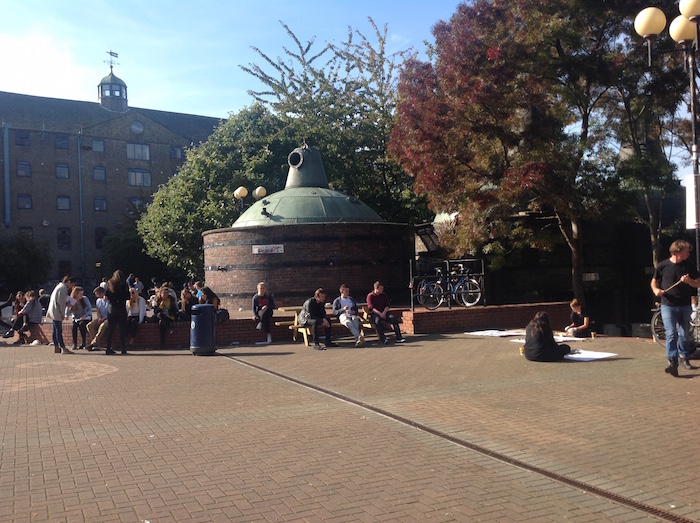
A view of the "Red Square" at the National College and Art and Design in Dublin, Ireland
The press room was built up over several decades by Bill Bolger (former head of department) and recently retired master printer Seán Sills. As has happened over recent years, when traditional printing presses closed and liquidated their inventory, the Distillers Press found itself the recipient of cases and cases of type. They now hold over 300 cases of metal type, included a great many in Irish character (or Gaelic), and more than 140 cases of wooden display type—the kind that many young designers crush on.
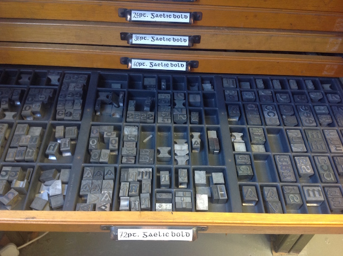
A case of 72 pt. Gaelic Bold
While working on a printing project is not a degree requirement, students in the Visual Communications concentration are encouraged to make use of the print room resources. Every year, the press issues a portfolio of broadsides made by designers from the program. Recent themes have included tributes to the works of James Joyce and Seamus Heaney and celebrations of the music of Ian Dury and Ian Curtis. Staff members and faculty make frequent use of the presses and have produced signature works, such as Brendon Deacy’s A Life in Relief, a masterful graphic retelling of the life of firebrand Michael Davitt.
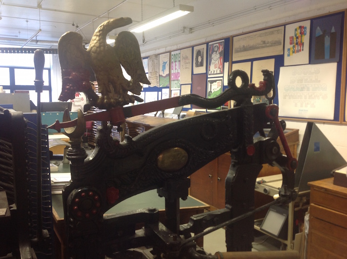
The 1833 Columbian Press with examples of student work lining the wall
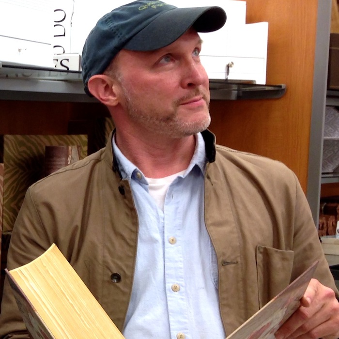
On a recent visit to the press, my guide was current custodian and print technician Jamie Murphy. A graduate of both NCAD’s undergraduate and graduate programs, Murphy worked in commercial design and in print shops in the United Kingdom before returning to Dublin as Designer in Residence to assist the Distillers Press train a new generation of printers. In addition to the great amount of energy he devotes to the academic press, Murphy operates his own imprint, The Salvage Press, dedicated to producing beautifully made books, including his most recent completed project, a new setting of Samuel Beckett’s short prose essay “Imagination Dead Imagine,” printed in shaped text blocks with accompanying lithographs by David O’Kane.
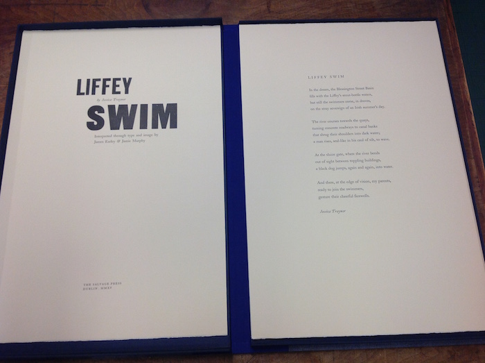
The Salvage Press's latest work in progress: "Liffey Swim," a poem by Jessica Traynor with illustrations by James Earley
The work in the press room combines many of the disciplines taught at NCAD—design, image-making, typography, and type design—bringing an integrative and welcoming feel to eager students. The bounty of fonts available for projects serves a dual purpose in that the hands-on typesetting is also an instruction in two centuries of letterforms. The Visual Communications department recently designed the college's new typeface: Bill, named for the former, long-serving press master. The typeface is based on stencils discovered in the college’s archives that were used for labeling commercial crates in the early twentieth century. For the time being, though, this quirky font is not available for use outside the college.
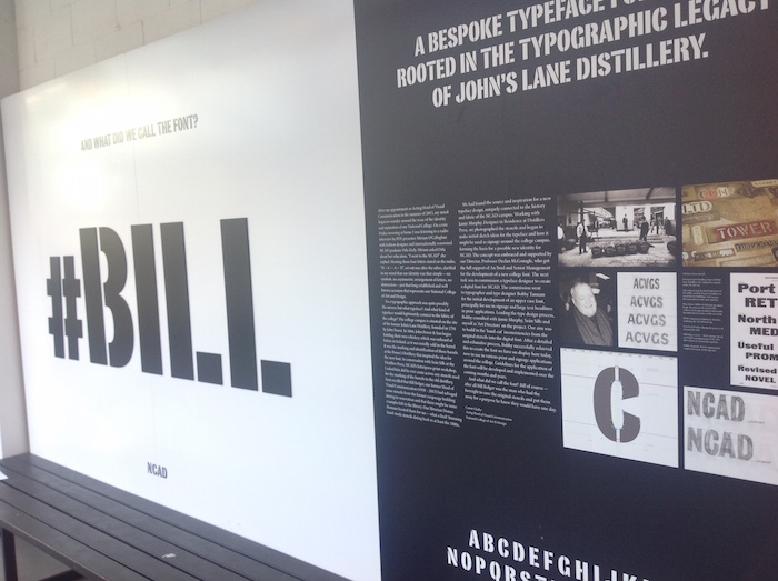
The NCAD typeface, Bill
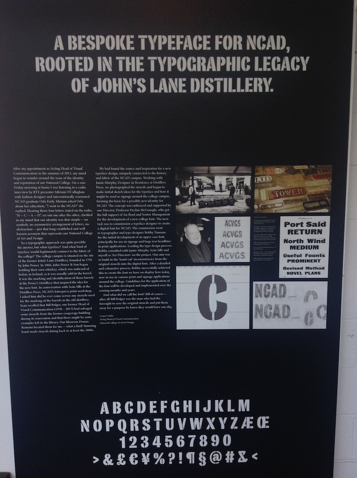
The inspiration for the Bill typeface
On the day that I visited, the press room was filled with examples of student work—broadsides papered one wall, exhibiting the young designers’ love of color and and displaying the fruits of their first steps into the demanding craft of typesetting and printing from metal type. Drying on wire racks were keepsakes for an upcoming showing of Paris is Burning, bearing one word in two fonts: Opulence. Artists’ books by teachers and students were on display, and through a wall of windows, a new class of students was working on design projects. The adjacency of the presses to the classroom worked far beyond simple metaphor—the classic machinery of image and text making was truly at the students’ disposal – with engaged master printers at the ready to demonstrate and teach. If only all design programs had ink and type (metal and wood) so near and so available.
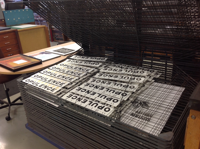
Opulence in the press room


Comments [1]
12.19.15
03:14