The Drawbridge no. 19. Creative direction by Stephen Coates
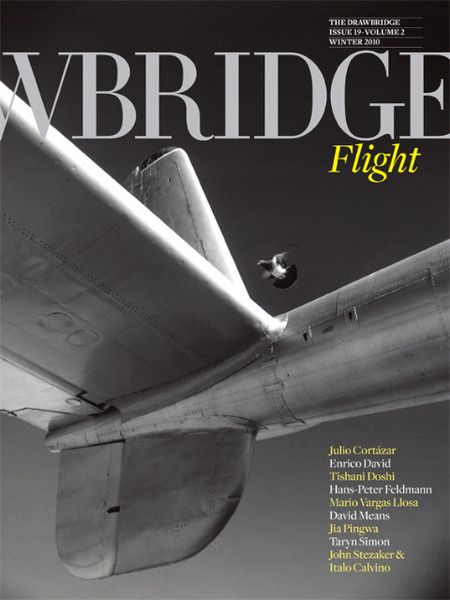
Cover photograph: Flights by Dave Anderson, 2004
Changing a magazine’s format is always risky. It’s such a fundamental aspect of what we perceive it to be The Drawbridge’s transformation is particularly startling. Indeed, it might rate as one of the most dramatic changes of visual direction ever ventured by a literary magazine. Or any kind of magazine.
Launched in London in 2006, The Drawbridge achieved an immediate impact and notability by being BIG. At a time when British broadsheet newspapers were abandoning their widescreen pages and slimming down, The Drawbridge expanded boldly in the opposite direction. With elegant typography by creative director Stephen Coates (my partner at Eye magazine in the 1990s), its pages had tremendous panache. The work of esteemed writers and thinkers such as John Berger, Noam Chomsky, Terry Eagleton, Greil Marcus, Geoff Dyer and Slavoj Žižek jumped from the paper with the urgency of news stories hammered out at the keyboard only a few hours earlier. The other thing the magazine had going for it was the space to run huge pictures, sometimes the size of a TV screen.
Much as I admired it as a concept, The Drawbridge was as unwieldy to read as it was hard to find on the newsstands. With issue 14, the publisher reduced the page size while retaining the newspaper format. Now comes a complete switch to a full-color, perfect-bound, 144-page journal on uncoated paper that feels like a sumptuously upholstered art catalogue. Finally, you can pull out a copy of The Drawbridge and read it anywhere. Coates gives the writing big paragraph indents, generous line-spacing and a single, broad text column, ranged left — an attractively informal note in a publication that exudes serious intent. The opening pages of the essays and fiction all receive the same consistent treatment, like chapter titles in a book. It’s a courageously reader-friendly piece of reinvention that manages to be every bit as classy as the outsized original version; and it works.
Photograph: Charles, Vasa, Minnesota, 2002 by Alec Soth
Every issue has a theme (failure, opulence, ghosts) and this time, liberally interpreted, it’s flying; in a story by novelist Tishani Doshi, for instance, the “flight” is by two killers from the scene of their crime. The Drawbridge has always been cleverly illustrated. Photography editor Millie Simpson and drawings editor Paul Davis work with Coates, and the new issue has many well-chosen art works and photos alongside the writing. In addition to the pieces reproduced here, there is a series of eight forensically descriptive photographs from a set of 1,075 by the always interesting Taryn Simon, who has a show at Tate Modern in May. The pictures record contraband — gold dust, steroids, counterfeit phones, a deer penis — seized at JFK by US customs.
I particularly like the pairing of “The Night Driver,” a short story by Italo Calvino that surfaced recently in English translation in The Complete Cosmicomics (Penguin), with a series of luminous images of paper cuts by the collage artist John Stezaker, subject of a long-overdue retrospective at the Whitechapel Gallery in London. Stezaker explains that Calvino’s writing has always inspired him and he was excited to discover “The Night Driver” — the diagonal cuts, like mysterious cones of light, are his response to the story. Such subtle interconnections of the literary and the visual promise to make the new look Drawbridge an essential read.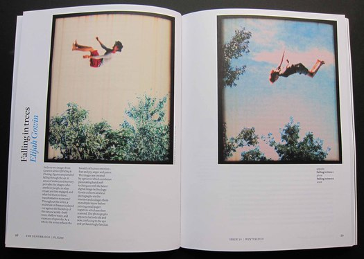 Photographs: Falling in Trees 1 and 2 by Elijah Gowin, 2006
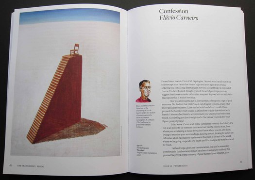
Main drawing: The Chair, project for an installation by Davide Bignami, 2008
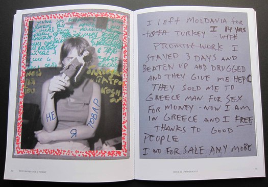
Athens, Greece, 2004 by Jim Goldberg. This 14-year-old girl, now protected, had been trafficked for three years


Comments [1]
If the texts wasn't above the "G" I wouldn't of known that it's the drawbridge magazine.
D "R" AWBRIDG "E": He should of ran half the "R" and "E" off the page. I don't know the story behind the cover, so I'm probably
wrong. But I really like the re-design is great. The CD did good.
02.23.11
04:26