
Landscape architect Gary Hilderbrand’s collage Glass House Reflections II (2012)
“Composite Landscapes: Photomontage and Landscape Architecture,” Isabella Stewart Gardner Museum, closes Sept. 2. Catalog is to be published in January 2014.
“Cut n’ Paste: From Architectural Assemblage to Collage City,” Museum of Modern Art, through Dec. 1
This summer two very different institutions produced parallel exhibitions on the art of collage and architecture. At the Museum of Modern Art, “Cut ‘n’ Paste” prepared a modernist history of collage, giving pride of place to Mies van der Rohe’s large photo collages, then mixing in postwar graphic design, contemporary photo-manipulation, and projections of digital renderings on a movable scrim. At the Isabella Stewart Gardner Museum, “Composite Landscapes” offers a similarly interdisciplinary look at the history of landscape collage, mixing working drawings and client-driven renderings with Mrs. Gardner’s travel scrapbooks and artist-made collages. Seeing them both suggests common themes as well as opposed approaches to envisioning and embracing landscape.
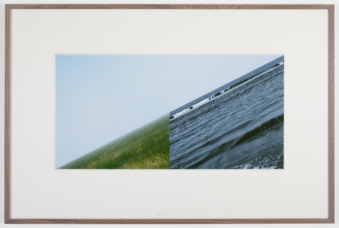
Jan Dibbets, Land-Sea, G:83 (2007)
As one example, the Boston show includes landscape architect Gary Hilderbrand’s collages of Mies’s Farnsworth House and Philip Johnson’s Glass House, commissioned for a Glass House fundraiser. In his compositions the interior furniture-scapes of those famous glass boxes float within the green sea of their outdoor surroundings. A little rectangle of veneer lies over a larger photograph of wildish trees like a boat on a lake. Everything’s landscape. Whereas in Mies’s own landscape collages of his unbuilt Resor House in Jackson Hole, Wyoming, the building remains primary by means of sharp lines and a surround of empty paper. The mountains are framed, and then replaced and suggested by the more architectural (flat) materials of Picassos or paneling. One sees Mies’s book-matched marble walls as his version of landscape paintings.
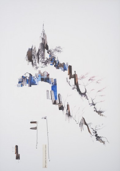
Valerio Morabito, Memory and Landscape (2013) There’s also the question, Why now? The presence of digital renderings at the end of the MoMA show and the beginning of the Gardner exhibit suggests the dominant reason for a new look at representation. The way we look at architecture now has been largely, but not entirely, unexamined, and it is one of the topics I am planning to think about during my upcoming year as a Loeb Fellow at the Graduate School of Design at Harvard. I would love to see the third renderings show of the summer, "New Views: The Rendered Image in Architecture" at the Art Institute of Chicago through Jan. 5. Both of these shows seem accidentally polemical, in that the reasons for the exhibitions pale by comparison to their physically cut ‘n’ pasted ancestors. At the Gardner, clunky wooden easels hold flat screen TVs, in an extremely odd juxtaposition of formality and technology. To see the works by Weiss/Manfredi, GROSS MAX, SCAPE and others you have to stand there waiting for the images to slowly cycle, marked with minimum information about location and maker. The emphemerality of many of these images, and their inability to hold one’s attention seemed inscribed in the method of display. At MoMA, there were digital renderings printed out and hung on the wall, as well as more projected over a curtain through which visitors could walk. This made for a fun photo op, but again, it didn’t convince me that the new ways were graphically better. I’d rather look at the older composites: the Gardner show has a copy of a Repton Red Book, showing before-and-after landscape gardening on a larger English estate. Even the smaller format of the Repton album, about the size of an iPad Mini, had some appeal: isn’t hand-held how we see landscape now, through the square frame of Instagram? How might those expectations (of contrast in scale, of intense color, of the importance of sunsets and clouds) start being expropriated back out to the physical world?
 Ludwig Mies van der Rohe, Convention Hall Project (1954)
In both shows, I appreciated the overall mix of art, design, photography, process and finished products. At “Cut ‘n’ Paste,’ curated by Pedro Gadanho and Phoebe Springstubb, after a too-brief gloss on the history of modernist photo collage, there was a corner dominated by Mies’s big, familiar compositions for the Glass Skyscraper, the Bismarck Monument and the Resor House (the Concert Hall was out in the hall). These composite images are so familiar, one forgets their incredible scale. In a book Mies and Hilderbrand’s homage might look the same size, but in reality, Hildbrand’s collages would fit in Mies’s pocket. I was also reminded of how indebted 1990s Rem Koolhaas (he really has to be periodized) is to Mies’s technique. His undermining collages of MoMA, for MoMA, labeling the museum “MoMA, Inc.”, use the same scale and perspective to render new museum spaces, complete with blunt wedges of pasted paper. Both master and pupil have aged. Put your cheek close to the glass of Mies’s Concert Hall collage and you can see the wrinkles. Other treasures at MoMA: Oscar Nitschke’s cult classic Maison de la Publicite, as striking and relevant now as it was in 1936. On the large back wall, the curators created a collage of their own, drawing from the print, photography, design and architecture collections. Roberto Burle Marx’s patterned compositions of reds browns and greens for Sao Paolo would have made a bold accent for the mostly delicately-colored Boston show. I loved seeing Lester Beall’s tough 1941 poster, “Slums Breed Crime” in this context.

Roberto Burle Marx, Ibirapuera Park, Quadricentennial Gardens, project, São Paulo, Brazil (1953)
The Gardner exhibition, curated by Charles Waldheim and Andrea Hansen, also provides a parallel architectural history for those of us who weren’t paying enough attention in decades past. Did I know there was deconstructivism in landscape architecture? Adriaan Geuze of West 8, who now communicates in the international language of feelies, is represented by a 1990 collage for Rotterdam’s Schouwburgplein, rendered in the hot and bright colors, and at the axonometric angle, I associate with Zaha Hadid. It’s a gorgeous composition, entirely appropriate for a park I sometimes teach as an example of the disappearing line between park and plaza, landscape and architecture. It also made me wonder if you could win a competition today with a handcrafted image like that.
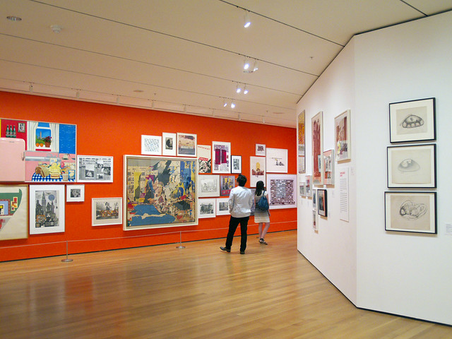 "Cut 'n' Paste" at MoMA, installation view (via Archidose)
The other apparent reason for the Gardner’s exhibition of composite landscapes is its own newish addition by Renzo Piano Building Workshop. It is a handsome, well-made piece of architecture, with many glorious layered effects of plants, glass and the various greens of the façade and interior surfaces. The new building seems to invite the viewing of composite landscapes as you move through the building; I particularly liked the way the old Gardner’s motley surface, all Venetian balconies and round windows, was reflected in Piano’s smoothness. (Instagrams of my visit here.) But it is also generic Piano, hardly inflected, except by the cluttered addition of a variety of potted plants, to the specific wonders of the Gardner Museum. The gallery and auditorium felt rather like the Morgan Library. The low glass entrance reminded me of the Nasher. I did love the ridged patinated copper cladding, running from inside out, in a lovely soft aqua. Was there no way to bring suggestions of the exoticism, textiles, patterned surfaces and lace curtains of the original down the long glass hall that connects them? If contemporary architecture’s idea of richness is limited to color (lime, aqua, Renzo red) it makes our aesthetic palette seem impoverished indeed.


