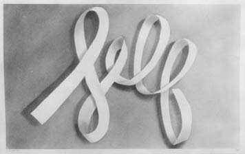
Self, Ed Ruscha, 1967
Fine artists have been taking inspiration -- when not outright stealing -- from the world of graphic design for a century. The list is long: Kurt Schwitters and Georges Braque, Stuart Davis and Charles Demuth, Jasper Johns and Andy Warhol, Barbara Kruger and Jenny Holzer.
But I admire one above all, not just as an artist but as a graphic designer, and I mean that as a compliment: Ed Ruscha. A new exhibition on view through September 26, "Cotton Puffs, Q-tips®, Smoke and Mirrors: The Drawings of Ed Ruscha," at the Whitney Museum of Art in New York proves why.
Born in Oklahoma City, as a child Ruscha wanted to be a cartoonist. Moving to Los Angeles, he enrolled in 1956 as a commercial art student at Chouinard Art Institute (now Cal Arts). Ironically, it was seeing a tiny, black and white reproduction of Jasper Johns's "Target with Four Faces" in Print magazine, of all places, that inspired him to become a painter rather than a graphic designer. But from his earliest days, he exhibited a love for typefaces -- perfectly drawn, used with intelligence and passion -- with which any graphic designer would sympathize.
Certainly other artists have incorporated the language of advertising and signage and publications and package design in their work. But where, say, Andy Warhol sought an offhand, almost sloppy, casualness in his mechanically reproduced small space ads and Brillo boxes, Ruscha's lettering from the early sixties (SPAM in Frankfurter, GAS in Cooper Black, HONK in Stymie Bold) is lovingly, respectfully precise. And where an artist like Barbara Kruger would seize upon a single signature graphic style (Futura Extra Bold Italic in her case) and repeat as relentlessly as a corporation seeking a proprietary house style, Ruscha has been restless and endlessly inventive, changing typefaces to suit the messages, and inventing new ones (most notably his calligraphic "ribbon" style) seemingly just for the sheer joy of it. Similarly, he has explored different media with a vengeance; the show includes drawings executed in vegetable juices, gunpowder, blood, and tobacco juice as well as more prosaic ink, tempura, graphite and pastel.
Unlike other artists of his generation, but with an enthusiasm that, again, would be familiar to any graphic designer, Ruscha began publishing, early and often. Books like Twentysix Gasoline Stations and Every Building on the Sunset Strip were ways of documenting his deadpan obsessions at a modest cost (400 numbered copies for $3.00 each) that, he felt, anyone could afford. "I want to be the Henry Ford of book making," he explained at the time. Obviously, at that price the books would be sold at a loss, but, he confessed, "It is almost worth the money to have the thrill of seeing four hundred exactly identical books stacked in front of you."
A few of Ruscha's notebooks are on view at the Whitney, and it was there, more than anywhere else, that I experienced the shock of recognition. Careful sketches of Hector Guimard's signage for the Paris Metro, studies of how paper folds and curls, layouts of future projects with typefaces effortlessly indicated with a few scribbled lines: if this isn't the way a designer thinks on paper, nothing is. Particularly fascinating are the frequent lists of words that serve as Ruscha's starting point; without clients to provide the messages, he has to invent them himself. "They come about in strange ways," he told New York magazine, "There's no formula; they just have to be emotionally loaded. It may be something that I hear on the radio, or a lyric from a song...It's a simple thing."
It's no surprise that one of Ruscha's earliest -- and most loaded -- subjects is one that he returned to repeatedly: that most iconic of American typographic expressions, the landmark, once-temporary-now-permanent HOLLYWOOD sign that symbolizes his hometown to the rest of the world. Monumental, yet in its way as ephemeral as the celluloid fantasies it indelibly evokes, it's a perfect demonstration of how graphic design can inflame the popular imagination. At the Whitney, we see evidence that Ed Ruscha has been conducting the same kind of demonstrations for over forty years.


Comments [25]
One of them, All The Buildings on the Sunset Strip, is a long accordion-fold photo essay of a street, arguably more famous than the Hollywood drawing/painting/print. For one thing is certain about Ed Ruscha: from parking lots to Absolut ads, he knows how to keep Ed Ruscha in the public eye.
This shouldn't bug me, but I guess it does. When my friends and I were in school, cross-media pop artists like Ruscha were our idols. Then I discovered a deserving hero for young graphic designers, Helmut Herzfeld, known as John Heartfield to the English speaking world.
Now, some will say it's like juxtaposing avocados and mangoes, this comparison of the creator of photomontage with the Prince of California Pop. But, aside from nationality, and historical period there is one huge difference. John Heartfield cared enough about his world to risk his life doing his work to improve it. He had a cause, albeit political, and he moved about in a frantic effort to evade capture so as to continue his anti-Nazi satires (once exiting out his bathroom window as the Gestapo came in the front door).
At a time when the artists of The Critical Art Ensemble are being harassed by their government (ours) in a manner similar to the way Heartfield was by the Nazis, it's good to remember his exploits. You'll never see an Absolut bottle by Heartfield; he died long before the campaign commenced. But compared to the terminally apolitical Ruscha... well, just make mine "heart felt."
07.12.04
08:20
I can't wait to see the show.
07.12.04
08:47
07.12.04
09:13
To address David and Jerry's points, my strong feelings about the work don't necessarily transfer to idolization of the artist. I guess it's no contest that John Heartfield was "braver," for instance. Nor do I look to Ruscha for a model for an enviable professional practice; in fact, I wonder whether even successful artists would claim to live in a world of "no clients, free expression."
To Jerry's final point, however, there was a moment in the show that gave me pause. Two pieces from 1965 exhibited at the Whitney, GAG and CHAW (numbers 35 and 36 in the catalog, respectively) were beautifully framed and solemnly described as having been executed with "Phototype and cellulose tape on paper."
To an art critic, these masterpieces would have evoked the Dada collages of Kurt Schwitters. But to me, they looked exactly like pieces of pre-Macintosh camera-ready mechanical artwork, the kinds of things I saw (and helped produce) every day of the first 10 years of my professional life. It made me wonder how many yellowing pieces of illustration board are decomposing in landfills that might look just as good on gallery walls.
07.12.04
10:40
Contrast Ruscha's work with that of Ana Mendieta, also currently at the Whitney. Mendieta's work is not beautiful but I was inspired by her bold experimentation with media and process, her research on symbolism, and her courageous willingness to put herself on the line and tell us about herself and our world. She has more to teach designers and artists than Ruscha does.
07.13.04
12:44
Ruscha's art is glorified lettering. How many graphic designers these days can letter a tenth as well as he can? Or need to? It's just like from painting to photography.
07.13.04
12:46
Speaking of questions, you have to ask yourself why, exactly, someone has spent over twenty (or thirty?) years making art with found words? That one question was enough for me to want to read more about Ruscha, and the resultant readings and viewings were extremely rewarding, especially to a designer embroiled in the use and abuse of language and letters.
Without sounding too didactic here, an old design prof used to say to me ad nauseum, "look through the work." In Ruscha's case, along with other conceptual artists', this has significance.
07.13.04
10:28
Sounds more like I should "read through the work". What's inappropriate about calling it glorified lettering? It's basically lettering, except with all this other stuff catapulting it up the hierarchy, hence glorified. I thought it was enough to be skillfully drawn with interesting materials, but I guess it's even more gloriffic now that it requires extratextual readings to really understand it. Haha! Don't worry too much. I read a lot about Ruscha and a bunch of other artists (Ed Kosuth, Douglas Gordon, Lawrence Weiner...Robert Indiana) several years ago. I just don't remember or have access to a college library.
07.13.04
02:31
Many of the photographs date from the years right after his graduation, and the still lifes of product packaging and street signage not only anticipate his later work but compare favorably, in my opinion, to the work of Walker Evans. I was also surprised that the "documentary" Los Angeles images, which we know well from his books of gas stations and parking lots, seem, when exhibited as prints, to fit in well with the work of people like Bernd and Hilla Becher.
There is also a handsome catalog available, beautifully designed by Lorraine Wild.
07.13.04
02:40
Ah, Michael ... the bicycle seat, the butterball, the found object ... if you call it art, it's art. If you throw it out, it's garbage.
And yeah, you had to put the link to the catalogue in there, didn't you?
07.13.04
09:04
Ad Reinhardt fetishized paste-up in a series of prints made from his comics for Art News and PM. He actually reproduced the shifts in paper color and the white-out from his original mechanicals. (Click on his name at the top of the list)
07.14.04
03:28
Art isn't communication design...
07.14.04
02:33
07.14.04
05:03
How quickly that can change as their is a great review of his 1968 Lisp and other work, comparing it and contrasting it with his contemporaries. Go to theNational Galleryfor this retrospective.
In any case, I do find his work, from a graphic design point of view quite exceptional in that in its form, it simply is. It does not really try to complicate things or send a message, it is simply what it is. While there are subtle nuances to engage the viewer from an art standpoint, to say it's not worthier than another artists because it didn't hold a political point of view is off-base. The work has inspired many designers I'm sure and certainly he did more with language and words than any artist before him. And on this level, for me, he deserves further study.
07.14.04
08:24
This link has some nice readings of his work, especially towards the end.
07.15.04
07:45
What I am curious about is why have young artists turned to type as the subject matter?
Has a visual culture of signs, texts, posters, etc. replaced the renaissance figure? Is it the new still life? is it simply just a continuation of what Ruscha and Johns were doing? or is it from a growing awareness of graphic design?
Why is it that as graphic designers we applaude bold moves when galleries recognize posters, annual reports, etc. as gallery worthy, when art that contains type seems to move into the eye of the curator with ease.
07.16.04
12:11
Personally, I find Ruscha's efforts as a pioneer of the cheap printed multiple much more important than his word-sight-gag paintings.
Sorry Michael, but lust for Ruscha's surfaces traverses regions of the aesthetic (those dealing specifically with beauty) that I feel Ruscha exploits in an effort to valorize his painting. He has been fascinating designers for years. Maybe it's time to spend time reflecting on a more worthy aspect of the graphisphere.
07.18.04
06:44
07.18.04
08:08
07.18.04
08:14
how do you pronounce his name?
is it roosh-ka or roo-shay
07.22.04
11:44
Evidently this question has come up before.
In 1968, Billy Al Bengston designed a business card for Ruscha with the following three lines:
EDWARD RUSCHA
(ED-WERD REW-SHAY)
YOUNG ARTIST
It is reproduced in Volume 2 of the Ruscha catalogue raisonne published by the Walker Art Center in 1999. Looks like good old centered Copperplate in case you're interested.
07.23.04
11:50
07.25.04
01:27
You can't look at a word and read it at the same time, any more than you can simultaneously kneel and jump. You may think you can, because the toggle between the two mental operations is so fast. Graphic advertisers play that switch back and forth. Ruscha learned to freeze it in midthrow, causing a helpless, not unpleasant buzz at the controls of consciousness.
My mystification at the neologism "graphic advertisers" aside, I wonder whether Schjeldahl's basic premise about looking and reading is true. It never occured to me -- in the case of small groups of words, at least -- that there was much of a difference.
07.25.04
05:53
i think the question of whether this is art or graphic design is a bit boring. many of the artists mentioned - kurt schwitters, andy warhol, and barbara krueger - worked professionally (paid the bills) as graphic designers, or commercial artists. sol lewitt and dieter roth also worked as graphic designers. they were familiar with type and the tools of mass production, and that in turn informed their process as artists, but the work that developed their reputation as artists is very different from the work they did at their day jobs. there are many graphic designers who aren't famous for their artwork, including karl gerstner, karel martens, and peter saville, though some of them would probably question the 'artistic' value of their work.
but designing the campbell's soup versus making a reproduction of it and posting it in a gallery are two very different things, and the difference lies primarily in the intent . one is packaging that identifies a product in the market place to consumers, the other identifies the cultural impact of that products packaging in a consumption-based culture. one intends to appeal to our base needs as consumers, the other attempts to appeal to our sensibility and reflect on what is the meaning of the imagery surrounding the things that we buy.
the same goes for ruscha. 'collecting' 26 gas stations says more about one person's subjectivity (which can possibly resonate on a deeper level with other people's subjectivity) and a personal way of seeing the world than it does about gasoline stations. it wasn't asked very much, but i think the more important question is what the hell is ed ruscha trying to say? what drives him as an artist?
if anything, graphic designers steal a lot more from artists than vice versa. most of the modernist movement wouldnt exist if it werent for painters like malevich, kandinsky, klee, and miro. and im sure we'll be seeing a lot of knocked-out masking-tape type on gradients pushing product soon.
08.21.04
02:59
http://www.oomgallery.net
I've been viewing this work for a while now. I think the process is rather interesting as Caesar also takes great photographs and is a TV director in the UK. From the moving image—still image—and back again...brave and challenging work.
03.29.05
12:30