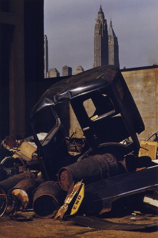
Ernst Haas, Brooklyn, New York, 1952
It might seem curious to us now, bathed in the perpetual radiance of photographic color, that only a few decades ago color had a bad reputation. As Walker Evans famously put it, “there are four simple words which must be whispered: color photography is vulgar.” Color was identified with commerce, with manipulative advertising and crowd-pleasing stories about the stars in popular magazines. The color picture was too close to reality. Where was the personal vision, the transformation, and the art? Serious photographers shot and interpreted the world in black and white.
According to the well-worn narrative, all this began to change in the 1970s with the “new color photography” of American photographers like William Eggleston, Stephen Shore and Joel Meyerowitz. These figures are now acknowledged masters, initiators of a raw new direction, and few contemporary photographers restrict themselves to anachronistic black and white. In recent years, though, new research has introduced a more nuanced picture of color photography’s development. In Ernst Haas: Color Correction, published in 2011, art historian Phillip Prodger refers to the “vitality of the color underground” in the 1950s and 1960s. Saul Leiter’s pictures, discussed in a recent post, are an example. Ernst Haas’s are another.
I first saw some of the pictures in Color Correction — a play on words, signaling the need for a rethink — at the Rencontres d’Arles photography festival in 2010, in a show curated by William A. Ewing, who also made the selection for the book. A few months later, Thames & Hudson published a book on Haas in the Photofile series. These experiments in visual poetry were a revelation. Haas (1921-86) was once world-renowned as a color photographer. In 1953, he published the first color photo essay in Life magazine (“Images of a Magic City” in two parts: scroll down) and in 1962 he was given the first solo exhibition of color photographs at the Museum of Modern Art — 14 years before Eggleston’s famous MoMA show (unfortunately there was no catalogue). In his introduction to the exhibition in Arles, Ewing noted that critics and curators had come to regard Haas’s pictures as “too feel-good, too sentimental” to hold his work in high esteem.
Ernst Haas, New York City, 1963
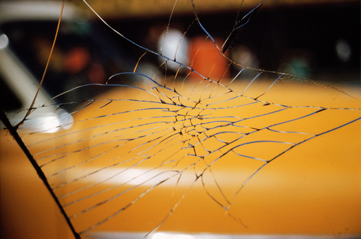
The photographs in Color Correction show another side to Haas’s handling of color. Prodger describes how on a roll of 36 exposures (usually Kodachrome) devoted to his commercial work Haas would often include one or two pictures of subjects of purely personal interest. Some he published; others appear in the book for the first time. As a visual journalist working for national news magazines, Haas needed to show intelligible scenes, to tell stories. In his more personal pictures, he moves in much closer to his subjects in search of a new visual world, a world that anyone could see, says Prodger, “if only they adjusted their eyes and tilted their head the right way.” Untethered from its setting, form starts to become abstract, focus blurs and colors flare. Haas liked to construct his pictures in layers, as in the shot above of the yellow car seen through a web of cracked glass, and he often used a shallow depth of field. It’s not always easy to tell what we are looking at in the untitled pictures and we frequently have no idea where these close-up phenomena are taking place. In 1961, Haas wrote:
Bored with obvious reality, I find my fascination in transforming it into a subjective point of view. Without touching my subject I want to come to the moment when, through pure concentration of seeing, the composed picture becomes "more made than taken." Without a descriptive caption to justify its existence, it will speak for itself — less descriptive, more creative; less informative, more suggestive — less prose, more poetry.

Ernst Haas, New York City, 1959
Pictures such as Haas’s and Leiter’s are a long way away from the “objective” eye, the glacially detached and distant overview, that has dominated art photography in the past two decades, in the work of Jeff Wall, Thomas Struth, Thomas Demand, et al. Haas and Leiter are intimists and sensualists, lyric poets of the camera lens, who discovered a refined and subjective form of meaning akin to music (“pictures begin where words end” said Haas) in inconsequential moments and scenes that could easily have been dismissed as nothing at all by a casual viewer, who happened to see the photographers at work. Prodger conjures an appealing picture of Haas poised in the street focusing all his attention and his camera on a luminous splash of grease. Anyone who can see why an artist might find value in such a transient but arresting detail will be able to appreciate these pictures.
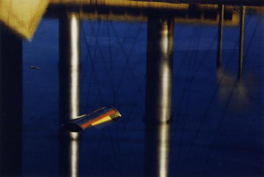
Ernst Haas, USA, circa 1955
Maybe the gradual emergence of color photography’s underground history will prompt a critical reassessment of its practitioners’ place in the development of color. Color Correction argues persuasively that the elevation of Eggleston as a pioneer of color, while Haas was downplayed, had much to do with the preferences and agenda of MoMA’s photography curator John Szarkowski, who inherited the plan to mount Haas’s show at MoMA from the previous curator, Edward Steichen, and then damned Haas with faint praise. “Whereas Haas was concerned with personal expression,” writes Prodger, “Eggleston is concerned with vernacular tradition.” The new photographic attitude favored showing the mundane without expressive aesthetic intervention. Nevertheless, some of the large claims made for the 1970s generation of color photographers were being queried even at the time.
The campaign to restore Haas to “the vanguard of twentieth century photography” shows no signs of slackening. The Color Correction exhibition opens on January 20 at the Christophe Guye Galerie in Zurich.
See also:
Saul Leiter and the Typographic Fragment


Comments [4]
.
01.19.12
10:48
There was a nice story in Vanity Fair a year ago about the pictures taken with the last roll of Kodachrome, discontinued in 2009.
01.19.12
12:21
01.19.12
05:02
01.21.12
09:21