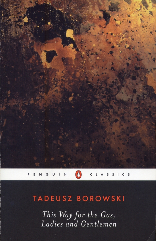
Design by Viktor Koen, Penguin Books, USA, 2003
There is no right or final answer with a book cover. Where music albums are forever identified with the artwork that clad them on release, book covers change and change again. Over time a much-reprinted novel or short story collection will generate scores of different cover designs around the world. While the visual interpretation of any book’s contents can be taxing, with some books the stakes are especially high.
Tadeusz Borowski’s This Way for the Gas, Ladies and Gentlemen is that kind of publication. Los Angeles architect and book lover John Bertram has organized a series of cover design competitions in which he asks designers to interpret a demanding work of fiction. In 2010, with the Consulate General of the Republic of Poland in Los Angeles as co-sponsor, Bertram set the challenge of designing a cover for Borowski’s harrowingly bleak collection of 12 stories based on the writer’s experiences in Auschwitz. These speculative covers later became the starting point for a fascinating visual and literary study — This Way: Covering/Uncovering Tadeusz Borowski’s This Way for the Gas, Ladies and Gentlemen — edited by Marco Sonzogni, with Bertram’s help, and published in April this year.
I read Borowski’s book, available in the U.S. as a Penguin Classic, a few years ago. I had never heard of it until I happened to see it in a bookstore. From the author’s Polish name and the ferocious irony of the title, it was obvious what it was about and the cover photograph of something fiery and blackened (burnt metal, though the subject is unclear) clinched my desire to read it. The image played menacingly against the title — it could be interpreted as a deadly miasma — and had great metaphorical power without stating anything specific.
The book, though, is unflinchingly brutal and disturbingly matter-of-fact about the dehumanizing struggle to survive in Auschwitz. In the title story, the narrator toils on the ramp where new arrivals unaware of their fate are unloaded from the trains — many have died on the journey. His main concern is with the food the prisoners have brought with them and he longs to return to his bunk with no mattress and “sleep among comrades who are not going to the gas tonight.” At the end, walking back to the camp, he sees smoke rising from the crematoria and notes with the same expressionless tone that the “transport is already burning.”
As Sonzogni observes in his introduction, any attempt to create a cover design for Borowksi’s book has unavoidable ethical considerations. “Can images reproduce the unimaginable?” he asks. “And how are those images to be interpreted?” In 1949, the philosopher Theodor Adorno saw the matter in the most universal terms when he declared, “To write poetry after Auschwitz is barbaric” — as though no art about any subject produced by the culture that had given rise to Auschwitz could ever speak with legitimacy again.
This was untenable, but a famous case study from film history indicates the acute sensitivity of the issue when it came to representations of the Holocaust so soon after the events. In Gillo Pontecorvo’s Kapò (1959), one of the first feature films to dramatize the experience of the camps, a prisoner throws herself on an electrified barbed-wire fence. Pontecorvo attempts to accentuate the drama of the image by tracking in toward the dead woman hanging on the wire and framing the body more tightly. For the film critic (later director) Jacques Rivette, reviewing Kapò in Cahiers du Cinéma, this shot was anathema and Pontecorvo deserved “nothing but the most profound contempt.” (What did Rivette later make of a film like Schindler’s List?) Rivette’s insistence that the selection and treatment of film images implicitly expresses an ethical position has given his review a key place in the history of French film writing.
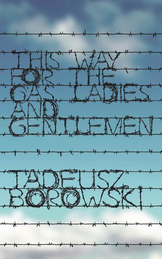
Anna Zysko, Poland, winning competition entry
Allowing for the obvious differences of media, the composition of a cover image presents the designer with comparable hazards. Sensationalism, cheap shock tactics and melodrama are out of the question, no matter how shocking the book’s subject. Fashionable design and over-design are equally inappropriate. Literalism and using the most obvious visual props risks falling into stale and therefore unfeeling cliché. Such images might include railway tracks, barbed wire, fence posts, blue striped uniforms, yellow stars, tattooed numbers, swastikas, showerheads, gas and smoke, skulls and crossbones, and blood. That’s not to say that none of these devices can be used — in the 241 competition entries every one of them occurs — but their acceptability comes down to the mindfulness and subtlety of the visual rhetoric. Whatever sense of horror or outrage a spectator might feel 65 years later, these are not experiences we have had, or can claim to imagine fully or understand. To justify itself, a design will need to convey sensitivity, gravitas, a quality of carefulness and intuiting-just-enough that might be described as decorum. It shouldn’t pretend to know what its creator cannot possibly know.

Scott Barrie, Canada, competition entry
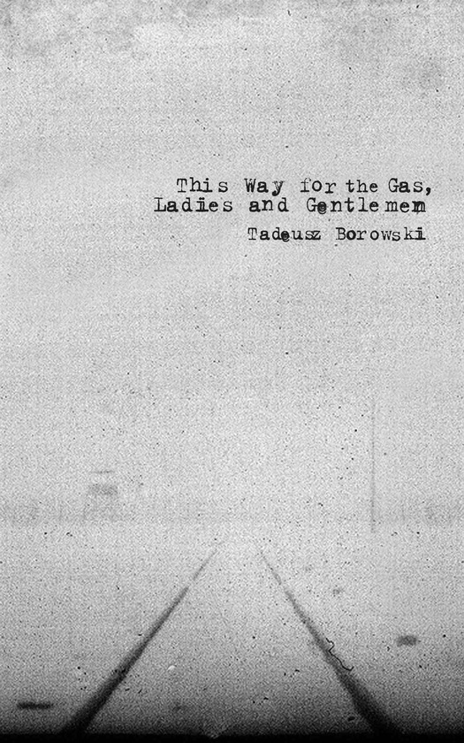
Peter Chmela, Slovakia, competition entry

David Gee, Canada, commissioned by John Bertram
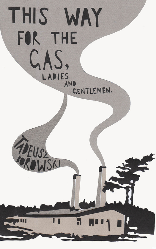
I have selected ten of the covers to show here, concentrating on three visual themes. They are all “good designs,” but that doesn’t mean they are all equally good interpretations of the subject and book. Scott Barrie’s exuberantly graphic stylization of the tracks leading to Auschwitz’s notorious gate, in melodramatic red, comes dangerously close to airbrushing the nightmare. Agata Jakubowska’s cover is an exercise in style with a cute, flower-like flame and an unfortunate note of whimsy in the see-through architecture of the crematorium. In Dean Owen’s understated monochrome illustration, the swirling smoke shapes are self-conscious, the hand-lettering a little too prettily spaced. Callum Starr appears to confuse the blocks that housed the prisoners with the brick-built crematoria. The drawing works well against the sober formality of the type, but his contemporary version of expressionism has a retro air. Nevertheless, these are all delicately judged designs compared to the clumsiness and excess found in some other entries (see them all here).
Dean Owen, United Kingdom, competition entry
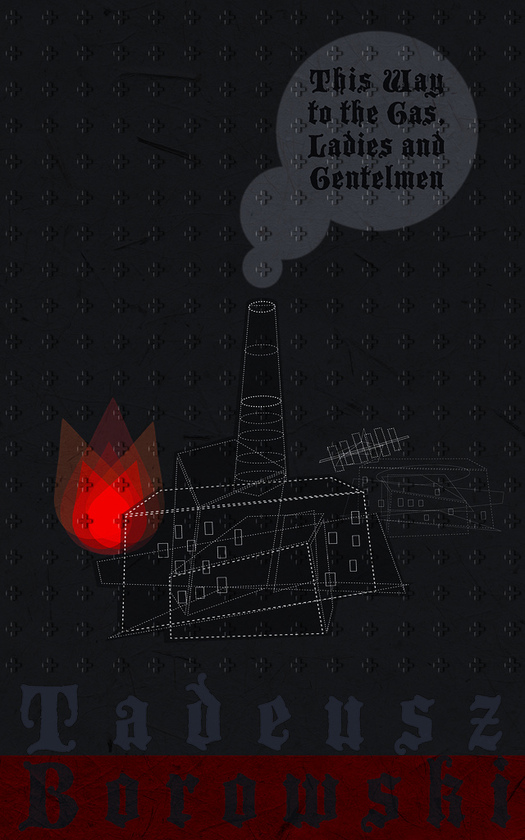
Agata Jakubowska, Austria, competition entry
Callum Starr, Australia, competition entry
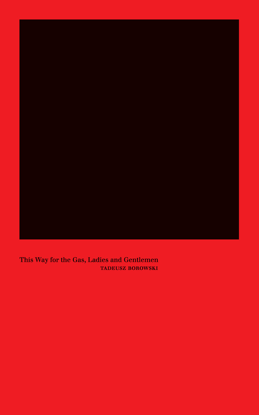
Most effective are the cover concepts that acknowledge the extreme difficulty of visualizing existence in the death camps, reflecting what the philosopher Berel Lang, another contributor to the book, calls “a wariness of the possibility of finding an adequate narrative or figurative representation.” Peter Chmela’s fading, reticent image (above) of the tracks and a distant watchtower is heavy with dread, suffering and sadness. Jamie Keenan, a highly experienced cover designer, eschews representation entirely in favor of letters that inexorably disappear, while Karoly Kele reduces incarceration and the gas chamber to a severe yellow box shrouded by a black cloud of smoke. Well-deployed, block-like type helps to give this abstract yet explicit image great authority; it might not capture the book’s tone, but its maturity seems adequate to the subject. In the most minimalist cover, by Sulki and Min Choi from South Korea, the “image” becomes a monumental black void within a flat field of red. In his essay for This Way, Bertram likens this nullity to photographs by Elżbieta Janicka of the empty white sky at six death camps, including Auschwitz.
Jamie Keenan, United Kingdom, commissioned by John Bertram
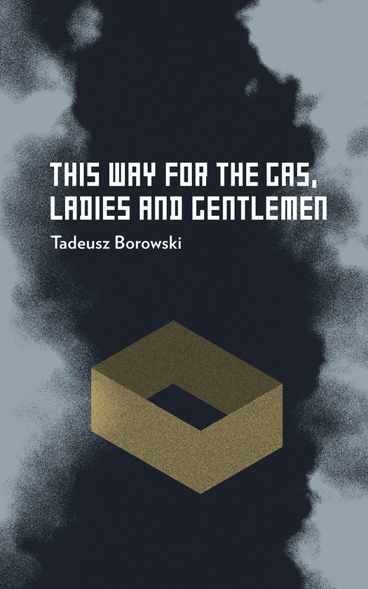
Karoly Kele, Hungary, competition entry
Sulki Choi & Min Choi, South Korea, commissioned by John Bertram
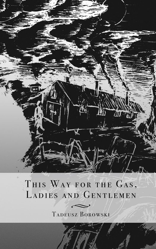
Anna Zyśko’s image of barbed wire twisted to make the lettering was a worthy winner, though perhaps a bit Sagmeister-esque, but the most effective cover in This Way, in my view, is a commissioned piece (above) by David Gee, another established cover designer. Gee opts for railway tracks, an obvious enough motif, but uses the photo in an unexpected way to portray the plain unavoidable truth. These monstrous transports took place on ordinary days, in familiar places, sometimes in fine weather, through pleasant, unremarkable countryside.
The apparent lightness of the scene amplifies the mocking welcome of the title. The horizontal rules slicing across the image at the tracks’ terminal point are a symbol of nullification. The picture trembles with the memory of trauma that can never be fully expressed, yet will never be erased. And because it shows an everyday scene — embodying what another essayist calls “the Auschwitz oxymoron of unprecedented cruelty made routine” — this speculative cover, more than the others, seems to belong to the book.
See also:
W.G. Sebald: Writing with Pictures
On the Threshold of Sebald’s Room
Romek Marber: Survivor


Comments [5]
But to try to redeem my comment slightly, I'll say I mostly agree with Rick's choice conceptually and visually but am not quite sold on the typeface.
11.26.11
08:16
11.27.11
12:59
12.09.11
05:40
10.02.12
02:18
10.02.12
04:19