
Happy generic figures encircling the world, designer and date unknown
My first paying job as a graphic designer — strictly speaking, as a commercial artist — was doing the illustrations for a filmstrip, one of those slideshows timed to a recorded soundtrack that was popular in mid-20th century classrooms. It was intended to introduce an inner-city youth employment program to potential participants. It was 1975, the summer I graduated from high school. My work was directed by a charismatic black guy whom I now picture as Idris Elba. Nearly 35 years later, I can only remember two things about that project. First, the soundtrack he had picked was the very hip-to-me "Maiden Voyage" by Herbie Hancock. Second, and more importantly, I had a lot of trouble figuring out how to draw the characters that would represent the participants in this program, whose poses would be used to illustrate the step-by-step requirements of enrollment and successful completion.
My first attempts were ambitious: eyes, noses, hairdos, clothing. Idris was patient. "Listen, you've got to simplify these. I don't want people distracted by these hats and stuff." I tried again. "Better, but can you make it so you can't tell whether they're black or white?" Okay, one more time. "Look, Mike, I don't want people even to know whether these are men or women. They just have to look like...people, you know?" I tried another drawing. Idris was getting antsy. "Right, but these are too stiff looking. Can you make them look a little happier?" Finally I reduced the figures down to their essence: eyeless balls representing heads, atop curvy stars, with the four points representing fingerless, toeless arms and legs. "That's it!" said my first client.
Without really knowing what I was doing, for my first paying job, I had contributed to a plague: the profusion of sexless, blankly cheerful little people that I have come to call Neutered Sprites. They're everywhere. Behold!
Representing the archetypical homo sapiens isn't easy. Da Vinci's "Vitruvian Man," from around 1490, was the artist's attempt to map a kind of universal humanity, but it's anything but: white, muscled and long-haired, he looks too much like Owen Wilson to serve as a placeholder for most of the world's population, or at least for me. Over 350 years later, Le Corbusier's Modulor comes a lot closer. But it's still undeniably, even militantly, masculine, a strident standard-bearer for the modernist utopia.
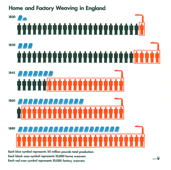
Otto Neurath, "Home and Factory Weaving in England," from Modern Man in the Making, 1939
The quest for a completely neutral approach to human representation led other mid-century designers to pure geometry. Trained as sociologist and political economist, Otto Neurath created a language of symbols called Isotype to convey complex statistical ideas in a simple visual way. There's no mistaking the gender of Neurath's square-shouldered, round-headed figures: he frankly calls them "man symbols," fitting the title of his masterwork, Modern Man in the Making. But they are undoubtably landmarks, and clearly progenitors to the now-ubiquitous bathroom symbols formalized by Roger Cook and Don Shanosky in 1974 as part of the AIGA-led U.S. Department of Transportation Symbol Signs program.
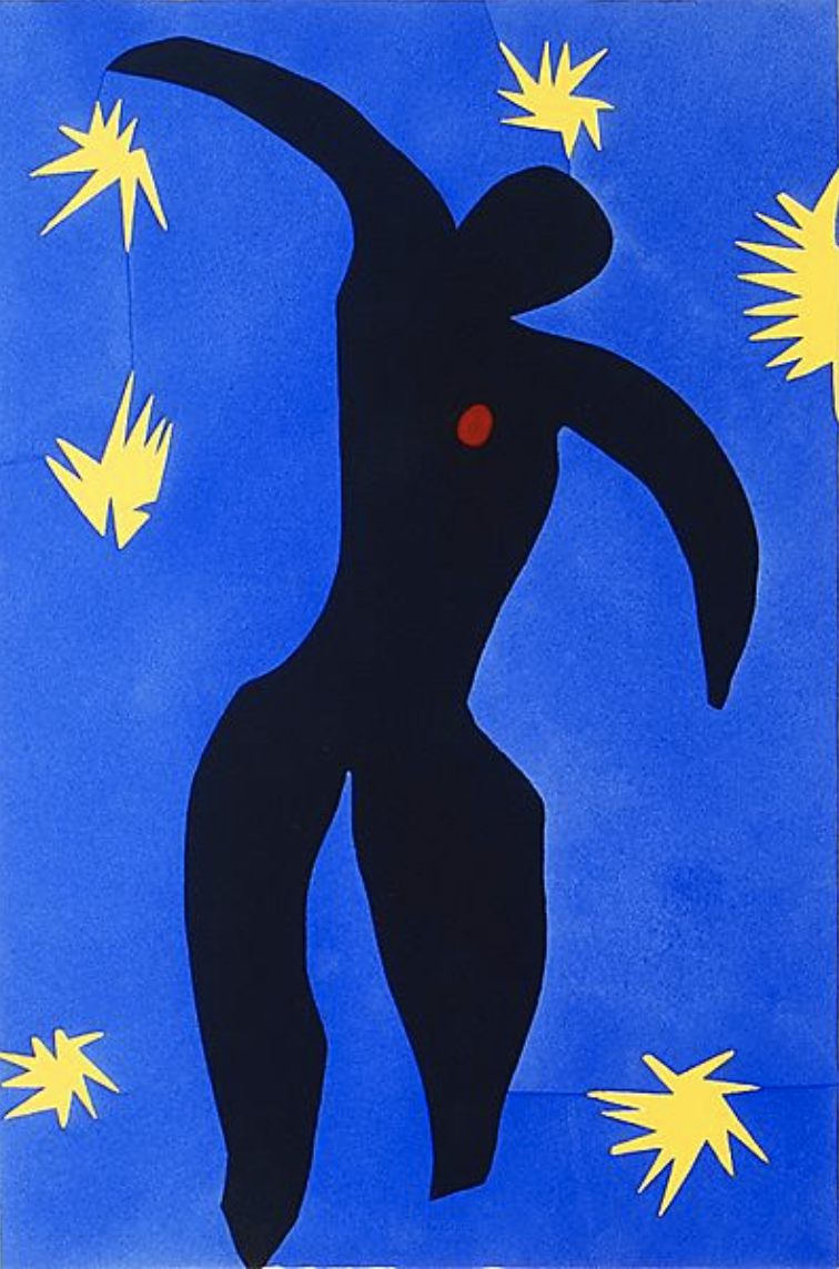
Henri Matisse, Icarus (Icare) from "Jazz," 1943-44
The design world, however, clearly had a need for a less rigid, "friendlier," way of representing people. Hence, starting in the late fifties, the rise of the Neutered Sprites. I suspect that many of those who draw these have a vague image in their minds of the dancing figures in Henri Matisse's collages. These have all the characteristics for which one seeks in vain in Corbu and Neutrath. They are nimble, lively, happy. They are not obviously young or old, black or white, male or female. And one last thing, which is the best of all. Drawing the human figure, as anyone who has taken a life drawing class can testify, is difficult. Neutered Sprites are — or at least they appear to be — really easy to draw. I remember realizing that with great relief back on that very first job. The little bastards just came pouring out of my felt tipped pen, one after another. "Hey," I thought to myself. "This isn't going to take that long after all."
The traditional habitat of the Sprites today, of course, is Nonprofitland. Finding them isn't hard. Look for logos for organizations dedicated to community-building, or health-supporting, or any kind of relentlessly positive thinking. There you will find these little figures by the dozens, prancing around, holding hands, embracing their families, and generally celebrating the universal themes of wellness, happiness, and goodness.
Unfortunately, they have come to have the opposite effect on me. They make me sour and depressed, not least because of my dim memories of having personally contributed to their proliferation. So, I hereby take a sacred pledge: with Da Vinci, Corbu, and Otto Neurath as my witnesses, I swear I will never create another Neutered Sprite. I invite you to join me. Together, we can defeat this epidemic!
Research assistance by Kai Samela and Rishi Sodha


Comments [44]
While I think we need to ban these like Comic Sans and Papyrus typefaces, I'm ashamed to say that i don't have an answer as to an alternative.
I don't think we need to go the route of certain pharmaceutical drug companies and start having anthropomorphic bees or circles representing people, but we still have the need to communicate that "people" in the visual sense, are indeed people.
But I think we can start the ban now, and let the masses figure out an alternative.
05.06.09
11:16
05.06.09
11:22
#6 references a simple scissor cut piece of paper, contextually for the organization being represented rather clever I think. #13 rather eloquently expresses a sense of childlike wonder. Pretty darn hard to do by just using a couple of turned up chins. The NSF logo (#20) I've always been partial to, a great riff on how we tend to reference the structure of an atom. And #27 is a very clever play on the veins of the maple leaf. In the Canadian context, again it's a logical flourish. In my humble opinion, not all cheese is cheesy.
05.06.09
12:08
05.06.09
01:14
I swear I will never create another Neutered Sprite. I invite you to join me. Together, we can defeat this epidemic!
Fanta, Sie
05.06.09
01:28
Its also worthy of note that for better or worse, even the humanist logo is a neutered sprite, stretching out and striving to become iconic.
http://commons.wikimedia.org/wiki/File:Happy_Human.png
05.06.09
01:37
05.06.09
01:40
I don't think abstract anatomical representations of gender would be very flattering. Just watch an old Chris Cunningham video.
05.06.09
01:59
05.06.09
02:04
In healthcare in particular, we're generally mandated to develop designs which are as inclusive as possible. There are generally two approaches to this, as far as I've been able to determine:
1. Don't reference people at all -- keep the design to the facility or representations of tools, i.e., stethoscopes; or
2. Use neutered sprites.
For some designs the first option is viable, possibly even desirable; however if the logo or graphic must have a human touch to it, sprites are the only option left.
Unless one wants to try to draw the logo version of the Enterprise bridge crew, of course, and represent every major gender and ethnicity, which has its own problems associated with it.
Finally, your 50-ad roundup was a bit unfair. By the 40th slide or so I was feeling overwhelmed, but that's because there were 50 slides containing the sprites. In general, in the wild, one doesn't see so many sprite-bespattered logos in a row.
In any case, don't flog the sprites unless you're able to suggest an alternative.
05.06.09
03:14
Always interested in "cliché" and why certain images are continually used. Scales for lawyers, hearts for doctors, apples for teachers/education, wrenches for plumbers, car silhouettes for mechanics, eyes or glasses for optometrists, a house for realtors, crosses for Christianity and "Neutered Sprites" for the myriad visuals showing diversity and/or all the other abstract nonprofit endeavors under the sun. Etc., etc. Can’t recall any modern "sprites" before Matisse (can anyone else?). And don't forget the cute paper cutouts of children “holding” hands.
Don't recall who first said it, but there is a reason why some clichés are cliché. Part of our collective unconscious?
Of course, am most impressed by those who take the time to improve or build on a cliché and add something new. (Have seen several creative film or movie company logos over the years using the film strip or camera lens.)
But agreed — too many just go for the obvious and quick and don’t take the time to really craft something unique. Their loss.
Nonetheless, a fun observation.
VR/
05.06.09
03:51
05.06.09
04:03
05.06.09
08:00
Cheers!
05.06.09
10:37
05.06.09
10:49
I think these sort of things are simply laziness and lack of creativity. Swoops, spirals, etc. have been on the list of design cliches for many years now. I would also now add the human hand print to the lazy designer collection. (Oops, there are book covers to the right that use hand prints or silhouettes.)
More of swoops and spirals on these sites:
http://lekowicz.com/library/logohell/logohell.html
http://www.splorp.com/critique/
http://www.thestreet.com/tech/internet/986150.html
05.06.09
10:56
05.06.09
10:57
Small world . . . I think all designers are all guilty of creating Neutered Sprites. Paul Rand understood how to put a spin on the cliché.
During high school, in the late 1970’s early 80’s, I took life-drawing classes at Bucks County Community College and was interested in graphic design. On a ski trip, I met Roger Cook, who later showed me his work at his design firm in Princeton, NJ. Inspired by his work, I ended up transferring from MICA to Cooper Union where I met Don Shanosky’s son and a bunch of other very talented designers. But when reading your post, I did not think of “Rijie” I thought of Paul Rand and his essay on Design and the Play Instinct.
What is your favorite Neutered Sprite by Paul Rand?
Check out Direction Magazine from the Summer 1942
05.06.09
11:53
where are all the olympic symbols for instance?
and MB, given that you have kept all of your notebooks, maybe you could off included a peak of yours?
05.07.09
02:52
05.07.09
05:11
GOOD SPRITE: The sprite—though seemingly "easy" to depict—is quite the opposite. It is an abstraction of the human form. To be believable (I don't mean realistic.) it needs to capture not only the physical body, but some sense of being human. To make a good abstraction, you need to know your subject in order to make intelligent decisions about what you choose include and to be understand what you are leaving out. Matisse's abstractions are strong because he is anatomically informed, has tremendous skills and knowledge with an equal measure of restraint, and is aware of how depictions of the physical body represent more than our physical and visual reality. In short, a "good" sprite is informed from the inside out.
BAD SPRITE: A bad sprite is a superficial rendition of someone else's sprite. It begins and ends with an external description.
How do you create an extremely simple depiction of a human being that manages to feel "true," that is ageless or genderless without being soulless? Some fine artists spend their entire lives exploring that question.
05.07.09
10:02
Thanks for this post--quite amusing on an otherwise very bleak morning.
05.07.09
10:11
05.08.09
03:47
As someone who has run many 10Ks, half-marathons and marathons, believe me, there is a place besides healthcare and nonprofits that the neutered sprite thrives. If I get another race t-shirts with one of these illustrations on it...
05.08.09
04:14
05.08.09
05:24
05.09.09
07:04
I think all the above can be conveyed in smarter, more meaningful ways through visual metaphors and sensibility of abstract shapes and/or typography.
05.09.09
11:46
When a new project comes in, graphic designers in office listen to the brief and then fly away to their PCs, to trawl the internet. I ask them why they do that, sit and look at all those images. All they say is "for reference".
There will be an answer, let it be.
05.11.09
01:19
Sidenote:
Carl: The Neutered Sprites on Direction, Summer 1942 are fish (note the hook near the bottom).
05.11.09
11:12
05.11.09
01:36
05.13.09
06:43
05.14.09
08:42
05.15.09
01:28
Jon Reigelman, here is a cast of characters on the cover of A-D MAGAZINE that show no gender, race or age but represent diversity.
A-D MAGAZINE
Vol. 7, No. 3
February- March 1941
—
JNH: It is Friday let’s fry a few fish.
05.15.09
05:03
http://www.jkr.co.uk/design-gazette/2008/08/healthy-pictograms-the-next-generation/
The pictograms for the Japan Olympics were unapologetically male - perhaps the point is when the client want's a wishy washy answer, they get design which reflects this.
05.15.09
09:59
05.20.09
06:46
http://sturnellaneglecta.deviantart.com/art/Dear-Graphic-Designers-123240973
(with a sprite unapologetically stolen from one of the 50 examples)
05.21.09
02:56
05.22.09
06:57
http://www.sportsphilanthropy.com/assets/410_mlsworkslogo.jpg
06.23.09
06:30
06.26.09
01:09
08.11.10
08:31
08.13.10
04:01
08.19.10
07:51
12.01.11
05:48