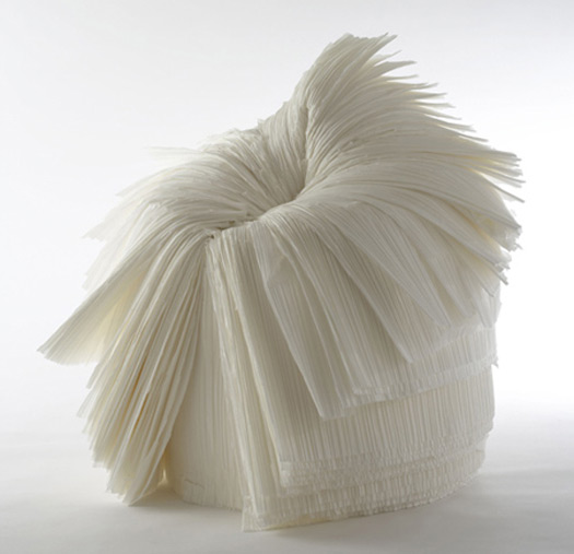
Cabbage Chair designed by Nendo for Issey Miyake
There is much to applaud about the Cooper-Hewitt’s 2010 National Design Triennial, the fourth installation in a 10-year-old series. This show is called “Why Design Now?” Such a big question seems at first glance absurd. Why do people ever design? Mainly because we cannot help it; design is, first, a necessary response on our part as we make our way through the world — we design tools to dig, or cook, or perform surgery. Then, design can be thought of as a sort of embroidery on the necessary; we design out of joy (stage sets!) and celebration (birthday cakes!), or sorrow (think of the design of shrouds and caskets), or a sense of the beautiful or comical. We design to argue, and we design to settle arguments. We need, we want, we think, therefore we design. It’s that basic.
Any show that gets us down to fundamental truths even as we walk in the door is valuable. The Cooper-Hewitt’s mission with this triennial is to ask us to consider what we should be thinking about these days — whether as designers, or as consumers. Given the environmental degradation we have caused, given the economic disparities with which we live, given the fluctuations in our sense of national and global security — how have designers responded in ways that are relevant, responsible and life-enhancing? These aren’t always values we demand of design — much that is beautiful is simply irrelevant; much that is responsible is simply pedestrian. But as considerations of the way we live now, these curatorial values are an excellent filter through which to examine a very specific sort of design passion, one that, at its roots, has to do with sustainability and social enhancement.
The Cooper-Hewitt show is beautifully presented; exhibition designers Patrick Seymour and Catarina Tsang of Tsang Seymour were meticulous in their attention to portability — it treads lightly on its patch of real estate — as well as their use of renewable and non-polluting resources. It is, appropriately, the most sustainable show in the museum’s history. I recommend the accompanying catalog, which is handsome and useful. There is so much information to take in about each item in the show that a decision must have been made not to overload the signs. As a result, you must resort to the catalog to gain some understanding of why each thing was included. Unfortunately, though, even with crib notes in hand, the selections do not necessarily speak for themselves.
This problem struck me immediately as I gazed at the first offering: the Cabbage chair. It might be worth stopping here for a moment, as it highlights some significant issues. The chair was created for a show by fashion designer Issey Miyake. He was (properly) concerned by the “vast amounts” of paper waste generated in the manufacturing of his pleated fabrics, so he asked the Japanese design studio Nendo to find a use for this discarded paper. One response is a chair that unfurls from a roll; resin is added to strengthen the paper. The result is beautiful and strange, but mysterious — and silly. It cannot be half as comfortable as your average college dorm beanbag. And how durable is it? Why wasn’t this paper recyclable in the first place — is it somehow treated with chemical stiffeners? And so on. Don’t these considerations matter? Is it enough that an object is lovely? In contrast, the Book LED Floor Lamp by Goodmorning Technology seems to be a small masterpiece of sense and sensibility. As the book-shaped shade is spread open, the lamp glows brighter.
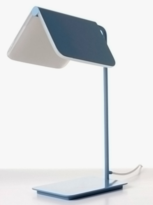
Book LED Floor Lamp by Goodmorning Technology
The curators have ambitiously organized the show around several categories: Energy, Mobility, Community, Materials, Prosperity, Health, Communication, Simplicity. If that’s not overwhelming, I would like to know what vitamins you are taking. Seriously, though, such a list reveals an inherent problem in editing. This is too much ground to cover; apples and oranges are mixed up along the way, so that the viewer is befuddled. It may have been wiser to settle on some basic, desirable values for our times: simplicity, prosperity, sustainability, health — and used those as a grid against which to measure design solutions in materials, communications and mobility. We might have added the values of pragmatism and reliability. The argument against them is that there must be room among designers for dreams, but we may be, as is implied in the call for sustainability, heading into nightmarish times.
Furthermore, it is impossible to know which of the projects and objects shown here are simply interesting, elegant or cute, and which are actually buildable, to say nothing of effective. That would seem a critical consideration — does it work? Along with, is it necessary? To start small, the 4:Secs Condom Applicator Generation II, is a plastic device that “aims to reduce the spread of sexually transmitted diseases,” an enormous, and tragically growing, problem. Do we really need a piece of plastic to do a job better done by hand? Did the curators consider trash — as well as issues of human emotion (who is going to carry that around? Or risk the embarrassment factor when whipping it out?) I bring this up not to be trivial, but because it symbolizes a problem I kept seeing throughout the show.
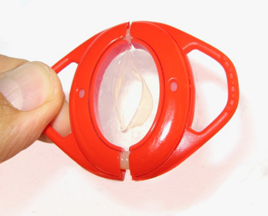
4:Secs Condom Applicator Generation II designed by XYZ
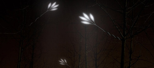
The “Energy” section alone would have been enough for a fascinating show — and it is, of course, the most important design challenge we face. Without effective, reliable new sources of sustainable energy, we will continue to rely on coal and oil, fossil fuels, with increasingly tragic consequences. The triennial offers an introductory survey of the field, skating so lightly across solar, wind, and ocean technology that I learned nothing new. It is way past time to introduce. We must now press hard for results. Items like the Invisible Streetlight, artificial leaves made of silicon and aluminum embedded with LEDs, by Korean designer Jongoh Lee are poetic, but how strong are they? And what happens in summer, when real leaves shade the “photo-capacitors”? Where’s the urgency — this should have been the showcase for new designs that actually work — the answer to why design now?
The solar tower technology featured here is more beautiful than the average solar array. Is it effective? Is it reasonably priced — in relation to what it produces? We are not told. BioWAVE ocean-wave energy systems that mimic the motion of seaweed are intriguing — unlike the wind and the sun, wave motion never stops — but how close to feasible are such wildly expensive structures? The show is more successful when it comes to the small items of everyday life. The Soil Lamp is a little beauty, but the bulb was dark when I visited. Apparently the U.S. Department of Energy has announced an L Prize competition for the design of an LED bulb to replace the incandescent, which will soon be outlawed. I would have loved to have seen a display of the best entries so far — or is the one shown, Philips’ bulb, far and away the best solution? A folding bicycle is a useful thing, but the one shown here, IF Mode, is nowhere near as elegant or lightweight as the English Brompton currently on the market. IceStone’s precast slabs are the beautiful, useful, intelligently designed product of a company whose values are consistent throughout. Demonstrating the power of communication, projects like Michael Bierut’s bold and exemplary Green Patriot bus posters, and the Get-Together UK telephone network for the elderly, are stellar.
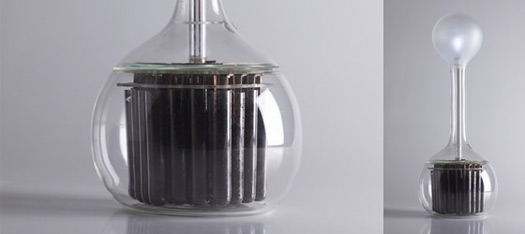
Soil Lamp prototype designed by Marieke Staps
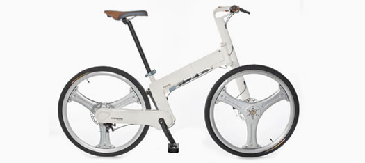
IF Mode folding bicycle designed by Ryan Carroll, Michael Lin and Mark Sanders
We are asked to consider MetaboliCity: “an urban ecosystem that supports modular farming systems”— lightweight textile scaffolding for plants, with solar cells to harvest the sun’s energy, powering a pump “that monitors and feeds the plants as well as micro LEDS for ambient light at night.” Since when are tomatoes afraid of the dark? I could not help wondering how quickly a gust of prairie breeze would blow these structures away. Sometimes ideas — or packages — are so seductive that they distract from straightforward, or call them naïve, but critical questions, such as “Why? What for?” More rigorous thinking would have been prophylactic; too many seeds are scattered in this show, seeds that are sterile, and in any event would fall on fallow ground.
Some of the larger projects that are showcased, such as the Masdar Development designed by London-based Foster + Partners and currently being built on the desert outskirts of Abu Dhabi, are fascinating in what they say about our expectations of the way we will live decades hence: largely indoors, where we can control temperatures and climates, in buildings huddled together in communal shade, drinking water that is desalinated in solar-power processes. The New Fortress movement (as I call it) may produce buildings that look elegant, but they are depressing in what they say about how willing we are to compromise on serious quality-of-life issues. Masdar may be useful in showing us where we are headed, but it actually does a disservice in making adaptation look beautiful; only the extremely wealthy will be able to afford to respond with such style to catastrophes like drought and heat that come with climate change.
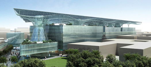
Masdar Development designed by Foster + Partners
Another fascinating area that could have carried its own show is “Prosperity,” which features products that are the results of “designers, architects, and engineers joined with organizations to find low-cost ways to address the underpinnings of poverty and to improve the quality of people’s lives.” We see a tool designed to help farmers efficiently thresh millet; low-smoke stoves manufactured with traditional methods, but designed to cut debilitating indoor pollution; small wooden radios made by Javanese farmers; the gorgeous hand-knotted rugs from Odegard; and the clothing from fashion label Alabama Chanin. These last two represent a provocative aspect of prosperity, the redistribution of extreme wealth. Only rich clients can afford carpets and clothing that costs thousands of dollars — and yet it seems a small price to pay to revitalize an ailing southern American town, or help end illegal child labor in Nepal, as RugMark Foundation does.
So how do the curators meet the challenge posed in the show’s title? Clearly, I had a mixed response. I was dazzled by some of the answers, dazed by others. The brain trust behind such a display is impressive. I left with my mind churning in argument — and that’s constructive — but I also left with feelings of confusion and frustration. In spite of all the categories explored, or perhaps because of them, the show was somewhat inchoate. At times I didn’t feel the curators were taking their own intentions seriously enough.
Designers today are operating in the face of unprecedented global pressures, challenges so enormous that even if they turn their backs on considerations of sustainability, they are making a powerful (if perverse) statement. These issues are pervasive, inescapable. We have never been in a time in which design mattered more — I would go so far as to say it is now a matter of life and death. The urgency of the question — Why Design Now? — could guide the spirit of the Cooper-Hewitt’s shows for years to come.


Comments [8]
06.01.10
04:32
Maybe i can get lucky and catch the Soil Bulb when it is on.
06.02.10
10:04
It's my impression that the kind of products that you sighted are what could also be referred to as blogosphere design. Products primarily conceive as concepts to dazzle consumer's concerns, but with very little substance or practical use.
It's all too apparent that product design has lost touch with it's roots. And it's unfortunate that an exhibition such as this, which could have helped to educate, spread awareness and bring people back to creating practical solutions has missed the opportunity.
Lets hope that in some way the attention from the 2010 World Cup Soccer in South Africa, my home country, will help to open designer's and curator's eyes to the practical realities of the world.
06.02.10
12:21
I have been a devoted fan of yours through H&G for years and appreciate your pensive review here, which I purposely read prior to attending the exhibit.
As with all design, merging the beautiful with the practical is a fine line.
06.02.10
08:33
06.05.10
09:58
There are many examples of how the proliferation of CAD and rendering software and access to the internet has enabled the artifice of amazing-looking and realistic-appearing objects that have no relationship to the physical world of objects at all, and turn out to be empty shells of possibility. Hotelicopter anyone?
In all seriousness, I am quite pleased to find that I'm not alone in feeling that honest and heartfelt critique is a skill that more and more people, especially designers, need to develop, and utilize. My hope is that along with Clay Shirky's "Cognitive Surplus" we also discover the "Curatorial Powers" and ability to "Critique with Love".
06.05.10
05:14
06.15.10
01:52
06.28.10
06:56