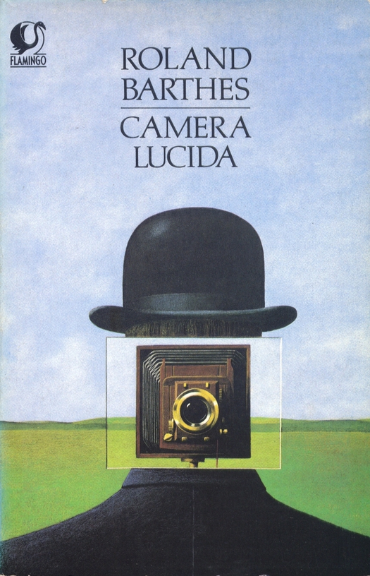
Illustration by John Holmes, published by Flamingo, Fontana Paperbacks, 1984
Over the past year, I have been giving lectures about Surrealism and the graphic image based on the work shown in my exhibition, Uncanny. (Last chance to see it in the Netherlands — it closes on Sunday.) Working on the project, I made an early decision to leave out the many applied and commercial images inspired by René Magritte’s paintings that would certainly need to be included in any complete overview of the subject. I did this partly to focus on and emphasize a kind of image-making that seems closer, in its psychological concerns and sometimes disturbing content, to the art of the original Surrealists, and partly because the work influenced by Magritte tends to be illustration rather than graphic design. It was also a matter of taste and my lecture reflects this emphasis.
It’s not that I dislike Magritte, though I much prefer his darker pictures (in both senses) and word paintings from the 1920s and 1930s to the summery palette of the later paintings for which he is perhaps better known. But the countless “witty” copies by later illustrators of Magritte’s conceptual conundrums and deadpan style have always grated. By appropriating his subject matter and method, they ended up making a great artist look hackneyed. One has to make an effort of cultural and art historical imagination now to recapture the real Magritte. The two impersonations here by the British artist and illustrator John Holmes are better than most. As John Coulthart of Feuilleton pointed out when Holmes’ death was belatedly announced in October, his debt to Magritte was often obvious.
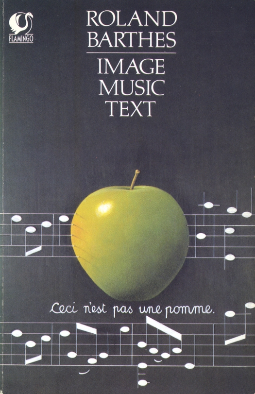
Illustration by John Holmes, published by Flamingo, Fontana Paperbacks, 1984
What I like about the two cover illustrations from the mid-1980s is that they are so faithful to Magritte in content and treatment that pastiche no longer seems like the most accurate word to describe them. Holmes’ paintings based on two of the Belgian artist’s trademark motifs, the bowler hat and the green apple, could almost be forgeries or fakes, except that Holmes’ technique may well be better. Not that there was any intention to deceive — readers of Barthes would have had no trouble picking up the visual references. The elegantly centered title pieces above the stately, symmetrical images help to give the covers an air of intellectual precision perfectly in keeping with Barthes’ brilliantly lucid essays.
Both books carry a back cover credit for Holmes. This was a step forward because the covers he produced in the 1970s, often for science fiction and horror paperbacks, were frequently uncredited. This oversight even includes Holmes’ most famous cover for Germaine Greer’s feminist classic The Female Eunuch, a book I bought as a teenager. For years I wondered who had done the painting. The same is true of the anonymous cover image for J.G Ballard’s The Atrocity Exhibition, which I acquired around the same time — it was Coulthart, commenting on an earlier post, who suggested that the bandaged figure is probably by Holmes. The style is an exact match and I am certain he is right. Magritte’s influence can be seen in both covers, though it’s less direct here, in Holmes’ cruel fragmentation of the female body reconfigured as a hanging torso, and in the way he makes a protagonist uncanny by concealment, in this case by medically improbable amounts of surgical dressing.
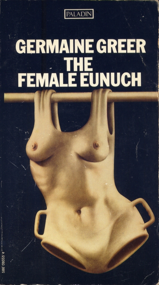
Illustration by John Holmes, published by Paladin, Granada Publishing, 1971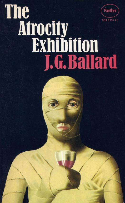
Illustration attributed to John Holmes, published by Panther, Granada Publishing, 1972
After my lecture about Uncanny at CalArts in October, design teacher and Design Observer contributor Lorraine Wild astutely zeroed in on the Magritte knockoffs airbrushed from my talk. There is no getting around them and in the next phase of my research into Surrealism and the graphic image, I intend to grasp the plastic nettle and explore the influence of Magritte on conceptual illustration more thoroughly.
See also:
The Dictionary as Art Concept


Comments [4]
This still works, though:
http://www.condenaststore.com/-sp/Magritte-Takes-One-High-and-Inside-New-Yorker-Cartoon-Prints_i8545077_.htm
12.05.11
10:00
http://day-ellison.posterous.com/oliver-sacks-md
12.05.11
10:04
12.05.11
10:31
Since the ball is rolling, I'd be pleased to see any other examples of Magritte-derived illustration readers of this post care to send links for.
Nice to hear from you, Will Novosedlik (if that's you). Thanks for the comment.
12.05.11
11:41