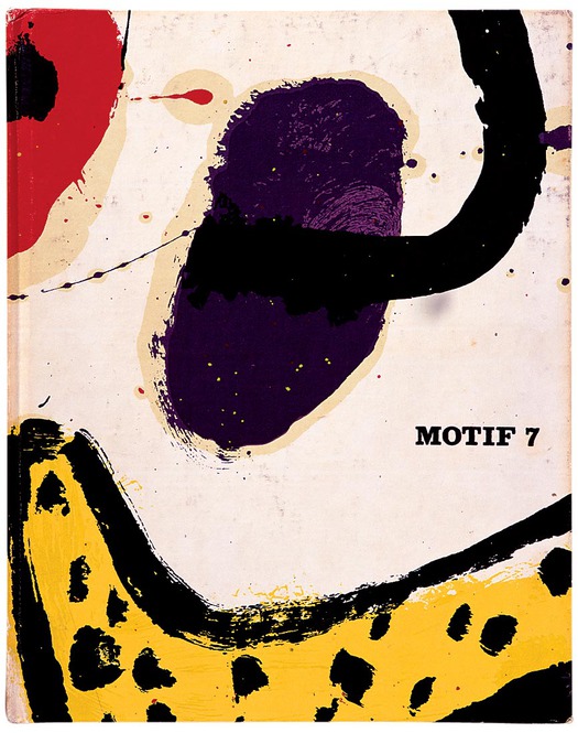
Motif no. 7, Summer 1961. Cover: Alan Davie. Publisher: The Shenval Press
Motif magazine’s range of editorial interests was unusually broad for its time and, in the often highly segmented world of periodical publishing, it has rarely been equalled in Britain. In an editorial in the first issue, signed by Motif’s editor, the late Ruari McLean, and its publisher, James Shand, they quote the 19th-century French writer and poet Théophile Gautier: “I am a man for whom the visible world exists.” Motif, they go on to explain, “is a periodical for which the visible world exists.”
Over the course of 13 issues, published from 1958 to 1967, Motif ran meticulously researched and beautifully illustrated articles about painting, sculpture, art education, graphic design, typography and lettering, illustration, photography, architecture, wood engraving, and the history of the graphic arts. “Visual culture” had yet to become a branch of academic inquiry and Motif’s urbane editor and publisher, whose careers began before the Second World War, would not have used the term. The magazine’s presentation of a wide array of visual arts on a more or less equal footing can nevertheless be seen as a prescient early example of a new way of documenting and appreciating the “visible world.”
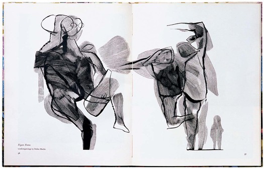
“Figure Forms” by Stefan Martin, Motif no. 4, March 1960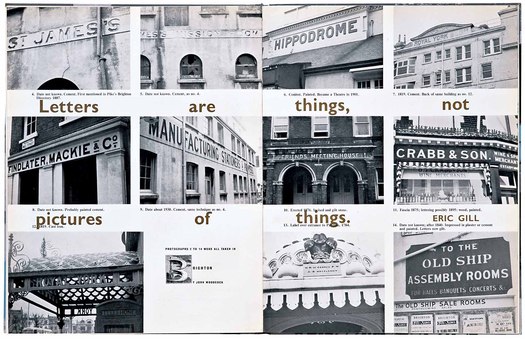
“Sans on Buildings, or What Happened before Architects Started Using Type Books.” Photographs taken in Brighton, England by John Woodcock. Motif no. 6, Spring 1961
The first editorial acknowledges a bias towards the graphic arts, since both men work in publishing and printing, yet McLean and Shand imagine the broadest possible readership for their journal. “Strenuous efforts will be made to make Motif appeal to the mind and eye of the non-specialist, the ordinary man who just wants to do exactly as he likes — but who is prepared to use his eyes to find out and evaluate what he likes.” They emphasize the point in the second issue: “Motif is for the receptive whole man (whether, by profession, artist or laundryman) who can get visual pleasure from Pollock’s abstractions, Mies van der Rohe’s skyscrapers, Paolozzi’s sculptures, or Stewart’s sun, moon and stars.” (Graphic artist Robert Stewart designed the cover and endpapers and his work is also featured in the issue.) Motif’s content, they write, would continue to be “unrepentantly and deliberately various.”
For Shand, owner of the Shenval Press, this was the fourth ambitious visual arts magazine he had started. In collaboration with the editor Robert Harling, Shand (1905-67) had published the influential journals Typography (1936-9), Alphabet and Image (1946-8) and Image (1949-52).
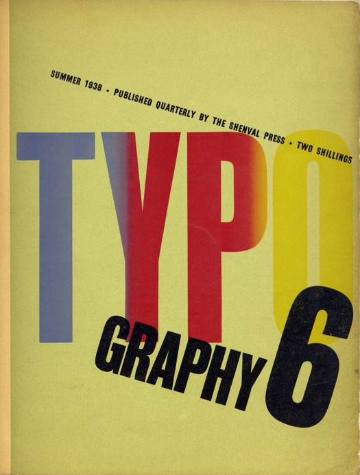
Typography no. 6, Summer 1938. Published by James Shand at the Shenval Press
By all accounts he was a complex man — “strange and difficult,” observes McLean in his autobiography True to Type. In an obituary written in 1968, for members of the Wynkyn de Worde Society, Allen Hutt notes Shand’s shyness and reserve, which combined with a “healthy iconoclasm” and an “enthusiastic readiness to give and take blows in causes about which he felt deeply.”
Ron Costley, who joined the Shenval Press’s London offices in 1961, as an assistant designer, recalls Shand’s perfectionism: “James was always upsetting people by wanting to get things right.” Hutt suspects that Shand never entirely escaped from the influence of his domineering father. Nevertheless, Shand was a bohemian in a business suit, much happier in the company of artists and writers, whom he met after hours at the Gargoyle club in Soho, than he was running the family business. McLean later remembered his colleague as “a man of distinguished creativity both as a writer, talker, and designer, who had been forced to stifle these gifts in building up a commercially successful and famous printing business, the Shenval Press. A magazine gave him an outlet, besides being a showpiece for his firm’s printing skills.”
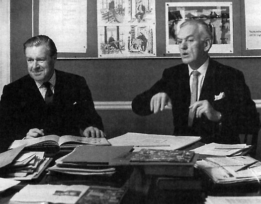
Ruari McLean (left) and James Shand in the Motif office in 1961, with images from the magazine on the wall
Photograph: John Hedgecoe
McLean (1917-2006) had contributed an article about the history of the Egyptian letterform to the first issue of Alphabet and Image, and he recalled that it was Harling who mentioned him to Shand as a possible editor for Motif. Shand proposed to pay the salaries of both McLean and his assistant, Fianach Lawry (then Jardine), and gave them a room in Shenval’s Georgian offices at 58 Frith Street in Soho, London. “Ruari was very much an all-up-front person, certainly highly intelligent and literate, but I don’t think there were any mysteries, whereas Shand was a much more complicated person,” says James Mosley, who contributed to Motif from the first issue.
McLean was already a published author and he loved magazines. “I was brought up to believe that reading magazines was a sin, or at least a waste of time,” he writes in his book Magazine Design, published in 1969. “I could construct a perfectly good autobiography merely by writing down the names of the magazines I eagerly devoured at all the various stages of my life. My education (and certainly my general knowledge) probably owes more to magazines than to books.”
The first edition of Motif, published in November 1958, established the template for the following eight issues. Unusually for a magazine, Motif had a hard cover, like a book; the binding was filled, front and back, with a hazily idyllic domestic scene, showing women at a table, drawn direct to silkscreen by Charles Mozley, who had also come up with Motif’s name one evening. In subsequent issues, the endpapers were used for graphic art. The contents included the first installment of a three-part history of photography by Helmut Gernsheim; a piece titled “The Born Illustrator” by Edward Ardizzone; a portfolio of drawings and sculptures by Elisabeth Frink, with an introduction by poet and novelist Laurie Lee; a wry guide to art students by Richard Guyatt, professor of graphic design at the Royal College of Art; and an article about the type foundry of Vincent Figgins, from 1792-1836, by James Mosley, recently promoted from assistant librarian to librarian of the St Bride Library.
Mosley recalls that he met McLean and other figures on the typography scene at the library, which they used as a kind of club, dropping by to see who was around. McLean asked him what he was researching and writing about, Mosley told him, and McLean commissioned him to provide it for the first issue: “It was as simple as that.”
Motif no. 3, September 1959. Cover: John Griffiths
“The Glittering Heart” by Colin Banks and John Miles, Motif no. 4, March 1960
“London Skyline 1961” by Robert Bernard, Motif no. 8, Winter 1961
This distinctive publication made an immediate impression. “The first issue of Motif is a tribute to the British graphic arts industry and equals anything that can be produced abroad. The contents are agreeable, readable and have civilized charm,” wrote James Moran in Printing News. Motif drew attention in the general press, too. “As a vehicle for ideas, it may well become extremely valuable,” wrote artist and art critic Quentin Bell in The Listener.
Shenval printed 2,000 copies at the beginning, rising to 2,500, except for one issue where, to McLean’s irritation, Shand arbitrarily cut the print run below the level needed to fulfil existing orders. McLean realized early on that Shand had no interest in developing a proper sales organisation and this was a source of regret. Also, the magazine did not feature advertising at any point in its life; it seems that Shand never intended it to make a profit. As Fianach Lawry explains, “James Shand had to fight his brothers and board down at Hertford and Harlow to print and publish Motif because it wasn’t commercial enough for them, and they did not share James’s interest in and admiration for artistic things.” Ron Costley has similar memories: “When [James] died that sort of element in the firm just disappeared. They started looking for work like annual reports — much more commercial. The tenor of the company changed.”
In London, Motif was available from Better Books and Zwemmer’s in Charing Cross Road, Alec Tiranti in Charlotte Street, and other shops. In New York, it could be found at Museum Books and Wittenborn Art Books, and at bookshops in Chicago, Los Angeles, Copenhagen and Stockholm. It was also available on subscription to overseas readers, though sales were limited. Costley recalls that, “One of the things that depressed [Shand] was the lack of sales and that subscriptions weren’t taken up. It was the sort of thing that would be spoken about in the right circles, and enthusiasts would snap it up, but it never reached that wider audience.”
Motif rapidly established a circle of enthusiastic contributors. A sense of how McLean and Shand operated can be gained from the entertainment expenses for 1960 to 1962 held in the Motif archive at the University of Reading. “Lots of people had these amazing lunches in those days,” says Mosley, who describes McLean as a bon viveur who enjoyed the good life. Mosley was the magazine’s guest on four occasions in less than a year. Other names that appear in the expenses include Berthold Wolpe, Paul Rand, David Gentleman and Richard Hamilton, and regular contributors such as type historian Nicolete Gray, architectural critic Reyner Banham, Maurice de Sausmarez, head of fine art at Hornsey School of Art, and London art critic Robert Melville.
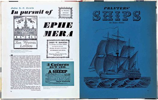
“In Pursuit of Ephemera” by John N.C. Lewis, Motif no. 7, Summer 1961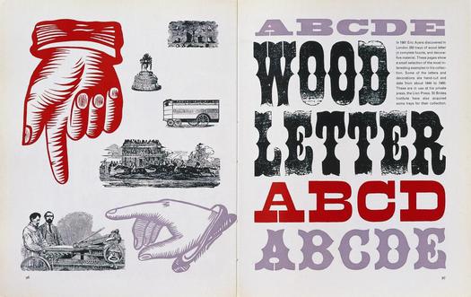
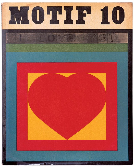
“Eric Ayers: Victorian Woodletter,” Motif no. 10, Winter 1962/3
It was an eclectic mix of artists, art teachers, critics and scholars, whose interests might have been expected to appeal to quite different kinds of reader (it also seems doubtful that laundrymen were ever a significant part of the readership). Mosley suggests that the art subjects were “slightly weird in a journal which was on the face of it typographic.” He didn’t read these pieces and believes that Motif’s typographic subject matter was the central issue for McLean. The emphasis on art, Mosley suggests, must have come from Shand, who collected paintings by the likes of Eric Ravilious and Edward Bawden. Allen Hutt writes that Motif was “beyond doubt an art publication” and that its value would lie in its presentation of the work of emerging artists. 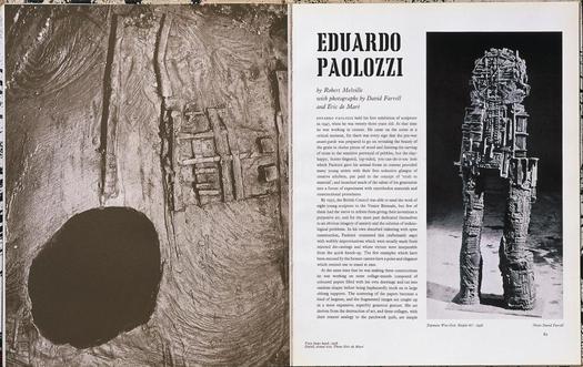
“Eduardo Paolozzi” by Robert Melville, Motif no. 2, February 1959
An analysis of the contents certainly bears this out. Not including reviews, Motif published 37 articles on type and lettering subjects; 40 on the graphic arts (illustration, drawing, wood-engraving and print-making); and 53 on painting, sculpture, photography and art education. It is worth noting, too, that Motif’s covers — the viewer’s first impression of its contents and concerns — invariably place the emphasis on painting and graphic art, making them quite different from the typographical covers of Typography and Alphabet and Image.
In True to Type, McLean acknowledges that Shand cared more than anything about the link that Motif’s content provided with art and artists, but he goes on to say that Shand gave him “a complete free hand as editor. He never told me what to put in the magazine and never rejected anything I had chosen.”
McLean’s son, David, supports this view, pointing to a picture from 1961 in True to Type (shown above) that captures McLean and Shand in mid-gesture, at work in the Motif office. “My father was certainly a fairly powerful character,” he says. “He looks happy in that photograph and he wouldn’t have been happy if James Shand was calling all the shots. I think he’s happy because James Shand was giving him a lot of rope and realised that he wouldn’t tolerate too much pushing around. I’m sure he wanted to contribute and he did contribute, but he left my father in overall control and must have, on the whole, respected his judgement.” McLean adds that his father had wide interests and good contacts in all the creative fields: architecture, painting, graphic art, design and printing. “He mixed with all those people,” says McLean. “He was very sociable.”
Where Motif truly excelled was as a superbly printed showcase for illustration and this is one of the best reasons to search out copies today. The magazine’s large pages — they measured 12 1/4 x 9 3/4 inches (312 x 247 mm) — abound with expressive ink drawings, brilliantly sharp wood-engravings, and radiant color prints. Covers such as Laurence Scarfe’s for issue 4, showing a gardener toiling under the sun in his marrow patch, are masterly feats of graphic art. Scarfe combines the old technique of lino-cutting with the modern technique of silkscreen to build up intricate layers of color and graphic texture. A note in the issue explains the process: “The key drawing was cut on linoleum, and prints [were] taken in blue, on which drawings for the six other colours were made. The key print and the colour separations were then transferred photographically to silkscreen.”
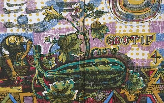
Motif no. 4, March 1960. Front and back cover: Laurence Scarfe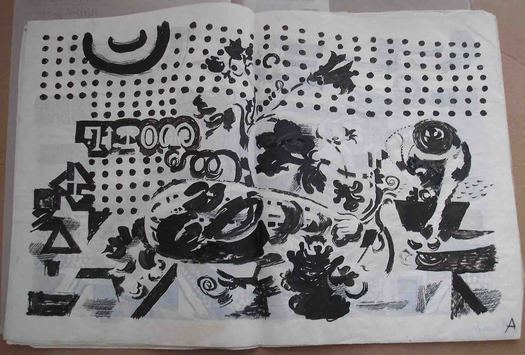
Laurence Scarfe, color separation (one of seven) for Motif no. 4. Photograph: Ron Costley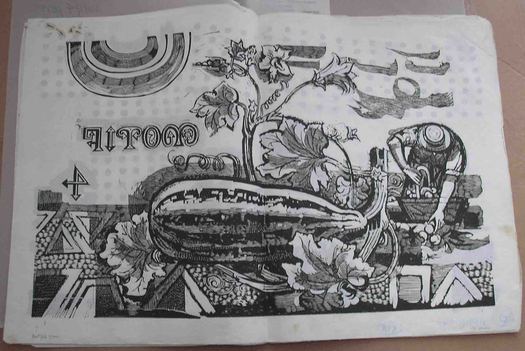
Laurence Scarfe, color separation (one of seven) for Motif no. 4. Photograph: Ron Costley
In issue 3, a series of decorative drawings of shop fronts by John Griffiths possess a vibrancy of hue and a passion for eccentric descriptive detail, recorded with effortless delicacy and charm, rarely seen in illustration today.
“A Front of Shops: Some Decorative Drawings” by John Griffiths, Motif no. 3, September 1959
In 1960, on a trip to the US to attend the annual design conference in Aspen and promote Motif, McLean visited Milton Glaser, whose work he knew from the Push Pin Graphic. McLean suggested that Glaser contribute some drawings and Glaser, who had been looking at Picasso’s animal pictures, proposed a bestiary. The presentation of the 12 images in Motif no. 7 (summer 1961) forms the most elaborate printed item to appear in the magazine.
Section of six-page fold-out from “A Bestiary” by Milton Glaser, Motif no. 7, Summer 1961
The folding pages open to reveal a display six pages wide that includes drawings of a lion, a grasshopper, a cassowary, a frog that appears almost to be clad in camouflage, and a mischievous, red-faced mandrill. “It was most informal, as things in those days tended to be before marketing people controlled everything,” recalls Glaser. “I did the drawings, he liked them and published them, and that was the end of it.” It wasn’t quite the end of it: some of them were published in 1965 as a children’s book, Cats and Bats and Things with Wings, with poems written in response to the images by Conrad Aiken.
Motif’s page design was as unrepentantly various as its contents. While images were always shown with a high degree of clarity and impact, McLean’s typography has none of the bracingly modern simplicity and consistency seen in Herbert Spencer’s Typographica, which was published at the same time. McLean designed each article individually, filling the two-column grid with a smorgasbord of type styles. In issue 4, for instance, he uses Ehrhardt, Grotesque, Caslon, Baskerville, Bembo, Plantin and Juliana for text, and Times New Roman, Caslon, Gill Sans, Garamond Italic, Chisel, Echo and Sanserif Shaded for headings. Mosley describes the lack of unity as a “shambles.” “I didn’t like it much really,” he says. “I don’t think Ruari’s design was his strong point. He was better as an editor.” In 1996, during a series of interviews about Typographica, I asked Spencer what he thought of Motif. “There is some very good material,” he replied. “But it’s not presented in a very stimulating way, is it?”
Costley, who was asked by McLean to design at least one of the articles (in issue 9), takes a different view, seeing Motif’s visual variety as fundamental to its appeal. “Each article stands on its own,” he says. “There’s a sort of scrapbook feel to it. The articles are so different in content that they respond to different treatments. It would be interesting as an exercise to take an issue and knock it into a conforming grid.” I think this is right. The variety suits the range of material and Motif would be flatter and considerably less engaging handled in any other way. It has a warmth of tone and a readability that Typographica lacks. On the other hand, its typographic disunity does date it. It feels like the product of the gentlemanly world of the 1950s bibliophile and, as the 1960s got under way, and the gaps between issues began to lengthen, it had the air of a publication being left behind by the mood of the times.
The flexibility had some other advantages. Mosley’s article “English Vernacular: A Study in Traditional Letter Forms” in Motif no. 11 (winter 1963/4) — the fruit of two years of obsessive research — runs to around 14,000 words and 106 illustrations over 53 pages. The only way to accommodate all this and to have the images move in parallel with the text was to use a three-column grid. There is evidence in the Motif archive that Mosley himself specified the text setting: 9pt Scotch Roman, 1pt leaded, on a 15 em column. The type’s appearance here is denser than usual, but for the most part, despite the lack of visual unity, Motif’s pages were highly inviting and readable.
For the 10th issue in winter 1962, Motif shed its stylish cover boards, which had always been prone to damage in the post and to warping. Pop Art covers by Peter Blake and Eduardo Paolozzi suggested that the magazine was making a not entirely convincing attempt to embrace the art scene’s new preoccupations.
Motif no. 10, Winter 1962/3. Cover: Peter Blake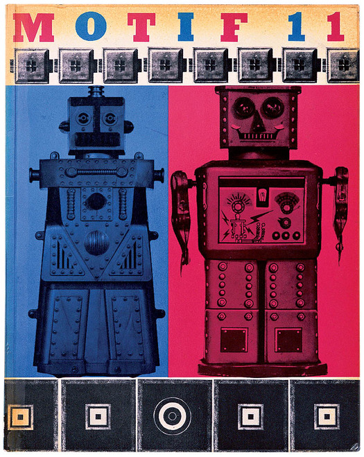
Motif no. 11, Winter 1963/4. Cover: Eduardo Paolozzi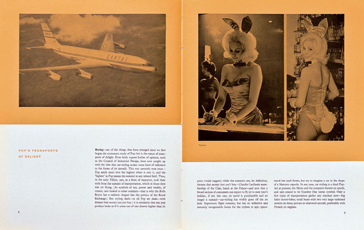
“Who is this 'Pop'?” by Reyner Banham, Motif no. 10, Winter 1962/3
From this point, the print specification was less elaborate than it had been in Motif’s early 1960s heyday. Motif’s use of special papers and its fine screen work had always imposed demands on Shenval, taking up time and attention to print and bind. “Motif had to wait its turn down at the printing works,” says Lawry, “and that could be maddening.” There were lengthening gaps between its appearance, and the issue with Mosley’s article was much delayed.
Shand seemed to lose interest and contributors went unpaid. “It is clear that we cannot continue to produce Motif with the present irregularity of appearance,” writes McLean in a note to Shand in December 1964. “I am not prepared to give it up without a struggle to save it. There is still no magazine in Britain catering for all the visual arts in visual terms.” It was a disheartening time for McLean. Shand was absent for long periods and hard to pin down when he surfaced. It emerged that he was ill, and he died suddenly in November 1967 of a coronary thrombosis. The final issue, no. 13, originally planned for publication in early 1965, came out at the end of 1967 as a tribute. It had been three years since the previous issue in winter 1964.
“There was a time,” notes Glaser, “when idiosyncratic publications like this that were the vision of individuals could find a way to survive. It’s just charming to see how entertaining, instructive and interesting they were able to be. Anybody who read Motif back in the 1960s would remember it.” Four decades later, the magazine’s carefully balanced coverage of art and design still looks intelligent and challenging. No magazine published in Britain today attempts such a broad, well-informed and even scholarly survey of the visual arts, and this might lead us to wonder whether the “receptive whole man” (or woman) with wide-ranging visual interests that Motif imagined as its ideal reader exists in any great numbers, even now. Art and design are still, for the most part, discussed separately in specialist publications aimed at narrowly defined readerships. Motif stands as a vivid reminder of a refined and now fading publishing culture dedicated to high standards of inquiry and writing, and with a passion to explore the aesthetic possibilities of printing and the boundless pleasures of the visible world.
This is an expanded version of an article first published in Eye no. 62 vol. 16, Winter 2006. It includes additional research undertaken for a lecture at the St Bride Library in May 2007. This is its first publication online.


Comments [4]
03.05.12
03:56
More drawings from “A Front of Shops” (with a bit of camera distortion) can be seen at Quad Royal.
04.14.12
04:38
01.08.13
11:01
In the first issue, the magazine showed the similar and better-known painting of street posters and playbills by John Orlando Parry titled "A London Street Scene" (1835 — varied dates are given but that's what it says on the painting). Would that suit your purpose? It's available in several places online and Feuilleton has a great large scan of a detail.
There's also a huge scan from a book here.
01.10.13
06:21