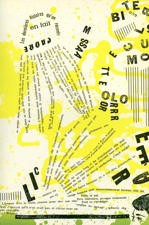
Asger Jorn and Guy Debord, page from Fin de Copenhague, published by Bauhaus Imaginiste, 1957
According to legend, Fin de Copenhague was composed and printed in the space of just 24 hours. Or maybe it was 48 hours. Either way it was pulled off with a dizzying burst of speed and with nonchalantly scathing brilliance by the Danish artist Asger Jorn, credited as main author, and the French theorist and writer Guy Debord, who is named as “technical adviser for détournement” — back to that in a moment.
Fin de Copenhague (Goodbye to Copenhagen) will be familiar, at least by reputation, to scholars and admirers of the Situationists, and perhaps to aficionados of the artist’s book, though not many will have perused an original copy since only 200 were printed by Permild & Rosengreen in Copenhagen, and published by Jorn’s “Bauhaus Imaginiste” in May 1957. I have never seen one myself. Christie’s sold a copy in 2011 for $14,427. What I do have, and show here, is a reprint published in 1986 by Editions Allia in Paris (it was reprinted again in 2001). It is one of those books that I count myself lucky to have stumbled upon by chance without knowing, at the moment I picked it up, anything about it. In fact, I couldn’t say now why I did pick it up, many years ago, because it has the plainest, most misleading cover. The original, unreproducible covers, made of super-tactile flong embossed with pages from newspapers, were all different.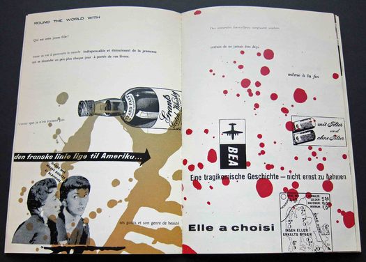
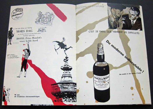
Asger Jorn and Guy Debord, spreads from Fin de Copenhague
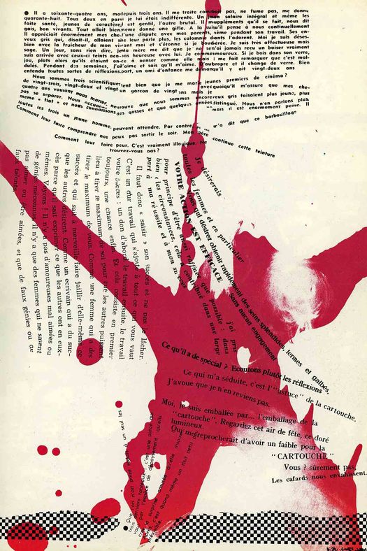
The book’s pages ripple with coarse trails of pigment and explode with wild energy. As the story goes, not long after they had arrived in Copenhagen Jorn and Debord stole a pile of newspapers and magazines from a newsstand, which they cut up to make 32 collages. At the printer next day, Jorn dribbled ink on to the zinc plates from the top of a ladder; these were then etched. The abstract shapes, like the frenetic daubings of a monkey wielding a paint brush, were printed on both sides of the sheet in gradated color, and the collage elements were printed in black on top of them. When the sheet was trimmed and bound, the formerly continuous marks and colors of Jorn’s carrying structure produced random collisions of colour and shape on the spreads. Pure chance completed the design. In 2008, a student at the Delft University of Technology named Bart Lans reconstructed the two sides of the sheet to show how the components would have looked before assembly.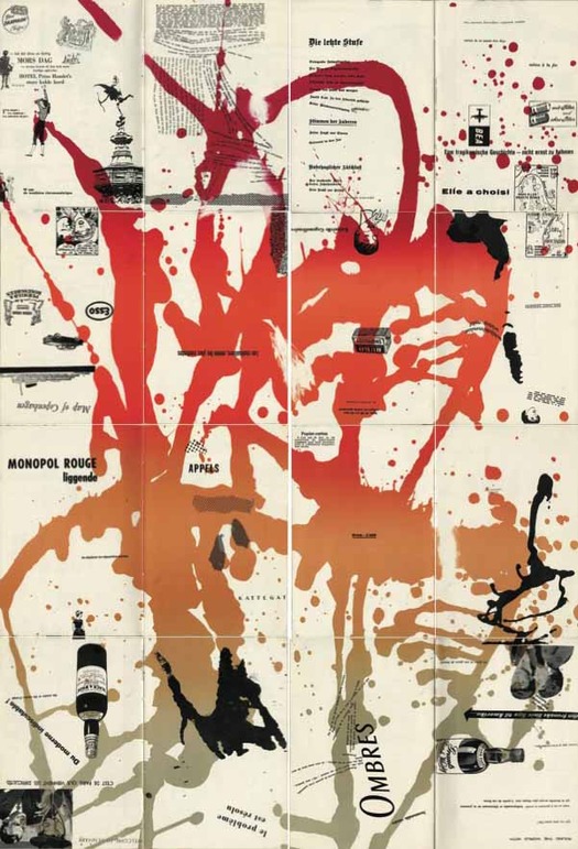
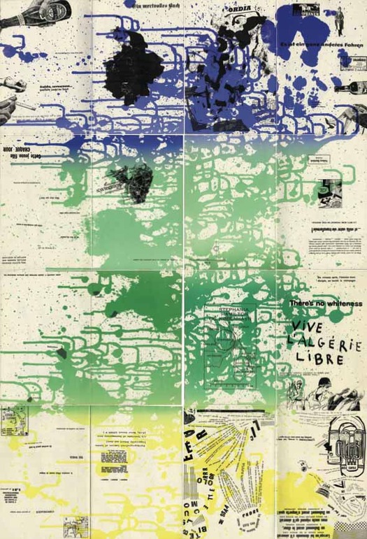
Fin de Copenhagen: reconstruction of both sides of the 16-page sheet by Bart Lans, 2008
The imagery is mainly line art — drawings of a car, a ship, women’s faces, cigarettes, whisky and beer bottles, logos and cartoons — and the mood is dismissively satirical. “What do you want?” runs one of the longer English texts. “Better and cheaper food? Lots of new clothes? A dream home with all the latest comforts and labour-saving devices? A new car . . . a motor-launch . . . a light aircraft of your own? Whatever you want, it’s coming your way — plus greater leisure for enjoying it all. With electronics, automation and nuclear energy, we are entering on the new Industrial Revolution which will supply our every need, easily . . . quickly . . . cheaply . . . abundantly.”
Ironic attacks on consumerism are highly familiar now, to the point of triteness, but 55 years ago, with economic “abundance” still an enticing promise, the Situationists’ critique of materialism was new. Fin de Copenhague is a premonition of the most disenchanted and deconstructed pages of Adbusters half a century later. “Le problème est résolu” declares one of the clippings. Jorn and Debord’s answer to this unduly confident claim is a page of nothing but splatters.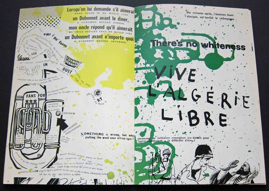
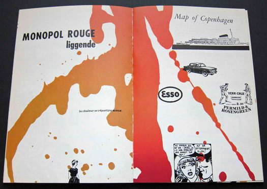
Asger Jorn and Guy Debord, spreads from Fin de Copenhague
Debord’s title-page credit drew attention to the book as an act of détournement (literally “diversion”). In “Methods of Détournement,” a text published in 1956, a year before the formation of the Situationist International revolutionary group, Debord and Gil J. Wolman outline the theory of using pre-existing artistic elements in a new ensemble — the theory obviously owes a lot to Dada. They distinguish between “minor détournements” (the use of insignificant elements such as press clippings and ordinary photos) and “deceptive détournements” (the use of significant elements such as famous political slogans or films). The détournements in Fin de Copenhague clearly fall into the category of minor. Of the four laws on the use of détournement, which Debord and Wolman go on to define, the only one that applies to the book is the first: “It is the most distant détourned element which contributes most sharply to the overall impression, and not the elements that directly determine the nature of this impression.” The point is underlined by one of Fin de Copenhague’s floating slogans: “Les mots même prennent un sens nouveau” (The same words take on a new meaning). On the opposite page, scattered fragments from unknown sentences imply connections and half suggest the emergence of an oblique new narrative: “to the café terrace” . . . “razor burn” . . . “very often your dress” . . . “but then what?”
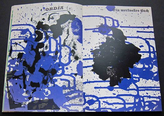
Asger Jorn and Guy Debord, page from Fin de Copenhague
Nor did Debord and Jorn rest on their laurels. A second collaboration by the two Situationists, on the book Mémoires, published in 1959, is just as indifferent to the “sacred rituals of printing” — as the AR put it — in its total reinvention of the page in the cause of political theory.
See also:
The Art of Punk and the Punk Aesthetic


Comments [3]
03.06.13
02:06
03.06.13
02:16
as usual, great post and topic. All about situasionism interest me since I read "Lipsticks Traces", essential in those years. About this images, the reconstruction by Bart Lans is a true finding. It explains me a lot. Great!
03.07.13
06:07