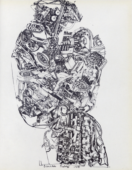
 Page from The Metallization of a Dream, showing Eduardo Paolozzi’s Automobile Head (1954) screen print
A definitive monograph about Eduardo Paolozzi (1924-2005), for some admirers a titan of British 20th-century art, is long overdue, though we are unlikely to get one until he receives a major posthumous retrospective. It’s not that this remarkable artist has lacked publications — there are many excellent sources of information about Paolozzi, and Robin Spencer’s definitive Eduardo Paolozzi: Writings and Interviews (2000, out of print) is an exceptionally useful volume by any standards. Nevertheless, there hasn’t been a full-blown illustrated monograph in English since Diane Kirkpatrick’s Eduardo Paolozzi in 1970.
Stranger still, the best designed book about Paolozzi, the volume that captures his work with the greatest visual immediacy and graphic excitement, even though it precedes his graphic masterpieces of the 1960s, was published nearly 50 years ago and has never been easy to find. The Metallization of a Dream was compiled with Paolozzi’s help by John Munday, a student at the Royal College of Art, designed by Munday, and printed, bound and published in 1963 by the RCA’s Lion and Unicorn Press, which operated from 1953 to 1978. The press’s editions ran to just 400 copies and mine is number 165; I acquired it in the 1990s at an art book fair.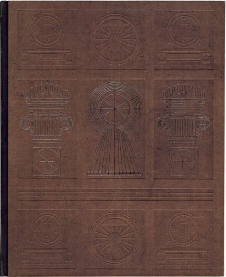
Front cover of The Metallization of a Dream, 1963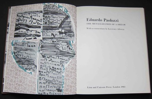
Title pages of The Metallization of a Dream. Designed by John Munday
Lion and Unicorn Press editions were assigned to graphic design students as exercises in hands-on learning. I don’t know where Munday went subsequently (and would be pleased to hear, if anyone reading this has information), but that year he also made several contributions to issue 34 of the RCA’s Ark magazine. The book runs to just 64 pages, but it feels more substantial than this suggests because of the thick, paper-covered boards used for the cover. These are embossed with mechanical images by Paolozzi — the only lettering appears on the spine — and they immediately establish the book’s ambiguous status as a kind of artist’s book with elements of the catalogue or monograph; in the hand, it feels almost monumental, more like a tablet carved out of wood than a book.
Inside, Munday uses images of Paolozzi’s sculptures and collages as large as he can, with many full-page bleeds, but they never appear over-scaled or excessive. He knows exactly when to pull back and change the pace with intermediate picture sizes, or a scattering of smaller images for contrast. He is also good at playing off the black-and-white photographs and color pages against Paolozzi’s drawings and line work. The decision to move all the captions to the back accentuates the sense that the volume is informally assembled from the artist’s work, like a sketchbook. The text is comfortably set for reading in 11/13 pt Modern No. 1 (Monotype series 1).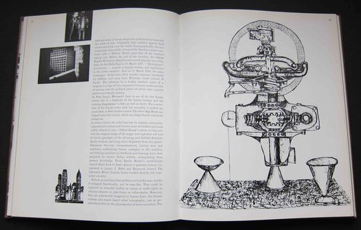 Right: Eduardo Paolozzi, ink drawing, 1961, related to the later Metallization of a Dream screen print
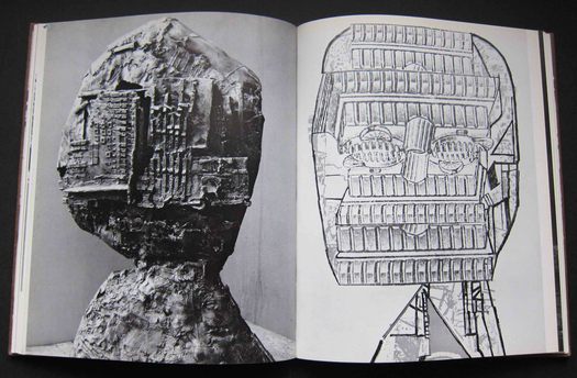
Left: Eduardo Paolozzi, Krokadeel, bronze, 1959. Right: Mask, screen print, 1961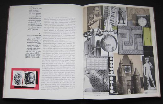
Left margin: pages from Paolozzi's Metafisikal Translations, 1962. Right: the collage as notebook, 1954
After a few notes at the beginning by Paolozzi, the main text is a commentary by the British art critic Lawrence Alloway, a member with Paolozzi in the 1950s of the Independent Group. Alloway was a key early theorist of Pop, who moved to the United States in 1961. The section headings — Anthropomorphism, Robot Profile, Metal Men, Comedy of Waste, Homo Faber (man the maker) — give a sense of Paolozzi’s recurrent themes, while the artist’s titles for the sculptures, such as Bride of the Konsul, His Majesty the Wheel and Tyrannical Tower Crowned with Thorns of Violence, were masterly miniature narratives in their own right. “In his later sculptures,” writes Alloway, “Paolozzi creates structures that are reciprocal to man. It is as if nervous ganglia ran through, and unified, human and non-human forms. [. . .] Hence, correspondences arise between operator and console, symmetries that make possible intimate and fast use. The result is machines that parody or narcissistically mirror their designers . . .”
Left: Eduardo Paolozzi, Standing Figure, screen print, 1956
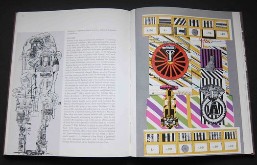
Right: Four Stills from the History of Nothing, screen print, 1962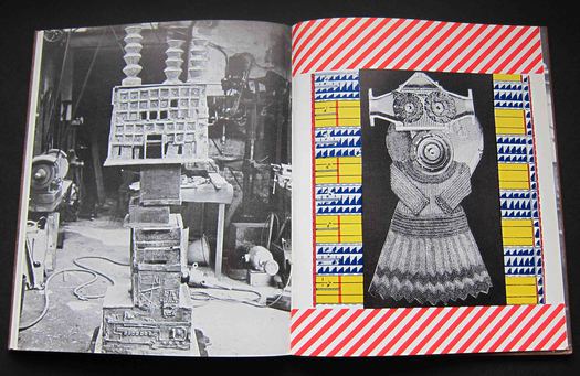
Left: Eduardo Paolozzi, Tyrannical Tower Crowned with Thorns of Violence, bronze, 1961. Right: collage, 1961
In 1963, Paolozzi was on the cusp of broadening his activities as a sculptor and devoting himself to the possibilities of screen printing. In his collaboration with Kelpra Studio, he would prove to be a master of the medium. Four Stills from the History of Nothing (1962), a screen print derived from his first film, History of Nothing, a surreal machine-age fantasia, is one of the earliest of these images. The Metallization of a Dream’s title is taken from a poetically disjointed artist’s statement, part manifesto, part collage scavenger’s wish-list, that Paolozzi made in 1961 while teaching in Hamburg — “The search for arch-types to aid the metallisation of the dream.” The phrase also became the title of a 1963 screen print based on some other mechanical imagery he had used in History of Nothing. This print probably appeared too late to find a place in John Munday’s exemplary little book, though a closely related ink drawing (shown above) is included.
See also:
On My Shelf: Surrealism Permanent Revelation
On My Shelf: Nairn’s London
On My Shelf: Richard Neville’s Playpower
On My Shelf: Stefan Lorant’s Lilliput


Comments [3]
Thanks for sharing this remarkable treasure. It was a dream of mine to do something on Paolozzi and you've only re-ignited that burning. Oh for a clone!
Louise
08.25.11
04:12
I actually have the silk screen print of "Automobile Head" 1954, I bought it, in of all places, a downtown Detroit department store in the mid 1960's for around a hundred dollars (can't remember the exact amount)...the household and furniture section of the store had a small gallery within it that offered inexpensive prints to buy to help decorate your rooms when you were purchasing furniture ! I think they carried British stuff because it was "cool" at the time....I also could have bought David Hockney's "Rakes Progress", the set for $90 a print, but I thought it was too much money for me at the time (I forgot how many were in the set in total)....be a nice retirement now if I had !
edfella
08.26.11
12:18
I had one of those wish-I'd-had-the-sense-to-buy-that moments with Paolozzi's Moonstrips Empire News (1967) perspex box of 101 screen prints. In 1989, I saw a copy for sale in the art book department of a Tokyo department store. The asking price, around $300, was way beyond my travel budget. In fact, the cost was remarkably low. Big mistake.
08.26.11
07:29