Paul Rand had more in common with Paul Klee than a four letter first and last name. One thing, like Klee, he enjoyed playing with childlike hieroglyphs. Another, also like Klee, he used geometric forms combined with letters, numbers, and arrows that he transformed into sketches of animals and people. Okay, these similarities do not make twins (in fact, Rand had an identical twin who died when he was young). But there is more: Rand owned a couple of small Klee paintings (which were eventually sold to help pay for his archive at Yale) and, most importantly his paintings were often like Klee’s.
Yes, I said paintings. When thinking about Rand, most people don’t think of him as a painter or watercolorist, which indeed on occasion he was.
Here’s a story. Once, on a visit to his comfortably modern home in eastern Connecticut, I said: “Paul, one of the things I like about you, is that you don’t pretend to be a painter.” I had just previously visited the homes of two deceased graphic designers to gather some work for articles, and their respective children were pressuring me to write about their mediocre paintings. So, not noticing the expression on Rand’s face, I brazenly continued: “I mean, you do what you do so well, and you stick to it without having to prove you are also an ‘artist.’ I admire that, Paul.”
Without a word, he took me by the arm, leading me into his bedroom where on three of the four walls were — gulp — paintings and watercolors. “Sorry,” I said. “No offense intended.” He smirked in that impish way of his, and we went back to the living room where the Klees, other Modern objects and naïf artifacts were on display.
He broke the silence: “I am going to include a couple of those non-existent paintings in a portfolio Mohawk Paper will publish.” And then proceeded to tell me how he liked working in all media, including photography and painting and how it influences what he does and how rarely these “other things” are seen in print or elsewhere. Actually, he used excellent judgment insofar as the paintings and watercolors were appealing for their humor and craft, but they were paeans to Klee (and even Cezanne). They were not his true métier (pardon my French). They showed his interests and represented his eye, but painting was not his signature work.
Nonetheless, when the Mohawk portfolio was published, it was a veritable creative biography — and a real insight. Rand had selected 18 disparate images, starting with a 1957 illustration of a paper-cutout hand with a striped top sitting on the finger. This was followed by “Sweet Dreams,” a 1970 photograph of his sleeping cat next to a pillow in wide striped fabric and this preceded “Gate Sign,” a 1975 photograph of a fragment of stenciled type … and so on. Each image was artfully selected, not to pedantically preface the next image, but in essence, to transcribe the visual dialogue he routinely had with all art forms — playful, deliberate and serendipitous.
In this context the paintings made sense as studies or investigations of form. Yet on their own they still lacked — to my eyes — the verve and inspiration of his graphic design. Even the sketchy anthropomorphic cigar drawing he did for his long-time client El Producto had more distinction. And Rand obviously knew this or we would have seen more of his “personal” work in his books and exhibitions.
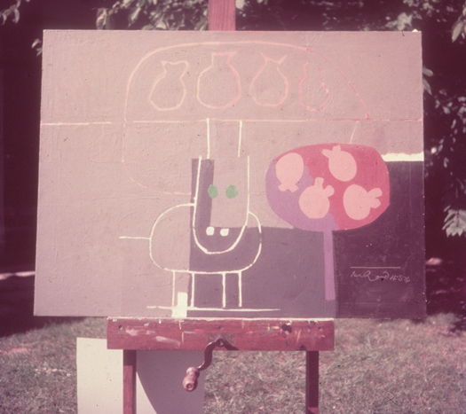
Recently, I was looking through the hundreds of outtakes from my book Paul Rand, to see if there was anything missing that should not have been cut. In fact, there were scores of great pieces from campaigns to posters, but nothing that truly irritated me by virtue of not appearing in the book. Then I stumbled upon a sleeve of transparencies of some of his paintings and watercolors, including a few sitting on a very serious easel (which I don’t recall seeing in his home). They were presumably important enough to be photographed, but their respective whereabouts is unknown. Some were simple brush sketches, while others were more finished in a Klee-like manner. There is a prosaic feeling — a sleeping dog and vase of flowers. There is a quiet simplicity as well.
As a youngster, Rand was extremely adept drawing, coloring, highlighting and otherwise doing what he called “Uncle Joe” renderings of real things. He gave that approach up pretty early in his career in favor of what might be termed abstract “represent-ationalism.” Eventually his drawing became little more than glyphs.
What is there to say about these paintings and watercolors? Are they building blocks or respites from the rigors of graphic design? When I said, “Paul, one of the things I like about you, is that you don’t pretend to be a painter” he had a knowing look. I don’t think he wanted to be a painter, but he wanted to integrate art into graphic design, which he did so very well.


Comments [8]
05.03.11
08:17
05.03.11
02:58
05.03.11
03:45
05.03.11
10:35
Andy, I doubt that Paul painted with any intention of having some great exhibition and making a grand entrance onto the art scene at the time. He defined and paved the road for graphic design in America. If there is anything that his art is a testament to and a lesson for, it's that as designers, we should not limit our exposure to other mediums of expression and let our lack of education and formal training in art stop us from just picking up a brush and going for it—if for nothing more than pure personal pleasure.
05.04.11
12:50
05.05.11
01:30
I wrote:
In this context the paintings made sense as studies or investigations of form. Yet on their own they still lacked — to my eyes — the verve and inspiration of his graphic design. Even the sketchy anthropomorphic cigar drawing he did for his long-time client El Producto had more distinction. And Rand obviously knew this or we would have seen more of his “personal” work in his books and exhibitions.
If he were a devout dilettante, perhaps he would have also tried showing these in a gallery or publishing them as many of his peers have done with their paintings. But he did NOT. These were kept from public view, with the exception of the few that ran in the Mohawk portfolio and a couple in his books to make points. Instead he was trying and struggling, which is more than admirable.
05.05.11
01:57
You're unlikely to be as confident as the 10 Years In The Saddle Hilton Hotels Luxury Brochure Guy. You need to drive around the track a couple of times.
If Paul Rand had banged out 500 gouache paintings they'd soon become as clever and vibrant as his graphics.
I throw down the challenge. Take three months off work and do 500 paintings, photos or short stories. 498 will be brilliant.
P.S. My 16 month daughter loves his picture of a green cat.
05.12.11
07:31