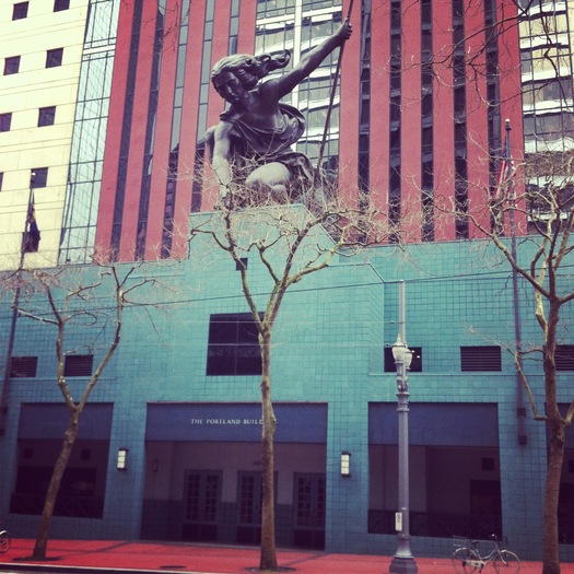
 Michael Graves & Associates, Portland Building (1982); Raymond Kaskey, Portlandia sculpture (1985)
A couple of weeks ago designer Frank Chimero posted a rant on his blog about "timeless" design. In a nutshell: what we call timeless today is a rough approximation of mainstream work in 1962, the work we see from that era looks good because time and taste have already separated the wheat from the chaff, and what's so great about "timeless" design anyway?
Some might say that this blog’s design has some “timeless” qualities. I will let you in on a secret: I am lazy. I want to make as few decisions as possible, but I want those choices to be good ones. I don’t add cruft, because I’d have to make the cruft so that I could add it. And then I’d have to decide where it would go, when all I really want to do is find that chimp with the ice cream cone and hang out with him.I'd been thinking about this post because I agree with him. I'm thrilled with our current definition of "timeless" design, but I know that is because I am well aware my taste is straight out of 1962. The process of writing the Design Research book was one of discovering that the things I grew up with, many of which I bought again for my own house, were all for sale at D/R, and thus, what I thought was idiosyncratic was actually collective.
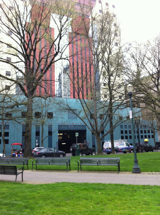
Then I went off to Portland, OR for spring break, and found a perfect illustration of the struggle for, and with, timelessness in the architecture of the city's downtown. I should say I was led to this architecture by Sandi Vincent, who posts on Aqua-Velvet and Flickr, who I only knew from Twitter, and who went above and beyond in assembling an all-day, child-friendly design tour. Given my recent postmodern experience in Australia, I was anxious to see Michael Graves's 1982 Portland Building, one of the early expressions of the style in the United States. (Here's an interview with Graves on the occasion of the building's 30th anniversary.) It has not aged well. To be more precise: it looked like shit. Dirty, damp, with a gloomy deep arcade. The colors evoked only the early 1980s, hotel ballrooms. It aggressively fills the block, leaving little room to look at its centralized composition. The only way to step back is in the park around the rear, where all of that symmetry points you to the gaping maw of the parking garage. I see in published photos that this maw is covered by leafy trees, the better to admire the upper pediment. But that is lost on the pedestrian, and given how the downtown has grown, the building's monumentality is hard to see unless you are right there. It isn't a presence on the skyline (I don't know if it ever was), which seems the primary rationale for making the whole thing look like a stumpy column in the first place.
Here is work of a moment, but it is an uncomfortable lesson. I can understand how limiting the modern office building came to feel as an idiom, and find the idea of color an appropriate response to the Portland climate. (Though there is, in fact, precious little color in downtown Portland. The neon on Interstate does a better job.) The Portlandia statue, which makes a cameo in the credits of the show of the same name, is strange but not ineffective. Anything more delicate would not have stood up to Graves's planes and patterns, and she looms out from that arcade assertively. But I still feel, as I always suspected I would when I experienced a Graves building in person, that it must have looked so much prettier as a drawing on yellow trace. Colors brighter, scale unknown.
Pietro Belluschi, Equitable (now Commonwealth) Building (1947)
Meanwhile, across town, we have Pietro Belluschi's 1947, aluminum-clad Equitable Building, often the first slide shown in the lecture on postwar American modernism. Equitable, UN, Lever, Seagram, the march of shiny boxes. Ironically, it won the AIA 25-year Award in 1982. The Equitable Building represents a number of firsts: aluminum cladding (repurposed from local wartime airplane production), double-glazing, and a completely sealed envelope. It also came with a built-in window-washing system, of the kind Lewis Mumford later made famous in his review of Lever House. The Equitable Building looks timeless. It is well-made and well-composed: the scale is small, the surface beautifully detailed, the corners crisper than you often see in contemporary architecture. When you go around the corner, the fire-escape is a funny old-fashioned tell: no one considered fire stairs. But its silvery skin, its generous windows, its glassy retail ground floor, are also what we mostly build now downtown. Chimero writes,
Would it spoil your day to say that timeless design is currently in fashion? (That doesn’t even make sense.) Regardless, perhaps you truly mean to say that a design is fundamentally sound, or that it is sturdy, or well-built. All great things.The Equitable building fits both definitions.
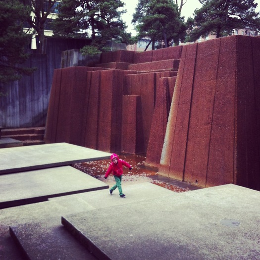
Lawrence Halprin & Associates, Keller Fountain Park (1970)
That said, I choose something from the 1970s as my favorite piece of Portland modernism (small m): Lawrence Halprin & Associates' Ira Keller Fountain, turned off for the winter, but still a fabulous place to explore. It is architecture, it is landscape, it is a playground, and it creates its own atmosphere, even without the water (an obvious reference to the striking nearby falls in the Columbia River Gorge). Standing on the stony bottom, you can see the tops of the surrounding buildings, including the Wells Fargo Tower, but they feel very far away. It is a concentrated version of the feeling of being in the city, but not, you get in certain places in Central Park, where Central Park West and South become a fringe. The striped texture of the board-formed concrete reinforces the sharp edges of the planes of the fountain's walls and floor. The pebbly ground and wavy lines of perpetual damp play against the geometry. This also could have been built yesterday.


Comments [6]
Pietro's building is brilliant. It's amusing that he was forcefully against Graves' Portland building. He knew the real shit so to speak.
04.04.13
10:14
I had to look up the Equitable Building to find better images--quite nice. Please invest in a better camera!
04.05.13
01:07
04.05.13
03:05
Belluschi's buildings, while some of the most modern and innovative of their time, were never in denial or disregard for their context or the great foundation of classical design that he no doubt knew from his young life and education in Italy.
The city is distinguished by the modesty and compatibility of its buildings. Unfortunately, the current architectural impetus is towards hyper individuality and irony. Recent buildings are expressions of sustainable hubris and ego, and have destroyed the integrity of the city.
04.08.13
11:40
06.04.13
01:26
Virtually all sources identify Mr Graves's edifice as the first Post-Modern expression. No need to hedge, unless you can provide prior examples.
Stumptown-upon-Willamette has been stripped of so many charms that its residents can cling only to old jokes with forgotten punchlines. Deny us not our abominable pre-eminence in this fruitless arena.
01.08.14
09:29