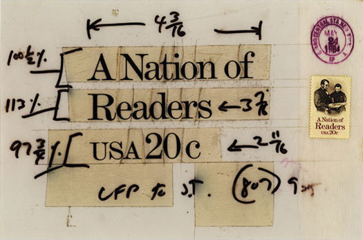
Phototypesetting films for production of A Nation of Readers, a stamp designed by Bradbury Thompson
The first stamp by an AIGA Medalist, was not actually a real postage stamp: it was probably a 1909 poster stamp meant to advertise the Society of the Friends of the Poster in Berlin which featured a graphic by Lucian Bernhard. The next stamp by an AIGA Medalist was not a real stamp either: Thomas M. Cleland designed three stamp-like Christmas Seals between 1916 and 1922. A Christmas Seal by Rudolph Ruzicka followed in 1923. W.A. Dwiggins dabbled in stamp design, but nothing came of it other than a series of hypothetical stamps in Towards a Reform of the Paper Currency in 1932 and an AIGA poster stamp celebrating the first 500 years of printing in 1940. It was not until 1958 when Lester Beall’s Freedom of the Press was issued, that a (future) AIGA Medalist would design an official government postage stamp.
In 1999, I started to collect postage stamps by designers of typefaces. At the time I was a letterpress printer and the collection focused on stamps by designers of hot-metal types. I was fascinated by these miniature examples of graphic design that came from the hands of men whose primary work (I thought) had been lettering and book design. In time I began to collect stamps by designers of cold type. As I skimmed the stamp catalogues for the names of type designers, I would come across other designers whose work I knew: Piet Zwart, Antonio Frasconi, Emil Ruder, Celistino Piatti, Irma Boom, Experimental Jetset — and dozens more. Among these designers I noticed that a handful were AIGA Medalists.

Several of the stamps by the Medalists were the exception to my general disinterest in American postage. Lester Beall’s Freedom of the Press, Georg Olden’s Emancipation Proclamation, and Ivan Chermayeff’s Canada, caught my eye long before I knew who designed them — or who Beall, Olden, and Chermayeff were. What other gems had been overlooked, ignored, or forgotten as a result of the mind-numbing philatelic vortex of errors and perforations, covers and cancellations? Well, about 200 stamps by twenty-one AIGA medalists have been lost in that vortex.
Most of the Medalists only designed one or two stamps. Bradbury Thompson’s designs make up the overwhelming majority of the collection, and I’m told his philatelic work is celebrated with a permanent display at the Yale Station post office in New Haven, Connecticut. Other designers received less flattering tributes: Leonard Baskin’s Thoreau was voted the “Worst Stamp” of 1967 by the readers of Linn’s Stamp News. Chermayeff’s Canada was voted second-worst. (What was voted “Best Stamp”? See here.)
In an effort to collect not just the product of design, but the process, a few years ago I acquired a collection of phototypesetting films used to set a number of Bradbury Thompson’s stamps. In a further effort to collect stamp-related materials (like poster stamps and Christmas Seals) I’ve tracked down a book-of-stamps Christmas greeting from Bruce Rogers and a Tschichold-designed Puffin Picture Book about stamp collecting.
Although the word “stamp” occurs twenty-four times in the five paragraphs above, I don’t consider this to be a proper stamp collection. In fact, I’m really not the least bit interested in stamps. This is just a collection of graphic design, typography, and lettering that we happen(ed) to lick and stick on the corners of envelopes. In many cases we’ve had the most intimate of relationships with these designs, never realizing where they came from. We only knew where they were going.


Comments [3]
It would be interesting to know if there are designers who had special skill in the special area of stamps. Coin design, as recent US quarters show, is subtle. Stamps too--you don't just shrink a painting or poster.
03.01.11
11:06
Yes, here's how Time reported some of the response to the design in 1967:
"After he [the Postmaster General] approved a 5¢ stamp to commemorate the 150th anniversary of Henry David Thoreau's birth, furious collectors complained that the Post Office Department was making the Walden Ponderer look like a thug, a Communist, a hippie or "a beatnik suffering from withdrawal symptoms." One fan even threatened civil disobedience. "If you bring a blown-up poster of this hideous thing into Concord, Mass.," he wrote, "you'd better send along a contingent of the National Guard."
I don't know much about stamp designing as a career or who actually carries out much of the work when not an outside artist or designer, but recently the Times ran an obituary for Paul Calle:
http://www.nytimes.com/2010/12/31/arts/design/31calle.html
03.01.11
04:48
03.01.11
10:03