Robert Brownjohn, 1961. Collection: Victoria and Albert Museum
Robert Brownjohn’s photographs of London street typography, published in Typographica new series no. 4 in December 1961, have become the stuff of design legend. Brownjohn claims in his introduction to “Street Level,” a 32-page visual essay, that the pictures were gathered on a single trip around the city. I showed the entire sequence in my book Typographica (2001) and several spreads are also reproduced in Robert Brownjohn: Sex and Typography (2005), a monograph originated by Brownjohn’s daughter, Eliza, a tireless champion of her father’s work; there was also an exhibition at the Design Museum in London.
Eliza’s latest gift to her father’s memory — he died in 1970 when she was 14 — is a pair of noteworthy coups. She has given Brownjohn’s entire design archive to the Museum of Modern Art, where a display of his work on the Goldfinger film titles is on view, and the Victoria and Albert Museum has recently acquired the street photographs. Eighteen of Brownjohn’s black and white prints are on display in the museum’s photography gallery until next fall, centrally placed on the end wall. They are flanked on one side by industrial photographs by Bernd and Hilla Becher and on the other by pictures by Henri Cartier-Bresson and Eve Arnold. The placement among some of the medium’s great masters is a clear indication that the V&A’s curators regard the pictures as a significant series, though they were unknown until now outside the small world of Brownjohn’s design admirers. The V&A is also displaying some pages from “Street Level.” These are slightly unsatisfactory because the loose printed sheets from 16-page signatures inevitably show mismatched pages rather than the carefully constructed spreads seen in the bound publication.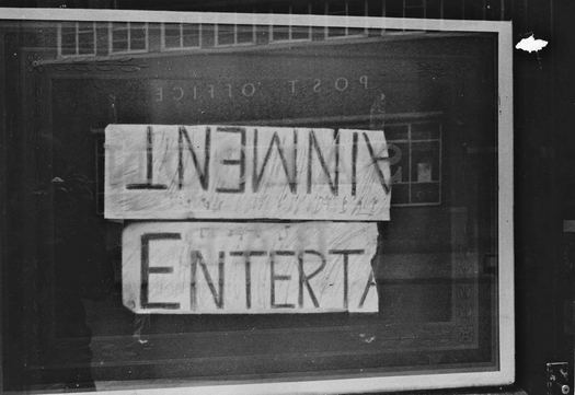
Robert Brownjohn, 1961. Collection: Victoria and Albert Museum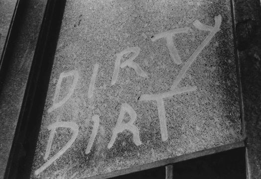
Robert Brownjohn, 1961. Collection: Victoria and Albert Museum
The layout of “Street Level” was almost certainly carried out by the late Herbert Spencer, Typographica’s editor and designer, though his memories about the specifics were vague when I interviewed him in the 1990s. Complex collage layouts of this kind were Spencer’s métier — Typographica abounds with them — and this one is a tour de force, though the combination of photos and printed graphics to explore visual themes such as distortion, repetition and missing letters does also suggest Brownjohn’s involvement; he clearly wrote the playful captions. Spencer used at least 67 of Brownjohn’s pictures, supplementing these with similar shots by David Bailey, Don Foster and himself; it was Spencer’s habit to use his own pictures in the magazine. There are an additional seven photos in “Street Level” seemingly taken by Brownjohn (they are not otherwise credited) that don’t appear among the 137 pictures acquired by the V&A. Some are still in the possession of Eliza Brownjohn; others may have been lost over the years. Brownjohn lent a colleague prints for teaching purposes and some bear signs of damage.
Robert Brownjohn, 1961. Collection: Victoria and Albert Museum
Ten of the 18 pictures on display at the V&A were published in Typographica. I have also been able to study the other unpublished pictures not on view, and the strongest shots for the purposes of the article have undoubtedly been used. As Brownjohn writes:
The things they show have very little to do with Design, apart from achieving its object. They show what weather, wit, accident, lack of judgement, bad taste, bad spelling, necessity, and good loud repetition can do to put a sort of music into the streets where we walk.
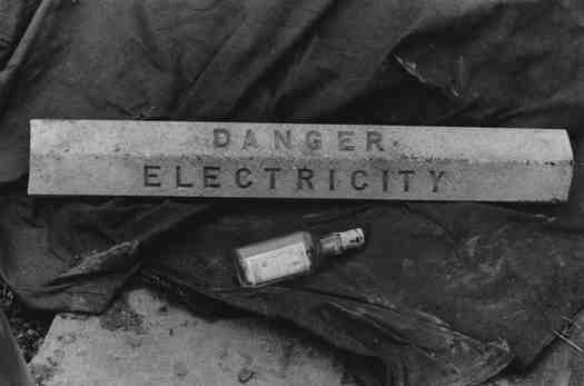
It can now be seen that Spencer, as picture editor, treated the prints with great rigor, cropping them, often severely, to zero in on key points of typographic interest; not a single picture by Brownjohn remains intact. A good example is the trio of pictures illustrating type distortion on page 34 (the page is on show at the V&A, but not the print below, which is a slightly different version of the shot). Of the three equal-sized rectangular strips, two represent less than a third of the surface area of the original shot, while the other shows just over half. 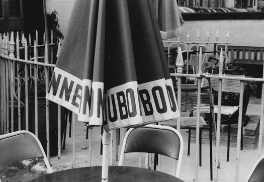
Robert Brownjohn, 1961. Collection: Victoria and Albert Museum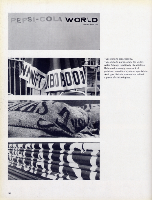
Page 34 from “Street Level,” Typographica new series no. 4, December 1961
At the V&A, a direct comparison can be made between the scratched-graffiti photo, which is displayed as a print, and the cropped version shown in the article, which is also on view.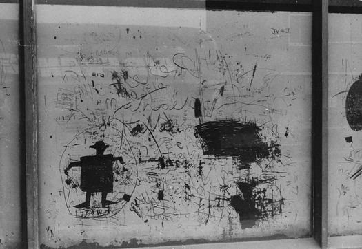
Robert Brownjohn, 1961. Collection: Victoria and Albert Museum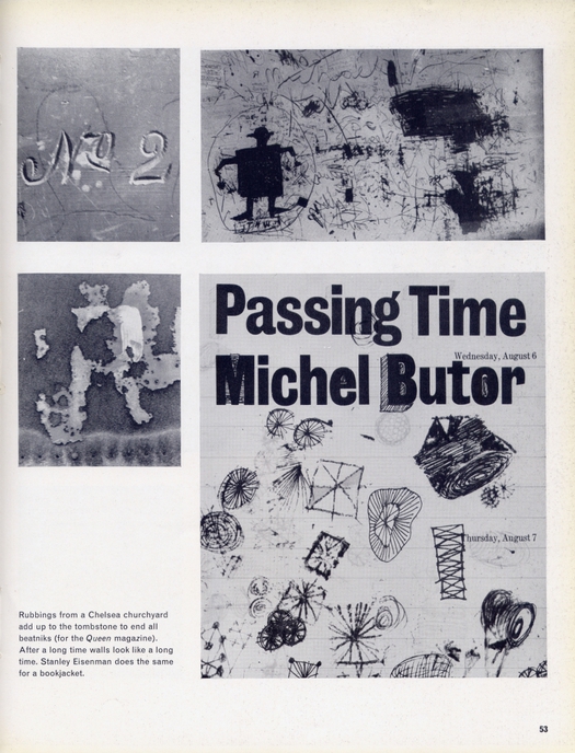
Page 53 from “Street Level,” Typographica new series no. 4, December 1961
None of the original pictures is shown in Robert Brownjohn: Sex and Typography so it’s only now that we can take their measure as photographs rather than as adroitly selected and organized typographic details pressed into editorial use. Even so, the V&A’s brief labels frame the pictures entirely in terms of their potential design applications: “Brownjohn made these photographs as inspiration for his typography.” And: “The article discusses the practical application of photographs as an inspiring source for graphic design.”
After the excitement of seeing the original prints for the first time, I read these labels with a sense of slight deflation. While this interpretation obviously isn’t wrong, it seems an unnecessarily circumscribed way of looking at pictures that are first of all examples of the long-established genre of the street photograph. Certainly, their forensic inspection of lettering in situ makes them a specialized contribution. People are the subject of these pictures only in an indirect, representational sense. But if Brownjohn’s interest had only been in typographic idiosyncrasies and what he could borrow from them later in his design work, then he could have gone in closer and cropped out most of the background while taking the shot, as he did with several pictures of numbers.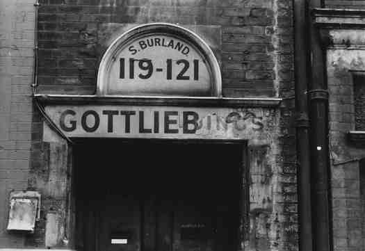
Robert Brownjohn, 1961. Collection: Victoria and Albert Museum
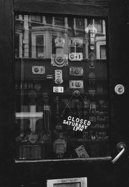
What the photos on display show, including the 10 from Typographica, is that Brownjohn tended to include enough of the setting to give a strong sense of the look and atmosphere of the place where he found the lettering or graffiti. The British capital’s dour post-war street texture was fascinating and meaningful to him. As an American and a recent arrival in London, he would have seen everything with the newcomer’s hungry and hypersensitive eye, whether the pictures were taken in a single day touring around town by taxi, as the story would have it, or in the course of several trips. Brownjohn shows the bricks, the stone, the doorways and window frames, the railings, the adjacent fixtures, the surrounding structure. Like Spencer, he valued the accidental effects wrought by dilapidation, the elements, or human hands, in their own right, as a kind of visual music or poetry, irrespective of the formal design applications that these expressive details might go on to inspire.
At the V&A, in one ghostly photo (second from top) of the handwritten word “Entertainment” broken into two and half inverted, he captures a reflection of himself disappearing into the darkness at the edge of the picture like a silent witness, his omnivorous Pentax raised to his eye. Sometimes, and more often than one might suppose from the Typographica edit, it’s possible to determine the pictures’ location: Liverpool Street; Charing Cross Station; Campden Houses in Peel Street, Notting Hill; the Fenwick department store on Bond Street; and Algerian Coffee Stores on Old Compton Street, Soho — an institution at the time and still in business today.
It will be interesting to see what historians and critics of photography make of these pictures and whether they are prepared to absorb them into street photography’s growing canon. Earlier this year, the Centre Pompidou in Paris published La Ville écrite (The Written City) with photographs of lettering, signs and graffiti by Man Ray, Brassaï, Walker Evans, André Kertész, Gisèle Freund, William Klein, Ernst Haas, Thomas Struth, Wim Wenders, and many others. From Saul Leiter to Vivian Maier, previously unknown street photographers of great perception are still emerging. Brownjohn’s pictures would look perfectly at home in this company. The semi-undercover field of “designers’ photographs,” in which Brownjohn is a leading figure, calls out for more study as an established, legitimate but critically neglected branch of photographic practice.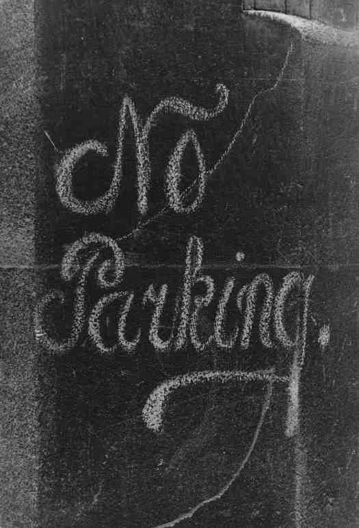
Robert Brownjohn, 1961. Collection: Victoria and Albert Museum
See also:
Typographic Stories of the City Streets
Saul Leiter and the Typographic Fragment
Ernst Haas and the Color Underground
Wim Wenders’ Strange and Quiet Places


