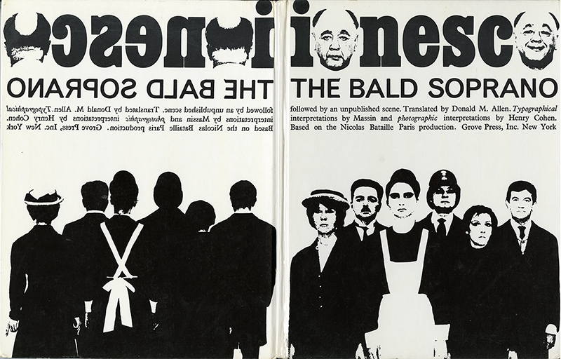
Robert Massin, born in 1925 and who died on February 8, was a pioneer of contemporary typographic hijinx. Had he not done anything else during his extraordinary career as typographer, art director, and editor, the kinetic book he designed in 1964 for Eugene Ionesco’s absurd “anti-play,” La Cantatrice Chauve, which is known in its American edition as The Bald Soprano (1965) and in the English edition as The Bald Prima Donna (1966) insures his place in the pantheon of expressive typography. Born of the Dadas and Futurists, Massin invented a raucously narrative form of typophoto composition that, two decades after he introduced it, became the model for digital design. Today it would be as easy as pressing a button, but back in 1964 Massin only had the digits on his two hands to work with, along with the honed eye of a master stage craftsman. As metaphoric and kinetic free-form typographies go, The Bald Soprano was Massin’s attempt to capture what Laetitia Wolff, curator of “Massin in Continuo,” a retrospective exhibition at the Herb Lubalin Study Center of Cooper Union, New York (Winter 2002), called “the dynamism of the theatre within the static confines of the book.”
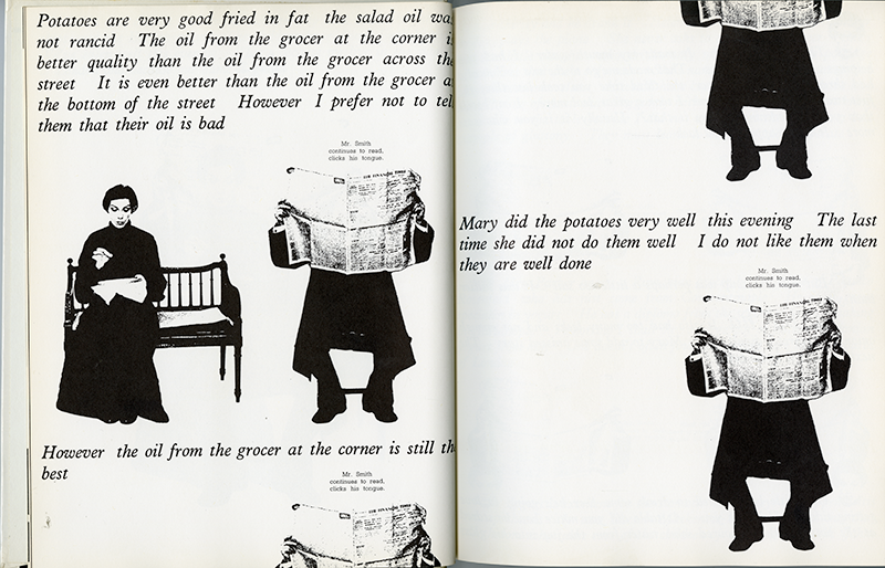
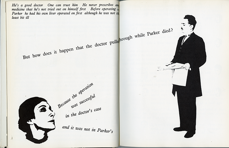
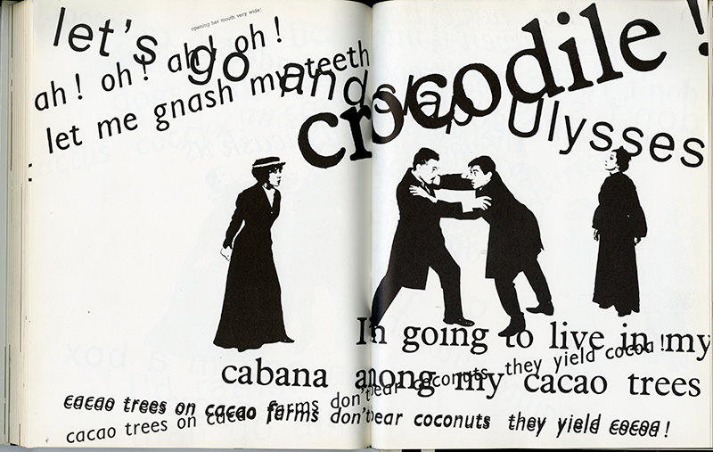
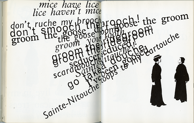
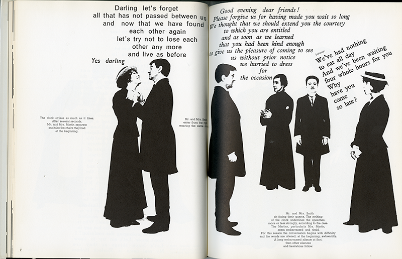
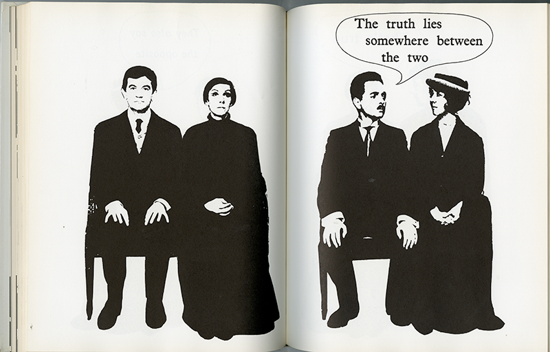
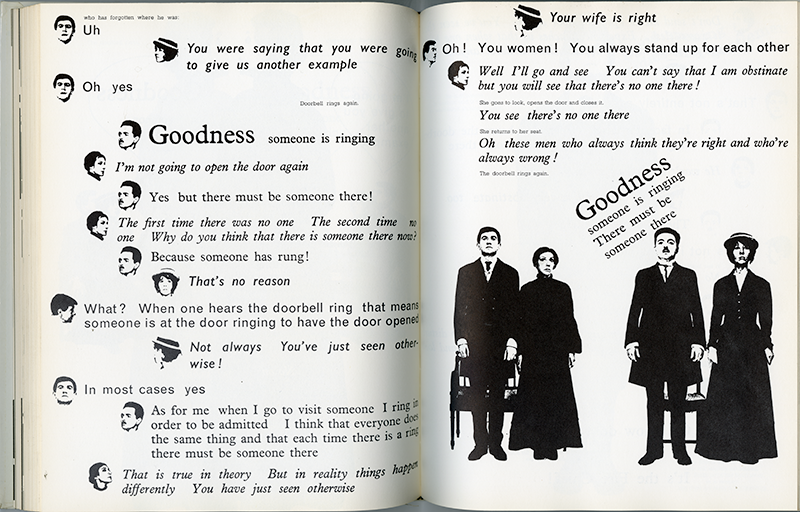
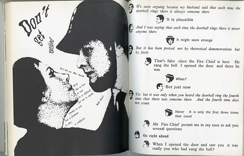
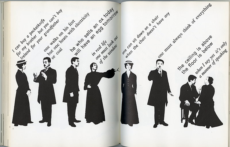
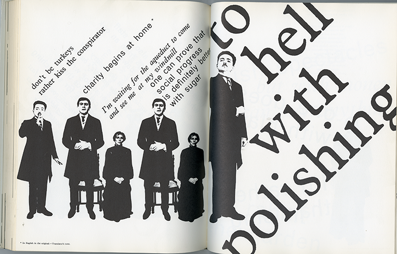
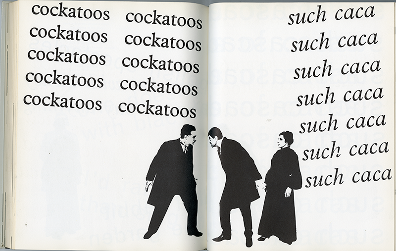
After having seen Ionesco’s surreal comedy over twenty times Massin sought to translate its dynamics from stage to printed page with all the nuances, inflections, and ticks that the actors experienced before their live audiences. Heretofore graphic design and typography was a frame not the actual art — a means of facilitating written communications rather than being the message — but Massin altered this traditional role by transforming Ionesco’s players into veritable logos or agents of meaning, which he did simply by assigning to each character a specific typeface that represented a distinctly personalized voice. The typefaces were attached to high contrast photographs of the actors. Through this process they became black and white symbols replacing their otherwise typewritten names in the original script. Conjuring mental pictures was no longer unnecessary since readers immediately saw, and therefore identified with, each individual player.
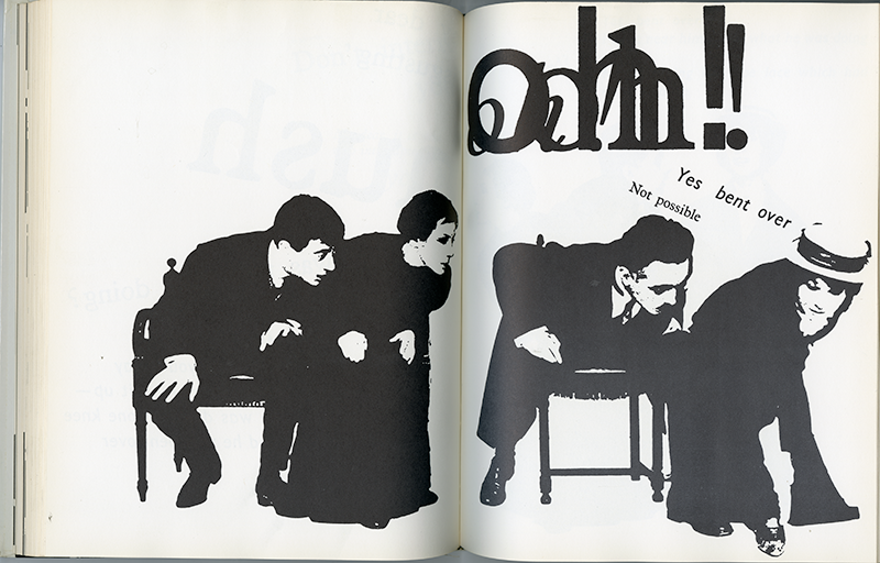
The layouts were large storyboards. But rather than showing conventional dialogue captioned neatly underneath the respective images, the texts were typeset in the typefaces “parlant” (which evoked the language and nuance of the character) and were integrated from scene to scene. Stage directions were replaced by actual, physical gestures and movements of the actor/symbols as the type flowed from their respective personages across the pages in varying sizes and configurations. Their dueling dialogues became increasingly chaotic as more actors appeared on the stage/page.
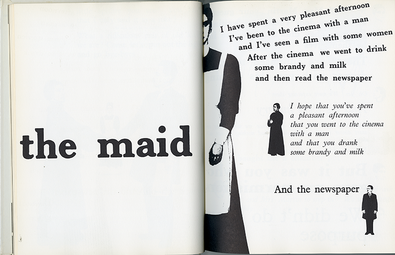
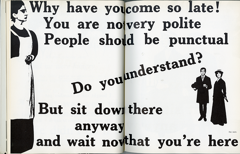
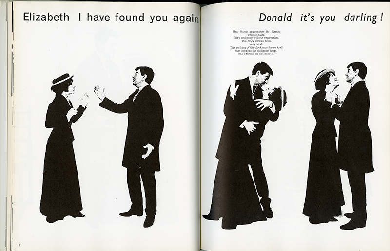
Conceptually, Massin’s interpretation was in sync with Ionesco’s existential commentaries on language and logic, but technically it was a huge (though controlled) mess. Every element was not only arduously composed and pasted-up (the days of glue and photo-mechanicals are but a memory to those who work with digital tools today), and produced in three different versions for the French, English, and American editions. Even more extraordinary was the way in which Massin distorted the type to distinguish between quiet and loud conversations. He stretched the text (which currently is a simple keyboard operation) by transferring the type onto soft rubber — using three-dozen condoms, to be exact — which he pulled and tugged to bend and warp then photographed the result as line art. It was hard enough doing this for the original French edition, but he also had to do iterations for two separate English translations. The end result, however, was a tour de force of interpretative typography.
At the time of publication and for almost a decade thereafter The Bald Soprano was a veritable typographical Rosetta stone that influenced experimental designers, especially those working with minimal means. I am aware of one such influence on mid- to late-Sixties American ”underground” newspapers. Under the constraints of working with primitive materials, high-contrast (or Kodalith) film eliminated the need for costly halftones because veloxes (or paper prints) could be directly pasted upon the mechanical reducing the expense of negative stripping. As evidence of Massin’s impact, my very own tattered copy of The Bald Soprano, which remains on my bookshelf, was “borrowed” from the chief art director of one of these newspapers and never returned. Stylistically speaking, Massin’s method further introduced a film noir aesthetic to already eclectic Underground design and a kinetic dynamism found in the purposeful clash of type and image on a single page.
Massin also inspired an elite group of book artists working in pictorial narrative. Most notable was the work of American typographer and performance artist, Warren Lehrer, author of the multi-layered typographic Babel titled French Fries, a stage play of intersecting dialogues, who introduced color, textures, and more chaotic typographic interplay to the original Massin model. During the nineties, with the advent of digital design, neo-expressionist, and deconstructive typographers furthered the “type-as-voice” idea. Yet Massin’s work, despite the ignorance of many artists and designers who perhaps unknowingly stand upon his shoulders, remains the highest peak of these typographic contortions.
Another milestone was Massin’s Letter and Image, a book that traced his distinct practice back to a rich history. It is an encyclopedic anthology of illustrated and expressive letterforms that took him fifteen years to compile and edit, and incidentally was one of the first volumes to address the history of eclectic type before the widespread, postmodern interest in design history starting in the 1980s. When first published in America by Van Nostrand the book was a fixture on many designers’ bookshelves. Letter and Image was the first historical treatise to offer the contextual and intellectual underpinnings necessary to truly understand how metaphoric letterforms, particularly in Western culture, developed into distinct languages that were more than mere accessories to pictures. Moreover, “The publication provided an alternative to the rationalist history of typography propagated by the Bauhaus-influenced modernists,” wrote Latetia Wolff.
Although many who bought the book did so to “borrow” (or steal, as I did) ideas, the anthology of over 1,000 examples, including Apollinaire’s Calligrammes (the holy grail of expressive typography), Medieval illuminations, sign, graffiti, advertisement, and package lettering, articulately describes the origins of the pictorial-letterform. Massin was not, however, the only designer of his time to be interested in this relationship — in America Push Pin Studios prefigured postmodern pastiche by decades — but he was the first to codify the history, if not the tenets, of what might be labeled “typographic pictorialism.” Therefore, what Jan Tschichold did for the New Typography, Massin did for a new eclecticism through Type and Image.
Massin also was the figurehead of what became known as the “retro” typographic movement. But rather than simply draw on nostalgia to make pastiche, he built a complex typographic vocabulary (not merely a trendy style) on the reapplication of vintage graphic forms, which he applied to books and book covers when he was art director for the book clubs Club Français du Livre and Club du Meilleur Livre, among others. Some designers argue that even the most classical texts and their covers should be reinterpreted in a contemporary design idiom. But Massin, whose interest in classical letters date back to his boyhood when he learned engraving from his father, a stone engraver, believed that pastiche “always extracts the essential character of a period, thus acknowledging the course of graphic history,” explained Wolff. For Massin matching the content and context of a book was more than a problem-solving exercise, it was his responsibility to the reader to afford them a comfortable reading environment. Arguably all his bookwork has been concerned with the reader’s relationship to literature, rather than using design to sell a product.
Paradoxically, Massin, who was never formally taught graphic design, proffered a fervent ethic on the role of type and image as vessels of meaning. Nonetheless, he did not have a fixed ideology (Modernist or otherwise) or methodology rooted in a single truth. “I had no methods, because I didn’t attend courses at the specialized Schools,” he once told me. But what has long governed his work was an intense curiosity, which caused him to practice design, in part, as the experimental manipulation of form and the exploration of materials. In his role as book designer and art director he continually played with new binding materials, “like linen cloth, gunny, silk, velvet, wood, etc.,” he explained about what he uses to transform a conventional cover and pages into a tactile object. During the 1950s, designing fine quality books for book clubs enabled Massin the opportunity to produced livre-objects.
Yet elite design was but a fraction of what interested Massin. In 1958 he joined Gallimard as the first art director. Prior to this the printer created all the cover, jacket, and interior designs. In return for a freehand, Massin offered to design everything, introducing an exclusive typographic standard. Over the next twenty years he produced a distinct visual character through individual books and various series for Editions Gallimard. But Massin was not a slave to his style. While some of his late jackets were similar to the American bestseller-look (devised by Paul Bacon that featured a big byline and title with small illustration), Massin’s strength was with series and his ability to at once have uniformity and surprise within a continuous imprint. His most visible was the Gallimard Folio series. In less than six months he redesigned over 300 covers in one pop using the same format with changing elements (and eventually design over 1,000 in all). For the illustrations he hired Andre François, Folon, Ronald Searle, and Roland Topor among over 200 others. But each series had its own character. For Gallimard’s Soleil Collection each cover was a simple setting of Didot on a flat color background — nothing that would drive the fashions of the day, but the formal subtlety that underlined the classical nature of the texts was a perfect fit.
Massin has always been intimately involved with the inner “organism” of books and it has made him acutely aware of how writing functions in the world. Therefore by 1979, after leaving Gallimard Editions, he was offered an editorship at Hachette, France’s other leading publisher. While in recent years the concept of designer as author or auteur has been debated and critiqued in some graphic design circles, yet decades earlier Massin accomplished the feat. Under the imprint Atelier Hachette/Massin he conceived, often wrote, edited, researched, and designed various books on popular culture. And later he became a publisher as well with Proust, a selection of excerpts from A la recherché du temps perdu conceived as a hypertext. He also published a volume of Robert Doisneau’s elegant photographs of French street life, and with Emile Zola’s family he has brought Zola’s rare photographs to public view.
L’ABC du métier, an illustrated biography of Massin’s own collected work, published in 1989 in France, was his last résumé of a career in which he demonstrated the inter-relationship of different visual and audible arts. In addition to this reprise of a lifetime’s artifacts, this book was not just a retrospective, but integral chronicle of a self-taught artist and artisan who through dogged happenstance influenced attitudes of graphic designers and the methods of graphic design. Sadly, however, in the United States many designers have never heard of or seen Massin’s accomplishments — his influences are ghostlike, practiced by others who are given his credit. One presumnes this exhibition will have broader range and greater appreciation than just a French audience. For despite the status in the pantheon afforded him by The Bald Soprano, his other invaluable typographic contributions should be more celebrated around the world.
In the United States many designers have never heard of or seen Massin’s accomplishments — his influences are ghostlike, practiced by others who invoke his spirit. Despite the status in the pantheon afforded him by The Bald Soprano, his other invaluable and historic typographic contributions should have broader range and greater appreciation.