
Hip New Year Holiday Photo Card, by Minted.
'Tis the season when the minds of parents of small children turn to holiday cards. And the minds of design-minded (but non-graphic designer) parents try to find a mass-market card their aesthetic can accomodate.
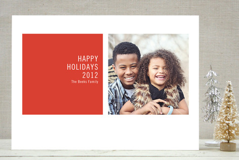
This is my fourth season as a holiday card consumer. The first two seasons, my architect husband designed the card while I art directed from the backseat of the Aeron chair. Last year I decided to spare him the aggravation, and went in search of a card I could select, customize and order--in less than an hour. I ended up with the one above, from Minted, one of several newish websites aggressively targeting the urban parent with heavy card stock, twee color combinations, and less clutter per card. I was fond of it then, but already the peppermint color combination makes me cringe. The little heart? Gill Sans? When we mail so little, every choice seems magnified. (Don't even get me started on the holiday stamps. Not loving the evergreens.) It's obviously an indicator of extreme design absorption that the typography makes me more nervous than the image selection.
I first blogged about the hipster holiday card last year, writing:
This year the "Modern" options seem even more pervasive, and pervasively the same. The card designers' idea of modern runs only to the first string of sans serif fonts: Arial, Avant Garde, Trade Gothic. A Christmas card has to have red and green; ecumenical (Hannukah, Happy New Year, Happy Holidays, Cheer) versions offer the architects' color palette of orange, cobalt, lime.Is there anything less contemporary than a Christmas card? In my memories of childhood December brought a flood of two types of card: the folded kind, with a red or green background and Santa-snowmen-snowflakes-pine trees embossed in silver or gold; and the photo card, long and thin, with a white right-hand strip reading “Joy!” or “Happy Holidays!” The first kind sometimes had a school photo or a highly amusing Xeroxed Christmas letter inside. The second kind simply was. As I became a teenager I began to make fun of the photos, which often featured matching outfits, one sulky family member, or wildly inappropriate out-of-season snaps...
The “Joy!” cards seemed to have disappeared, replaced with a mash-up of types 1 and 2, photos floating over red and green (and sometimes blue, for the Jews) backgrounds patterned with Santas-snowmen-snowflakes-pine trees. Sprinkled amongst the traditional designs, with their scripty fonts, and their cutesy family appellations, were a few tagged “Modern”. These never seemed to me to actually be modern, as they replaced snowflakes with damask-pattern wallpaper, and red and green with baby blue and brown. What they were were a Domino magazine cover, made into a card. The faux scallop-edge text block, the voluptuous serif lettering, the neo-preppy color combination. Domino freed women from the traditional, moved them to transitional, and Shutterfly and Co. noticed.

All Wrapped Up Card, by Shutterfly.
Rather than snowflakes, faux calligraphy, Christmas trees we get strips and squares: stripes as ribbons, stripes as highlights, squares of color with floating white text. Nothing figural can be modern, so an angle is as jaunty as it gets.
Modern Geometric Holiday Photo Card, by Minted.
I considered the card above last year, but stopped myself. Am I really so unimaginative as to only be able to order red (or baby blue), squares, Trade Gothic? But clearly I am the target audience for such dullish cards, as I considered the one below from Paper Culture this year, before realizing it was essentially the same reductive thing. (Another topic not to be started: the fake family names on the sample cards. Whoever chooses them is really on the baby name trends.)

Be Merry Be Bright Card, by Paper Culture.
There is another subculture in the modern card market, one which uses faux spray-paint rather than quilling, faux wood type rather than Gill Sans. Mango Ink seems to have cornered this rough-and-ready, Williamsburgian market (which just goes to show you what Williamsburg has become). When I looked at the Mango Ink cards I realized I do have a traditional side. If I wanted letterpress I would get letterpress, rather than a laser printed, pseudo badly impressed, fake Hatch Show Print card. Is December really the time for sullen-on-purpose kids? Little Sebastian, below, does not give me a warm and fuzzy feeling.

Mas Card, by Mango Ink.
The narcissism of holiday cards is undeniable, and the increasing range of pigeonholes in which to put your taste and your parenting only increase the anxiety of self-presentation. I know I have already wasted too many evenings in search of the card that represents my family (Who knows? My husband may be on the hook again this year). But here's a place where hundreds of thousands of Americans are choosing graphic design for themselves, even labeling themselves "Modern." I wish there were more choices, at reasonable prices, that were genuinely good, contemporary design, rather than just Scroogy sans serif.


Comments [5]
11.29.10
03:22
But to answer your question, the check box on sites like Minted that allows you to select the sans serif, color block cards (and spare yourself the snowmen) is typically labeled "Modern." I adopted their terminology. I don't think "Contemporary" has yet been embraced as a good thing by consumer culture, even though it is now historical too.
11.30.10
09:53
11.30.10
05:05
After reading this post, maybe you should order that one and send it out.
12.03.10
12:33
06.16.11
01:31