The following is the first in what we hope will become a new series of essays written by undergraduate college students on topics that seek to address more rigorous academic aspects of design scholarship. We welcome your submissions.
The Editors
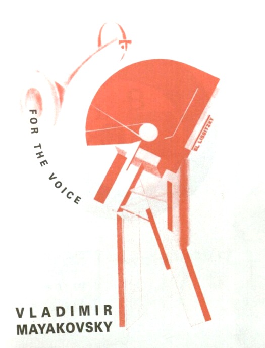
In his 1925 essay, Typographical Facts, Russian Constructivist artist El Lissitzky claimed that his design and construction of Dlia Golosa — or For the Voice, Vladimir Mayakovsky’s book of revolutionary verse — was meant to "stand in much the same relationship to the poems as an accompanying piano to a violin.”
Given that any poet struggles to weave sound and meaning in every poem, Lissitzky took it as his design challenge to widen Mayakovsky’s intention to include the typography and the book’s construction in the work of the poet. The question is not only, is such a thing possible, but also, did Lissitzky pull it off?
The task is riddled with contradictions. Right from the start, it becomes clear upon reading Lissitzky’s Topography of Typography, a short manifesto published in the July 1923 issue of Merz. Composed of eight short commandments, the manifesto lays out the order of design for what Lissitzky would call the "new book.” It is the very first of these maxims that takes issue with Lissitzky's claim:
The words on the printed sheet are learnt by sight, not by hearing.Lissitsky believed in the primacy of visual knowledge over auditory acquisition — yet as he himself concedes in Typographical Facts, "the poet in his poem united concept and sound". A tension thus arises when Lissitzky equates his visual translation of the text with the text itself, in that the poems are inextricably tied to their auditory components. As such, it seems that Lissitzky is not, as he claims, "creat[ing] an equivalent unity using the poem and the typography," but rather that he is creating a unity between the concept and the typography. Further, upon close examination of the physical object, it seems that this unity, of concept and design, is not an "equivalent" or an "accompaniment" to the auditory and written elements of the book, but one that prevails over and outshines them.
Yve-Alain Bois' essay Reading Lessons, frames several of the artist's basic theoretical claims. Among these is the assertion that "phonetic writing, like pure alphabetic writing, does not exist." In other words, the world in which a given grapheme denotes exclusively a given phoneme is not a real world. "The graphic sign is neither transparent nor without residue, but has its own density," or, as Roland Barthes later put it "the past and future of the letter…are independent of the phoneme." The letter "is an element" in and of itself, one that in itself is "composed of elements (—, |, /, and the curve…)." Because Lissitzky viewed the letter as an artistic element, he was faced with a task similar to Mondrian's problem of figure-ground opposition: that of facilitating the letter's interaction with the image. As Lissitzky considered the two to be one and the same, he strove to achieve a "perfect, nonhierarchical unity of "figure" and "letter." In Lissitzky's ideal the "image" and the "letter" are accepted as indistinguishable. It thus follows to conclude that in Lissitky's ideal, the concept of the "book" — which Stéphane Mallarmé described as the "total expansion of the letter" — would be similarly synonymous with image.
In a sense then, Dlia Golosa (For the Voice) is, in its entirety, a single continuous image. If the whole of the book is in itself an image, the question that then presents itself is one of primacy: is the book first and foremost an image that communicates content through visual data? Or is its information primarily conveyed through the phonetic and semantic denotations of its text? In Typographical Facts, Lissitzky's claim of "accompaniment," suggests that no such tension existed, but in the physical book itself, the battle for primacy between image and phoneme is undeniable.
Hints at possible strain between the book's two makers are evident as early as the opening page which is nearly blank, occupied by two short lines in the front and center:
BOOK CONSTRUCTOR / EL LISSITZKY
Here, the artist gives himself the title "constructor," rather than "illustrator" or "designer." The two latter terms imply a degree of submission: an illustrator only illustrates the ideas of the author, a designer, too, can only be creative insofar as it aligns with the content of what is being designed. With the term "constructor," Lissitzky gives himself more autonomy: he is the book's "builder," forming its fonts, its pages, its ideas. Hovering threateningly on the very first page — a spot normally reserved for the author — Lissitzky asserts his influence as a shaper of not only the book's visual elements but of its conceptual elements as well. Vladimir Mayakovsky's is credited on the following page, but its power is muted, dwarfed by a large Proun-like image and obliged to share space with a repeat appearance of Lissitzky's name. Equally interesting, while Mayakovsky's name is written in two parallel lines — lines that seem to form a right angle with an extension of the Proun-ish image above (similar to the right angle formed by Mayakovsky's name on the front cover) — Lissitzy's name is written in an upward-sloping diagonal. It is known from Lissitzky's own writings that he viewed the right angle as "unambiguous," something that "can be placed in alignment with the edges of the surface" and thus has "a static effect (rest)." In contrast, if a line is placed "diagonally, then it has a dynamic effect (agitation)." In other words, here Lissitzky depicts the writer as unchanging, without the capacity for progress. In contrast, he paints the "constructor" as dynamic, as, in his own words, an "agent for change."
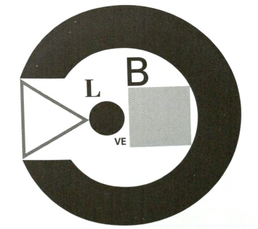
Martha Scotford's visual translation of the book's dedication, made out to Mayakovsky's married lover, Lili Brik.
The first page following these credits is the dedication, made out to Mayakovsky's married lover, Lili Brik. In both the original book and the english translation, this dedication is a visual pun. In the original, Lissitzky plays on how L.B., Brik's initials make up part of the letters for the Russian word "I love." He adds the other letters into the image, so that the reader can both see Brik's initials, and the word of which they are a part. In the translation, because this pun does not exist in English, the translator must achieve a similar effect through other means. Martha Scotford creates an image (above) composed of Brik's initials, L.B., and the letters of the word "love," such that the L of L.B. and that of "love" are the same. Further, she sets these letters within the shape of an eye "presented frontally and in profile," where the black pupil makes up the "o" of love. In this sense, the reader both understands the word play — eye love L.B. — and a commentary on visual phenomenon. As Scotford explains the eye "provides the second part of the theme of sensory reception: it represents seeing, and the idea of multiple perspectives." These two dedications, though communicated via different lettering systems, establish an important precedent for the book as a whole. They were not things intended to be read aloud, but rather devices whose function and wit exist only insofar as they are seen. Here, Lissitzky and his translator take letters and subjugate them, deny them their phonetic significance, and instead make them part of the image.
This is a choice that challenges a fundamental aspect of the book's nature. Dlia Golosa, translates literally to mean "for the voice," and it was Mayakovsky's intention that the book be read out loud, but exactly how this was meant to occur remains uncertain. Among many other scholarly speculations, historian Alan Birnholz writes that "the size, colour [sic] and organisation [sic] of letters change both to make the book more interesting visually and to push the viewer beyond reading silently to himself and toward declaiming in public. One does not just read these poems, one speaks them out loud and, when the typography suggests, begins to shout as well." The changes in the book's lettering are certainly 'interesting visually,' but Birnholz does little to substantiate his claim that the type provokes the reader into speech. (Perhaps what Birnholz means is that by changing the size, color, and organization of the letters, Lissitzky creates a tension that elicits, in a visual sense, the same effect that volume and quality of speech elicit audibly.)
The book's first poem, Left March, provides a fitting illustration for precisely this tension. The title refers to a command given to marching soldiers, to march "by the left," an order that is repeated throughout the poem four times: By the left!/Left!/Left! Lissitzky prints each repetition of this phrase in red, while the rest of the poem remains in standard black. Similarly, each repetition of the command is formed into a small right angle, spaced equidistantly from the instance before and/or after it. This combination has a dual effect. First, by making the command visually distinct from the rest of the poem Lissitzky virtually recreates the sound of a sergeant barking orders to his troops. Second, by spacing the identically-shaped red lines evenly amongst the black, the artsti evokes a visual rhythm that calls to mind the steady march of foot soldiers. Finally, this visual orchestration recalls the red, Proun-like image on the cover page featuring a hollowed, donut shape resembling the mouth of a phonograph. Curving out of this mouth — as if physically emanating from it — Lissitzky printed the words "For the Voice": an auditory end realized through visual means, further evidence that Lissitzky's design eclipses both the text and Mayakovsky's aural intention. If Lizzitzky can manipulate image to signify the idea of sound, the image becomes doubly powerful, becoming not only the more efficient medium, but one that, in visually duplicating its effect, renders sound useless.


Comments [2]
01.16.14
07:37
Essays written by scholars, however young, should include proper citations of sources. Several authors and designers are mentioned in this article, obviously they have been useful to the student writer, but no further information is provided for the reader wanting to find these sources.
01.27.14
02:04