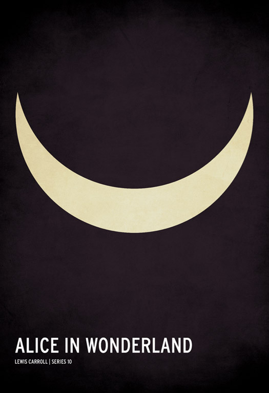
Minimalist children's book poster, by Christian Jackson
"Stop That" is a recurring series I just invented. Previous entries include "Hands Off the Icons," a Dwell column in which I begged the furniture manufacturers of the world to stop painting Eames green and Le Corbusier pink (latest outrage = Xtreames, which offers to pimp your Lounge with olive leather and stripes to benefit the armed forces). And my Twitter war against Architect Barbie, which all the good intentions in the world can't save from being a bad idea.
This week, minimalist posters, a design blog meme whose time is over. As I tweeted last week, on a day which brought me both minimalist Philosophy posters and minimalist Game of Thrones posters, "It's official: there's nothing you can't make a minimalist poster for, and soon there will be nothing without one." What was, the first time I saw it applied to Mad Men, a charming exercise in reducing archetypes to their essence, has now become an attention-getting tic. After Mad Men (at least on my Dashboard) came Albert Exergian's more ambitious series on TV shows. And Marvel superheros. And fairy tales.
All these posters are good-looking: clean, modern, mostly clever. (Marvel's superhero symbols are already masterpieces of minimalism, making the posterization redundant.) At least Alice, above, makes you think twice. So what's my problem? First, these posters seem part of the long wave of 1960s retromania in graphic design (among other places), a wave that includes House Industries' Eames and Girard fonts, the ubiquity of Neutraface, even the current penchant for fonts that look like the lettering on Harley Earl-designed bumpers. Peter Biľak recently wrote on Typotheque, "We Don't Need New Fonts," meaning, make a font that fulfills a contemporary need rather than redrawing the past.
Still, there are typefaces which haven’t been made yet and which we need. Type that reacts to our present reality rather than being constrained by past conventions; type for non-Latin scripts that gives its users more choices; type that brings readers from previous media to new ones. It is time to think about why we design type, not just how we design it.

"For Like Ever" poster, by Village
Second: Don't trade on past glories or past masters. Those Marvel posters don't really improve on the original, they just make it into a new commodity, and the designer gets fans by adjacency. Now minimalist posters themselves have become an adjacency: if you make some, you can be assured they will travel the blogs, Tumblr, Twitter. It's an obvious self-promotion meme, separate from the promotion of a specific product, or work for a client. I'd much rather buy a poster designed to work out there in the world than a poster designed as 2011 room decor. These will date, just like "For Like Ever" and "Keep Calm and Carry On." Fun while they lasted, but now as twee as the birds.
I know this sounds snobby. I know I shouldn't deny anyone the right to self-promote. But the best piece of graphic design I saw last week was this, from Christian Annyas's post of Sanborn map logos and type.

BROOKLYN New York. Atlas 80. Vol. 6, 1888 (via Annyas)
It is everything the minimalist posters aren't. And it was so complicated, so anti-minimal, it made me want to look twice.


Comments [15]
09.06.11
10:53
My issue with so many of these posters is that they display a disheartening lack of thought and serve to reinforce the popular notion that "minimalism" is an excuse for something a designer threw together in five minutes. I will confess I've done a few of these posters, and I think for a while, particularly when Olly Moss hit the scene, they were exciting as a reaction against the dearth of truly innovative and inspiring one-sheets for contemporary cinema.
But it became quickly apparent that, like many things in internet-land, the "me, too!" effect was in full swing. I would proudly hang a Müller-Brockmann poster in my house any day of the week, but I see none of the complex and intricate math, division of space, and contrast of geometry that made Swiss Minimalism so striking apparent in these posters.
I also find the scope of cinematic history incredibly limited in the selection of films these artists choose to depict. Really, I think we've seen enough graphic homages to The Big Lebowski, Reservoir Dogs, and Edward Scissorhands to last a lifetime.
09.06.11
12:52
I think its annoying how the whole idea is to be minimal, yet most designers add a texture on the top at the end. Flat colour would be minimal. Plus there is usually just a vectored object in the centre of the poster, nothing interesting going on at all. And often the type seems like a total afterthought and isn't always appropriate.
But all that said there are sometimes good ones, but I don't think they are actually minimal. Olly Moss often sneaks some nice ideas into his with negative space or clever imagery. As for most minimal posters, I think they are trend and a gimmick, people were doing much more interesting things with flat colour in the 50's and 60's.
09.06.11
06:25
Some of them just don't make sense. The Marvel posters seem tiresome after the first few.
I don't mind additional textures, as long as it is done thoughtfully.
Minimalism can be effective when it's done well, but I think we all hope that this trend will disappear soon. It's much too easy to do it badly.
09.06.11
10:38
I've got another one for you:
"Stop That: Holding Your Posters"
A | B
09.07.11
04:58
"I don't believe in the words minimalism or postminimalism, postmodernism or deconstructionism, romanticism, realism, or expressionism of any kind. I do believe in poetry."
http://craigkirby.net/philosophy.html
I wish we could only define and seek to place objects in or out of the world of poetry.
09.11.11
11:54
For interactive, this is killing me. Less stuff is maybe good (ornament is not inherently evil, but okay) but is less data? Less information? Less function? I think: not automatically. We need to get back to appropriate responses, and not just remove shapes, words and pixels, be it from irons, annual reports, posters or webapps.
I just wish I could write something as spot-on as your article above about this issue.
09.14.11
11:39
I've also been meaning to think more about the Dieter Rams-Apple connection, and whether their goals really are the same.
09.14.11
03:25
Trends come to a screeching halt once they reach full saturation, among forward thinking designers, anyhow. Designers who continue to flog dead horses are just make themselves look a little out of touch. Trends in graphic design (like fashion and music) come swiftly and leave swiftly. With such a glut of visual information piped into our eyes, we become aware of trends very quickly and become sick of them just as quickly.
Those "minimalist" posters were doomed before they ever caught steam. So were the Helvetica poster-holders. So was the constant glut of info graphics (you remember, the ones with circles of pastel colors and bold condensed Trade Gothic look-a-likes with rounded corners). They all looked the exact same, and then they just faded away, (only a handful have slid into my Google Reader in the past year or two) and were replaced with something that appeared to be fresher, ad infinitum.
These are mainly young people playing out formal investigations. I see them as designers who are cutting their teeth and trying things out for size to see if they fit. When I was in school, it was the late 90's and early 00's—the Misprinted Type hay-day. All my stuff looked like Carson, Charles Wilkin and Eduardo Recife. And when I reached my fill, I just stopped, and moved on to other pursuits.
09.14.11
05:12
09.15.11
03:09
The horizontal crescent reminds the viewer of the Cheshire Cat (accompanied by the book's title), and that reminds the reader of the story. So there's a moment of recognition then nothing else.
These posters tend not to suggest anything, or promise anything. They use simple tricks to remind us of something we all ready know; a book or character or tv show that already has built in ready-to-use icons.
This brand of poster is too easy and too empty.
11.07.11
11:13
Secondly, I couldn't agree more. It's not that I don't enjoy the minimalist design, it's just that its time has passed and newer generations are wired differently. Besides, one thing is living in a minimalist house and other way different a designer that doesn't want to put too much thinking into it.
Now, the last sentence bring me to this question, aren't designers way underpaid in most cases, specially if hired by a company that needs somebody to throw something together real quick because it has to go to print in 3 days?
I am not defending minimal posters, but the designer that ends up doing whatever because is being forced to do something real fast. Let's face it, most of the time, designers have to work with constrained deadlines because little importance is paid to that part of the equation.
Honestly, I haven't designed a minimal poster because I simply like complex designs.
12.01.11
09:23
I agree that there are far too many self promotional posters out there that serve more as cheap decor than design (if by design we mean useful/communicative), but I would not consider the Sanborn maps to be any better. I would argue that this post would be more interesting if it were a critique on the unnecessary and wasteful instead of being a critique on a valuable, but misused graphic style.
Trends come and go, and swashy, illegible, wood block type letterpressed onto archival paper is far more popular now than clarity and communication.
01.06.12
02:48
01.23.12
11:42
01.23.12
12:03