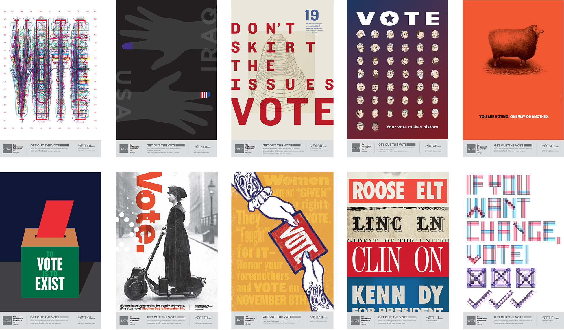
Posters from AIGA's Get Out the Vote project by Paula Scher, Michael Vanderbyl, Su Mathews, Ashleigh Axios, Sean Adams, Milton Glaser, Jessica Helfand, Ann Willoughby, Dana Arnett, and Louise Sandhaus.
1. In the voting booth, design actually helps. It may not be award-winning design, but the ballot I filled out on election day—full of ugly boxes and multilingual cautionary notes—was clear enough that I filled it in with ease. At least, I think I filled it in. I can’t be entirely certain since selfies were taboo.
2. Campaign logos can make a difference, if only in identifying who’s who. In this election year, the identities for Trump and Hillary were so visually distinctive that I, for one, knew not to mistakenly walk into the Trump tent at last summer’s Connecticut Agricultural Fair.
3. Assuming they’re not over-designed or self-indulgent, designing buttons and poster campaigns can be truly cathartic—if only for the designer. Even if these contributions don’t change a single vote, there’s something delightful about sharing this sort of pithy visual commentary with the world.
4. Banner ads on websites, Facebook posts, even tweets are arguably effective but only if the message (or image) changes from time to time. Of course, it also depends on one’s tolerance for banner bombardment. After a year of “I’m With Her” and “Lock Her Up”, I’ll be happy to see Viagra ads once again.
5. One can only acquire so many stickers as premiums for cash contributions, given that the available real estate for sticker display is basically limited to laptops, notebooks, and the occasional refrigerator (and since putting them up in public venues could result in being arrested).
6. Presidential candidate doggie toys are adorable in theory but annoying in practice, especially after you’ve seen the umpteenth video of yet another puppy ripping one to smithereens. I’m sure those which are, miraculously, still intact will reveal themselves on eBay one day soon, but for now, they’re about as appealing as plush emojis.
7. Junk mail—even when it supports your candidate of choice—is still junk mail. (Especially when it includes stickers.)
8. Lawn signs are the Scarlet Letters of the campaign season. Damn my neighbor!
9. The color blue, believed to be most peoples’ favorite color, continues to delight. Nothing was as appealing as the “Obama Blue,” where even the darker shades suggested a blue sky of hope. (This election? Not so much.)
10. A campaign is nothing without well placed, photographically opportunistic, slogan-filled signs. My congratulations to all the design consultants who knew exactly where to place them in front (or behind) the candidates for the most impact. Good show!


