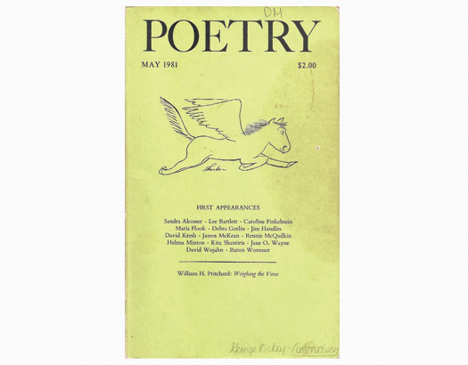
Cover Poetry, May 1981. Pegasus illustration by James Thurber
I still own the first copy of Poetry magazine I ever bought; the May 1981 issue aptly titled “First Appearances.” The simple two-color cover, once a fluorescent sea-green, is now badly faded, and the line drawing of a flying horse (Pegasus) illustrated by James Thurber is largely obscured by what looks like an ugly oil-stain. My initials mark the cover, as does the line “George Rickey — Constructivism,” though I have long forgotten why I deemed that particular statement important enough to mar this issue. What I do remember, vividly, is one of the poems inside, a little gem by Jim Handlin titled “Remnants.”
1
Everything gets slow, stops.
I reread the telegram.
2
I remember the squirrel dead
at the end of the driveway.
The body thrown up on the grass
next to the azalea.
The red where the car hit
so different from the red
of the bush.
All that day and the next
I thought of ways
to stay close to my mother.
3
They auction off the contents
of the estate. Limoges and
cloisonné, piece after piece.
The bed she slept in, her silver
tea set. I notice cobwebs
in corners, dust, places
where the wallpaper’s faded/
Her painting for some other wall,
her gold for someone else’s finger.
Outside taillights slash the night:
red and more red.
I am unsure why I bought that issue of Poetry. At the time, I was a sophomore in college majoring in English Literature; I imagine now that this was likely the time I experimented writing some (bad) verse myself. But Jim Handlin’s poem has stayed with me nearly thirty years, as has the issue that contained it.
Harriet Monroe founded Poetry magazine in 1912; it is the oldest monthly publication devoted to poetry in the world. Its mission is “to print the best poetry written today, in whatever style, genre, or approach.” The magazine established its reputation by publishing some of the first important poems written by T. S. Eliot, Ezra Pound, Wallace Stevens, H. D., William Carlos Williams, Carl Sandburg, and many, many others. But with no obvious poetic talent and little interest in pursuing the discipline, it is no surprise that I didn’t pick up another copy of the magazine until I happened upon one several decades later.
My stepmother, Georganna Millman, is a poet, and lives with my father deep in the Catskill Mountains. One weekend, about five years ago, I noticed a copy of Poetry magazine in the living room. But this didn’t look like the old copy I remembered tucked among my college paperbacks. This was a redesigned Poetry — a resplendent four-color cover on a sumptuous matte-white stock. I rifled through the issue to see who the art director was, and was surprised to see that Winterhouse was the firm responsible for this modern and nearly edgy new look.
That holiday season I received a card in the mail from the magazine notifying me that I was the lucky recipient of a gift subscription from my stepmother. Every month thereafter, I received one gorgeous issue after another. Each was a precious tome-like jewel with cover artwork by the likes of John Arndt, Barry Blitt, David Bryne, Karen Caldicot and Felix Sockwell. But my favorite cover came from Maira Kalman for the special Humor Issue in July/August 2006. Upon first glance, it appeared to be a Kalman classic: beautiful, charming and sweet. But upon further examination, I discovered Maira spelled Poetry PEOTRY. Even the trademark had to be changed for the issue to allow it to be mailed by USPS! Now that was hilarious.
It has been five years and 60 covers since Poetry magazine’s redesign. As the venerable magazine nears its 100-year anniversary, the publication is stronger than ever — and its commitment to illustration for its covers has not waivered. I recently had the opportunity to speak with Poetry’s editor, Christian Wiman, who has been at the helm of the magazine since 2003 — when the magazine became a part of the Poetry Foundation.
I still own the first copy of Poetry magazine I ever bought; the May 1981 issue aptly titled “First Appearances.” The simple two-color cover, once a fluorescent sea-green, is now badly faded, and the line drawing of a flying horse (Pegasus) illustrated by James Thurber is largely obscured by what looks like an ugly oil-stain. My initials mark the cover, as does the line “George Rickey — Constructivism,” though I have long forgotten why I deemed that particular statement important enough to mar this issue. What I do remember, vividly, is one of the poems inside, a little gem by Jim Handlin titled “Remnants.”

1
Everything gets slow, stops.
I reread the telegram.
2
I remember the squirrel dead
at the end of the driveway.
The body thrown up on the grass
next to the azalea.
The red where the car hit
so different from the red
of the bush.
All that day and the next
I thought of ways
to stay close to my mother.
3
They auction off the contents
of the estate. Limoges and
cloisonné, piece after piece.
The bed she slept in, her silver
tea set. I notice cobwebs
in corners, dust, places
where the wallpaper’s faded/
Her painting for some other wall,
her gold for someone else’s finger.
Outside taillights slash the night:
red and more red.
I am unsure why I bought that issue of Poetry. At the time, I was a sophomore in college majoring in English Literature; I imagine now that this was likely the time I experimented writing some (bad) verse myself. But Jim Handlin’s poem has stayed with me nearly thirty years, as has the issue that contained it.
Harriet Monroe founded Poetry magazine in 1912; it is the oldest monthly publication devoted to poetry in the world. Its mission is “to print the best poetry written today, in whatever style, genre, or approach.” The magazine established its reputation by publishing some of the first important poems written by T. S. Eliot, Ezra Pound, Wallace Stevens, H. D., William Carlos Williams, Carl Sandburg, and many, many others. But with no obvious poetic talent and little interest in pursuing the discipline, it is no surprise that I didn’t pick up another copy of the magazine until I happened upon one several decades later.
My stepmother, Georganna Millman, is a poet, and lives with my father deep in the Catskill Mountains. One weekend, about five years ago, I noticed a copy of Poetry magazine in the living room. But this didn’t look like the old copy I remembered tucked among my college paperbacks. This was a redesigned Poetry — a resplendent four-color cover on a sumptuous matte-white stock. I rifled through the issue to see who the art director was, and was surprised to see that Winterhouse was the firm responsible for this modern and nearly edgy new look.
That holiday season I received a card in the mail from the magazine notifying me that I was the lucky recipient of a gift subscription from my stepmother. Every month thereafter, I received one gorgeous issue after another. Each was a precious tome-like jewel with cover artwork by the likes of John Arndt, Barry Blitt, David Bryne, Karen Caldicot and Felix Sockwell. But my favorite cover came from Maira Kalman for the special Humor Issue in July/August 2006. Upon first glance, it appeared to be a Kalman classic: beautiful, charming and sweet. But upon further examination, I discovered Maira spelled Poetry PEOTRY. Even the trademark had to be changed for the issue to allow it to be mailed by USPS! Now that was hilarious.
It has been five years and 60 covers since Poetry magazine’s redesign. As the venerable magazine nears its 100-year anniversary, the publication is stronger than ever — and its commitment to illustration for its covers has not waivered. I recently had the opportunity to speak with Poetry’s editor, Christian Wiman, who has been at the helm of the magazine since 2003 — when the magazine became a part of the Poetry Foundation.
Debbie Millman: What made you decide to do a redesign in the first place?
Christian Wiman: When I took over as Editor of Poetry magazine, I was interested in shaking up the content. My goal was to reconceive the idea of what the publication could be, while retaining a sense of the magazine’s 100-year history. I quickly realized that this intent had to be reflected in the design as well. It had looked the same way for a long time and it had become too staid, and a little stale. I wanted to wake it up, but I didn’t know how. I started making some incremental changes before the actual redesign, but quickly realized I didn’t know anything about design.
DM: So you hired a design firm to help you. What were some of the steps you took a long the way?
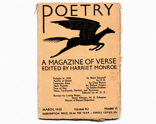
CW: There were many different stages of the process. There [had] been a Pegasus associated with Poetry magazine for 93 years. James Thurber drew one for us on a cocktail napkin years and years ago. Now, we still use a Pegasus as our identity, but we feature a more elegant version drawn by Eric Gill in the 1930s.
Christian Wiman: When I took over as Editor of Poetry magazine, I was interested in shaking up the content. My goal was to reconceive the idea of what the publication could be, while retaining a sense of the magazine’s 100-year history. I quickly realized that this intent had to be reflected in the design as well. It had looked the same way for a long time and it had become too staid, and a little stale. I wanted to wake it up, but I didn’t know how. I started making some incremental changes before the actual redesign, but quickly realized I didn’t know anything about design.
DM: So you hired a design firm to help you. What were some of the steps you took a long the way?
CW: There were many different stages of the process. There [had] been a Pegasus associated with Poetry magazine for 93 years. James Thurber drew one for us on a cocktail napkin years and years ago. Now, we still use a Pegasus as our identity, but we feature a more elegant version drawn by Eric Gill in the 1930s.
Cover Poetry, March 1933. Pegasus illustration by Eric Gill
DM: One of the nice things about the covers today is the mix of very well known, very established, very respected artists and illustrators, as well as really new, fresh voices.
CW: This is very deliberate; we want the same ethos that pervades the contents of the magazine to be present in the covers.
DM: What would you say that ethos is?
CW: We seek to discover and publish new voices. Discovery is our mission. This has been Poetry magazine’s mission since the beginning. That applies to the illustrators we choose, not just to the poets and writers.
DM: Do you have a favorite cover?
CW: Certainly, the cover of our first redesigned issue in April 2005 is one of my favorites. The artwork is by Henrik Drescher, and features a man jumping around.
DM: That fit with the new tone of the magazine?
CW: That was really our line in the sand. A stand up and take notice moment.
DM: Yes, yes it was.


Comments [8]
09.27.10
01:49
It's interesting Debbie how your initials aren't really sitting perfectly spaced in the right hand corner but instead just above the 'R' in poetry. The little differences between an english literature student and a design student I guess!
This article has come at a perfect time. I'm about to start work on a handmade zine project with my writer flat mate and these covers are certainly a source of inspiration of what great editorial can be.
Congratulations on the new season of Design Matters :)
Thoroughly enjoyed your interview with Massimo Vignelli.
Matt.
09.28.10
10:00
09.29.10
02:08
I remember seeing all those Poetry issues in
in your mud room. My grandafther, Sam Sauls (Sauls, hmm. am I Jewish too?) is a graphic designer and published poet. When I first moved to New York he would send me a stack of his latest ever so often with a note "Petey, Please see if you can send these to one of your friends at the New Yorker." Of course, I've never known anyone at the New Yorker and his poems are creepy as hell. Another creepster in the family tree: Edgar A Poe.
For my cover I remember trying to sell POE(in red)TRY(black) but that didnt make sense as he wasn't in the issue. Anyhoo, thx for the post. yer lovin, F
10.04.10
11:07
10.06.10
01:53
However, the face that every time I click the "next" button and it reloads the ENTIRE page over and over and over and over is very time consuming and not efficient. I wish your slideshow was more independent in context to the webpage in view.
Just a note :)
04.14.11
01:36
Free
Ai
Weiwei
04.14.11
06:32
Maybe I'm just time traveling again.
VR/
p.s. row, row, row your boat…
04.14.11
09:56