And then there is Marian Bantjes, who is all of this. She's a visual contortionist whose ideas about space and shape know no limits. Hers is a lofty, loopy love affair with typography and pattern and color: with them, she plays and inverts, flips and subverts, twists and turns and reinvents the world. In this as in so many things, she is utterly fearless. She's also her own worst critic — tireless and critical about not only what she makes but how she makes it.
What follows is her own step-by-step process to produce the cover for her new book, I Wonder, recently published by Monacelli and Thames & Hudson: it's an expository monologue, in which Bantjes reflects and rejects iteration upon iteration until she finds an acceptable solution.
Acceptable to whom? In an age in which everyone claims to be a designer, Bantjes' approach lies somewhere between perfectionism and fetishism. Which is, by the way, the whole point.
— Jessica Helfand
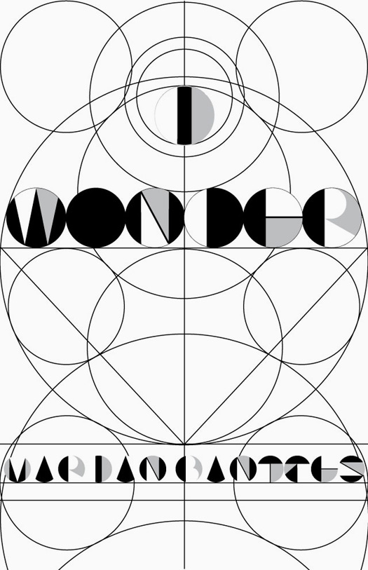
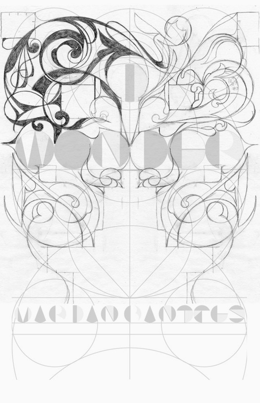
Cover 1a
I started with a basic template: this was a grid for me to work from. I wanted to juxtapose a "modern" design with an ornamental one.
I started with a basic template: this was a grid for me to work from. I wanted to juxtapose a "modern" design with an ornamental one.
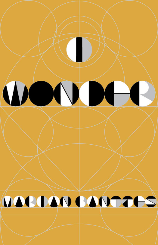
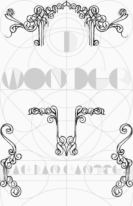
Cover 1b
My intent was that the cover would be printed with two golds and a silver: so quite subtle in the ornament. And then there would be round holes punched in the cover which would see through to a fly-page behind. That page would be an array of gemometric lines and shapes in white, black and silver and the letterforms would not be that evident on the page itself, unless viewed through the holes on the front. I knew this was risky, but ...
My intent was that the cover would be printed with two golds and a silver: so quite subtle in the ornament. And then there would be round holes punched in the cover which would see through to a fly-page behind. That page would be an array of gemometric lines and shapes in white, black and silver and the letterforms would not be that evident on the page itself, unless viewed through the holes on the front. I knew this was risky, but ...
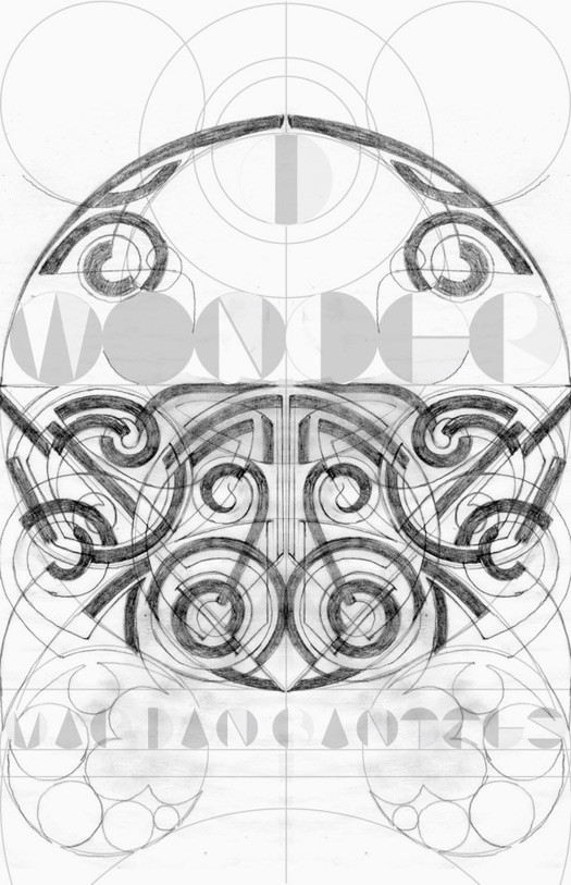
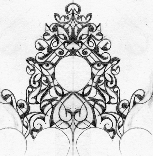
Cover 2a
This is my first sketch for the design. I was uncertain about it ...
This is my first sketch for the design. I was uncertain about it ...
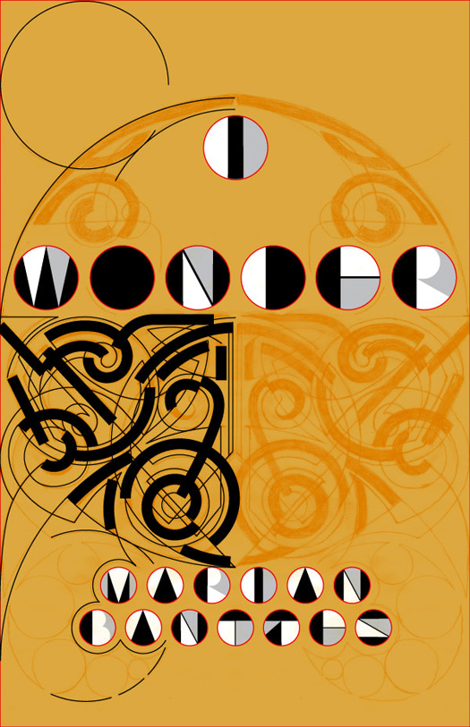
Cover 2b
But I decided to take it into Illustraor for a trial. I decided it looked too Celtic.
But I decided to take it into Illustraor for a trial. I decided it looked too Celtic.
Cover 3
Moving away from Celtic and into Rococo, it seemed just too obviously swirly.
Moving away from Celtic and into Rococo, it seemed just too obviously swirly.
Cover 4
Attempting to introduce some of my signature straights + curves ... but this reminded me of a Baroque clock ...
Attempting to introduce some of my signature straights + curves ... but this reminded me of a Baroque clock ...
Cover 5
I'm not sure what I was thinking. Clearly I didn't think it through for very long. I decided to turn to patterns, and bring the cover into full-color + gold.
I'm not sure what I was thinking. Clearly I didn't think it through for very long. I decided to turn to patterns, and bring the cover into full-color + gold.
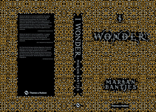
Cover 6a
I was quite happy with this. My intent was to have the checkerboard in silver foil, as well as the silver blocks in the round letters. (I had abandonded the idea of the holes as having too much potential to go horribly awry at the last minute. This very nearly became the final cover, and was the one that Lucas Dietrich took with him to the Frankfurt Book Fair.
I was quite happy with this. My intent was to have the checkerboard in silver foil, as well as the silver blocks in the round letters. (I had abandonded the idea of the holes as having too much potential to go horribly awry at the last minute. This very nearly became the final cover, and was the one that Lucas Dietrich took with him to the Frankfurt Book Fair.
Cover 6b
But when I showed this cover to my friend Henrik Kubel, he was, to my dismay, not overwhelmed. He thought the spine was a joke, or an obvious stroke of supreme laziness (which it was). He finally said the design looked "Illustrator-y". Whether true or not, there's not a worse adjective he could have used — it went straight to the heart of my insecurity and I instantly knew I had to start again.
But when I showed this cover to my friend Henrik Kubel, he was, to my dismay, not overwhelmed. He thought the spine was a joke, or an obvious stroke of supreme laziness (which it was). He finally said the design looked "Illustrator-y". Whether true or not, there's not a worse adjective he could have used — it went straight to the heart of my insecurity and I instantly knew I had to start again.
Cover 7
So I began to play with the idea of doing the whole thing in foil blocking.
So I began to play with the idea of doing the whole thing in foil blocking.
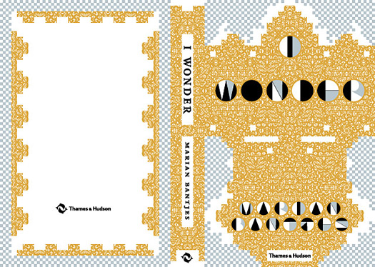
Cover 8
For a while I considered possibly even having two covers for the book — a white version and a black version.
For a while I considered possibly even having two covers for the book — a white version and a black version.
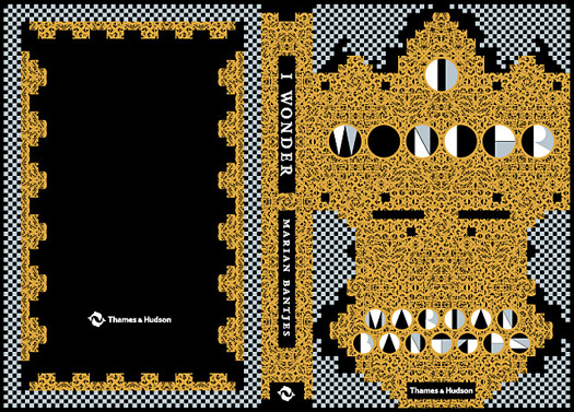
Cover 9
In the end, there was only one version. The result is, as you can see, close to the final. The foilers were skeptical of wrapping the edges of the binding and wanted to pull the design back from the edge. But I badly wanted a complete fill of pattern, so we did a test and it worked out fine.
In the end, there was only one version. The result is, as you can see, close to the final. The foilers were skeptical of wrapping the edges of the binding and wanted to pull the design back from the edge. But I badly wanted a complete fill of pattern, so we did a test and it worked out fine.
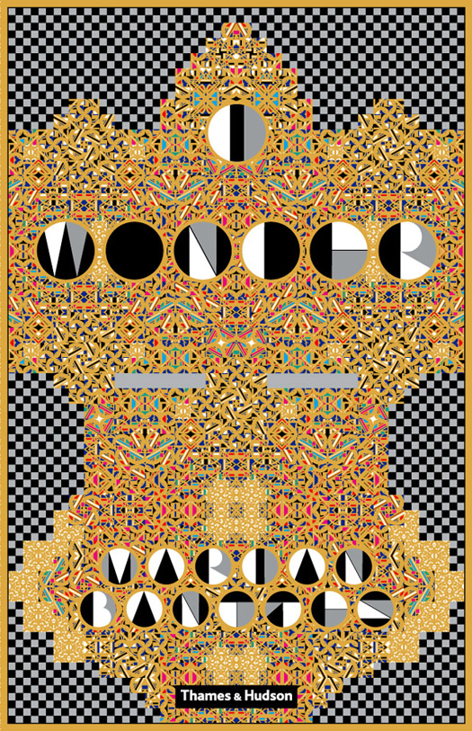
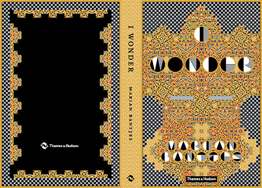
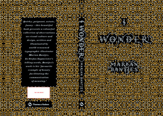
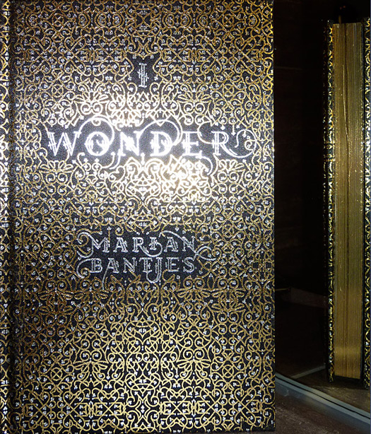
Cover 10
This is the final artwork for the Thames & Hudson English version; the =North American cover has the Monicelli logo on the front cover. The only thing I regret is that when the foilers printed a sample, the text on the back, in H&FJ's Acropolis Black Italic was badly filling in. I had to do some work on it and letterspaced it. My intent was that after the foiling it would look "normal," but I think it's too letterspaced and airy in the end.
Ultimately I am overjoyed with the cover. From the very beginning I had planned to have gold-foiled page edges and I always wanted it to feel like a brick of gold. It does! The book is surprisingly heavy for its small size and it's not only shiny and flashy, but the feel of the satin is gorgeous: it's very sensuous. And visually it's so very me: familiar in a historical way, but also contemporary.
This is the final artwork for the Thames & Hudson English version; the =North American cover has the Monicelli logo on the front cover. The only thing I regret is that when the foilers printed a sample, the text on the back, in H&FJ's Acropolis Black Italic was badly filling in. I had to do some work on it and letterspaced it. My intent was that after the foiling it would look "normal," but I think it's too letterspaced and airy in the end.
Final cover
Ultimately I am overjoyed with the cover. From the very beginning I had planned to have gold-foiled page edges and I always wanted it to feel like a brick of gold. It does! The book is surprisingly heavy for its small size and it's not only shiny and flashy, but the feel of the satin is gorgeous: it's very sensuous. And visually it's so very me: familiar in a historical way, but also contemporary.


Comments [23]
10.25.10
10:45
10.25.10
11:09
10.25.10
02:07
10.25.10
02:57
10.25.10
03:58
10.25.10
05:58
10.25.10
10:17
10.26.10
11:07
10.26.10
11:14
10.26.10
11:17
10.26.10
07:19
Not all design has to fit into a tidy box.
10.27.10
02:43
10.27.10
03:21
10.28.10
07:32
10.30.10
06:49
11.02.10
05:41
11.02.10
05:46
11.04.10
12:29
11.06.10
06:08
I understand that the design field is comprised of different sects with their own design dogmas, but it doesn't have to be like that.
11.07.10
10:22
11.09.10
10:34
I especially appreciate seeing the process in this development. It's rare to glimpse the exacting work this takes compared to the final piece. I see the endless joy in her work. And I don't see hero-worship, It's appreciation for handmade art.
01.31.11
07:47
03.25.11
12:10