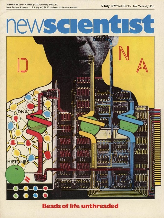
New Scientist, 5 July 1979. Cover illustration by Muscle Films (Nichola Bruce and Michael Coulson)
The image above is a cover from the British magazine New Scientist, a news weekly aimed at the scientific community and anyone interested in science. It was founded in 1956 and is still going strong. I saved the cover when it appeared in 1979 because I admired the image. I was fascinated by the artist Eduardo Paolozzi (this won’t surprise regular readers) and the cover’s graphic quality and the collage of the man repurposed as an industrial complex reminded me of his screenprints. I liked it enough to frame it and put in on my wall.
Recently, I found the cover again and realized I had no idea who made it — I long ago threw out the rest of the magazine with the image credit. In the late 1970s and 1980s, the New Scientist cover was an important forum for a new generation of British illustrators, during a highly fertile, often radical, though now somewhat overlooked chapter in the discipline’s history. The magazine’s art editor, Chris Jones, had a catholic eye for talent and commissioned distinctive cover images by artists such as Sue Coe, Russell Mills, Ian Pollock, Peter Kennard, Liz Pyle, Andrzej Klimowski, Bill Sanderson, and Dan Fern. Much of that came later, though, and when I bought the issue I wasn’t following those visual trends. In 1986, I went to an exhibition of New Scientist original cover artwork in London, but the “Beads of Life Unthreaded” image wasn’t included in either the show or the accompanying catalogue.
My best guess for its creator was David Pelham, well known for Penguin Science Fiction book covers, such as Sirius (1973), that bear graphic comparison with the New Scientist image. In an email, Pelham commented on the DNA illustration’s resemblance to Paolozzi’s prints, but confirmed that this powerful image wasn’t his work, though he said he rather wished it were. By then, I had found the answer with Google Books, which has digitized many complete issues of New Scientist. The illustration is by Nichola Bruce and Michael Coulson of Muscle Films, who created several striking covers for the magazine in those years.
What particularly interested me about Bruce and Coulson’s visual interpretation of DNA, which has hardly dated thanks to its intellectual and graphic cogency, is its treatment of the man’s inner body as both machine and factory. We have been looking at this kind of imagery a lot recently, with the publication, in 2009 and 2013, of two monographs about Fritz Kahn, a long-neglected German doctor, science writer and pioneer of information graphics, who used visual metaphors to elucidate the body’s hidden processes. Kahn’s most famous and unforgettable creation, proliferating across the Internet as I write, is Der Mensch als Industriepalast (Man as Industrial Palace), which exists in two similar versions produced in 1926 and c. 1928.
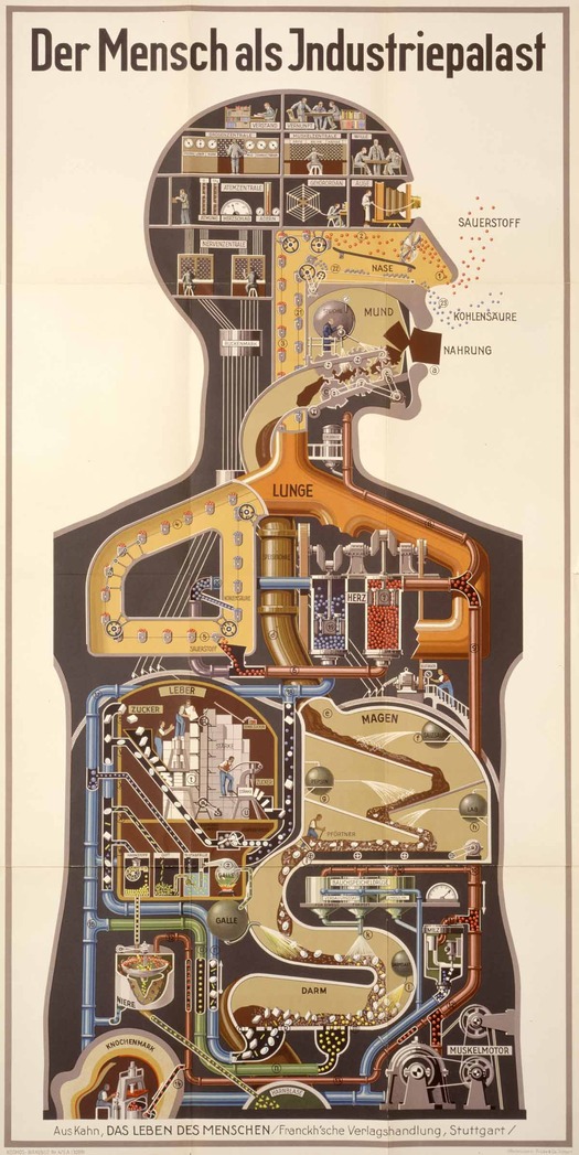
Fritz Kahn, Der Mensch als Industriepalast, c. 1928
These spectacularly strange yet cozily familiar images must have had great popular impact in their day and other educators of the public in the corporeal mysteries, such as Harold Wheeler, editor of The Miracle of Life in the 1940s, used similar factory imagery to portray the “chemical works” of the body “in a form suited to an essentially mechanical age,” as a caption puts it.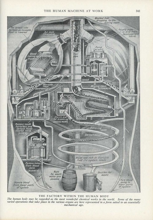
Plate from The Miracle of Life, published by Odhams Press, London, edition undated, 1940s
Kahn’s posters were also noticed and appropriated as marvelous and inadvertently surreal art objects by observers in the art world. In a photograph of the Mayor Gallery in London, taken in 1939, the image can be seen in the window of an exhibition of works by the British Surrealists Roland Penrose and Ithell Colquhoun — it appears to have been cut out from its background. In 1951, the artist, designer and writer Barbara Jones (a figure now receiving deserved attention) included The Human Factory, the English version of the poster, in Black Eyes and Lemonade, a trailblazing exhibition devoted to the popular arts held at the Whitechapel Art Gallery in London.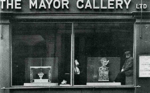
Exhibition of work by Roland Penrose and Ithell Colquhoun at the Mayor Gallery, London, 1939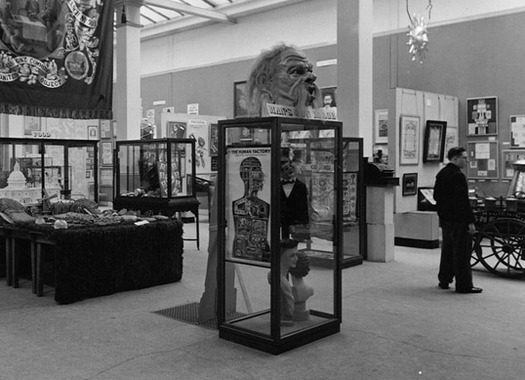 Black Eyes and Lemonade, an exhibition of popular arts at the Whitechapel Art Gallery, London, 1951
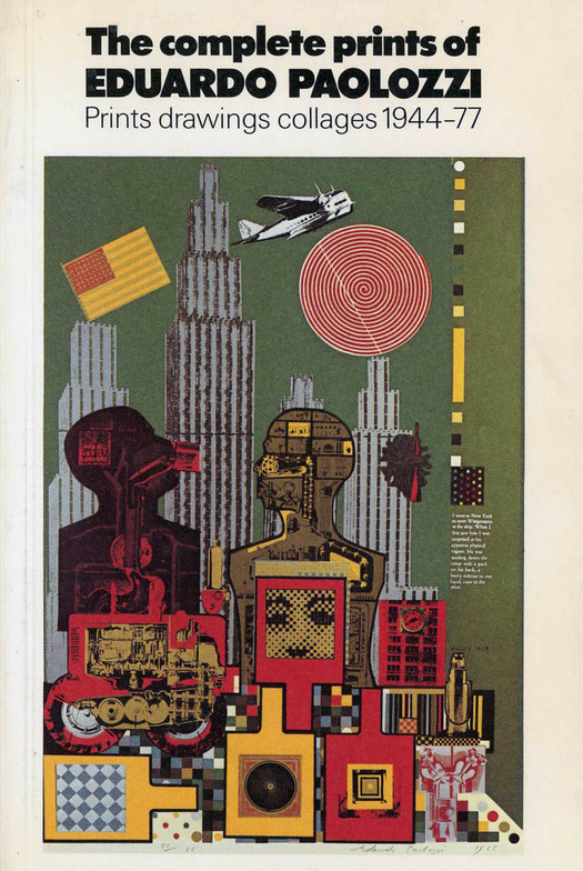
Paolozzi is likely to have visited Black Eyes and Lemonade, where he couldn’t have missed Kahn’s poster. In 1965, he included one of Kahn’s industrial palace figures in the screenprint Wittgenstein in New York (below) from the series As is When, one of his most frequently reprinted images. In Paolozzi’s remix, the human factory has become a cybernetic entity fully merged with the technological environment of the city. The same figure reappears, recolorized, in Paolozzi’s Man Holds the Key (1972), a numbered screenprint and lithograph in the Bunk portfolio based on a collage from the early 1950s. In 1971, Kahn’s durable icon found its way onto the paperback cover of Man Modified, a timely study of man/machine interaction by David Fishlock, a science journalist on the Financial Times, though the image isn’t credited to Kahn. Also in 1972, David Pelham, an admirer of Paolozzi, commissioned the artist to create a Penguin cover for Lost in the Funhouse, a collection of metafictional texts by the postmodernist American writer John Barth. Paolozzi’s human factory (borrowed from an unidentified source) modernizes the Kahn-like image with sharper lines and a bright Pop palette, and moves even closer in graphic effect to the later New Scientist cover by Muscle Films, even down to the yellow backdrop. According to Pelham’s account in Penguin by Designers, Barth adored it.
Catalogue published by the Victoria & Albert Museum, London, 1977, showing Wittgenstein
in New York by Eduardo Paolozzi, 1965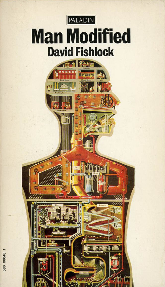
Man Modified, published by Paladin, London, 1971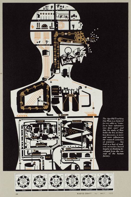
Eduardo Paolozzi, 28. Man Holds the Key, screenprint and lithograph, 1972. Source: Tate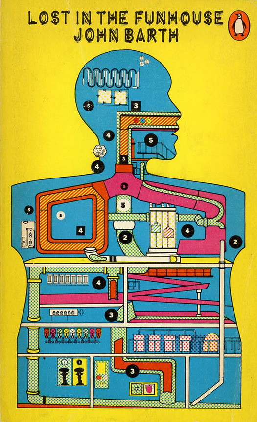
Lost in the Funhouse, published by Penguin Books, Harmondsworth, 1972.
Cover by Eduardo Paolozzi
I contacted Nichola Bruce and Michael Coulson to ask them about the sources of their image. The duo collaborated as Muscle Films on film projects from 1977 to 1991, as well as image-making and illustration; these commissions were also produced under the name of “Kruddart.”
“Paolozzi was definitely on the radar,” says Bruce. “I had poster prints of his on the wall.” She also mentions Warhol, Oldenberg and Lichtenstein. Coulson remembers Paolozzi as “more of an art school influence” during their time at Hornsey College of Art in London, in the early 1970s. Kahn was still an obscure figure in those days and neither of them knew about him. Later, when they devised the DNA image, their inspirations came from German Dada and collage — Hannah Höch, Raoul Hausmann, John Heartfield, Herbert Bayer, George Grosz, and Kurt Schwitters — as well as the graphic work of the Russian Constructivist Aleksandr Rodchenko. In the UK, these figures were touchstones for progressive graphic artists in the punk and post-punk years of the mid- to late 1970s. Another key influence for Bruce and Coulson was the anatomical illustrations of Andreas Vesalius and his seven-volume study, De Humani Corporis Fabrica (On the Fabric of the Human Body, 1543). “We had a lot of medical dissection books,” recalls Bruce. “Medical posters. Plastic brains with bits that separate out.”
“We were interested in using the body as a metaphor,” says Coulson, “and we created a series of illustrations on the theme of the human head as camera — the resulting image complete with clockwork wind-up mechanism fixed to the side of the head above the ear.”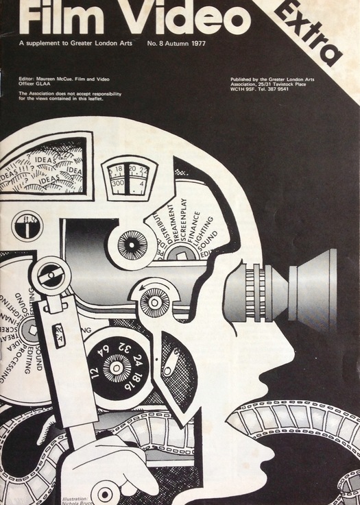
Film Video no. 8, 1977. Cover illustration by Nichola Bruce
In Art Meets Science: The Cover Art of New Scientist (1986), Chris Jones recalls working with Bruce and Coulson. “I was thrilled by their enthusiasm . . . Their uninhibited approach was refreshing and again broke another barrier with the often fairly incomprehensible area of the physical sciences.” Muscle Films’ first cover, in February 1979, visualized the discovery of a new particle, and their second, two weeks later, commemorated Einstein’s centenary; “Beads of Life Unthreaded” was the third. Bruce had recently read James D. Watson’s The Double Helix, his controversial autobiographical account of the discovery of the structure of DNA. Bruce and Coulson talked to the article’s author, Miranda Robertson, associate editor of Nature, and concluded that they would need to find a graphic analogy for biological information storage. In the emerging digital world, the chips and circuits inside a computer hard drive provided the most apposite metaphor. Later on, illustrators struggling to represent the immaterial for computer magazines would do this kind of imagery to death, but in 1979 it was still fresh and startling.
“To make the illustration, we originally created a looser, less specific image but decided we didn’t like the approach,” recalls Coulson. “For the next attempt we took the head from our film Boolean Procedure’s main character [played by Michael Howley] and degraded it using an old photocopier to give it a machine-like quality and began to incorporate some of the computer chip imagery. We always tried to ensure that the image we created contained real scientific information. To illustrate the concept of the compacting and storing of the miles of genetic information within each cell, we showed how the DNA is wound around a spool and is then able to be unraveled, read and copied. I wanted this section of the illustration to be scientific and have a different quality than either the semi-realistic human head or the industrial design of the computer circuits.”
They chose primaries because they are graphic: three colors for the three letters of DNA. The finished piece is a physical collage, about the same size as the magazine cover, with all the pieces fixed in position by spray mount. The blocks of color are either painted or flat colored paper, with the red letters stenciled onto the yellow surface. The art editor’s use of blue and red for the typography ties everything together, making this a particularly well unified New Scientist cover. In covers by other artists, the illustration was often less well integrated.
If Kahn’s human factory, whatever its inventor’s didactic intentions, is as much about the domination of machinic modes of thinking and being in a mechanical age as it is about the invisible operations of the body, so Bruce and Coulson’s cover is similarly double-coded and ambiguous. Even as the illustration monumentalizes Crick and Watson’s brilliant deciphering of the human operating system, it hints at the human costs of the looming digital future by presenting a body prosthetically colonized and restructured by electronic components. The image stands up so well decades later because it boldly intuited a deep technological and cultural shift, just as it was about to happen, and froze it in a piece of visual journalism with total graphic conviction.
See also:
Machine Head, a profile of Fritz Kahn
Eduardo Paolozzi, 20th Century Image-Maker
On My Shelf: The Metallization of a Dream


Comments [3]
06.30.14
12:05
06.30.14
12:06
06.30.14
12:07