I have been writing short essays on how commercial, ad hoc and folk art things became part of a larger design language. One might think of it as anti-design, but its not so much a rebellion as a foundation for graphic design. This new series will focus on the anonymous originators and more contemporary figures who buck the canon in interesting ways. —SH
++++
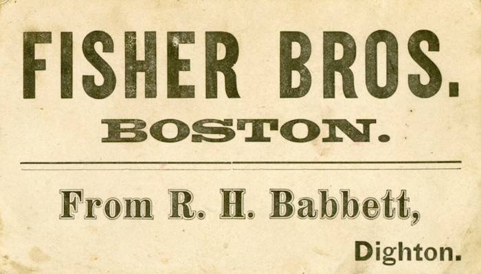
The merchant’s address cards on these pages admitedly defy some classical tenets of graphic design and typography, including word spacing, juxtaposition of discordant typefaces and inclusion of too many letter styles. In fact, to even refer to these as graphic design may be stretching the term for the purist.
The commercial printers of the late nineteenth century who composed them were, however, duly proud of their results – if only for the craftsmanship of a finished commission. Afterall, they had to overcome considerable technical and physical constraints, not the least being the routine scarcity of certain typefaces, which, in part, fostered the multiple typeface look. That printers and compositors sucessfully solved their respective problems within their limitations was integral to the layout profession – make good with what is available and don’t make excuses over what is not. Necessity is the mother of some wonderful inventions, and the paucity of type material and lack of aesthetic rules gave birth to some extraordinarily eye-catching results.
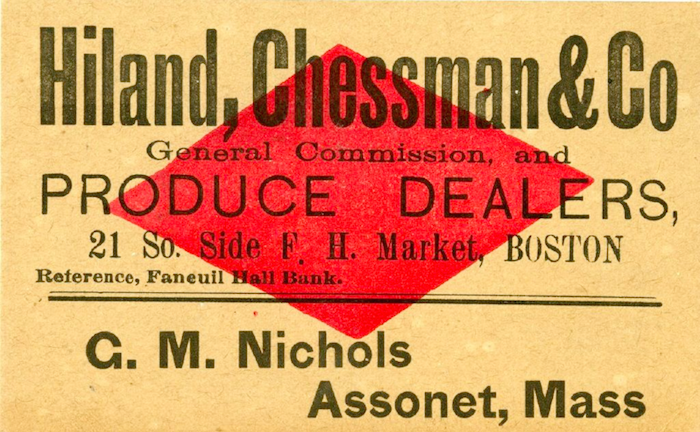
Although bestowing on compositors and printers the title of graphic designer does not occur for another few decades, the men and women who set, composed and printed these cards and similar quotidian ephemera were producing what must be called graphic design. And what appears as ad hoc layout is arguably anything but. The cards addressed to Hiland, Chessman & Co. and C.E.Morrison & Co. are examples of simple heirarchical design where the use of multiple typefaces draw the eye to the to the right places for the proper actions. The addressees names are the largest, boldest letters and focal points. The sender’s name, being somewhat less important, is considerably smaller yet not obscured. So, even though the multiple type styles suggests expedience, they are nonetheless used in a logically functional way.
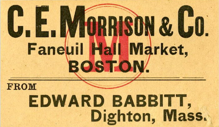
On both the addition of red is a highlight that adds to the efficiency of the design. And the nonpareil rules effectively distinguishes one piece of information (i.e. the addressee) from another (the sender). What could be more simple and more refined?


Comments [1]
12.10.15
03:36