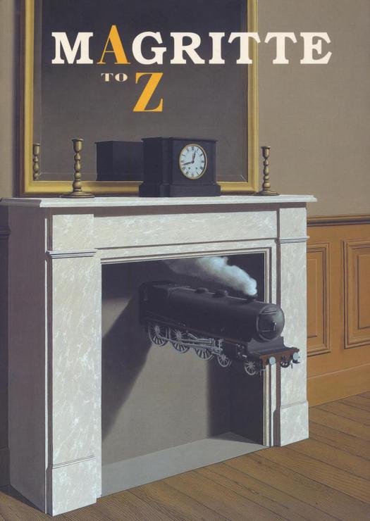
Magritte A to Z, Tate Publishing, 2011, showing Magritte's Time Transfixed, 1938. Designed by Tony Waddingham
How important is originality when it comes to book design? The issue came up recently in a panel discussion in Zurich that I took part in, organized around the annual Most Beautiful Swiss Books competition. The term “beauty” is something of a red herring here. What the jury, which included Cornel Windlin (the chair), Lars Müller and Linda van Deursen, seemed to be looking for were books that contribute something new in their design. Exactly what this means in terms of the 19 titles they chose for their final selection, and how these books meet this criterion, was never properly defined during our discussion. But it did seem that a book that was merely excellent in applying a familiar design approach, as plenty of the also-rans appeared to be, couldn’t, in the jury’s view, qualify as a “most beautiful” book.
Although it would be unwise to deny that exceptions of startling originality are always possible, the idea that designers might annually, after 500 years of book design, reinvent the paper-based, non-digital, printed book in a significant way as an information carrier and as a reading experience verges on hubris. Of course, there is endless scope for stylistic expression (the perfectly honorable design activity that dare not speak its name these days) and it’s also possible to manipulate the physical form of a book in original ways — Irma Boom is an obvious example of a designer who has won many fans by doing this. But the idea that book design might be able to express meaning in ways that no one has ever thought of before, and that this quest should be a national competition’s guiding criterion, seems as wildly over-optimistic as it is limiting. Nor does it have much to do with the quotidian forms of appeal that make a book attractive to general buyers — as opposed to a design jury processing a pile of 500 volumes, while committed to a meta-level of design, in which the avant-garde imperative to keep “making it new” remains the ideal.
Besides, it’s the inevitable fate of any good design idea to be snapped up and reapplied without the slightest qualms by other designers. A while back I wrote an article for Eye about the prevalence now, particularly within the art world, of books based on the editorial structure of the dictionary. The originality of this device as a self-conscious design strategy (and I doubt we could ever be certain who thought of it first) didn’t lie in inventing the editorial structure, which was a given, but in the clever contextual shift involved in applying this accommodating framework to the genre of the catalogue, where it would seem fresh and unusual.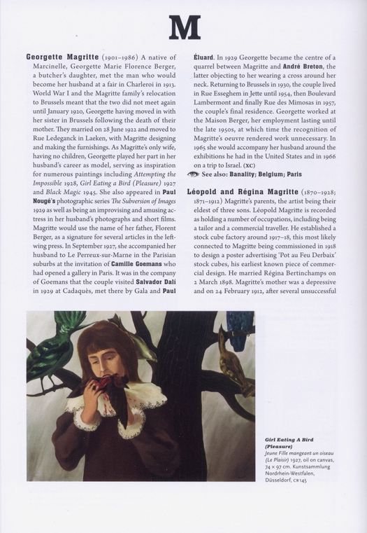
Page from Magritte A to Z, Tate Publishing, 2011. Designed by Tony Waddingham
The dictionary structure turns up again in the catalogue for René Magritte: The Pleasure Principle, now showing at Tate Liverpool in the UK (until 16 October). Far from finding this an obvious or overused conceit, it strikes me as a perfect device for exploring Magritte’s brand of Surrealism. As a precedent, one thinks immediately of André Breton and Paul Eluard’s Dictionnaire abrégé du surréalisme (1938), which naturally has an entry on Magritte. I felt a little shock of pleasure myself when I opened Magritte A to Z and saw how well the book worked. (That would probably be true for almost any conceptually rich art subject, but there will be diminishing returns, or at least diminishing delights, if too many catalogues of this kind begin to appear.) The Magritte dictionary, edited by Christoph Grunenberg and Darren Pih and designed by Tony Waddingham, contains around 150 short texts, by a team of contributors, that cover key people, crucial images from the paintings (clouds, pipe, frame, window, mannequin, curtain) and central concepts for understanding the artist, such as psychoanalysis, language, fetish, kitsch, violence, parody and pastiche, and appropriation.
Ah, yes, appropriation. As it happens, I used exactly the same dictionary structure last year, in place of a conventional essay, for the introduction of my Uncanny: Surrealism and Graphic Design catalogue. The immediate inspiration for doing this, I readily confess, came from “A Quay Brothers Dictionary” by film critic Michael Brooke, which can be found in the booklet that accompanies a DVD set of the Quays’ short films. 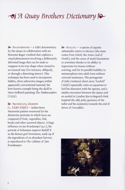
Page from Quay Brothers DVD booklet, British Film Institute, 2006. Designer unknown
The form of the dictionary just seemed so right for fantastic or surreal subject matter that I wanted to make a little dictionary, too, though my fascination with this editorial device goes all the way back to an alphabetically structured article about the film director Peter Greenaway — here, again, the editorial organization is a perfect match for the subject — that I read and clipped from Time Out magazine in London many years ago.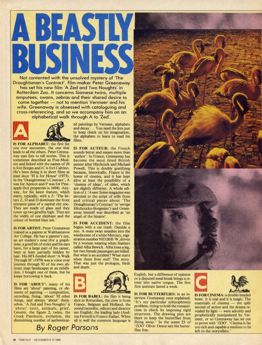 Page from Time Out, December 4-11, 1985. Designer unknown
One even more curious thing about Magritte A to Z, coming so soon after Uncanny, is that the designer and editors have also employed the same device to indicate related subjects in the dictionary as the one I suggested for my catalogue — a small graphic image of an eye, placed at the end of entries.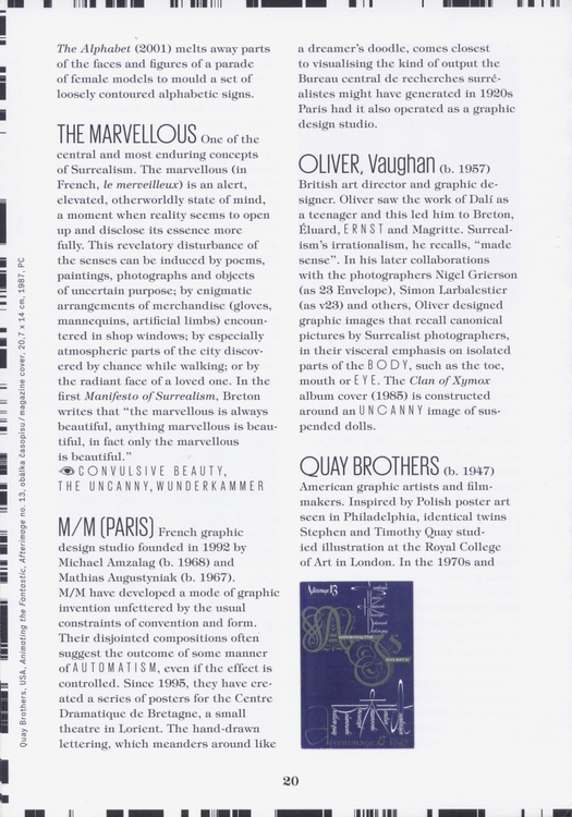
Page from Uncanny: Surrealism and Graphic Design, Moravian Gallery, 2010
Designed by Adam Machacek and Sebastian Bohner
I’m not proposing that this is anything other than a coincidence, though several months ago I sent a copy of Uncanny to one of the Magritte A to Z contributors, or even that it would matter if the Magritte team had seen the idea in Uncanny and decided to use it. We all share in the optical unconscious (to appropriate a phrase) and designers will certainly have employed images of the eye for similar purposes many times before. Indeed, anyone with an understanding of Surrealism’s poetic concern with the image of the eye might arrive at the same visual conclusion, though the Magritte book ever so slightly spoils the effect by adding the words “See also,” needlessly duplicating what the image has already said with satisfying brevity.
In any case, to return to our starting point, designers worry far too much about “originality.” Magritte A to Z is a wonderfully conceived, diverting and readable book that compels you to see an over-familiar and even, for many viewers, hackneyed subject in a sharp new light. It’s the best illustrated guide to Magritte I have seen, not least because the alphabetical entries throw together lesser-known pictures in revealing new combinations. Perhaps it should be mandatory on graphic design courses to consult Steven Heller and Mirko Ilić’s The Anatomy of Design, a book that exhaustively demonstrates, with 2,000 examples, how graphic ideas held in collective ownership are endlessly recycled, readapted and reused. With book design, we should value appropriateness to subject, vivid animation of content, and the dexterity and panache with which the designers interpret every purposeful, cherishable convention of the book. The notion of continual reinvention as a worthwhile or attainable goal is particularly misplaced here, while the “book as object” is a different issue.


Comments [2]
07.07.11
05:49
07.28.11
01:21