On March 16 HBO will premiere David Simon’s mini-series of Philip Roth’s 2004 novel The Plot Against America. In this alternate history the fascist-leaning America First isolationists field aviator-hero and xenophobic populist Charles Lindbergh for president against Franklin D. Roosevelt. In today’s political era this fiction is all too timely. Lindbergh defeats the incumbent, makes a deal with Adolf Hitler to avoid a world war, and ultimately plays into dormant anti-semitism in the United States. Roth, who died in 2018, was usually reluctant to see his work adapted for the screen yet he gave Simon the green light. The novel centers on a Jewish working family in Newark, New Jersey (Roth’s home town), as they face an increasingly violent racist and anti-semitic backlash. Much of the novel is based on real events, including the rise of German American bunds that emerged during the decade prior to America’s entry into World War II. To make the series realistic set and prop design had to be impeccably accurate. For the graphic elements, veteran prop designer Eric Rosenberg was hired as Supervising Graphic Designer to lead the graphics team. Designing props since 1991, he has worked on The Hudsucker Proxy, Forrest Grump, Stargate, and dozens of other films and TV. Sometimes his props receive only a second of screen time after hours and days of work, but that is the nature of the field. I asked him specifically to talk about what depths of research did he plumb to make props against America for The Plot Against America.
Steven Heller: I must admit, ever since reading Roth's The Plot Against America, I've voyeuristically wanted to see it brought to the large or small screen. I've read most of the alternative universe novels (notably Sinclair Lewis’ It Can’t Happen Here and Philip K. Dick’s Man In the High Castle) and although I admired the graphics and set design for the cable version of High Castle, was relieved that these were what-ifs, rather than what was or what might be. With Plot, the reality is too close to home. How do you feel as you are recreating these realities?
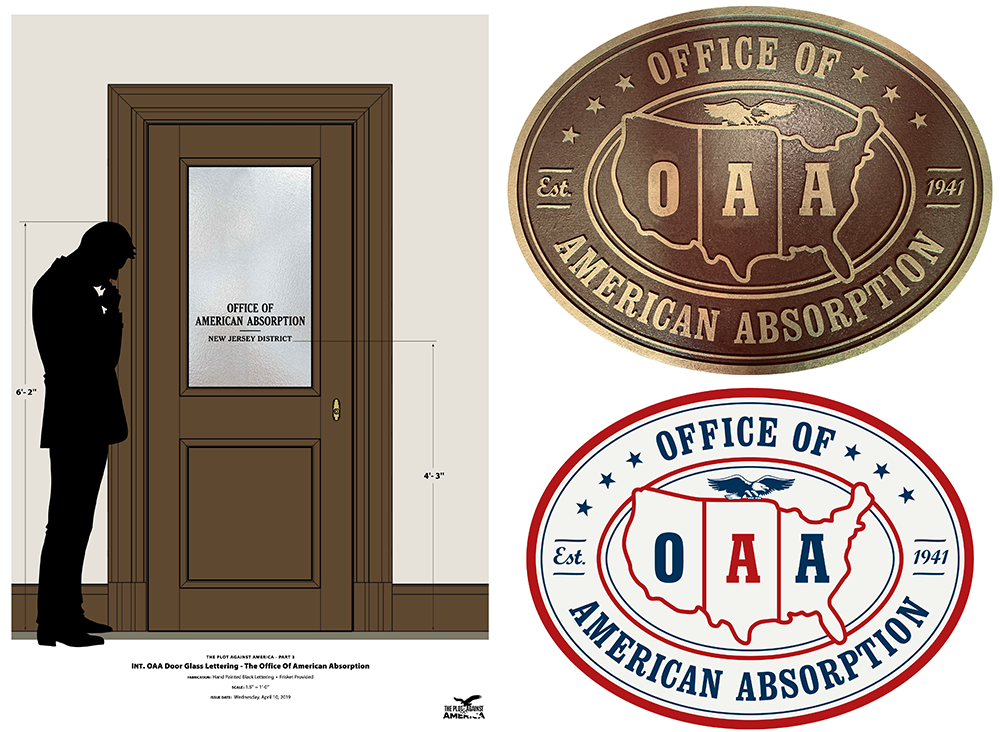
Eric Rosenberg: That the Plot Against America was being made and released at a time when so many of the issues it raises are a reality for the nation made us all acutely aware that this series will be closely scrutinized. Like any period piece there’s a devotion to the details and getting it right, but the added twist of traveling down this alternate fork in the historical road gives us license to imagine and implement the “What if?”. In creating the graphics for the Office of American Absorption [a government department for relocating Jews from big cities to rural areas] I had to design propaganda for an inherently insidious program yet have it fit in with the tone of U.S. Government issue posters of the time. So there’s the creative satisfaction at designing something well for the project while at the same time being aware that it's intent within the story is really awful.
SH: For The Plot Against America, what was you research process like?
ER: The entire Art Department dove into researching all facets of the era. There’s such a wealth of imagery and facts on every subject to be found online, so that really helps us to get it right. The show only had 8 weeks of prep time from the launch of the Art Dept. until principal photography commenced. Had we not found the research as quickly as it can now be accessed there’s no way we would have had enough knowledge and resources to get the job done with the level of detail it has.
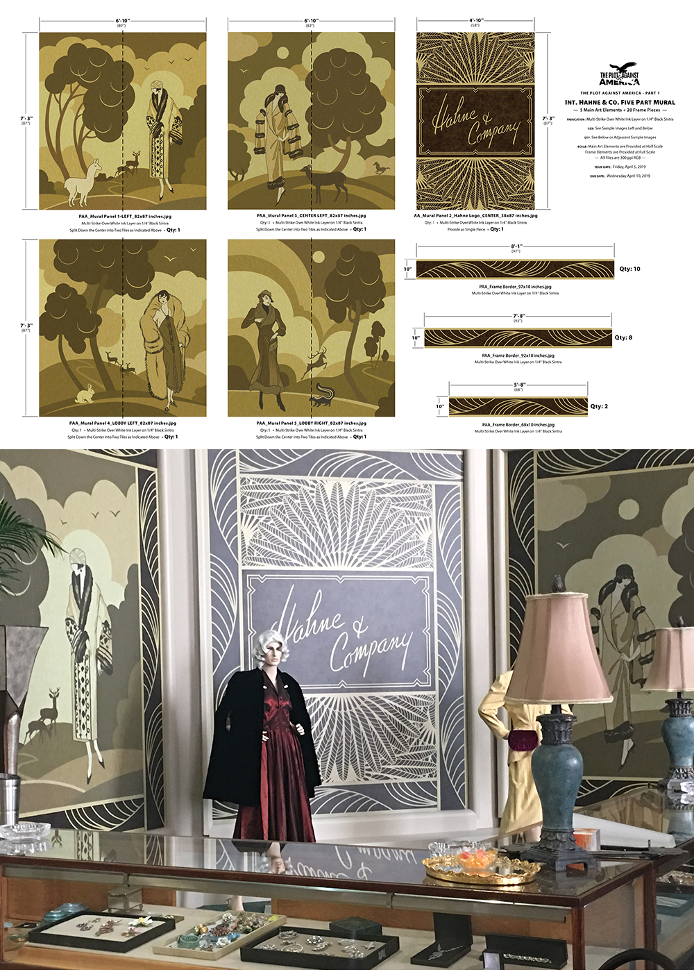
One of my early projects was creating graphics for Hahne’s, a major department store in Newark, New Jersey in the early 20th century. There wasn't much imagery to be found beyond some postcard views, but there was enough to see their logo evolve over the years. I learned all about department store shopping bags too, when they were invented and at what point they became commonplace. In 1940 when this story begins they weren’t in use. Your goods were wrapped in brown paper and tied closed. However our property master had some made anyway, he wanted them on hand if requested, and they were.
All of the voting sequences involved lots of research for the specific graphics at the polls and the voting machines, but also identifying all of the candidates for offices high and low.
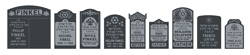
The two sequences at Jewish cemeteries had us designing numerous gravestones and were among the toughest projects on the series to get right. I learned so much about the traditions of grave markers from Eastern European Jews vs. those from Germany. David Simon was very specific about the formats and the Hebrew characters.
SH: I know you have a collection of actual materials (i.e. 1939 NY World's Fair, about which I did a book). Did you use any of the original items in any scenes?
ER: Sadly no. I brought the subject up with the show’s set decorator early on, but she said that it was very hard to obtain legal clearance for those items. Given all the beautiful graphics adorning their packaging, these pieces can be viewed as artwork with all inherent rights. While I thought it would be highly likely that [the protagonists] the Levin family would have visited the Fair, and that the boys would have a poster or souvenir Trylon and Perisphere [the centerpiece logo of the NY Fair] in their bedroom, with so much else going on I didn’t pursue the matter further.
However we did use many beautiful WPA issued posters from the era, high resolution scans are available for download from the Library of Congress digital collection. I've admired those designs since the book Posters of the WPA was published in 1987. Since these were all U.S. Government funded works there are no copyright restrictions in place. The posters graced many sets, including school classrooms and the public library, sometimes they really saved the day when last minute set dressing was needed due to a change in blocking the shot by the director.
SH: What are they key graphic documents that you had to make for the film? And how long were their respective screen times?
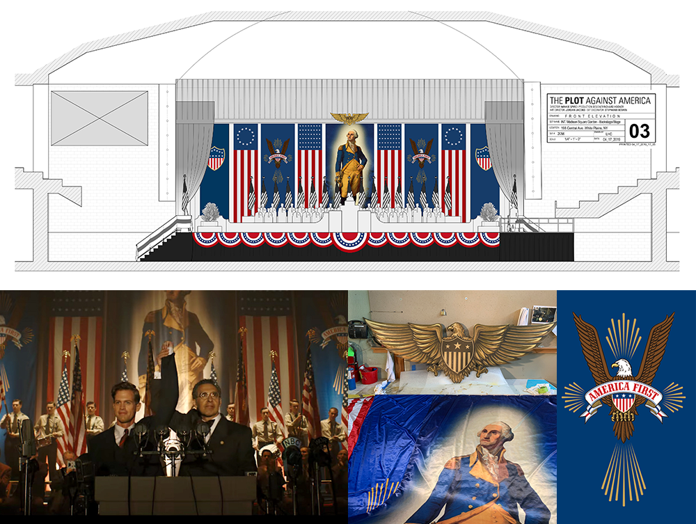
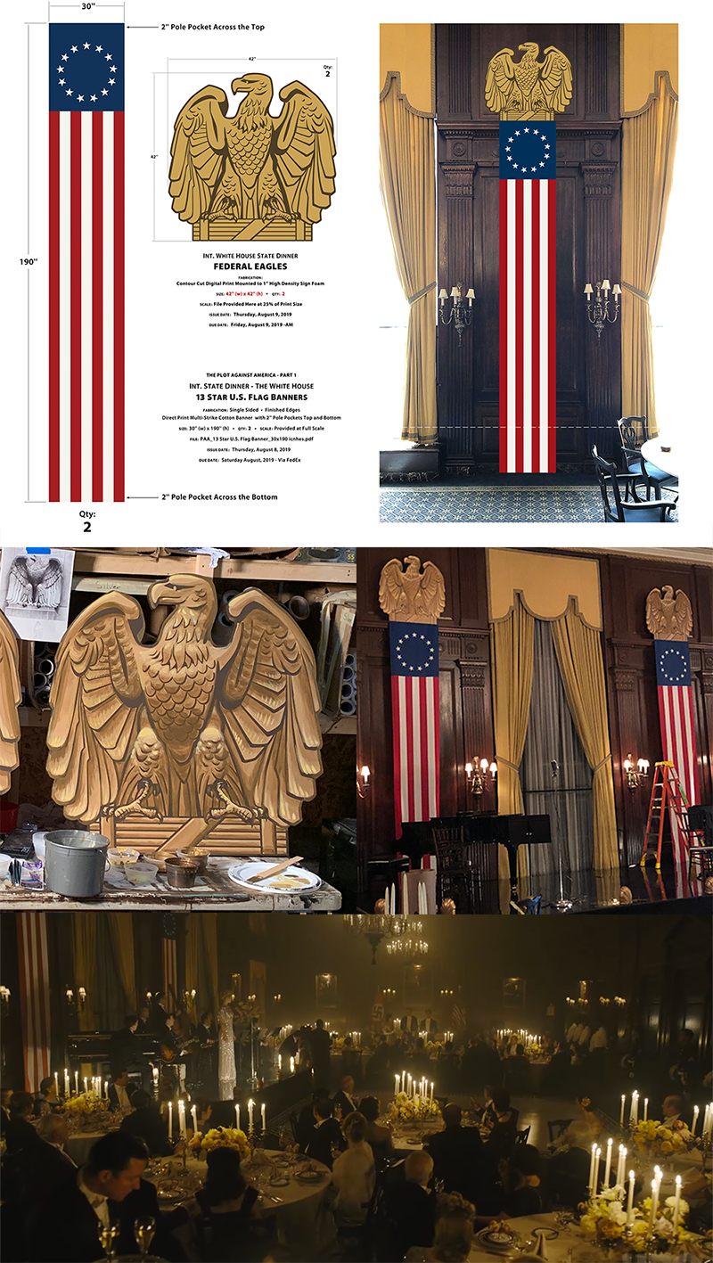
ER: Most items I design get just seconds on screen, I don’t think that will be much different for this project with a few exceptions. The banners dressing the [infamous] America First rally at Madison Square Garden will undoubtedly be the most featured graphics with the longest screen time. It’s the moment in the story where Rabbi Bengelsdorf introduces Lindbergh to the crowd of supporters with a passionate, laudatory speech, helping make Lindbergh acceptable to wary Americans while also showing Jewish-American support of a man known to hold anti-semitic views.
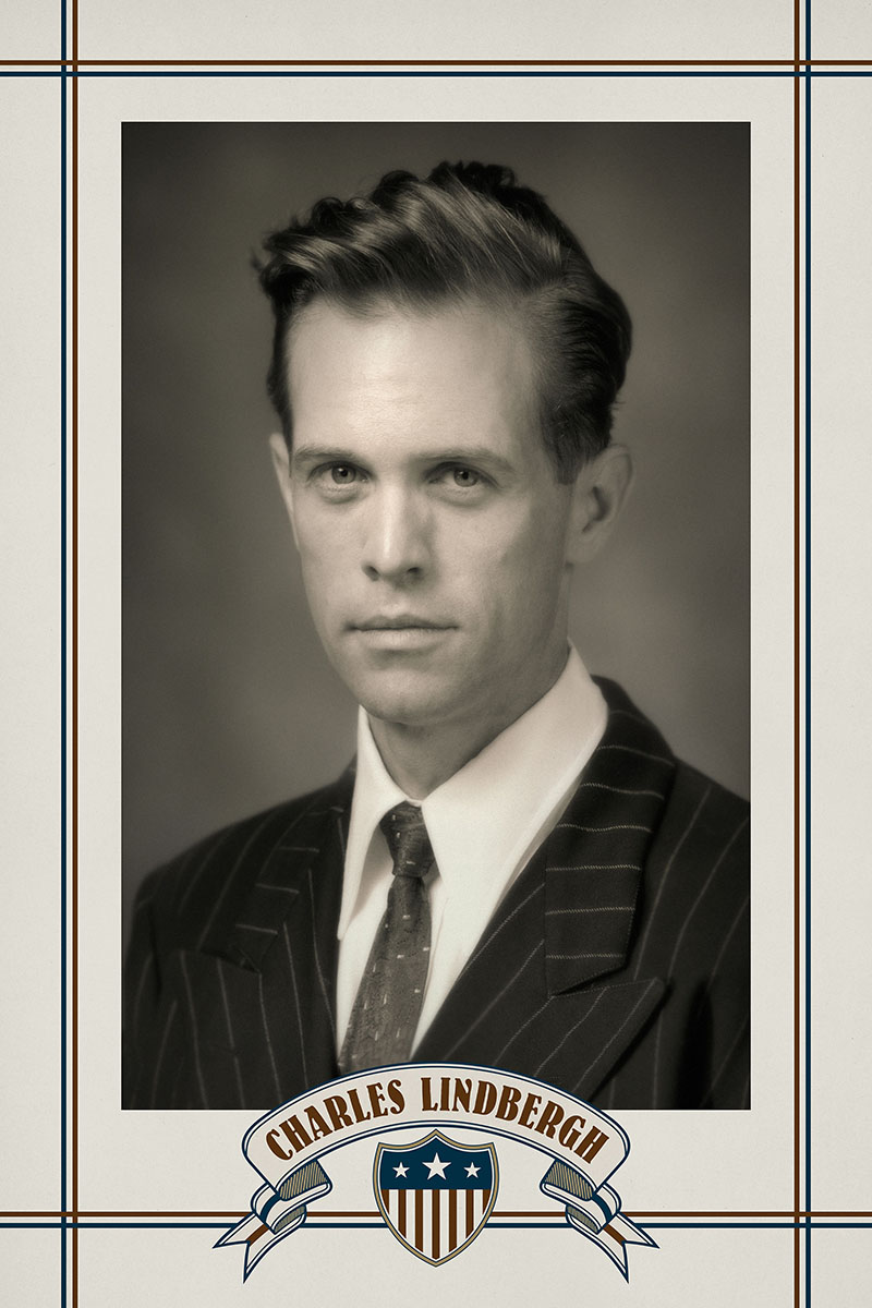
The America First logo featured there was the first item I designed for the show. David Simon had told Production Designer Richard Hoover that the logo should reflect the famous quote incorrectly attributed to Sinclair Lewis: “When fascism comes to America it will be wrapped in the flag and carrying a cross.” The eagle and banner are a composite of artworks I found on iStock. On the site I also discovered a cross made of rays, a really lucky find. It allowed me to include a large cross as part of the design in an understated manner that might even be overlooked at first glance.
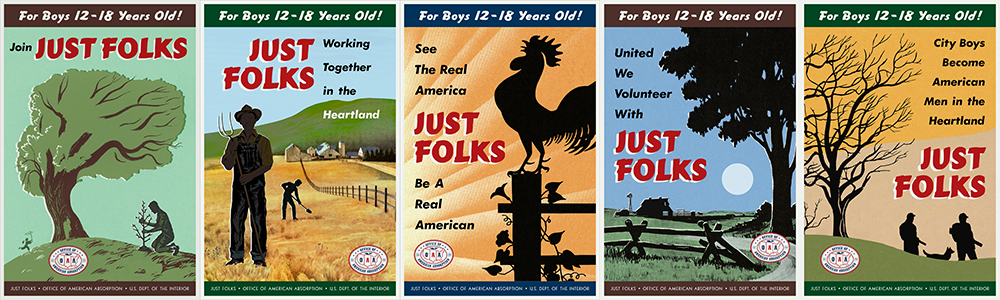
While the rally banners will get the most time, it’s the Just Folks graphics I designed that are key items for the series. They illustrate the programs Lindbergh's administration has put into place to erode Jewish identity and ultimately to relocate Jewish-American citizens out of the major cities. The audience never sees any scenes of these programs in action, they are only spoken of and represented by the graphics. The first set of posters puts a happy face on a program whose intent is sowing division between the Jewish-American children and their parents. The second set features photographs of these boys, happy on the farms of rural America. Since there weren’t any scripted moments focusing on the first set of posters.
The second group featuring the farm boys was written in the script, and ties into what’s likely the most important prop piece I did, The Just Folks brochure. This was a scripted item, it’s used to show both Sandy Levin’s thorough indoctrination into Lindbergh’s new America, and how far his Aunt Evelyn (Winona Ryder) will go in her allegiance to Rabbi Bengelsdorf (John Turturro), and against her own sister Bess (Zoey Kazan). It showcases Sandy Levin working on a Kentucky tobacco farm, an image that I was responsible for figuring out and executing. This prop will likely get the most screen time, it's at the heart of the dilemma the Levin family faces as their own son turns against them and the culture he comes from.
Another important part of this set is the United States map in Evelyn's office at the OAA showing the growing Just Folks program. Its relatively small at first, but when we go back to her office in a later episode it has greatly expanded.
A variation of the map was created for Lionel Bengelsdorf's OAA office within the U.S. Deptartment of the Interior in Washington D.C.. This version shows the plans for Homestead 42, a forced relocation program wherein Jewish employees of some of America's largest corporations face an ultimatum, to keep your job you must accept a forced move to a rural state. Herman Levin who works for the Metropolitan Life Insurance Company is himself faced with this decision.
A featured photo will be a composite I did featuring young Bess and Evelyn in front of their father's grocery store in 1910. We were fortunate to find and license an excellent shot of a storefront from the Ontario Jewish Archive. A couple of young girls were hired to be Bess and Evelyn, and there was a dedicated photo shoot. We see the photo as the sisters sit shiva for their mother. Bess has found the picture among her mother's things and suggests Evelyn might like to have it. However she's dismissive of the idea and hurts Bess's feelings. This comes at a time in the story where Evelyn is in full allegiance to Rabbi Bengelsdorf and has risen to a position of authority at the Office of American Absorption.
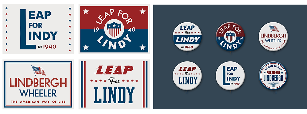
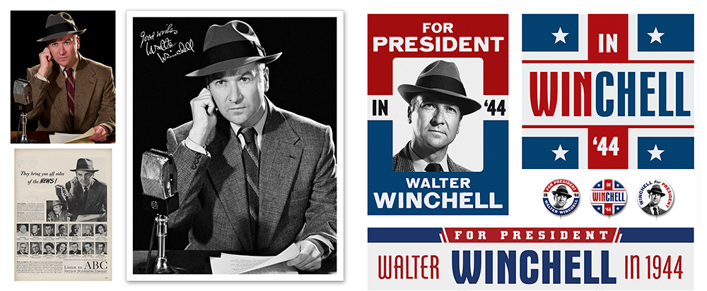
I’m sure we’ll get a good look at the Lindbergh campaign pins and placards too, over the course of several scenes. The Walter Winchell campaign rally is another scene where the graphics quickly sell the scene. [Winchell was an extremely American popular radio commentator who was both Jewish and an outspoken critic of Hitler.] Contemporary editing styles really speed things along these days, and even though this is a period piece I’ve no expectation that the graphics will be lingered over too long.
SH: I'm sure you've looked at many films of the period 1930s to 40s. I've always noticed in Nazi-era films that the costume or prop people did something wrong. I know in Plot there are items regarding Lindbergh's campaign and anti-semitic materials that did not exist in the past, what was your process to insure these seem authentic?
ER: As with all projects the answers come from the research. For Lindbergh’s campaign materials it was Republican candidate posters and pins from the 1930’s. Although the fictitious Lindbergh presidency would take a radical shift, it’s run-up would be a typical Republican effort. At the time when I needed to get the Lindbergh campaign graphics done they hadn't yet cast the role so these pieces only use typography and color. The Walter Winchell’s campaign graphics drew from those of Franklin Roosevelt. We did quite a few Roosevelt posters and pins too, those were direct re-creations except for the photos which were all found at the Library of Congress digital collection.
The key to finding the tone for the Just Folks recruiting posters was a period Boy Scouts poster that one of our graphics team found. It had a stark simplicity, the figures were in silhouette, it just felt right. Based on that piece I asked for images that related to it be searched for on iStockphoto. There wouldn’t be time or budget to create original illustrations for this first set of Just Folks posters, they would have to come from our iStock subscription where they would also be guaranteed clear for use. From the images compiled I selected six for the poster set. I then had some of them simplified and tweaked to work better for their intended use. Further alterations were made once I began designing the posters and needed to accommodate the typography. While the goal was to design attractive propaganda posters that would feel correct for the period, I also kept in mind that these were U.S. government generated items. With that in mind I kept to a simple layout, without flourish. As part of this process I also designed the OAA seal which would be featured on each poster. For this usage it was done in red , white and blue, everywhere else it would be just one color. One of David Simon’s co-writers Reena Rexrode supplied the headlines.
For both the Just Folks brochure and the second series of posters featuring photos of Jewish boys who took part in the first program, it was critical to find actual period photography. While there were a few photos on iStock that were usable as secondary shots in the brochure, it took the quality assets of Getty Images and Alamy for the farm boys to be found. Two of those photos are by renowned American photographers. The shot of Sandy Levin on the tobacco Farm was a composite of actor Caleb Malis into a Berenice Abbott photo. The teen on the Stark Field leaning on his backhoe was by Dorothea Lang. I looked into using U.S. Farm Administration photos that are available through the Library of Congress, but HBO legal wouldn't give clearance since the copyright holders could not be determined.
SH: What for you was the most surprising (or even the most haunting) part of the experience of producing this stuff?
ER: Most surprising is that we actually pulled this off given the tight and ever changing shooting schedule. I can say without hesitation that this was the toughest project I’ve ever done in the 28 years I’ve been doing this job. I think any of the other graphic designers who worked on the show would say the same. I'm indebted to these talented people who worked so hard to get it all done.
Most haunting is the collision between the fiction Philip Roth wrote sixteen years ago and the reality of where this nation is today. I was conscious from the start that this series will be closely looked at given the times we live in, and that there was a great feeling of responsibility to insure we'd all get it right. As a graphic designer who's Jewish it’s certainly strange to be designing propaganda for a fascist and anti-semitic American administration. I don’t know that I could ever have been comfortable doing a project like Man In The High Castle with its overt Nazi imagery, but thankfully the graphic world of The Plot Against America didn’t require that.
SH: How many items would you say were created? How many designers were there in your crew? How long did it take?
ER: Over the eight months of production, hundreds of items were designed, along with reproducing scores of facsimile posters and ads from the period. While I've only discussed prop and set decoration items thus far, there were several urban streetscapes that were fully designed with shops of the period, each having multiple signs and advertising dressing. There were also several billboards created. Many of the more obscure items we needed for set decoration graphics had to be mostly or entirely recreated. While we might find a decent research image and get clearance to use it, the resolution was usually poor so they could never be enlarged and printed for use on set, a full on vector redraw and typesetting was required. Other times we were allowed to use the item but had to find replacement artwork from a cleared source, especially so if it used the image of a person. In the lucky cases a high quality image or file would be found, but those would still require a certain amount of retouching and color restoration.
We began the production with a graphics staff of three including myself. It quickly became clear that with the limited prep time, and the sheer number of projects, additional help would be needed. Soon there were five of us on full time, with additional designers working remotely as needed. By the second block of three episodes all concerned understood we needed to remain at five in total, the work couldn't be completed with fewer than that. There was one weekend early on where including myself, seven graphic designers were working. In that case I had learned late on a Friday evening that the schedule had changed and a New Jersey street which would feature a major scene at Tabotchnick’s Deli would film that coming Wednesday. In order to design and fabricate everything for complete installation by Tuesday I'd have to assemble a weekend crew. I was so backed up with my own projects at that point that I would be designing the first set of Just Folks posters that weekend and couldn’t help with the street beyond giving my art direction.
Most designs for film and television graphics are generally done within the span of a half day to two at most, there just isn’t any more time available. There are exceptions of course, but that’s the way it is. The illustrated art deco triptych panels I designed for the Hahne’s department store are one of those, and there were actually five panels designed per the original plan. These were all original designs and took over a week to finalize. In addition there were other decorative pattern and logo panels I designed as a blocking device for that Bank of Newark filming location. In the end these pieces which will likely be blurry decoration in the background took about two weeks.
Newspapers were a major storytelling device, and I recommended to the Props department that they hire Ross MacDonald to take charge of this area. I had hired Ross on other projects to deal with fabrication and printing of vintage items and knew he was the perfect person for the job; he has contributed to many films with his own vintage prop designs and facsimilies. Herman Levin is often seen reading the Newark Star-Ledger at the dining table. It’s headlines on Lindbergh and the war in Europe help tell the story of this alternate turn in history. I knew there was no way I would ever have the time to deal with the many detailed layouts involved. Newspaper props are very time consuming, and these papers would have to run on a real press. Throughout the process I provided Ross with art direction, and the photos to be used and also worked with the show's script coordinator on getting headlines and copy written. Over the course of the production nearly thirty papers were made, including the Newark Star-Ledger, P.M., The Guardian, and the Yiddish newspaper, The Forward. Ross also made several facsimile stamp collector’s albums from the period long with various postage stamps including the U.S. issues desecrated with the Nazi swastika in Philip's nightmares. [Ross was assisted by designer James Reyman.]
A project that caused me concern from the start were several scenes featuring newsstands. In the period from 1940 to 1942 the majority of periodicals featured illustrated covers. Where we could find cleared art from the period, and do so within our budget had me worried. I assigned this project to one our designers and asked her to seek out magazine candidates. Once she had ten good ones, mainly those featuring photos, she went on to find photos and some illustrations from iStock and the Library of Congress. This carried us through the first couple of small news racks. However the fourth episode called for a large newsstand at the Newark train station for the scene where Alvin returns home from Canada. By this point in the production I had a bit of luck. First, HBO was now allowing us to use the Alamy stock image site which they had previously denied. They have a huge volume of quality vintage art and photos, and from that point on they became our main source for vintage art. Second, things had calmed down enough between the end of Block 1 and the beginning of Block 2 that I was able to have three designers spend most of their time on the magazine covers over the course of two weeks. Around 25 covers were completed in the end and we had what was needed for the shot.
SH: There are always people who look for the typographic inaccuracies and enjoy exposing them as gotcha-moments. . .
ER: We all strive for accuracy and want to be true to the time period the story takes place in. For a graphic designer the use of period correct typefaces is a prime responsibility. As I’ve come to work on larger projects and have other graphic designers working under my supervision I’ve had to police typefaces used. Not everyone is fully aware of a particular style’s date of creation or discerns the difference between a 1970’s neo-art deco typeface from a true design of the 1930’s. It may look right, but if it’s not correct another choice has to be made. Fortunately there are scores of quality vintage fonts of many periods available now. While they may be contemporary in their date of creation, the typographers creating the best works are providing us with well-crafted and very credible period type styles to work with.
I've amassed a huge graphics library and always bring a relevant batch to the office, and also encourage others to get their own. Many think everything can be found on the internet now, and while there's wealth of great images to be sure, it's still essential that printed research sources are sought out.
One of the challenges in designing graphics for the screen is that they must read very quickly. Screen time is precious and your work may only have a second or two up there. Insuring readability is always a priority. When designing for past periods I sometimes have to forsake that reality a bit for the sake of legibility. There are so many beautiful graphics I’ve seen that could never be emulated for the screen for being too detailed and intricate to take in.


