“Writing is like driving at night in the fog. You can only see as far as your headlights, but you can make the whole trip that way.” —E.L. Doctorow
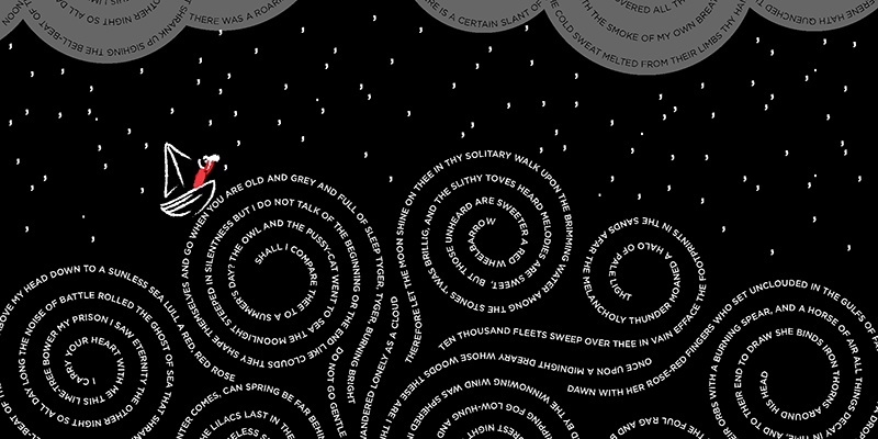
The syntactical and grammatical intricacies of the written language are rarely thought of in terms of experience design. But nowhere is this relationship more apparent and painstakingly wrought than in the forms of poetry. From the lengthy forewords disclaiming what was lost in translating Homer to the precise typographic decisions of e.e. cummings, meaning and form have never been more intentionally intertwined and carefully preserved than in poetry. The writing of a poem is the designing of an experience.
But what kind of experience? Is it visual, as we perceive the frail figure of a haiku: three short lines surrounded by white space? Is it auditory, as we hear rhyme, meter, and onomatopoeic words in our heads? Or is it both, as we recall how poet Allen Ginsburg howled in a San Francisco gallery?
As we read Shel Silverstein’s “Sarah Cynthia Sylvia Stout Would Not Take the Garbage Out” on a page illustrated with a tiny Sarah fleeing from under a towering heap of trash, we feel the momentum as “[t]he garbage rolled on down the hall,/It raised the roof, it broke the wall…”
And just then, Silverstein’s poem—so far a wall of text—encounters a page break. We experience the auditory and the visual together; the reader’s experience encompasses both.
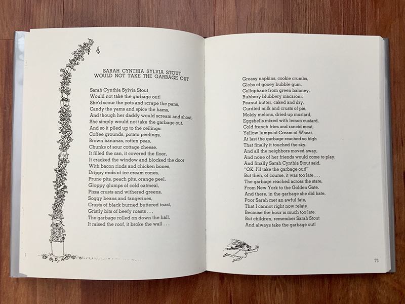
Spread from Where the Sidewalk Ends, by Shel Silverstein (1974).
We see this break, and this makes us pause for breath (which we hear) before we dive into the stack of lines:
Greasy napkins, cookie crumbs,The poem itself is a lasagna of language—or perhaps more fitting, a compost heap—that Silverstein has carefully, thoughtfully layered. Structure, rhythm, and rhyme are higher level techniques for shaping the user experience of language. Consider this passage from Robert Frost’s “Design”:
Globs of gooey bubble gum,
Cellophane from green baloney,
Rubbery blubbery macaroni.
I found a dimpled spider, fat and white,The punctuation is as visual as it is auditory. While he could have chosen any rearrangement of syntax or punctuation, Frost chose commas in the first two lines—giving the effect of a spider hanging about, or a dimple. With all the tools of language at his command, Frost selects an em-dash after the unexpected juxtaposition of “rigid satin cloth”—a line that evokes the shape of a sheet of rigid cloth. He employs another em-dash to follow “a witches’ broth”—a line not unlike that of a wand, broomstick, or spoon in a cauldron.
On a white heal-all, holding up a moth
Like a white piece of rigid satin cloth—
Assorted characters of death and blight
Mixed ready to begin the morning right,
Like the ingredients of a witches’ broth—
A snow-drop spider, a flower like a froth,
And dead wings carried like a paper kite.
Is this stretching the reader’s right to interpret meaning? Perhaps Frost would have been surprised at these perspectives. But like many designers, Frost created intentionally and wished his work to be carefully considered; he once said about poetry, “Why not have it imply everything?” In other words, a reader (the user) has an illimitable right to be a critic of poetry (the designed product). He even closes the poem with this stanza:
What had that flower to do with being white,Frost’s use of the word “design” here hints at a greater design behind life, like a larger, purposeful force that rules over the intentional creation of things. But he focuses, ironically, on the details of the smallest life forms: a flower, a spider, a moth. Design is in the details; it is made of details. And so is writing. Oscar Wilde is thought to have said, “I was working on the proof of one of my poems all the morning, and took out a comma. In the afternoon I put it back again.” Yes, design does govern in a thing so small.
The wayside blue and innocent heal-all?
What brought the kindred spider to that height,
Then steered the white moth thither in the night?
What but design of darkness to appall?—
If design govern in a thing so small.
Our visual and auditory experiences are shaped by syntax and punctuation, along with all the other tools of our language. As readers, writers, and designers, we must never assume that a writer chooses words or punctuation unintentionally, just as we by default do not assume a painter combines colors or brushstrokes thoughtlessly. These details, whether internationally placed or not, whether actively perceived or not, create the full experience.
Although reading text for its visual messages hasn’t become common practice in our schools and universities (with rare exceptions of intensive close-reading units in more advanced literary criticism or creative writing courses), this is a skill that can be learned. Poetry is a good place to start, for readers and writers of any age. Whether read to children or gifted to a grandparent, poetry transcends time in its pursuit to share the human experience. And human experience takes as many forms as poetry has taken—brief, lengthy, narrow, wide, structured, or rambling.
Ultimately, poets are designers. Their tools are letters and punctuation. Their goal is to evoke sensory experiences as rich as life itself. What results when we read a sentence, then, is a journey not unlike “traveling at night in the fog.” We strain to seek clarity as we are steered into a visual and auditory world where we see pauses and hear the unexpec—! Yes, Robert Frost took the road less traveled by, but that is not what has made all the difference. It’s also that he designed sharable experiences. And that we, as readers, have followed him into that yellow wood, willing to experience every leaf, every comma.