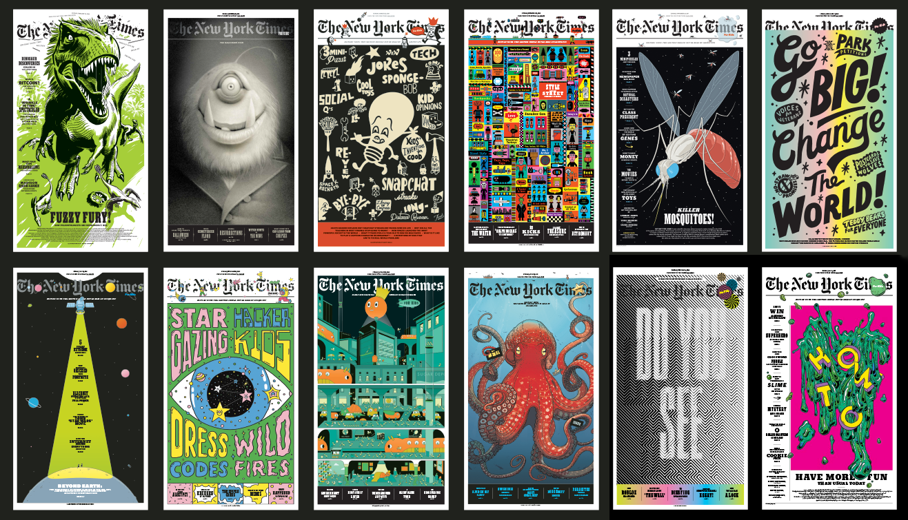
Selected The New York Times for Kids covers, art directed by Deb Bishop. Illustrated by (left to right, top to bottom) Kikuo Johnson, Travis Louie, Gary Taxali, Henning Wagenbreth, Anuj Shrestha, Kate Prior, Giacomo Gambineri, Super Freak, Giacomo Gambineri, Jared Muralt, Sawdust, Kelsey Dake
Deborah Bishop’s career is proof that she is among the most innovative magazine designers in the field today. Starting as a deputy design director at House and Garden, the SVA grad became the design director for Martha Stewart’s Kids: Fun Stuff to Do Together, Blueprint Magazine, Martha Stewart Living, and More Magazine. In 2017 she became art director for special projects at The New York Times Magazine Group and NYT Magazine Labs. Among her signature publications is The New York Times for Kids, an incredibly luscious broadsheet newspaper/magazine that appears, curiously enough, only in the print Sunday edition of The Times. Each issue is a treat for kids of all ages, while smartly and wittily addressing the next generation of Times “truthers.” I recently asked Bishop to discuss the beginning and continued evolution of this innovative periodical, all the while wishing I had had the idea when I was at the Times.
Steven Heller: How did the idea for the special broadsheet magazines come about?
Deborah Bishop: The New York Times Mag Labs Dept. is part of The New York Times magazine group and was started by editor-in-chief Jake Silverstein and design director Gail Bichler. Our team was created to make products that enhance the Sunday newspaper subscriptions by bringing to it, experimental storytelling and design with magazine ingenuity. We do two sections a month in the Sunday edition of the paper. One section for adults on a broad range of topics such as Genetics, Puzzles, Fiction etc. and we also create The New York Times for Kids.
SH: They are graphically bold and typographically beautiful. It seems that these fit your design style to a “T.” How would you describe them?
DB: These special sections are kind of like designing a very big magazine feature, or designing a new magazine for each new topic. We have to think about how to keep them cohesive visually throughout many pages and create a custom grid design for each, which suits my design experience. It is important to make them as beautiful as The New York Times Magazine typographically as they are an extension of the magazine brand. We aim to take advantage of the immense newspaper scale, but also to try to tweak how newspapers are typically laid out. The covers are posters.
The New York Times for Kids is a whole new entity within The New York Times so I was really thinking about how to create a visual brand within the Times without talking down to kids—not to be a sad reproduction—but something different that was cool. The idea of the big logo and separate “for kids,” was important because it allowed us flexibility to create a bespoke logo for each cover. Initially we considered a more newspaper-style front page with multiple stories but I really wanted to do a magazine style cover to make it stand out graphically within the newspaper. We strive to keep the design and artwork to the same sophisticated standard as The New York Times Magazine. Kids are visually sophisticated and we are hoping that adults will enjoy it too.

The New York Times for Kids art directed by Deb Bishop, illustrated by Bill Mayer.
SH: How are these special kids issues doing? I know I look forward getting them, do kids anxiously anticipate them as much as I do?
DB: They seem to be doing very well. I don’t have any numbers but we get great feedback. Adults want to read the Kids section and they seem to be anticipated each month by both kids and adults. Readers often want us to publish more of them but I don’t really think it would be the same product if we did it weekly or we would need a much bigger team!
SH: What is the process of deciding upon a theme?
DB: On bespoke sections, like Fiction or Genetics, story ideas come from my partner and editorial director, Caitlin Roper. She often works with other editors at the Times to bring ideas to the Labs table but once in a while an idea comes out of our mutual interests. Together we discuss sections for the year, to make sure we can package them well both editorially and visually. Since we both come from magazines, we tend to work more collaboratively than the newspaper teams—content informs the design and vice versa.
For Kids: Our center spreads are very important to the overall theme of an issue and usually dictate the cover. We work as a team to come up with the year’s line-up. We like science a lot but we also like to just have fun. Our themes are often connected to the news or the season. It’s important to us that the middle spread be something that is worthy of being so big. Usually it’s something that is informational, they can draw on or write on, or they will want to keep as a poster.
SH: How do you keep them “Timesean”?
DB: We use only Times fonts at the moment which helps keep them looking like the same brand. Black is our favorite color. The New York Times logo does a lot of work for us whether we run it big or small as it’s a powerful signature. Even the newsprint makes it feel Times-like. The idea of playing with the logo on ”Kids” actually emphasizes the iconic-ness of The New York Times brand but allows the “Kids,” brand to be slightly irreverent and cool.
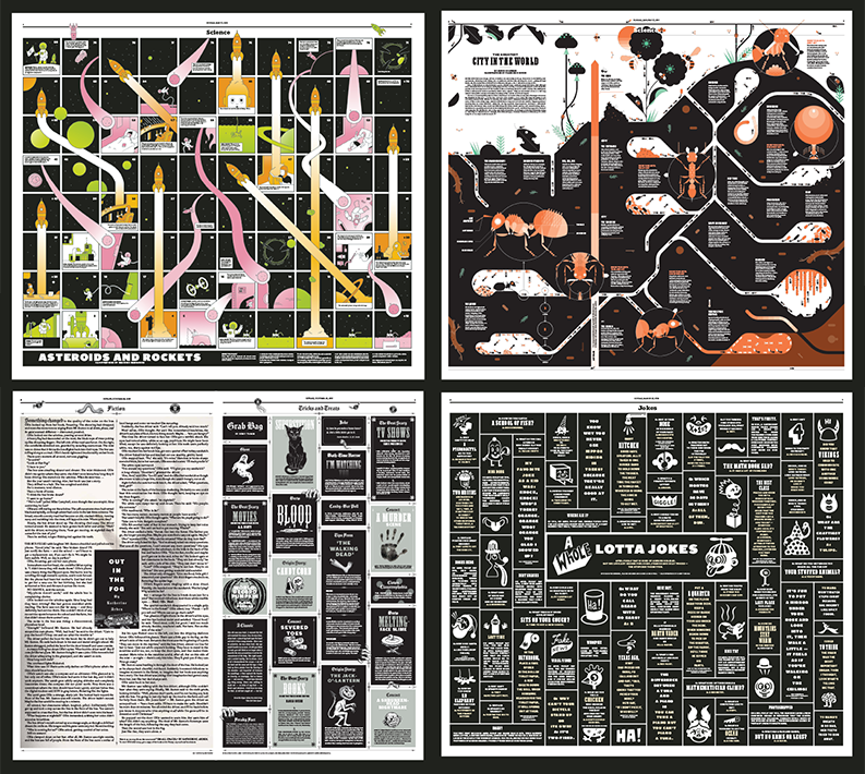
Selected The New York Times for Kids spreads, art directed by Deb Bishop. Illustrated by (left to right, top to bottom) Giacomo Gambineri, Francesco Muzzi, Kyle Hilton And Jon Macnair, and Gary Taxali
SH: What is the design structure?
DB: The adult sections are fairly loose— each is completely different in every way except that we only use the NYT magazine fonts and text styles, and there is a certain standard we are trying to achieve from a visual perspective that only really good designers get.
With the Kids section we have a format and family of fonts that we stick to. The slugs define each page from a content perspective and we don’t break out of these set styles or content slugs too often. The slugs create a very eclectic mix of subjects. One way we pull each issue visually is by adding what we call ”sprinkles,” (tiny spots) that help pull this very eclectic mix of subjects together visually over twelve pages. That’s really my job. “How do I pull all this stuff together?—to make it feel considered and smart.” “How do I create a package?”
SH: Is this like anything you’ve done before?
DB: I have worked on a variety of kids projects during my career. Early on while I was working at Rolling Stone I was moonlightling on weekends for “Let’s find Out,” a Scholastic venture. While at Martha Stewart Omnimedia I co-founded Martha Stewart Kids, so I have some experience working with the subject matter. The trick to working on Kids content is to never talk down or lower your standards visually—there is so much potential.
SH: Keep ‘em coming!


