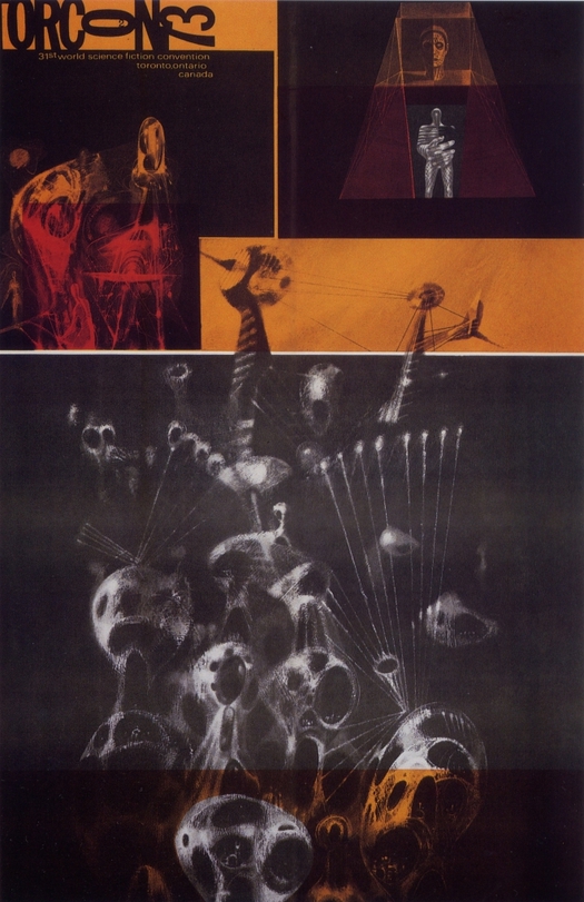
Richard Powers, Torcon 2, poster for the 31st World Science Fiction Convention, 1973
Anyone reading this blog regularly will be aware of my not so secret enthusiasms for Surrealism, science fiction and the writing of J.G. Ballard. A special issue on SF in the Guardian Review last weekend has presented a grab-it-while-you-can opportunity to talk about all three, with particular reference to Richard Powers (1921-96), an artist and illustrator whose work offers perhaps the ultimate fusion of Surrealism and visual SF.
The Guardian asked leading SF writers to choose their favorite novel or author in the genre and tell readers why. For the novelist Christopher Priest, author of The Prestige (later made into a film), it had to be Ballard’s short story “The Voices of Time,” first published in 1960. Here’s what Priest says:
The plot almost defies summary. An imminent global disaster is seen from the viewpoint of a group of sleep-addicted scientists, slowly going mad in a desert installation surrounded by salt lakes, where genetic experiments have bred mutant animals to resist the radiated atmosphere. Meanwhile, a countdown to the end of the universe has begun, a suicidal madman engraves a mandala on the floor of an emptied swimming pool, a sleep-deprived astronomer cruises the dunes in a white Packard saloon, a raven-haired temptress named Coma plays the men off against each other. Somehow it all seems to make crazy and brilliant sense. I have read the story a dozen times, never actually understood it, but also have never failed to draw inspiration and encouragement from Ballard’s pellucid writing and amazing and surreal images.
If that delirious stream of images doesn’t convince you that you need to read Ballard, then nothing will.
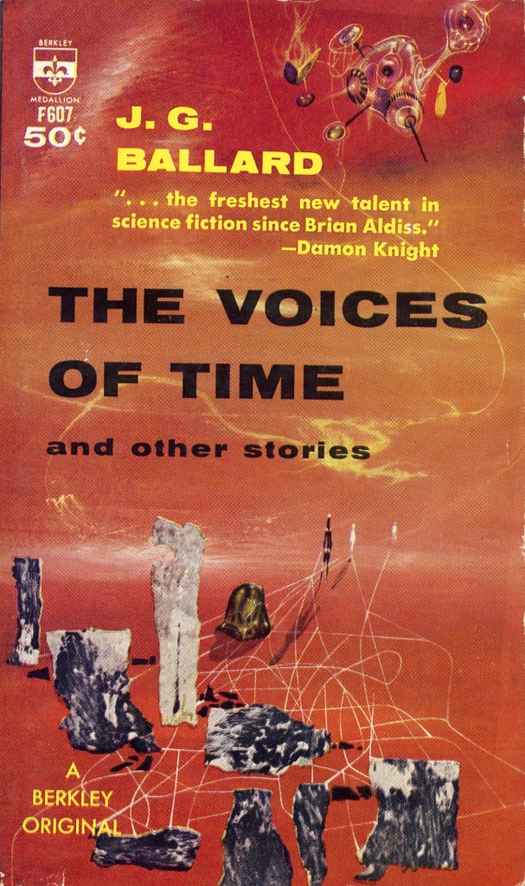
Richard Powers, The Voices of Time, book cover illustration, 1962
Each of the selected books was illustrated with a cover and these images, especially the early ones, are always a key part of the fun with surveys like this. For “The Voices of Time,” the paper showed the Berkley Original cover published in 1962, with an illustration by Richard Powers. The image doesn’t have much to do with the story, except perhaps as a tenuous visual metaphor, but I’m not going to object to that here. I rather like it. Powers was such an interesting artist that I’m prepared to see him as a book cover auteur who found opportunities — an astonishing quantity of opportunities — to express his vision for financial reward on the handy, ubiquitous tablets that paperback publishers duly provided. You might almost say that the books’ authors were lucky to get him. When The Voices of Time short story collection was reprinted by Berkley in 1966, Powers readily produced another cover image. Here again, he takes the infinite landscapes and near sentient abstract forms seen in the paintings of the Surrealist Yves Tanguy, which strange as they are, don’t necessarily imply we have left Earth's atmosphere behind, and renders them incontrovertibly extraterrestrial.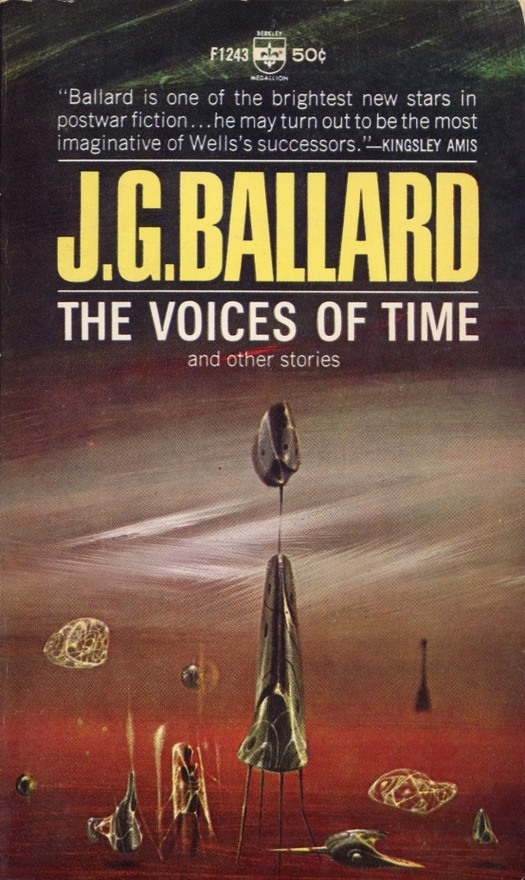
Richard Powers, The Voices of Time, book cover illustration, 1966
Powers’ massive oeuvre of printed work can be studied online at the dizzyingly comprehensive Powers Compendium. The Guardian’s selection also included a 1953 cover for Clifford Simak’s City, when Powers’ work was still clunkily figurative and literal, if one can say such a thing about imaginary alien life forms. In later cover paintings, which are shown without type in The Art of Richard Powers by Jane Frank (2001), Powers constructs ambiguous pictorial spaces that seem to be both psychic and cosmic, molecular and planetary.
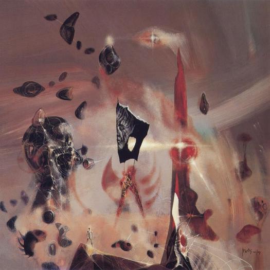
Richard Powers, The Shape Changer, acrylics on wood, 1973. For a novel by Keith Laumer
In The Shape Changer, a small humanoid figure glowing with light confronts an awesome vortex of rushing vapor and swirling space debris. There are smooth, pebble-like bodies inscribed with markings that could be floating talismans or alien space-pods, and a giant head veined with luminous threads that might be a living rock formation or an organic machine. Paintings like this recall the pulsating visionary art of the Chilean Surrealist Roberto Matta (see these galleries). Powers’ images, exercises in pure painting that constantly push towards abstraction, are far more suggestive than the naturalistic style of illustration (often by airbrush) that dominated SF book covers in the 1970s, not that art directors always seemed to know how to use Powers’ gifts. The Shape Changer was all but crushed by bizarrely over-emphatic typography, while an earlier image for the Science Fiction Omnibus (1963) — Action Painting meets mystical Surrealism — was heavily cropped on the book, stripping it of the full force of its vertiginous energy. Celestial beings once again merge with the fabric of space.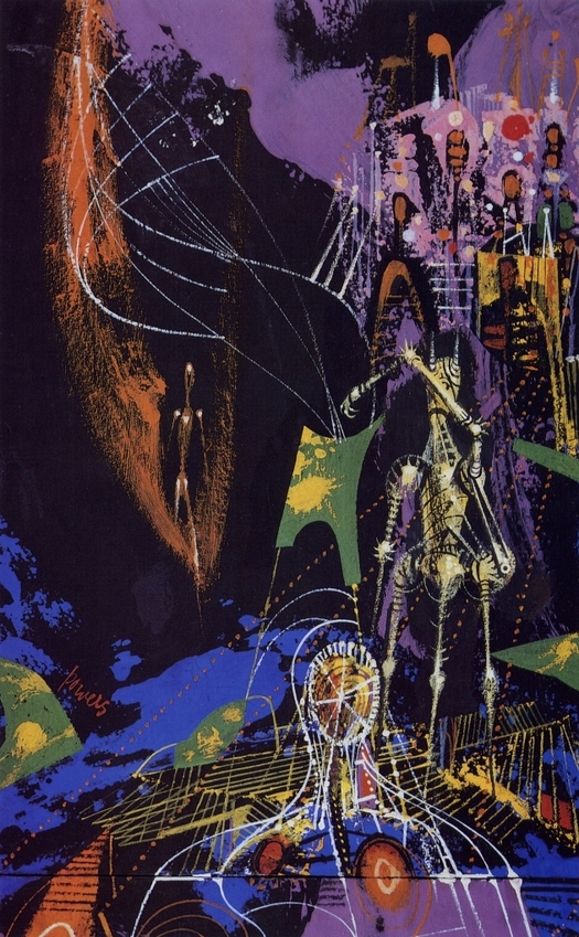
Richard Powers, Science Fiction Omnibus, acrylics, 1963. For an anthology edited by Groff Conklin
Earlier this year, the Courtauld Institute in London, a bastion of traditional art history and scholarship, held a conference titled “Surrealism, Science Fiction and Comics.” The single-day event probably attempted to cover too much ground — I would like to have seen fewer comics and more SF — but it was certainly a sign of the way that the study of Surrealism’s cultural impact continues to make connections with as yet barely researched areas of inquiry. The relationship between Surrealism and science fiction has the potential to be especially fertile and illuminating and one might have expected some consideration of Powers at the conference, but no one spoke about him.
Any future study of the interconnection of Surrealism and visual SF (particularly in the 1960s) needs to rectify this oversight. Jane Frank’s book has sections on abstract Surrealism and Surrealist techniques, and Powers, though by all accounts an elusive interviewee, was open about his visual influences and the sources for his stylistic experiments. Frank writes that, “he sought to penetrate a zone of discovery and revelation where there is no boundary between verbal and pictorial images.” The book is a fine starting point, but open-minded scholars more fully versed in Surrealism’s history and concepts would bring vital new perspectives.


Comments [11]
05.19.11
08:07
Yes, I grant that one on discussing Powers: the sloppy typography that surrounds many of his paperback cover images diminishes their visual powers (no pun intended) and certainly lowers their attempts to connect with the book within.
05.19.11
08:30
05.19.11
03:02
By the way: I still think that Rick Poynor should consider a monograph on this subject, the cross-pollination between SF and Surrealism. SF imagery and its study have been in the hands of the "airbrushed (now Photoshoped) spaceship" brigade for too long, they lack a fresh perspective.
05.19.11
03:30
I completely agree about the inadequacies of the other Ballard-Powers covers, but I think a broader assessment of the quality of Powers' work as an SF artist can't be confined to the Ballard covers and needs to take in many more examples. Then there are two main issues to consider. First, the quality of the art as art. (Does it draw on Surrealism and other sources adequately? What did Powers add? Is this good art?) And second, the issue of art direction: did the designers who used Powers' images employ them sensitively, as interpretations of the texts and as well resolved cover designs? Clearly, many of them did not, but the first question is the one that interests me more. Have you seen Jane Frank's book? The paintings are very well shown there.
05.19.11
05:11
And allow me to insist: I would crave a Rick Poynor book on this general subject of SF and Surrealism. As a self proclaimed surrealist you owe it to yourself (and us the readers). Will you write anything for any book that will presumably come out of the British Library SF exhibition, by the way?
05.19.11
05:46
I knew him, and have more than a dozen of his paintings, including Ballard's VERMILION SANDS.
He was very well-read, and didn't care much for many of the books he illustrated, but he respected and liked Ballard's work.
05.20.11
11:38
I'll be reviewing the exhibition for Creative Review.
I didn't see anything on Powers in either the exhibition or the book, but that can't be called an oversight (even if it's a shame) since neither is primarily concerned with SF art as a genre, though a great deal of SF art is inevitably shown.
Ballard is well represented, with books and corrected manuscripts, and it's possible to listen to "Warm Leatherette" by The Normal, inspired by Crash, on headphones while looking at a vitrine of Ballard material. That's an experience I never expected to have at the British Library. The electronic track, dating from 1978, still sounds coldly futuristic and utterly perverse.
05.22.11
07:07
And (not wishing to insist too much) do consider writing or editing THAT book on SF art. I (and many more) would crave it.
05.22.11
05:56
05.23.11
10:36
Surrealism for the masses? Yes, it is. But the "masses" in this case is a well-defined subculture — science fiction fans and readers of the 1950s, 60s and 70s. I'm interested in the diffusion of ideas and images imported from Surrealism into everyday graphic communication, and Powers provides a particularly salient example of this phenomenon (whether one likes his work much or not). His art is fascinating both as cultural history — as a sign of the wider impact of Surrealism as it filters through popular arts and communication — and for its place in the history of graphic design and illustration, where it has still to be thoroughly assessed.
05.24.11
04:25