
Illustration for The Atrocity Exhibition by Phoebe Gloeckner, Re/Search, 1990
J.G. Ballard is unusual among writers of fiction for being perceived primarily in terms of his imagery. The term “Ballardian,” now in wide critical use, has become shorthand for a particular kind of location, object, conjunction of objects, or atmosphere. As many interviews with Ballard, who died in 2009, have made clear, his principal influences came from visual artists and he sometimes spoke of himself as a frustrated painter. Images and ideas drawn from Surrealism and Pop informed his writing to a degree that sets him apart from other contemporary writers operating at a similar level of imaginative intensity.
All of this might seem to offer highly promising source material for anyone whose task is to represent Ballard, his oeuvre or specific works in the form of a visual image. This essay explores the ways in which Ballard’s worlds and worldview have been represented as visual imagery in the media. My focus is not on the texts, but on their visual interpretation. Book covers are central to this discussion, though I also consider other kinds of illustration, photography and typography, concentrating in particular on The Atrocity Exhibition (1970). These images, which are not usually given any critical attention at all, can be understood as a form of evidence for the meanings the books hold for their audiences. They can also be seen as a kind of highly condensed commentary on the texts, especially in their cumulative effect over time. Many of Ballard’s covers circulate on websites run by enthusiasts and collectors and they are often used in articles about his work on the Internet.
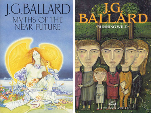
Left: Design by Bill Botten, Jonathan Cape, hardback, 1982
Right: Design by Craig Dodd. Illustration by Janet Woolley, Hutchinson, hardback, 1988
When it comes to his book covers, Ballard has not been served well by most of his publishers. Simon Sellars, introducing an interview with Ballard collector Rick McGrath on his Ballardian website, describes them as “the trashiest covers this side of Philip K. Dick.” A commenter on the thread agrees: “If there were an award for Writer Most Abused by His Publisher’s Designers, Ballard would have to receive the lifetime achievement award [. . .] It’s a real testament to his prose that you stomach some of those cover illustrations to read it.” I share these views. I bought hardback editions of Ballard’s books as they were published between 1979 and 1991 with an unvarying sense of dismay at the covers’ failure to match my perceptions of the writer they represented — or rather misrepresented. Rather than assemble a rogue’s gallery of the many Ballard cover disasters (the two above are typical), I would rather concentrate here on cases that seem more purely Ballardian.
One might ask, of course, whether it matters much anyway. Is a book cover anything more than superficial packaging, a kind of advertisement that has no purpose other than prompting a purchase? While that might once have been a literary person’s view of covers, it is no longer adequate, particularly where a visually knowledgeable writer such as Ballard is concerned. (To explore this issue properly would require a lengthy detour into the history and development not just of book design but of late 20th century graphic culture.) Ballard certainly understood the importance of the visual for contemporary audiences. In an interview published in 1981 he explained:
“I’ve always been conscious since I started writing that the tide was running the wrong way for the writer, whereas the visual artist, the painter or sculptor, was in a seller’s market; the direction of the twentieth century was ever more visual. I sensed way back in the late fifties when I started that the tide was running away from the written word towards the visual mode of expression and therefore one couldn’t any more rely on the reader, you couldn’t expect him to meet you any more than half way.”
Ballard signalled his allegiance to Surrealism in his novels, and in his essay “The Coming of the Unconscious,” published in New Worlds in 1966, he goes so far as to specify six key Surrealist paintings with a “direct bearing on the speculative fiction of the immediate future” by De Chirico, Dalí, Magritte, Dominguez and Ernst, listed twice for The Elephant of Celebes (1921) and The Eye of Silence (1943-44). One Surrealist painting not included in the New Worlds list, The Palace of Windowed Rocks (1942) by Yves Tanguy, had already surfaced on a Penguin paperback of Ballard’s The Drowned World (1965) where a detail is used (for some reason the picture has been flipped). This was most likely chosen by Penguin’s art director, Germano Facetti, who had a brilliant eye for selecting paintings that encapsulated the mood of a text.
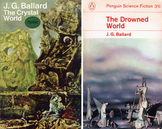
Left: Detail from The Eye of Silence, Panther, paperback, 1968
Right: Detail from The Palace of Windowed Rocks, Penguin, paperback, 1965
In 2004, in a letter, Ballard told me that he had forced his British publisher, Jonathan Cape, to use The Eye of Silence on the hardback cover of The Crystal World (1966) — one of only two Cape covers that satisfied him (“the design dept hadn’t the faintest idea what I was about”). The image was used again on the paperback. Two decades later, another Ernst from Ballard’s pantheon, Europe after the Rain (1940-42), appeared on the American cover of Memories of the Space Age, though it is a half-hearted design, with poorly matched typography. Ballard was also able to persuade Cape to use a detail from Dali’s pen and ink drawing City of Drawers (1936) on the UK hardback of The Atrocity Exhibition.
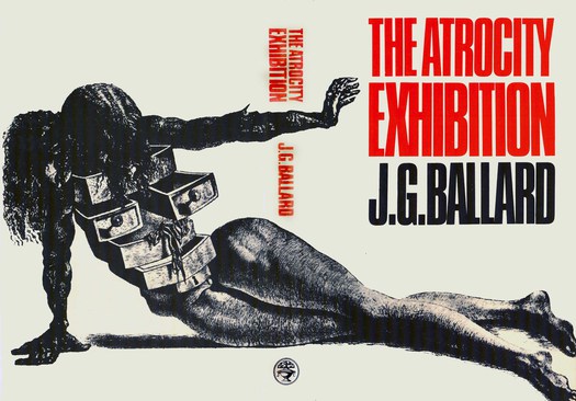
Detail from City of Drawers, Jonathan Cape, hardback, 1970
Seen in the round, the jacket has undeniable power and it was unusual, especially for its time, in reserving its principal content — the woman’s bizarre cabinet-of-drawers torso — for the concealed back cover. Yet the image has only a tangential relationship to the book, as does the psychedelic Dalí, Hallucinogenic Toreador (1968-70), used on a reissue of The Voices of Time in 1992.
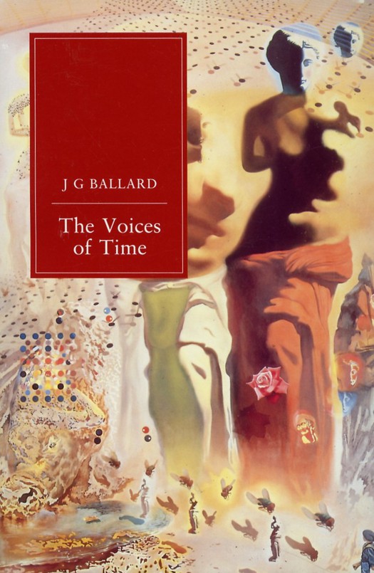
Detail from Hallucinogenic Toreador, Orion, paperback, 1992
Designs based on canonical Surrealist images can be seen as a kind of amplified citation, or a confirmation of Ballard’s allegiance to Surrealism, rather than as an interpretation of the book itself. They are Ballardian by association rather than Ballardian in essence.

Design and illustration by David Pelham, Penguin, paperback, 1974

Replica of the Fat Man atomic bomb dropped on Nagasaki in 1945
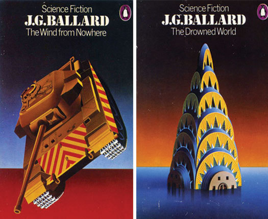
Four covers published by Penguin in 1974 are among the most purely Ballardian images to be found on any of his books. David Pelham, art director of Penguin in the 1970s, designed them and created the airbrush illustrations. The Terminal Beach (first published in 1964), the strongest of the quartet in my view, unites two Ballardian motifs, the sand fused by weapons tests in the title story and the Fat Man bomb dropped on Nagasaki, standing here for all atomic weapons. Graphic design is a form of rhetoric and one reason this image works so well is that it has been realized so perfectly. Pelham’s illustration is grounded, like Ballard’s prose, in meticulously precise observation, but he has given this scene of becalmed destructive power an intensified, hyper-real quality, most obviously in the use of color. The image is simplified and stylized yet luminously sharp and exact. The tonal gradations and shadows endow the bomb with a presence both menacing and fetishistic: it is not just a bomb in the literal sense, but an avatar of psychic unease. The centered type is flawlessly placed and weighted in relation to the image below, and the stencil typeface carries a military association that fits the subject matter of the title story.
The lack of resonance in later editions of The Terminal Beach underlines the conceptual and aesthetic accuracy of Pelham’s cover. The 1974 edition attracts attention, as a book cover should, while reflecting with considerable insight the nature of the texts inside. It satisfies the needs of both the potential buyer, at the moment of purchase, and the committed reader, who will live with the book.
Left and right: Design and illustration by David Pelham, Penguin, paperback, 1974
Pelham worked elegant variations on this basic structure and even Ballard’s first novel, The Wind from Nowhere, later suppressed by the writer, achieved temporary respectability. The Ballard series was, in addition, a sub-series that developed from Penguin’s superbly visualized science fiction series of the early 1970s, also designed by Pelham — the consistent panel at the bottom becomes the ground and horizon on the Ballard books.
Pelham was both an excellent designer and an enthusiastic reader of Ballard’s writing. Unlike so many of Ballard’s designers, he understood these books. In Penguin by Designers (Penguin Collectors Society, 2007), Pelham explains how the covers came about: “I was very familiar with Ballard’s work, having been a great admirer from way back. I admired the bleak style of his catastrophe novels [. . .] and their heartless depiction of human and technological breakdown and decay. Grim perhaps, but wonderfully written. Drawn to the romance of his apocalyptic imagery, I wanted to illustrate his covers myself.” Ballard’s friend, the artist Eduardo Paolozzi, introduced Pelham to Ballard and Pelham showed him a postcard-sized trial image for The Drought. Ballard gave his approval and they discussed the other titles.
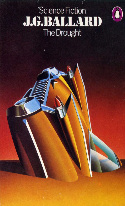
Design and illustration by David Pelham, Penguin, paperback, 1974
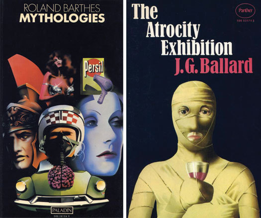
Although I don’t propose here to examine the cover treatments of Crash (1973), which I have done elsewhere, it must be clear that The Drought’s iconic, entropic car body could have functioned just as suggestively to represent Crash. Once again, the hardware’s obsessional and fetishistic qualities, the eroticized gleam of the car’s accentuated chromium trim, the eerie light and sickly plasticity reminiscent of Dalí’s pictures, without simply quoting one of them, seem utterly Ballardian. The writer’s love of 1960s American car styling is, in any case, a matter of record. Airbrush, also used at the time on the cover of a paperback translation of Barthes’ Mythologies, proved to be exactly the right tool to evoke an overlit, affectless realm of celebrity, mass media and seductively styled consumer design — a lurid, stripped-down, Pop Art update of Dalí’s old-masterish oil paint illusionism. It’s also interesting to note the use of montage to represent themes in Barthes’ essays.
Left: Illustration by Phillip Castle, Paladin, paperback, 1973
Right: Illustrator uncredited, Panther, paperback, 1972
A similar technique was applied to the first British paperback edition of The Atrocity Exhibition, published by Panther in 1972. The typeface, with its exceptionally deep x-height and abbreviated ascenders, has a ferocious bite, suggesting seriousness and rigor, while the unusual stepped arrangement of the title and author’s name gives the cover an air of instability. As so often, the image bears only a tangential relationship to the central incidents, themes and tropes of the book. Whatever the illustrator had in mind, it is clear that Ballard is still being characterized in relation to Surrealism, although the slightly jocular image entirely lacks the power and conviction of the real thing. Later paperback cover treatments of The Atrocity Exhibition, published in 1979 and 1985, continued to visualize the book in terms of waxily smooth imagery created with an airbrush.
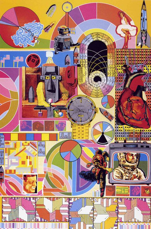
The repeated failure of editors, designers and illustrators to engage intellectually with The Atrocity Exhibition is all the more remarkable because the book offers a litany of Ballardian images: bunkers, concrete causeways, jutting balconies, crashed bombers, a drained sculpture fountain, a deserted beach resort, rubber mannequins and plastic dummies, as well as more ambiguous images such as a “conceptual auto disaster” or a “spinal landscape” — quite apart from its erotic content. The many artists Ballard invokes by name or by art-work title also suggest visual possibilities, particularly the contemporary artists: Kienholz, Segal, Wesselmann, Warhol, Paolozzi. Above all, there are the book’s numbered lists, conceptual image-kits assembled, according to Ballard, by free association. These read like an artist’s notes on components for a painting or print and any one of them could provide an image-maker with the elements for a provocative montage. Montage was a modernist invention, in use since the 1920s, and Ballard was well acquainted with Just what is it that makes today’s homes so different, so appealing?, Richard Hamilton’s seminal, proto-Pop collage of 1956.
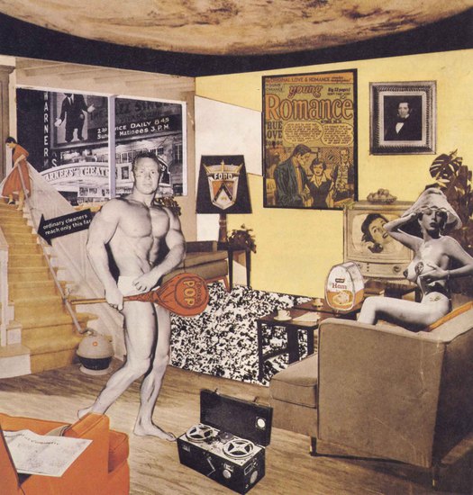
Just what is it that makes today’s homes so different, so appealing? by Richard Hamilton, collage, 1956
Paolozzi’s screenprints are also intricate montages — Ballard owned at least three, including a copy of B.A.S.H. (1971) seen on his wall behind him in a frequently used publicity shot from the 1980s — and the artist produced occasional book covers. They were both contributing editors at Ambit magazine.
Eduardo Paolozzi, B.A.S.H., screenprint, 1971
Moreover, covers for fiction based on montage, with multiple focal points, were not unknown in British publishing by the mid-1980s.
One of the more significant moments in the evolution of Ballard studies came with the publication of Re/Search’s special issue about Ballard in 1984. It remains an essential document, most obviously for its interviews.
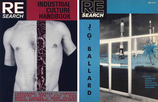
Left: Cover concept and photograph by Bobby Adams. Design by Rebecca Wilson, Re/Search, 1983
Right: Design by Rececca Wilson. Photograph by Ana Barrado, Re/Search, 1984
Ballard had for several years been a key figure for post-punk musicians and the book was the most complete expression to date of a particular view of Ballard that zeroed in on everything that was most acutely Ballardian for hardcore fans — with The Atrocity Exhibition and Crash at the center — and harnessed this to a branch of subcultural inquiry obsessed with extremes of all kinds. Based in San Francisco, the founders began by publishing Search & Destroy, a punk newspaper, and previous issues of Re/Search had been devoted to William Burroughs and to industrial culture and the music of experimental bands such as Throbbing Gristle, Cabaret Voltaire and SPK.
Page design by Andrea Juno, Re/Search, 1984
Apart from its content, much of the impact of the Ballard issue comes from the typography and layout, which is radically different from the tastefully well-mannered professional design of its day. The designer, Andrea Juno, buttresses, brackets and constrains the text with heavy bars and panels and kick-starts paragraphs with emphatic black squares. Photographs by Ana Barrado and Bobby Adams of rockets, concrete block houses and palm trees compose a monochrome travelogue of Ballardian America, electrically charged yet at the same time ethereally removed. The combined effect is so forceful and unsettling as to stamp Ballard with a new framework of visual references such that even the strangely over-articulated typography comes to seem in some curious way Ballardian.
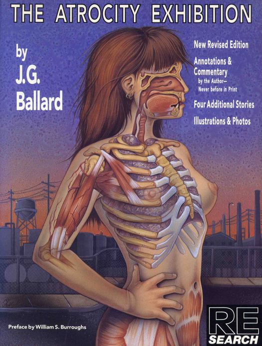
Design by Andrea Juno. Illustration by Phoebe Gloeckner, Re/Search, 1990
Page design for The Atrocity Exhibition by Andrea Juno, Re/Search, 1990
Juno applied essentially the same repertoire of brutally industrial graphic devices to the expanded edition of The Atrocity Exhibition that Re/Search published in 1990, with annotations by Ballard. While the startlingly aggressive and disturbing cover image by Phoebe Gloeckner, a medical illustrator and comic book artist, is let down by some clumsy typography, her series of 10 illustrations inside is the most intensive and forensic visual investigation in printed form of any text by Ballard, showing a willingness to emulate its cold, pornographic strategems that reminds us just how wide of the mark most publishers’ interpretations have been. In their introduction, Re/Search’s publisher/editors V. Vale and Andrea Juno suggest that the realism of the images “dismantles ‘pornography’ like Ballard’s text: as a series of fragmentary, alienated, passionless responses to a set of stimuli.”
The uncompromising Re/Search edition of Atrocity presaged a small shift in publisher awareness and an American edition of Crash produced in 1994 features one of the most apposite Ballard covers to date (see my essay about cover treatments of Crash). Most crucially, the design at last recognizes the representational possibilities of fragmentation and montage — albeit tightly gridded — a direction that remains to be deployed more fully across Ballard’s oeuvre. When a large-format annotated edition of Atrocity was published in Britain in 1993, with a mini-montage on a billboard on the cover, it did not include Gloeckner's illustrations. British publishers seem determined to make this demanding, complex, recalcitrant work look as innocuous as possible. The latest cover design (2006), part of a series, is a bland, spray-paint graffiti illustration of Marilyn Monroe — Ballard Banksy-fied — that couldn’t do less to direct attention to the book’s disquieting kit of images and fragmented narratives.
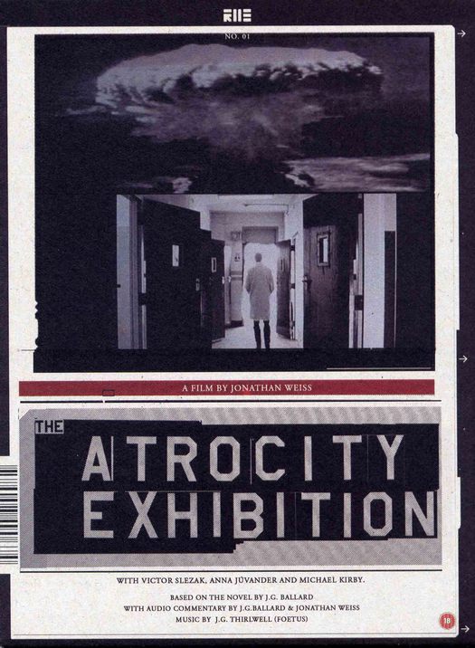
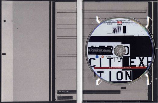
DVD Slipcase. Design by Bas Mantel, Reel23, 2006
For a more convincingly Ballardian use of imagery in recent years, we need to leave commercial bookselling and return to the cultural margins. The packaging of the Atrocity Exhibition DVD, released in The Netherlands by Reel23 in 2006, in a non-standard slipcase made of card, is a rare occasion when an entirely contemporary design approach has been applied to a Ballard-related commodity. The design accepts that the most likely buyer of the DVD will know Ballard’s work and will identify with the same elements of difficulty and extremity that engage Re/Search’s audience, and that mainstream publishers seem unable to handle with any boldness or coherence. Reel23 has also released David Cronenberg’s early films Stereo and Crimes of the Future, and The Atrocity Exhibition slipcase relates to the graphic styling and identity used for the company’s website, as well as its other DVD titles.
The apocalyptic imagery, drawn from director Jonathan Weiss’s film — via Ballard — is relatively understated, compared to the norms of DVD packaging, and most of the impact comes from the largely monochromatic graphic framework and the fractured, dysfunctionally letter-spaced typography. The sheets of computer print-out, recalling the waste material Ballard received in the 1960s from his friend Dr Christopher Evans’ wastepaper basket at the National Physics Lab, are a textural representation of the scientific language that pervades novel and film.

DVD packaging: outer and inner. Design by Bas Mantel, Reel23, 2006
Again, we might note how unusual it is — Re/Search aside — for typographic material to be used as any kind of signifier in relation to Ballard, even in the 1990s when the new digital design tools provoked an international trend for typographic experimentation, widely seen in the United States and Europe in CD packaging, advertising and magazines such as Ray Gun. Bear in mind, too, that Ballard had experimented in the late 1950s with typographic collages for a new kind of fiction and had later published a series of “advertisements” in Ambit. His original plan was to apply these techniques in The Atrocity Exhibition, but Jonathan Cape took fright at the idea.

“Advertisement” written and designed by J.G. Ballard, Ambit no. 33, 1967
What these examples make clear is that, when it comes to visualizations of Ballard, his admirers and fans, as close readers of the texts, have a much better idea of what an adequately Ballardian image requires than Ballard’s official mediators in publishing. Perhaps the most striking demonstration of the perspicacity of Ballard’s fans can be seen in the community-based, image-sharing website, Flickr. The site allows members of the public, mostly amateur photographers, to upload their own pictures. These images can then be tagged with a range of keywords so that the photos will show up in different Flickr collections. Thousands of pictures have been classified with the tags “Ballardian” and “J.G. Ballard” and there is a Ballard group, founded in 2005, consisting (on 3 February 2011) of 585 members. They provide a brief mission statement: “This group shall collect images that evoke the narrative of J.G. Ballard. Drained swimming pools in suburban landscapes, gated communities with their security video surveillance, highway embankments, deserted airport concourses, the post industrial nightmare of the end of the western empire.”
Some members upload dozens and even hundreds of pictures on these themes. While many are mundane, limited by the photographer’s eye and skill, the best attain a high level of intensity and resonance. Inevitably, there are smashed cars but covers of Crash have often displayed the same literalism. Other images of cars attain a heightened realism — a Surrealism — that might recall the dream car buried in the sand on the cover of The Drought. Some pictures display a Ballardian relish for the deserted, empty, drained, ruined and abandoned. Many photographers venture under the concrete roadways to document the immense stanchions and soaring thoroughfares.

Photograph by Stephen Teso, J.G. Ballard group on Flickr, 2010
The flyover has become a defining Ballardian image in publishing and commentary, so there is a sense, here, of the image-makers affirming their perception of Ballard and the personal meanings that his texts hold for them by adding their own versions of these images to a potentially limitless library of scenarios and epiphanies, which any Ballard reader with visual inclinations might share.
As with Ballard’s writing, the visual repetitions become hypnotic, compelling the reader (or viewer) to keep returning for reasons that, as literary critic Roger Luckhurst suggests in “The Angle Between Two Walls”: The Fiction of J.G. Ballard, cannot ultimately be explained. The most interesting pictures embody this sense of uncanny Ballardian immanence in more oblique types of subject matter and image. A photographer with the name “Hoodlum Scientist” — a reference to Ballardian characters such as Vaughan in Crash — titles one picture “The Angle Between Two Walls,” a verbal image taken from one of the “advertisements” Ballard published in Ambit. The Ballard group photo pool contains pictures that are far more effective as personally felt evocations of the writer’s vision than many of the images used over the years on his covers.
Photograph by Chris Beckett, J.G. Ballard group on Flickr, 2011
I want to conclude by posing a question in relation to Ballard that calls out for further research. My motivation for exploring the visual representation of Ballard’s writing stems, as I have said, from a feeling of dissatisfaction with the way so many of his books were presented. Why didn’t he do more to ensure that his book covers expressed his aims better? His enthusiasm for art would seem not only to have qualified him for the task, but to have made it a personal necessity. In his early days as a writer, Ballard did make efforts in this direction, though he was usually thwarted. In correspondence with me, he was particularly dismissive of Cape, saying that he was “very poorly published” by the company. He also noted that, “Jacket design is a vast and contentious subject, and authors can be a nightmare for jacket designers.” Yet his subsequent UK hardback fiction publishers, Gollancz and HarperCollins, and his paperback publishers, didn’t serve him much better. It is common today for writers, especially successful writers, to have a say in their covers. Could it be that Ballard overlooked design and in particular graphic design as an area of ever-increasing significance, despite his immense sensitivity to so many aspects of visual culture?
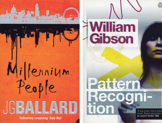
It might seem improbable, yet there are very few references to any kind of design in Ballard’s interviews. His neglected domestic environment at his home in Shepperton, so often commented upon by journalists, suggests someone for whom art as an idea remained separate from the many opportunities for visual meaning and satisfaction possible in one’s everyday surroundings. I approached Ballard twice in connection with the visual dimension of his work. He offered some help, but both times declined an interview, leaving me with the impression that this was not an area of particular importance to him, despite his early recognition that culture was becoming increasingly visual. Ever since Empire of the Sun (1984) brought Ballard a wider audience and a new level of acceptance among reviewers, his book covers have tended to be middlebrow and lacking in direction — the opposite of what he stood for — and they rarely live up to the books’ provocations. Compare the paperback cover of Millennium People with William Gibson’s Pattern Recognition, also published in 2004. Gibson’s publisher, Penguin, is carefully positioning him for a hip, plugged-in, visually aware, trend-monitoring, modern audience. And Ballard? What could an uncommitted browser deduce about the novel’s darkly sardonic view of Britain’s middle classes in revolt from this tepid conglomeration of stylistic signals?
Left: Illustration by Richard Green, HarperCollins, paperback, 2004
Right: Designer uncredited, Penguin, paperback, 2004
In December 2007, in an intriguing turn of events, the news website Times Online announced a competition in association with HarperCollins to create a cover for Crash — the ultimate Ballard design challenge. The winner’s design would be used on the cover of a new limited edition to be published in September 2008 and Ballard would be the judge. The deadline came and went. No winner was announced and the book failed to appear. Ballard’s illness with cancer is the most likely reason, although no official explanation was ever given. We can only hope that one day, as his books are reissued, this exceptionally visual writer will routinely receive cover designs as intelligent, challenging and original as his one-of-a-kind vision deserves.
An earlier version of this previously unpublished essay was delivered as a paper titled “Visualizing Ballard: Representation, Misrepresentation and the Graphic Image” at From Shanghai to Shepperton: An International Conference on J.G. Ballard held at the University of East Anglia in May 2007. My thanks to the conference’s organizer, Dr Jeannette Baxter, for inviting me to speak.
See also:
What Does J.G. Ballard Look Like? Part 2
Collapsing Bulkheads: The Covers of Crash
Speculative Fiction, Speculative Design


Comments [15]
Was strangely reminded by your descriptions — of Ballard's lesser covers — of several Rush (Canadian rock band) album covers. They had some really "surreal" ones through the mid-‘70s until recently. Especially the "Permanent Waves" cover by Hugh Syme.
Thanks again,
VR/
02.04.11
11:39
VR/
02.04.11
11:46
Incidentally, the illustration for the 1972 Panther edition of The Atrocity Exhibition looks like the work of John Holmes, a Scottish artist whose most visible work is his painting for the cover of The Female Eunuch. He produced a number of paintings in the early 70s for horror and sf paperbacks, many of them with a face or figure placed centrally as the main feature. Panther had a bad habit of not always crediting their cover artists or photographers.
02.05.11
10:16
The covers by John Holmes here pretty much confirm him as Atrocity artist, I think.
Thanks for the Rush link, Joe. It didn't seem to be working so I put in another one.
02.05.11
01:13
02.05.11
01:41
I imagine that he must have tried early on to have some input into his covers but given the difficulty and sheer bloody frustration of dealing with the publicity and sales departments who generally dictate how covers will look, he gave up and saved his energy for the insides. I know several mid-list authors who HATE the covers of their books but have absolutely no power over the design, which doesn't seem to matter whether it's a conglomerate or a boutique small press. Ballard's covers are a particularly egregious example but that's just because we know the contents so well - you've singled Ballard out for this attention when it's one of the most contentious areas of publishing, isn't it?
02.05.11
02:24
See: http://tinyurl.com/67mfgug
(That said, I must say Panther's 1973 cover for "The Disaster Area" also ranks high in the top of the 1970s Ballard covers, and do does Cape's "Vermillion Sands". For both publishers, those shone as the last good covers they produced for JGB's work).
02.05.11
04:04
2) http://pedromarquesdg.wordpress.com/2010/07/09/michael-moorcock-i-think-i-preferred-my-own-imagination-part-ii/
02.05.11
04:16
Very Respectfully,
02.06.11
01:15
02.08.11
06:17
One other jewel in the Dave Pelham contribution is the cover of the special 1974 boxed set of his four JGB titles... It shows a three-sided wraparound of a pristine B-52, nose buried in the sand, landing gear down. Again the sand and sky forms a two-part ground. Aside from Pelham's superb designs, I think his art also benefits from the clinical flatness of his airbrushing technique, certainly a style suited to Ballard's bleak narratives.
02.08.11
11:01
02.09.11
06:07
Rick, agreed, Pelham’s box is great. We should also mention Pelham’s fifth Ballard cover for The Four-Dimensional Nightmare, which followed in 1977. It’s funny to hear Michael Moorcock dismissing what you call the “clinical flatness” of airbrush in the second part of Pedro Marques’ interview with him: “I wasn’t really into airbrushed fetishism,” says Moorcock. “Again, that was more Jimmy’s [JGB’s] thing.”
Rune, it depends where in the world you are based. I can only comment with certainty on how the books were sold over time in the UK. Being identified with a genre doesn’t automatically translate into bad cover designs. In the 1960s, something of a golden age, there were some fine SF covers. And remember that the much-loved Pelham covers were aimed at SF enthusiasts, while always having potential appeal to readers of ordinary fiction.
The visual problems of presenting Ballard in the UK increased after he started to gain wider attention with Empire of the Sun in 1984, acquiring new readers who knew nothing of New Worlds magazine, his short stories, The Drowned World, The Atrocity Exhibition, or Crash. Since then, it has been routine to find his books, even reissues of the early SF, in the ordinary fiction section of British bookshops. This results in bland series identities, such as the latest spray-paint graffiti covers (in the UK), that attempt to be all things to all readers.
Having said this, Henry Sene Yee has designed some fine Ballard covers for a Picador mini-series in the US. The Crash image is a bit obvious (and weirdly jovial) but the other three are very nicely done, especially Super-Cannes.
02.09.11
01:53
02.10.11
08:22
02.11.11
10:25