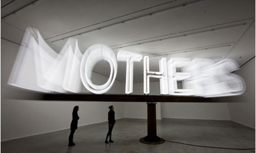
Martin Creed's new show Mothers at Hauser & Wirth in London. Photograph: David Levene for the Guardian
Back in the pre-Banksy days of big cars and even bigger hair, there came a cultural moment noted for its prevalence of large-scaled words and symbols, a comparatively brazen visual trope that flirted with modernity by celebrating overscaled visuals in the interest of commerce.
Back then we used to call it supergraphics. But when do we call it art?
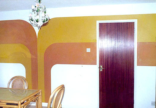
Like anything, there were good supergraphics and bad supergraphics, the main difference being the degree to which the visual form engaged with the essential dimensionality of the space it helped to articulate. Often, though, they were just really big and loud and they were everywhere — spilling out from awnings onto sidewalk signage, sprawling around then-new indistrial parks, a staple, if not an eyesore across public spaces both in the US and abroad.
Throughout the decade, letterforms shared space with bubbly-looking clouds and rainbows, a visual style that was largely predisposed to a kind of beige, tan, orange and red palette. These were, after all, the signature colors of that generation, and if you're waxing nostalgic, you'll be happy to know that there's an app for that: indeed, Hipstamatic has a filter that lets you instantly recreate those glory days of deep color saturation. Think of it as I do: as digital jaundice.
Typical warm-toned supergraphic from the 70s. Image courtesy Design Crisis
This was, after all, the 70s — a time when people wore bellbottoms, sported afros and decorated their pads (not their iPads) with beaded curtains and hanging macramé pots. It was a time before satellite TV — hell, before cable, even — way before health-conscious living, before fancy bottled water, when a quick New York lunch meant a trip to Chock Full O'Nuts for a cream cheese on date bread sandwich.
For reasons not entirely self-evident, giant, arched rainbows were an unfortunate — if common — visual hallmark of the 1970s and why? Bubbly and cartoonish, they dominated the opening credits for The Electric Company and the closing ID for the Hanna Barbera Company. They were popular in Europe, too, where they were more stylish, but still indelibly poised toward the orange range.
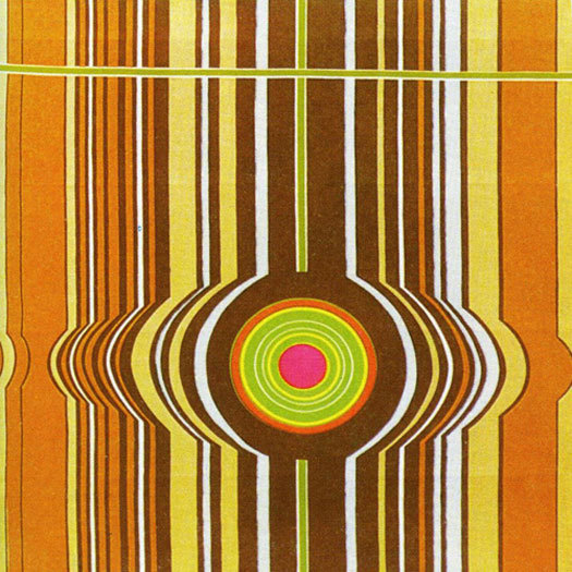
1970s geometric supergraphic textile by German designer Elsbeth Kupferoth
By the late 70s, the rainbow's color palette was brilliantly hijacked by the gay liberation movement. After an all-too-brief respite during which it lay mercifully dormant, the rainbow appears to be back in full force — in the form of an illuminated arcade at the entrance to Mohegan Sun. Should we blame Frank Stella? Or Sol Lewitt? Best not to try this at home, but if you find you must, perhaps you can follow these instructions. (Better yet: just look at this.)
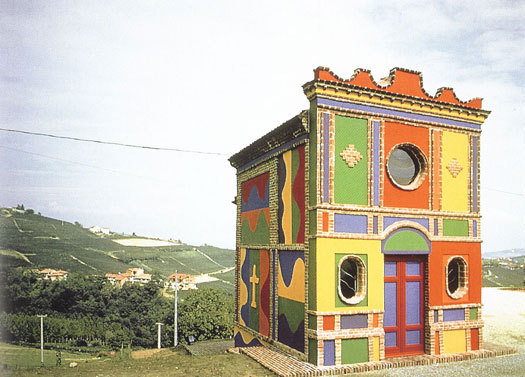
Sol Lewitt, Barolo Chapel, 1999
It bears saying that supergraphics have recently — and somewhat paradoxically — evolved to become a great deal more subtle, teaming up with sound and interactivity to create more immersive experiences, and finessing the relationship between personal and public with humor, elegance, even wit. But it's the typography that endures, proving that the graphics that celebrate letterforms remain, in the hands of good typgraphers, as compelling as they ever were. The takeaway here seems to suggest that while bigger is better, less — in this case, less color, fewer rainbows, simpler gestures all around — is indeed more.
Maybe that's what makes it art.
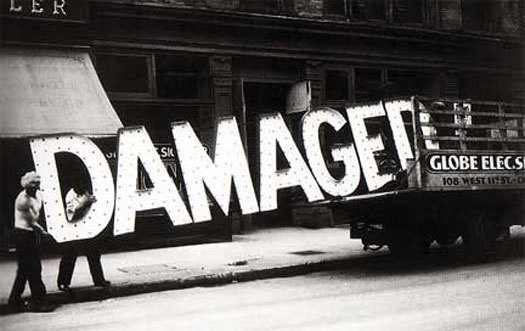
Walker Evans, Damaged, 1928-29. Courtesy Metropolitan Museum of Art, Walker Evans Archive


Comments [6]
01.27.11
10:32
01.27.11
11:00
Today during Fashion Week this concept still resounds through Europe, with the stupendous poster sizes of the beautifully clad women. A little more sophisticated in content maybe, but is it art. As a photographer I have to say a resounding yes!
I would love your take on my Blog from an Art perspective.
http://wp.me/1eJBt
It is only through criticism that an artist knows they are progressing.
Thanks for you input.
01.30.11
12:48
01.31.11
02:10
When it is a lie that tells the truth.
02.01.11
11:00
02.23.11
02:32