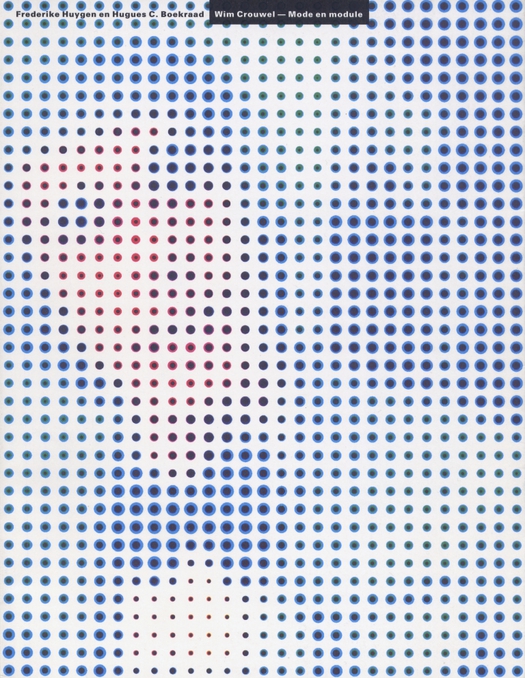
Cover of the monograph Wim Crouwel — Mode en module (1997) designed by Karel Martens and Jaap van Triest
Major graphic design exhibitions remain a rarity and large shows devoted to a single designer’s body of work are even more unusual. This week saw the opening in London of Wim Crouwel: A Graphic Odyssey at the Design Museum and questions are already being asked by Dutch admirers of Crouwel, who turned out in force for the occasion, why the first major retrospective of this leading figure, now 82, had to happen in the UK rather than in the Netherlands.
The show, guest curated by Tony Brook of Spin in collaboration with Design Museum curator Margaret Cubbage, is beautifully done. With commendable restraint, Brook has followed Crouwel’s frequently stated guideline and not attempted to interpose his own personality as a designer between the subject and the viewer. The space has been opened up by the show’s architects, 6a, turning the room into a huge viewing temple (pictures here). As a consequence of these smart curatorial decisions, Crouwel’s work comes through with magnificent clarity, giving visitors a chance to assess the nature of his achievement. There’s a good catalogue, too.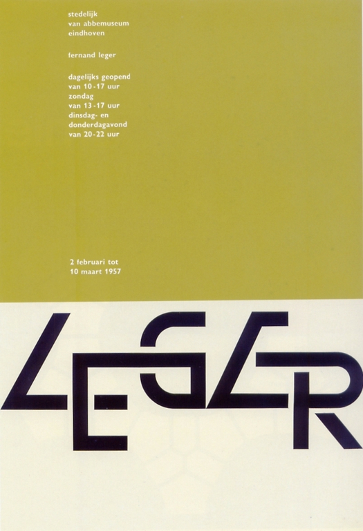
Wim Crouwel, Leger, exhibition poster, 1957
While I admire his work in the context of its time, I don’t subscribe to the cult of Crouwel that thrives among British designers with neo-modernist tendencies (I have an essay about this in the latest Creative Review: summary here). I have also acknowledged elsewhere that in the celebrated debate between Crouwel and Jan van Toorn about objectivity and subjectivity in design, I would have to side with Van Toorn’s politicized view rather than Crouwel’s claimed neutrality, despite what I just said about the exhibition’s design. This is not because I think Crouwel’s arguments have no merit or sense, but because I can’t believe in the situation his commandments would bring about if designers were to follow them en masse with the absolutism he demanded in the 1960s and 1970s. It would be boring as hell.
I thought of Crouwel a few days ago, before seeing the exhibition, while watching Michelangelo Antonioni’s Red Desert, released in 1964, the year after Crouwel and others founded Total Design in Amsterdam. The film, famous for its experiments with color, begins with a long opening sequence in an industrial landscape. On the one hand, it’s clear almost immediately that the female character (played by Monica Vitti) is alienated from this setting; at the same time, Antonioni finds great beauty in buildings like an oil refining plant, which were transforming the Italian landscape during this period of accelerated economic growth. Crouwel, a man fully adapted to this new technological world — like Vitti’s husband in the film, the plant’s manager — would have been at home there.
“I’ve always been fascinated by techniques and construction processes,” Crouwel writes in Typographic Architectures (2007). “Sprawling, human-built landscapes where high-voltage power lines run to the horizon have actually inspired me. [. . .] Railroads with their skein of rails and overhead wires are, to my eyes, full of poetry. I’m dazzled by pictures of space travel. [. . .] My output from 1956 to 1976 was the direct expression of these sources of inspiration.”
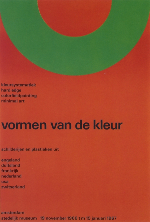
Wim Crouwel, Shapes of Colour, exhibition poster, 1966
What we can see now more clearly than ever, particularly in Crouwel’s posters in the exhibition, is that his practice was often at odds with the severity of his pronouncements. Far from suppressing his own creative personality in the way he advised, Crouwel was expressing it to the full. It just happens that this personality was inclined towards reduction and minimalism. Long-lasting client relationships can provide designers with the freedom and continuity to develop their thinking and methods, and Crouwel was fortunate to work with the museum director Edy de Wilde for three decades, first at the Van Abbemuseum in Eindhoven and then at the Stedelijk Museum in Amsterdam. According to De Wilde, who would have known better than anyone, Crouwel embraced the possibilities of the machine culture, while emphasizing that, “The machine cannot replace the precision of the human eye and human feeling.” (Kunst + Design: Wim Crouwel, 1991) De Wilde worked with the designer on hundreds of projects and concluded that pragmatic and emotional concerns were of equal importance for Crouwel.
In a fine analysis of Total Design’s philosophy, which appears in The Regime of Visibility (2005), the Dutch art critic Camiel van Winkel comes to much the same conclusion, though he puts it less charitably. Crouwel, he writes, “concealed his aesthetic preferences by legitimising them with the argument of maximum legibility.”
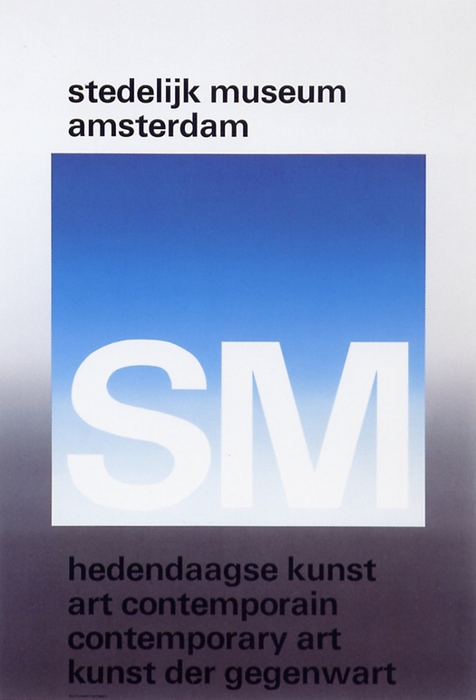
Wim Crouwel, Contemporary Art, museum poster, 1971
Crouwel himself accepted long ago that his work is far more personal than he once claimed. I interviewed him this week at a live event at the Design Museum and we continued our conversation over dinner. Like anyone else, he still has his aesthetic preferences and still holds strong views — postmodernism, he said in 2003, is “loathsome” — but in recent decades he has been much more open to other possible ways of working.
After years of talking to visual people about their work, I find it hard to see these personal philosophies as anything other than necessary fictions. These deeply held views tell us a lot about the motivations of the person espousing them. They are vital to the creative process and other creative people of similar outlook might find these precepts useful. But it’s the same as religions when they are viewed in absolute terms as the one true explanation of reality: they can’t all be right. There is room for many forms of practice and ways of thinking about practice and the cultural sphere is much the richer for it. Talking to Crouwel, who is excellent company, one senses his wry amusement at his earlier emphatic prescriptions. He knows the world wasn’t really like that, but it suited him to believe it was.


Comments [12]
04.02.11
01:41
Your reference to "personal philosophies as necessary fictions" reminds me of the debate about "bullshit" we had here on DO several years ago. I suspect they are different manifestations of the same syndrome.
04.02.11
01:52
VR/
04.02.11
09:02
The opening paragraph seems to be a reminder of the adage that graphic designers are sometimes taken for granted by their nearest community.
04.03.11
12:44
04.03.11
06:42
Of course, as Kenneth suggests, the limiting narrowness of such a perspective within graphic design was thoroughly examined during the years of postmodernism. Modernist form was understood to be a “vernacular,” one set of aesthetic choices or preferences in a smorgasbord of possibilities. But time passes, the wheel of fashion turns, the design world forgets and new versions of earlier thinking take root again, irrespective of previous debates and critiques. Crouwel, too, is ambivalent about the neo-modernism that some of his admirers practice, which he views as a style without any serious intellectual rationale.
04.05.11
05:01
04.06.11
03:28
04.06.11
04:43
04.08.11
09:55
04.09.11
11:02
In the case of Crouwel, he was a constant contributor to the design discourse of his day and that's one reason why his work has stayed interesting — because it has a strong point of view that he was able to articulate.
04.09.11
12:09
In my days at Art School (where one of Crouwels sons was one year behind me) a major influence on us fledgling graphic designers was Piet Schreuders, a self-taught designer who published a small book condemning the work of Total design and other followers of Swiss design: ‘Lay In Lay Out’. Watching Crouwel and Schreuders slugging it out was like seeing the Ali-Frasier fight; highly entertaining and very enervating.
04.19.11
08:53