Observed
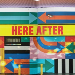
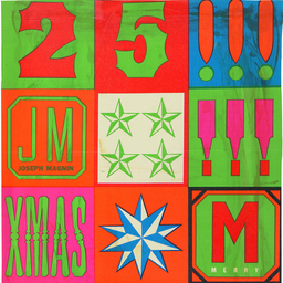
Did you know that since 1956, each Eurovision host broadcaster has had to come up with its own logo? Some are generic and forgettable, while others are more professional (and maybe also forgettable) (and speaking of forgetting, Istanbul completely forgot to design one in 2004, which is where at least one generic stand-in proved useful). As a suite of visual emblems, they're fascinating as a collective snapshot, sitting at the intersection of typography, globalism, and the amped-up TV culture of the music business. Among our favorites is the 2017 logo, which claims to have taken its inspiration from a traditional Ukrainian necklace, or
namysto—considered to be a protective amulet and a symbol of beauty and health—and in this case, a way to honor and celebrate
diversity.
Wonderful
job opportunity—perhaps for a newly-minted MFA grad—working with the amazing people at
Cita Press, where they celebrate the spread of culture and knowledge by publishing the writings of women authors whose works are open-licensed or in the public domain. Through its library of collaboratively designed free books, Cita honors the principles of decentralization, collective knowledge production, and equitable access to knowledge.
Struggling to figure out what to watch on Netflix? You're not alone! That's a challenge that still keeps
Steve Johnson, Netflix’s VP of design, up at night.
How does color function In factories, schools, and hospitals? In the 1950s,
it functioned like this. (Part Two is
here.)
As if Prime Minister Justin Trudeau
didn't have enough on his plate, public response to a new identity program sparks controversy (and ridicule). "It looks like a moose getting a prostrate exam!" one person noted. "It looks like a Minecraft character milking an elk!" observed another. Behold: the communications kerfuffle around the design of a
new logo for the Canadian Army.
Every object we bring into the world has a contextual backdrop, and every design decision is a compromise.
How long should objects last? Charlie Humble-Thomas—a student at the RCA in London—ponders the question of what he calls “conditional longevity”.
The United Methodist Church has reversed its denomination’s anti-LGBTQ policies and teachings and lifted all bans on same-sex marriage and gay clergy. The fight to allow same-sex marriage and gay clergy has been part of a painful debate within major Protestant denominations in the U.S. for nearly fifty years.
Click through for a timeline of major milestones of the last five decades.
AAPI History Month turns 45 this year.
Most
people credit its establishment to Jeanie Jew, a fourth-generation Chinese American and a co-founder of the congressional Asian-Pacific staff caucus. Her grandfather had helped build the
Transcontinental Railroad in the 1800s and then was killed amid anti-Asian unrest, a story which moved her colleagues on the Hill. In 1979, with support from California Rep. Norm Mineta and Hawaii Senators Daniel Inouye and Spark Matsunaga, President Jimmy Carter
issued a proclamation designating the first week of May as “Asian/Pacific American Heritage Week.”
The impossible dilemma of Black female leadership. “In predominantly White spaces, a Black woman is expected to code-switch, mimic White culture, and either explicitly or implicitly affirm harmful propaganda about Black people, in order to signal that she can be trusted by the establishment,” says Shauna Cox in
Nonprofit Quarterly Magazine.Weimar, Germany—the city that was home to both Germany’s post-1918 government and the first (of three) Bauhauses—has taken the courageous step to re-examine the school’s relationship to National Socialism. Organized by the
Klassic Stiftung Weimar and running from May 9 through mid-September, three exhibitions take on this immense subject:
The Bauhaus As a Site of Political Contest, 1919-1933, will be at the Museum Neues Weimar;
Removed – Confiscated – Assimilated, 1930/37 at the Bauhaus Museum; and
Living in the Dictatorship, 1933 -1945 at the Schiller Museum. A review in today's
Guardian looks at the complexity and coordination of this trio of shows, and delves into the historical nuance—and torment—of its political and artistic history.
Design Reviewed is dedicated to digitally preserving graphic design history and documenting the expansive visual culture of the last century. The archive is the work of one extremely dedicated man: his name is Matt Lamont (and you can get a little taste of his obsession
here).
Providing tactical strategies and creative support to tackle the complexities of balancing intuition and taste, technical and personal capability, strategic business decisions in design work and the demands of modern brand building, Matt Owens's
A Visible Distance: Craft, Creativity, and the Business of Design speaks to students, educators, and professionals.
Opening in 2025, the Boston Public Art Triennial will be curated by
Pedro H. Alonzo and
Terese Lukey and is free and accessible to all. More
here.
And for your Friday enjoyment—
Designer! (A poem by Dorothy Chan.)
In Iran, the ancient
qanat system enabled irrigation in desert environments, allowed for agriculture to flourish, and fostered community cooperation. “They are based on a huge shareholding system that requires different people living in a region to work together and use the water resources available," observes Negar Sanaan Bensi, a lecturer and researcher in the faculty of architecture at the Delft University of Technology in the Netherlands. With global warming sending temperatures soaring, rethinking these cooling tunnels represents a huge design opportunity, and hints at a promising future for community-building. (Also:
they're already using it in Spain.)
California Governor Gavin Newsom—long criticized for failing to address his state’s $73 billion budget deficit, overspending and lack of focus on local issues—asks for public input on
the design of a state coin. Hilarity (and, well, yes) humiliation ensues.
How does governance impact the preservation of critical, cultural, and historical artifacts, including, and especially, our cherished institutional archives?
John Thackara has some ideas.
London design practice
EcoLogicStudio has created a collection of everyday objects—including a desktop air purifier that outputs material used to create furniture and accessories—using algae.
Sloan Leo offers seven prompts to help you better understand what it means to
queer design.
Steven Heller reviews
Made in Italy NYC—an exclusive (and free!) exhibition celebrating the rich heritage of postwar Italian graphic design. (Bonus video content
here.)
Fascinating new (hybrid) job opportunity at MIT, where they are recruiting an Exhibition and Commons Director to manage an exciting set of public spaces known as “the commons”, the newest of which has been carved out of the redesigned
Metropolitan Storage Warehouse on MIT’s campus. The commons is envisioned as an assembly of curated physical sites and a set of related programs with a primary focus on architecture, design, urbanism, art, and technology. for their new building. Details
here.
Everything you ever wanted to know about the origins of Dutch design (but were afraid to ask).A meditation on the
history of design—and the rise of strategy—from Jarrett Fuller.
A meditation on
analog beauty—and vernacular signage—from Elizabeth Goodspeed.
Richard Stengel makes a compelling case that journalism should be free to save democracy. “According to the Reuters Institute for the Study of Journalism, more than 75% of America’s leading newspapers, magazines, and journals are behind online paywalls. And how do American news consumers react to that?” (
Subscription required.)
Please, please,
please…
get some sleep.The Supreme Court allows Idaho
to ban transgender health care for minors. For now.
Historically, we’ve invested huge resources to keep cities and nature separate. But we now know that the health of the soil and the health of people are the same story.
So, what does this have to do with design? Join the unstoppable John Thackara and Milan Politecnico professor Ezio Manzini today at 11 am ET as they discuss this critical—and surprisingly overlooked—environmental issue.
Conducted through audio interviews, Ana Miljački's
I Would Prefer Not To is an oral history project on the topic of the most important kind of refusal in architects’ toolboxes: refusal of the architectural commission. (Miljački, an architectural historian and theorist, is also Director of the Critical Broadcasting Lab at MIT.) Produced in conjunction with the Architectural League of New York, this podcast features conversations with a number of fascinating practitioners including Diller + Scofidio's Elizabeth Diller, WXY partner
Claire Weisz (who we interviewed in Season Three of The Design of Business | The Business of Design) and
Nina Cooke John (a Season Nine guest).
This past winter, a diverse cohort of students from the
MADE Program at Brown + RISD and Harvard immersed themselves in a wealth of data provided by the City of Boston with the mission of uncovering novel, meaningful, and joyful perspectives on navigating and understanding the urban environment. Their resulting projects—a series of interactive exhibits ranging from envisioning the evolving contours of the coastline to revealing the secret lives of the city’s trees—will be on view this week at the
Boston Museum of Science.