

December 31, 2009
A Dictionary of Surrealism and the Graphic Image

Alphabet by JindÅ™ich Heisler, 1952. Arrangement by Pierre Faucheux for Les manifestes du surréalisme, 1955
This text was first published as the introduction to Uncanny: Surrealism and Graphic Design, the catalogue for an exhibition I curated in 2010 for the Moravian Gallery in Brno in the Czech Republic as part of the Brno Biennial. The catalogue is now out of print and the text is republished with thanks to the gallery.
Introduction
Uncanny: Surrealism and Graphic Design uncovers the presence of an alternative tradition in graphic design. The Surrealist movement of the 1920s and 1930s focused on literature, painting, photography and the object, and the Surrealists’ publishing activities provided only hints of what a fully conceived Surrealist graphic design or typography might look like. Many of the most suggestive early examples came from Czechoslovakia, where Surrealism would become a lasting influence. Subsequently, Surrealist ideas and images had a profound impact on image-makers in every sphere of art and design, and by the 1960s the effects of Surrealism were widely felt in international graphic communication. Uncanny traces this intermittent line of development up to the present.
It would be mistaken to describe this lineage as representing a movement. Surrealistic design is not a group activity, it has never cohered into a dominant tendency within graphic design, and histories of design have said little about it. Work showing a strong debt to Surrealism emerges only when a graphic artist or designer appears who is attuned to this way of thinking, dreaming and imagining.
Most graphic design conforms to an underlying grid, a sense of structure and professional good taste, which brings order but also imposes limits. The images and designs in Uncanny break free from these bureaucratic restrictions and follow the impulses of a wayward, subjective, dreamlike logic to arrive at their own kind of equilibrium and form. They show that graphic design, too, can sometimes be a place to encounter the strange, the fantastical and the uncanny, to rediscover our lost sense of mystery, and to experience the convulsive beauty and capacity for enchantment and wonder that the Surrealists called “the marvelous.”
Automatism In the first Manifesto of Surrealism, published in Paris in 1924, Surrealism’s founder, André Breton, defines Surrealism as “Psychic automatism in its pure state, by which one proposes to express — verbally, by means of the written word, or in any other manner — the functioning of thought.” Reason would play no part in restricting the flow of thought in automatic writing and no moral or aesthetic control would be exercised. Surrealism offered a psychic mechanism to gain access to a superior reality.

Karel Teissig, film poster, 1967
Body Surrealist art and photography represented the body and probed its secret recesses with an anatomist’s fascination, as though base flesh — the big toe, the mouth — might divulge the ineffable mysteries of being. Graphic artists of the postwar years, inheriting this lexicon of anatomical images, broke the body into fragments, cutting out lips, breasts and limbs, and peeling away the skin to expose the bones that give the body structure, and the organs that animate it. Walking skeletons and speaking skulls are modern-day memento mori, intensifying the sense of life’s fragility and beauty. (See EYE)
Chance encounter Les chants de Maldoror (1869) by the Comte de Lautréamont contains a phrase — “Beautiful as the chance encounter of a sewing machine and an umbrella on a dissecting table” — that became a fundamental axiom for Breton and the Surrealists. Bringing together ordinary but otherwise unconnected elements in unexpected juxtapositions creates a new reality of the MARVELOUS. Negating an object’s everyday function allows us to perceive its inherent poetry and strangeness with electrifying clarity. (See WUNDERKAMMER)
CieÅ›lewicz, Roman (1930–96) Polish graphic designer and poster artist. CieÅ›lewicz studied at the Academy of Fine Arts in Krakow and worked in Warsaw until 1963, when he moved to Paris. Early posters such as Katastrofa (1961) and Zawrót gÅ‚owy (1963) for Hitchcock’s Vertigo assault the viewer with violently sharp, largely monochromatic images, which bring to mind similarly disquieting collages by ERNST. In later posters such as DiabÅ‚y z Loudun (1974), the ferocious graphic intensity coupled with unnervingly balanced symmetry becomes demonic. (See LETTERS)

JindÅ™ich Štyrský, collage from Portable Cabinet, 1934
Collage A quintessential medium of Surrealist expression, as it had also been for Dada. Mundane images of everyday reality could be cut up and reassembled in magical new configurations that subverted bourgeois preconceptions, values and rationality. ERNST used collage to reanimate old engravings with spine-tingling jolts of psychic power. The Czech Surrealists TEIGE and ŠTYRSKÝ employed collage for purposes of erotic fantasy. In the 1960s, innovative Czech poster designers drew heavily on this tradition of radical collage-making. For American designer EDWARD FELLA, the collage principle was easily summarized: “Juxtaposition is everything!”
Convulsive beauty André Breton concluded his book Nadja (1928) with the declaration that “Beauty will be convulsive or will not be at all.” The perception of beauty was understood by the Surrealists as a thrilling shock experienced not only in the mind but in the body as an involuntary sensation of giddiness or tension. (See THE MARVELOUS)
Death “Surrealism will usher you into death, which is a secret society.” — André Breton in the first Manifesto of Surrealism (1924). (See BODY)

Rudolf Nemec, Valerie and her Week of Wonders, LP, 1970
Desire The Surrealists saw desire as the true expression of the psyche and they used the word often in their discussions of life, literature and art. To be truly free, a person must first recognize, and then act on, his or her desires. In L’Amour fou (1937), Breton’s book about the mystery of love, he describes desire as “the only motive of the world.” The object of this longing might be the BODY of a lover, an entirely non-sexual goal or outcome, or an actual object endowed with the magnetic allure of a fetish. Surrealist art abounds with female love-objects who possess for the artist the power of the poetic muse. The found object, too, can be a realization of secret desire. (See THE MARVELOUS)

Andrzej Klimowski, The Secret, page from graphic novel, 2002
Dream The Surrealists believed, like Freud, that the motivations of the mind were most fully revealed in the operations of the unconscious. Dreams are tableaux from this hidden realm and Surrealist art repeatedly confronts us with extraordinary images originating in the depths of the nocturnal imagination. This is the aspect of Surrealism that has exerted the strongest influence on later generations of graphic artist. Poster design, in particular, has confronted the viewer with bizarrely transformed dreamlike figures (STAROWIEYSKI, VYLET’AL), grotesque apparitions (ROSEN, EARLS), demonic entities (CIESLEWICZ, TEISSIG) and otherworldly beings adrift in uncertain spaces (KLIMOWSKI). These images retain their capacity to enthrall and disturb, a sign that the image is provoking a reaction in the viewer’s own unconscious.

Elliott Earls, Cranrbook Academy of Art poster, 2008
Earls, Elliott (b. 1966) American graphic designer, performance artist and educator. As a student at Cranbrook Academy of Art, where he is now head of graphic design, Earls began to develop a militantly subjective graphic language, influenced by the examples of ERNST and Kurt Schwitters. In his posters, typefaces, and film projects, he mounts a continuous attack on fellow designers’ sense of decorum and taste, and wrenches graphic and typographic forms into discomfortingly malformed shapes. A series of posters promoting the departments at Cranbrook uses digital imaging to fashion monstrous mutations that appear to be simultaneously organic and artificial.

Sandals from Diderot’s Encyclopédie, 1751–72
Encyclopedia The encyclopedia’s — and dictionary’s — alphabetical organization facilitates the CHANCE ENCOUNTER of unrelated or incompatible objects and ideas. Furthermore, the images in encyclopedias, especially very old ones, frequently display a heightened character of strangeness, a numinous quality noted by Roland Barthes in his essay “The Plates of the Encyclopedia” (1964), a meditation on Diderot’s great 18th-century Enlightenment project. “We can say that there is not one plate of the Encyclopedia which fails to vibrate well beyond its demonstrative intent,” he writes. “This singular vibration is above all an astonishment.” (See WUNDERKAMMER)

Max Ernst, Une semaine de bonté, collage-novel, 1934
Ernst, Max (1891–1976) German painter and sculptor. Ernst, a self-taught artist educated in philosophy, was a master of the irrational juxtaposition of unrelated elements. His visual inventions exerted enormous influence on the development of 20th-century COLLAGE and graphic art. He founded the Cologne Dada group in 1919 and his first exhibition in Paris in 1920 was greeted enthusiastically by the emerging Surrealists. After collaborating with the poet Paul Éluard on Les malheurs des immortels (1922), which features a sequence of collages based on engravings, Ernst published the collage-novels La femme 100 têtes (1929), Rêve d’une petite fille qui voulut entrer au Carmel (1930) and Une semaine de bonté (1934). Posters by VYLET’AL (The Birds) and Milan Grygar (Marat-Sade) center on visual quotations from Ernst.
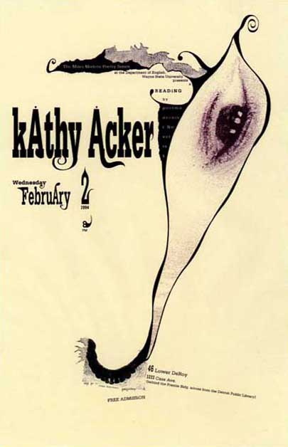
Brian Schorn, poster for a reading, 1994
Eye The eye, popularly regarded as the window of the soul, is one of the most persistent and suggestive icons in Surrealist image-making — from Man Ray to Salvador Dalí — as well as being a subject for Surrealist reflection. Georges Bataille made it his leitmotif in Story of the Eye (1928) and the Critical Dictionary (1929–30), which he edited, contains a long entry on the mysteries of the eye: “strange, vague, or simply beautiful.” In posters by designers such as TEISSIG, OLIVER and SCHORN, the organ of sight (often a solitary disembodied orb) regards the viewer with unsettling intensity. “The power of the eye is so strong that it is dangerous even when mere curiosity animates it” — Critical Dictionary. (See BODY)

Edward Fella, page from lettering book, 1992
Fella, Edward (b. 1938) American commercial artist, graphic designer and educator. In his notebooks and in a series of flyers to advertise his lectures, created since his retirement from commercial practice, Fella has used typographic material for a sustained experiment in “automatic designing.” The printed pieces display remarkable versatility, as though the continuously morphing letterforms are gushing from a reservoir in his unconscious. Fella acknowledges the work’s basis in AUTOMATISM: “the whole idea is not to think, to tap into the subconscious through a kind of automatic writing, a Surrealist practice.” His book Letters on America (2000) is a collection of Polaroids of vernacular lettering sought and catalogued as objects of DESIRE.
Klimowski, Andrzej (b. 1949) British graphic artist, illustrator and educator. In 1973, after studying painting, sculpture and graphic art, Klimowski moved to Warsaw to study poster design and film animation. The posters from his Polish period have more in common with the photo-collage approach of CIESLEWICZ than with the painted poster tradition. After returning to the UK in 1980, Klimowski applied his surreal images, often featuring angelic beings, to book cover design and editorial illustration. In 1994, he published his first wordless graphic novel, The Depository: A Dream Book, followed by The Secret (2002) and Horace Dorlan (2007), which alternates between his text and images.

Roman CieÅ›lewicz, alphabet for Guide de la France mystérieuse, 1964
Letters The fixed lineaments of the alphabet can also be made pliable and subjected to Surrealist COLLAGE and transformation. In 1952, the Czech poet JindÅ™ich Heisler, adapting the graphic lessons of ERNST, constructed an alphabet from details cut from old engravings. CIESLEWICZ did something similar for the Guide de la France Mystérieuse (1964). In 1994, SCHORN performed a series of incisions, amputations and sutures on the body of the letter “A.” “Letters can now be explored as living, organic wonders by removing old tissues, transplanting new organs, or grafting new limbs,” he said. M/M (PARIS)’s The Alphabet (2001) melts away parts of the faces and figures of a parade of female models to mould a set of loosely contoured alphabetic signs.
The marvelous One of the central and most enduring concepts of Surrealism. The marvelous (in French, le merveilleux) is an alert, elevated, otherworldly state of mind, a moment when reality seems to open up and disclose its essence more fully. This revelatory disturbance of the senses can be induced by poems, paintings, photographs and objects of uncertain purpose; by enigmatic arrangements of merchandise (gloves, mannequins, artificial limbs) encountered in shop windows; by especially atmospheric parts of the city discovered by chance while walking; or by the radiant face of a loved one. In the first Manifesto of Surrealism, Breton writes that “the marvelous is always beautiful, anything marvelous is beautiful, in fact only the marvelous is beautiful.” (See CONVULSIVE BEAUTY, THE UNCANNY, WUNDERKAMMER)

M/M (Paris), theater poster, 2005
M/M (Paris) French graphic design studio founded in 1992 by Michael Amzalag (b. 1968) and Mathias Augustyniak (b. 1967). M/M have developed a mode of graphic invention unfettered by the usual constraints of convention and form. Their disjointed compositions often suggest the outcome of some manner of AUTOMATISM, even if the effect is controlled. Since 1995, they have created a series of posters for the Centre Dramatique de Bretagne, a small theater in Lorient. The hand-drawn lettering, which meanders around like a dreamer’s doodle, comes closest to visualizing the kind of output the Bureau central de recherches surréalistes might have generated in 1920s Paris had it also operated as a graphic design studio.

Vaughan Oliver & Simon Larbalestier, theater poster, 1998
Oliver, Vaughan (b. 1957) British art director and graphic designer. Oliver saw the work of Dalí as a teenager and this led him to Breton, Éluard, ERNST and Magritte. Surrealism’s irrationalism, he recalls, “made sense.” In his later collaborations with the photographers Nigel Grierson (as 23 Envelope), Simon Larbalestier (as v23) and others, Oliver designed graphic images that recall canonical pictures by Surrealist photographers, in their visceral emphasis on isolated parts of the BODY, such as the toe, mouth or EYE. The Clan of Xymox album cover (1985) is constructed around an UNCANNY image of suspended dolls.

Quay Brothers, music poster, 1983
Quay Brothers (b. 1947) American graphic artists and film-makers. Inspired by Polish poster art seen in Philadelphia, identical twins Stephen and Timothy Quay studied illustration at the Royal College of Art in London. In the 1970s and early 1980s, they produced graphic images for posters and book covers before committing themselves entirely to film-making. Their animated WUNDERKAMMERN, using puppets and dolls, are haunted by a vision of a dark, surreal and melancholic Mitteleuropa. Much of their early graphic work is now lost and overlooked, but the Duet Emmo poster (1983) gives a flavor, and their ornate calligraphic film titles seem to emanate from a parallel reality.

Jonathon Rosen, cover of artist’s book, 1990
Rosen, Jonathon (b. 1959) American graphic artist and illustrator. Drawing on sources that include the scatological marginalia in medieval manuscripts, Hieronymus Bosch, antiquated technology, medical illustrations and Surrealism, Rosen has created a bizarre alternative universe where the troubled BODY exists in ambiguous symbiotic union with strange machines. His “Gothic Surrealism” was already fully developed in 1990 when a French publisher issued Intestinal Fortitude: Depictions of Anatomical Blasphemy, and he has continued to find outlets within commercial media for disturbing and even horrific imagery that makes no concessions to the casual viewer.
Schorn, Brian (b. 1961) American graphic designer, photographer and musician. Schorn attended medical school for two years before turning to photography and design. As a student at Cranbrook Academy of Art, he applied Surrealist concerns, including COLLAGE, AUTOMATISM and a focus on the BODY, to the production of graphic design and typography. These projects were fueled, he said, by “a desire to reach content not available to grid-orientated designs or thinking.” (See LETTERS)

Franciszek Starowieyski, theater poster, 1974
Starowieyski, Franciszek (1930–2009) Polish painter, poster artist, theater and film designer. Starowieyski’s extensive body of work across different media is one of the most consistent expressions of an unrestrained Surrealist sensibility to be found in graphic art and design. Oblivious to the dictates of artistic fashion or taste, he pushed his imagination to the limit, plunging viewers into an alarming psychological reality where the bulging corpulence of the BODY, representing life and DESIRE, is forced into an inescapably intimate embrace with the monstrous corruption of DEATH. The relationship is seen at its most tender in his poster for Strindberg’s Taniec smierci (The Dance of Death, 1974).
Štyrský, JindÅ™ich (1899–1942) Czechoslovakian artist, photographer and designer. Štyrský, a regular collaborator with the painter Toyen (1902–80), was a founder member in 1934 of the Surrealist Group in Czechoslovakia. In his photographic series, Štyrský concentrated on shop windows, fairgrounds and funerary objects. The typography of old advertisements and the crude vernacular paintings used to promote bizarre sideshow attractions add to the sense of unfathomable mystery. His Portable Cabinet collages (1934), many featuring BODY parts and organs, were the first to make use of source material printed in color, as though the deranged monochromatic dream-world discovered by Ernst could now be viewed in hallucinatory Technicolor.

Jan Švankmajer, hand-colored etching, 1972–73
Švankmajer, Jan (b. 1934) Czechoslovakian film-maker and artist. Švankmajer was already committed to Surrealism when, in 1970, he joined the Surrealist Group in Prague. The visual sensibility of his many short films, deeply in thrall to Arcimboldo and the surreal plenitude of the WUNDERKAMMER, is often highly graphic. In Historia Naturae, Suita (1967), he uses found imagery — old black and white engravings and lithographs — cut together in rapid, rhythmical montages to lay bare the rapacious appetites of man: the entire animal world exists to be consumed. In the 1970s, unable to make films, he created COLLAGES on anatomical, zoological, ethnological and technological themes. Švankmajer’s wife, Eva Švankmajerová (1940–2005), painter and fellow Surrealist, collaborated on his films and designed numerous posters to promote them.
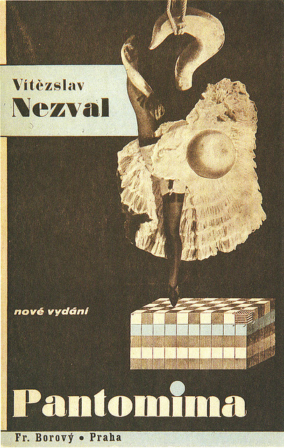
Karel Teige, book cover, 1935
Teige, Karel (1900–51) Czechoslovakian writer, critic and graphic designer. In the 1920s, Teige’s lyrical conception of Poetism, to describe the avant-garde position held by the DevÄ›tsil group, had much in common with Surrealism. His book and magazine design greatly influenced other designers. In 1934, he joined the Surrealist Group in Czechoslovakia, becoming its spokesman, and his book cover designs based on COLLAGE — such as Pantomima (1935) for the Surrealist novelist and poet VítÄ›zslav Nezval — fully embraced Surrealism. He also produced many autonomous collages that obsessively subjected photographs of the female BODY to erotic fragmentation.
Teissig, Karel (1925–2000) Czechoslovakian painter, graphic artist and illustrator. Teissig was one of the pioneers of COLLAGE in Czech film poster design and tended to concentrate on drama, mystery and horror films best suited to his powerfully emotive style. The visual influence of Surrealism can be seen in many of his most compelling images. In a poster designed in 1967 for Volker Schlöndorff’s Young Törless, about an emotionally detached boy who witnesses cruelties at school, Teissig employs the quintessential Surrealist trope of an antique anatomical diagram, made doubly strange by the upended presence of two menacing, hyena-like predators.

Emmanuel Polanco, book cover (undated recent edition)
The uncanny In his essay “The Uncanny” (1919), Freud suggests that the feeling something is uncanny (in German, unheimlich — “unhomely”) arises when an emotional impulse we have repressed returns to consciousness, triggered by some inexplicable sight or experience, and frightens us. It makes no difference to the effect whether the original source of this emotion, which could be highly familiar, was intrinsically disturbing or not. In many Surrealist images, something ordinary and familiar, suddenly perceived as a symbol, becomes disruptive and strange. Doubles are uncanny. Coincidence and repetition are uncanny. The “evil EYE” is uncanny. The doll, an inanimate object that nevertheless suggests the presence of life, is uncanny.

Josef Vylet’al, film poster, 1965
Vylet’al, Josef (1940–89) Czechoslovakian painter, graphic artist, film and theater designer. Vylet’al cited many artistic “allies,” including Bosch, Arcimboldo, Dalí, Magritte and ERNST, as well as the influence of ŠTYRSKÝ and Toyen. In 1965, ethereal, root-like forms, which he called “Tree Beings,” began to appear in his paintings, marking a new phase of intensity in his work. These spectral creatures can be seen in his poster for the Czech film Hrdina má Strach (The Hero is Afraid, 1965), where they float around an elegant figure in a bare, gridded room whose head has inflated to become a vast organic balloon, a symbol of either obliteration or boundless interior discovery.

Domenico Remps, Cabinet of Curiosities, oil on canvas, 1690s
Wunderkammer The first museums were Wunderkammern, cabinets of curiosities assembled by wealthy 17th-century scholars and collectors for the education and amusement of themselves and their acquaintances. The CHANCE ENCOUNTERS in these profuse displays of natural marvels and man-made objects provoked a sense of poetry and wonder, and Surrealists such as Breton, seeking the MARVELOUS, created similar private collections. BibliOdyssey, Pictorial Webster’s, Implicasphere and other contemporary “cabinets” pursue a DESIRE for enchantment that owes much to Surrealism. Museum-scale Wunderkammern include The Museum of Jurassic Technology in Culver City, Los Angeles, and the Bureau of the Centre for the Study of Surrealism and its Legacy at the Manchester Museum. (See ENCYCLOPEDIA)
See also:
The Dictionary as Art Concept
Love of Lexicons
Jan Švankmajer and the Graphic Uncanny
Slicing Open the Eyeball: Surrealism and the Visual Unconscious
Surrealism and Design, Part 1: Dark Tools of Desire
Surrealism and Design, Part 2: Documents of the Marvellous
Surrealism: The Enduring Appeal of Convulsive Beauty
Observed
View all
Observed
Share on Social
By Rick Poynor
 Rick Poynor is a writer, critic, lecturer and curator, specialising in design, media, photography and visual culture. He founded Eye, co-founded Design Observer, and contributes columns to Eye and Print. His latest book is Uncanny: Surrealism and Graphic Design.
Related Posts

Business
Kim Devall|Essays
The most disruptive thing a brand can do is be human

AI Observer
Lee Moreau|Critique
The Wizards of AI are sad and lonely men

Business
Louisa Eunice|Essays
The afterlife of souvenirs: what survives between culture and commerce?

Architecture
Bruce Miller|Essays
A haunting on the prairie
Related Posts
Business
Kim Devall|Essays
The most disruptive thing a brand can do is be human
AI Observer
Lee Moreau|Critique
The Wizards of AI are sad and lonely men
Business
Louisa Eunice|Essays
The afterlife of souvenirs: what survives between culture and commerce?
Architecture
Bruce Miller|Essays