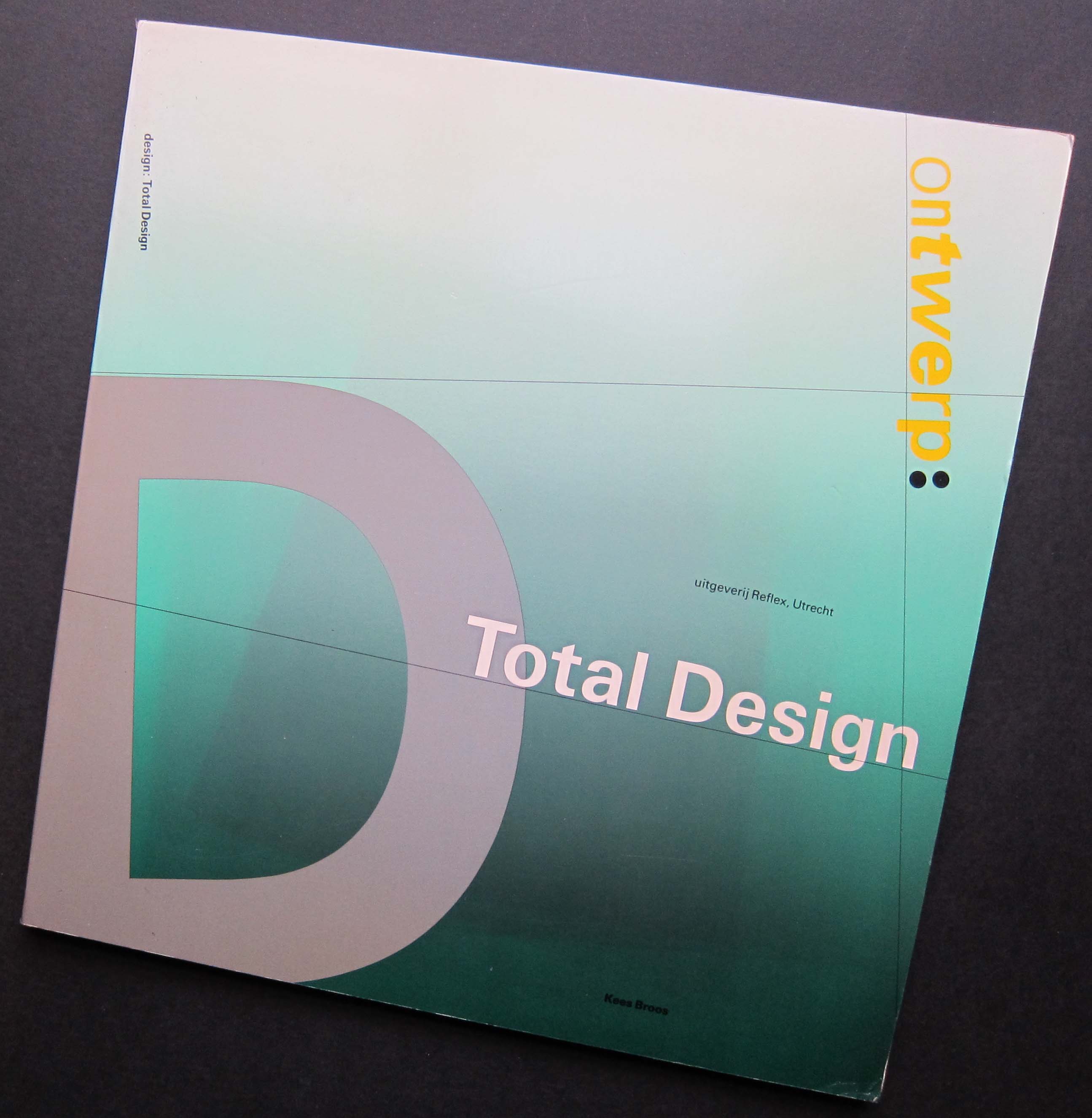
Ontwerp: Total Design book designed by Total Design, 1983
In 1983, on a visit to Amsterdam, I saw a remarkable book in a bookshop on Leidsestraat. Its shape was completely irregular. I understood a certain amount about typography and graphic design by then. I knew it fascinated me, but had yet to engage much with the history of the subject. The book, Ontwerp: Total Design by Kees Broos, had just come out and I bought it with great excitement, knowing it was unlikely to be available back home. In 1987, Wim Crouwel was the first graphic designer I interviewed for a magazine.
I begin an essay about Dutch graphic design in such a personal way because the subject is so close to me that it is impossible to disentangle these early encounters from my subsequent commitment to the discipline. It is hardly news to a Dutch audience that Dutch graphic design went through an extraordinarily inventive phase in the 1980s, but perhaps an outsider’s view can still shed some light on the degree of impact the country’s graphic design enjoyed overseas in those years.
There is a well-worn line about the Netherlands appearing to be some kind of heaven for graphic designers. The cliché holds true because that’s exactly how it seemed. Total Design, Studio Dumbar, Jan van Toorn, Anthon Beeke, Hard Werken, Wild Plakken, to name only the most obvious, were titanic figures able — as it seemed from afar — to seduce or even bend clients to their will, unless (remarkable thought) the clients actually sought such challenging work. In the 1980s, Studio Dumbar, the most emblematic Dutch designers for the British, entered project after project into the D&AD awards in London and won again and again. We had nothing to compare with this awe-inspiring level of graphic sophistication, originality and swaggering self-belief. Visits to the Netherlands, further meetings with Dutch graphic designers, and a growing knowledge of the Dutch design tradition powerfully underwrote my sense, in the late 1980s, that graphic design had much to offer and was worth writing about.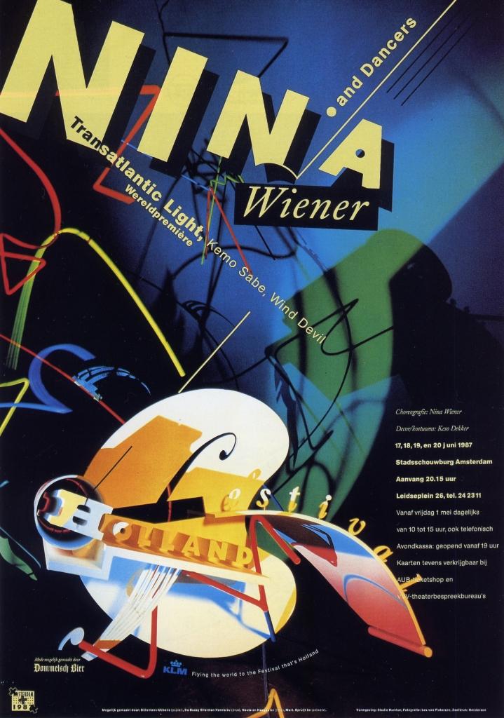
Poster designed by Studio Dumbar for Holland Festival, 1987
It is reasonable to ask, though, what exactly it was we were so enraptured by in Dutch graphic design: what were we celebrating? It was the brilliance of its graphic and typographic form. By degrees, since then, we have moved towards a situation where many of the assumptions about advanced graphic design’s inherent value as visual culture that were taken for granted among designers before the 1980s, during that decade’s design boom, and on into the 1990s, are now seen as misguided and no longer relevant to our circumstances today. As the century ended, the sticking point for many disillusioned design-watchers became form itself — the very attribute for which Dutch graphic design was once so highly prized. The repudiation of form as a valid pursuit in its own right wasn’t a specifically Dutch development. Nevertheless, Carel Kuitenbrouwer’s article “The New Sobriety,” published in Eye in 1995, was early to note a profound quietening down in Dutch graphic design after the turmoil of the 1980s.
After slow beginnings in the Netherlands and Britain (among other places), this yearning for formal sobriety became an international phenomenon within forward-thinking graphic design, a heartfelt reaction against the coercive visual overload of an increasingly spectacular global culture. Graphic excess had precipitated visual burn-out and elaborate kinds of formal expression could no longer signal anything trustworthy or meaningful. As Jop van Bennekom observed in HD: Holland Design New Graphics (2001): “Form is so worn out in the nineties.” That curious book, styled like a chunky, throwaway, airport bestseller, remains a revealing document of its moment, but compared to Dutch graphic design’s glory days, when the work was often distinguished by what Gert Dumbar liked to call “stylistic durability”, a decade later HD contains few images to set your attention on fire and little worth lingering over. Dutch graphic design, I felt then and still feel today, appeared to have thrown its beautiful graphic baby out with the decade’s excessively soapy bath water.
Visual branding versus free spirit
However well intentioned the motivations that underpinned some designers’ embrace of the new visual simplicity, it soon became just another fashionable style ripe for commercial exploitation. There was a time when much Dutch graphic design looked unequivocally Dutch because it came out of a Dutch modernist tradition of typography and montage to which it continually referred, even as it introduced new devices and directions. This tradition was still apparent in the 1980s within the postmodernism of Jan van Toorn or Studio Dumbar. 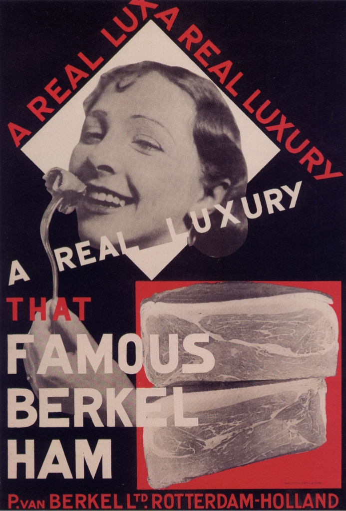
Poster designed by Paul Schuitema for Berkel ham, ca. 1928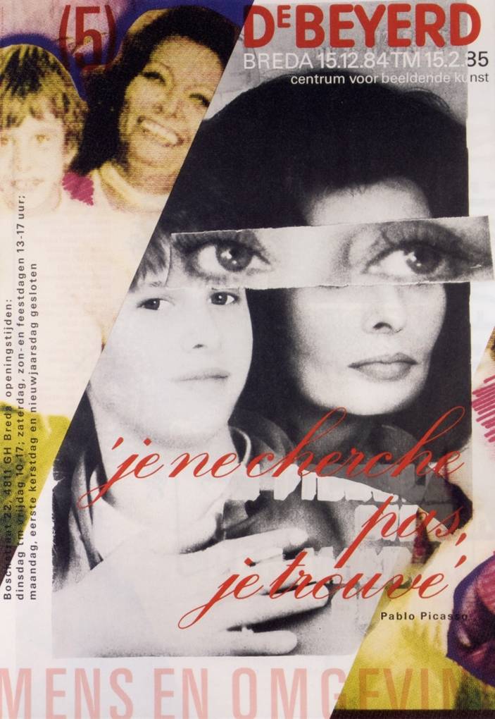
Poster designed by Jan van Toorn for DeBeyerd art center, 1984
Today, Dutch graphic design is much less obviously Dutch. Instead, its habitual graphic routines and styles of address are determined by international conventions of advertising, marketing, branding, fashion and popular culture. The most renowned Dutch “design” company of the last 15 years, KesselsKramer, is in reality an advertising agency, and co-founder Erik Kessels is regularly invited to speak about KK’s irreverent and humorous campaigns at international design conferences. Another way of saying this is that Dutch graphic design, once so vividly defined as an aspect of national visual culture, now feels much like everyone else’s graphic design. Most Dutch graphic design no longer leads the world in purely graphic terms because it has been obliged to fall into line with the imperatives of a globalised economy. Like graphic design everywhere else, Dutch graphic design mostly exists now to serve the market and the market’s needs must come first. 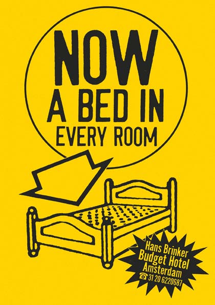
Poster designed by KesselsKramer for Hans Brinker Budget Hotel
Studio Dumbar, where strategy director Tom Dorresteijn has been a 50 per cent partner since 2005, exemplifies these changes. Dorresteijn’s concept of “visual branding” is explained in the Vision section of the Studio Dumbar website (the term also has a whole website of its own) where it is followed by a brief section titled, with heartbreaking poignancy, “Free spirit”. In this other, apparently rather recherché kind of design, we learn that “the designer has only one challenge: to see how far his or her creativity can go.” The new statutes of graphic design could hardly be made any plainer. Most of the time the designers are reined in, their creativity apportioned and constrained by the branding task. Once in a while, a benevolent client in the culture sector happens along and allows them to run around free and do what they want, like in the old days.
Somewhat anachronistically, Studio Dumbar still describes itself as a “studio”. This is a word that immediately implies a connection to art, conjuring an image of a small atelier where a creative person or group undertakes work of personal significance. Many Dutch design companies, like those in other countries, now prefer the term “agency”. De Designpolitie, a design team that fully embodies the contemporary ethos of Dutch graphic design, describes itself as a “graphic design agency”. Lava, recently named “European design agency of 2010”, also uses the term, explaining that it “belongs to a generation that has positioned itself between the traditional design agency and an advertising agency”. This is the point, of course: graphic design is ever more closely entwined with advertising, an activity whose commercial exploitation of the public sphere many graphic designers used to resist as a matter of principle. “Agency” is a service-orientated, marketing-friendly word. It makes designers sound more biddable.
Smooth and predictable visual procedures
The website rhetoric that contemporary Dutch designers use to explain their methods to prospective clients is just as revealing. “Thonik’s style is attractive and effective. Clear concepts are conveyed with a minimum of means.” (Thonik) “A lot of our work is concentrated, stripped to the bare essence.” (De Designpolitie) “Design is not art. We have no specific visual style. We always try to find a unique design solution.” (Lava) These statements are noteworthy not because they are inherently unsound but because they are absolutely standard rationales for a design company to offer. I have been hearing sentiments like these from British designers for the past 25 years. They originate from the “idea-based” design espoused by American and British designers in the late 1950s and 1960s, which was rejected in these countries in the 1980s and 1990s by younger designers, who argued that these shop-worn and often patronising methods of public address were no longer adequate to deal with the complexities of contemporary life and communication.
The wheel has now turned full circle. While the return to idea-based design might have begun as a necessary attempt to purify design of self-indulgent noise that risked obscuring the message, the outcome today is a smooth and predictable set of visual procedures that pose few challenges to client or viewer. 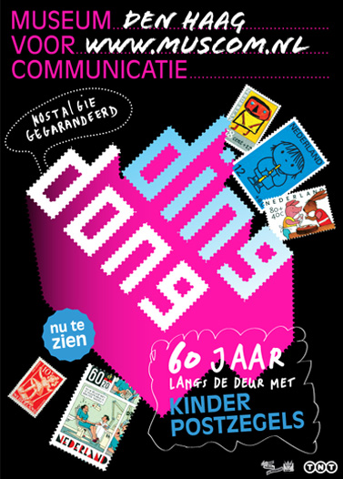
Poster designed by Lava for Museum of Communication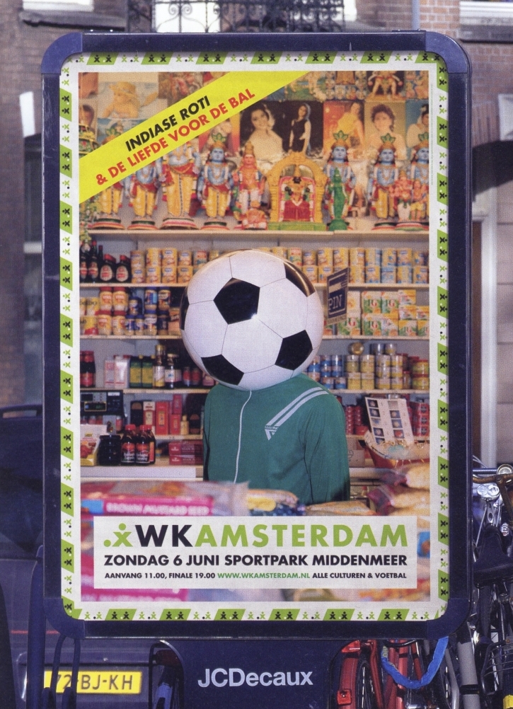
Poster designed by De Designpolitie for WK Amsterdam football tournament, 2004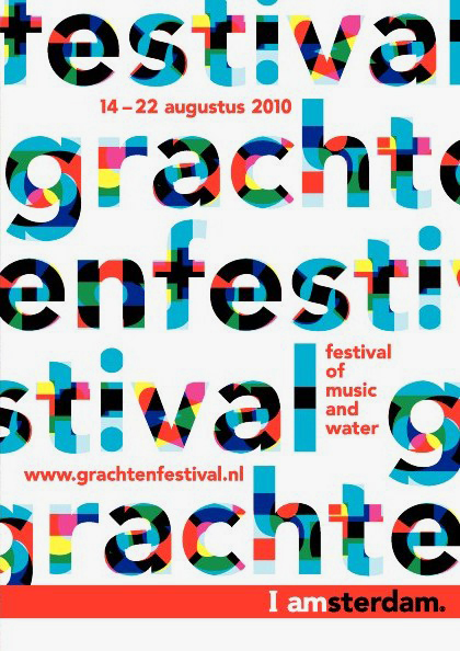
Poster designed by Thonik for Grachtenfestival, 2010. Amsterdam city brand by KesselsKramer
These designers are naturally aware of the Netherlands’ prodigious graphic tradition and, as if to reassure themselves and their design colleagues that they belong in its ranks, they sometimes invoke their forebears, even as they assure potential clients that everything will be simple and effective. Thonik follows its declaration about clear concepts and minimum means by stating that it “also has an anarchistic side and we regard each project as a chance to experiment.” De Designpolitie’s online profile informs visitors that “its members were brought up in the Dutch design culture and rich tradition of Dutch art, design and tolerance.” Their ruthlessly stripped-down designs, they claim, are both critical and communicative. The inherent tension of trying to have it both ways and relate to the great Dutch tradition of graphic design, while moderating the visual freedom that gave it life, can be sensed in a comment that Hans Wolbers of Lava left on Dorresteijn’s Visual Branding website in 2007. “I must tell you honestly that I am not very keen on theories,” writes Wolbers. “One sees regularly all kinds of ‘brand’ gurus selling an incredible amount of bullshit. Personally I place more and more belief in talented creatives that touch the right chord.”
This is another version of Studio Dumbar’s “free spirit” plea: stop trying to micro-manage the design process with an endless stream of self-justifying concepts, precepts and admonitions. Trust talented and committed designers to come up with truly fresh and surprising visual ideas, and then trust visually aware viewers to respond to them. Accept the subjectivity of the creative process, the element of chance, the things you shouldn’t even try to control. Eventually, the wheel might even turn again.
Perhaps it sounds as though I have fallen out of sympathy with Dutch graphic design. The disappointment, as I have tried to show, comes from the strength of admiration that preceded it. Dutch graphic design’s astonishing, inspiring achievements showed what could sometimes be possible in visual communication. Its innovations provided unusually exacting benchmarks that could be used to assess graphic design anywhere. I can only suggest that it would be dishonest now — and self-deceiving on the part of Dutch designers — not to apply these benchmarks to the contemporary graphic design scene.
The authentic historical voice of Dutch design
One of the most encouraging and energising developments in Dutch graphic design has come, since the end of the 1990s, from a perhaps unexpected direction. In Word of Image: Metaphorical Thinking in Dutch Graphic Design (2004), Jan Middendorp reprises the frequently heard view that Dutch designers are “no great theorists”, preferring instead to concentrate on the practicalities of making things work. Wolbers voices his own reservations about the perils of theorising in the statement above. But the idea that theory-averse pragmatism is particular to the Dutch has always seemed questionable: first, because only a minority of graphic designers anywhere are ever much given to theorising; second, because some Dutch designers — Crouwel and Van Toorn to name but two — have always been prepared to reflect trenchantly on the ideas that support their design methods.
In the last decade, two design groups, Experimental Jetset and Metahaven, have taken this commitment to intellectual reflection to a higher plane. Although it hasn’t been widely remarked, which may serve to underline the continuing paucity of close critical attention given to graphic design, both teams consistently offer some of the most cogent thinking about the discipline, its present condition and possibilities, happening today. In each case, independent critical reflection becomes an inseparable component of everyday practice. Nor are these the usual tiresome, spirit-crushing bromides about branding and marketing. Metahaven has recently published a book, Uncorporate Identity (2010), and both studios — they are emphatically studios — are interviewed in Iaspis Forum on Design and Critical Practice: The Reader (2009). Since space is limited, I will concentrate here on Experimental Jetset, the longer established team.
Poster designed by Metahaven for CAPC Musée d'art contemporain de Bordeaux, 2008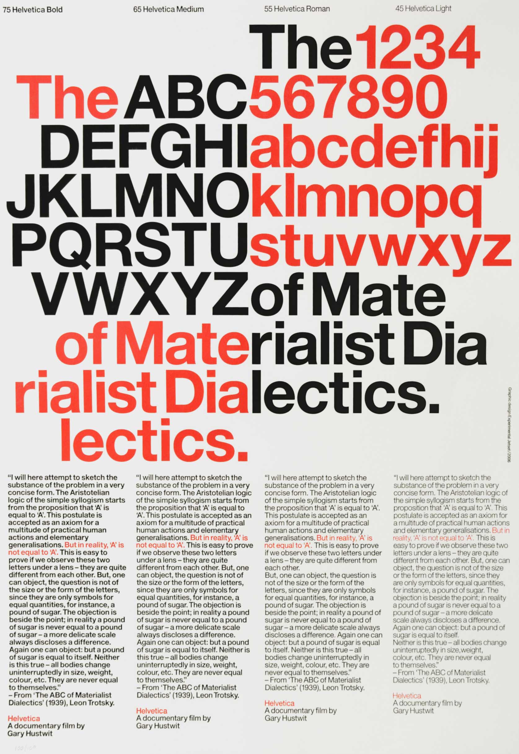
Poster designed by Experimental Jetset for Helvetica documentary, 2006
In Experimental Jetset’s uncompromising statement of their position, we hear the authentic historical voice of Dutch graphic design, a reminder of how the country attained its elevated position on the global design stage. The three members, Erwin Brinkers, Danny van den Dungen and Marieke Stolk, explain that “the reason we exist as a studio is because we have a singular aesthetic/conceptual vision, a very specific language we speak.” (See Studio Culture, 2009.) They are only interested, they say, in working with clients who understand this vision and who expect them to bring “a specific viewpoint, an aesthetic/conceptual language, an ideological approach” to the table. Clearly, this is a radically different style of self-presentation from one that promises a chameleonic ability to adapt the design output to fulfil a client’s expectations.
Experimental Jetset have a self-conscious relationship with the Dutch design tradition, most clearly seen in their frequent tributes to Wim Crouwel, the elder statesman most revered today by young designers outside the Netherlands. As a viewer, I have sometimes struggled with the Crouwel-esque modernism of Jetset’s visual palette. This doesn’t excite me greatly in 2010, even though I appreciate the source and understand the thinking — their desire to stress the materiality of design and create objects rather than images — that led them to these stark visual conclusions. It is characteristic of their clarity as commentators, though, that they freely admit the drawbacks of their hero’s former empire. “Total Design signalled in many ways the beginning of the sort of studios that we very much dislike: large communication conglomerates, where the actual practice of graphic design is overshadowed by branding strategies, marketing theories, advertising models, etc.” In their view, the over-complication of the commissioning and design process has been caused by layers of marketing and communication people who create unnecessary work to keep themselves employed.
“We feel we are now at a point in history where we actually have to go in the opposite direction,” they say. The solution to the bloating of the design business is not for design “agencies” to grow even bigger, but for marketing to shrink. Resolutely, Jetset remains a three-person studio that only takes on what it can handle. Here again, we encounter a variation of the “free spirit” argument, only his time from a studio that has found a way to make freedom of manoeuvre a central plank in its self-determined charter. If we care about graphic design — Dutch graphic design — as a still potentially limitless means of visual communication, then this modest proposal from one of the most thoughtful studios now at work in the design field must be correct. The future of graphic design, if it is to have one, can only lie in focusing on graphic design. Dutch designers who refuse to give up the ideal of studio practice are keeping the flame alight.
This essay first appeared in the Dutch Design Yearbook 2010 (NAi Publishers, Rotterdam, 2010) and is republished here with permission.
A Dutch translation of the essay is available here.


Comments [23]
Although you refer to Dutch design agencies, where then would a company like why not associates fit into your pre-conceived logic based on a websites 'about' page? They sport the term 'associates', they're known for dismissing theories and yet have the selling statement on their studios website.
Designers are organisers yet no self-respecting design on the planet wouldn't cringe when the time comes to sit down and organise a statement. However, it offers a chance for self-reflection and more logically, self promotion. A means to an end for obtaining work, regardless of the size of a studio. Some things are just default.
Bill Gates is extremely rich but he still provides a letterbox for his postman.
12.16.10
01:43
12.16.10
05:23
12.17.10
02:15
Do you want to look bad or good?
I can't imagine why any client would choose looking bad (although many do). While looking bad may be more affordable regarding the cost of the designing:
It Costs The Same To Implement
For every 1,000 signs and every 1,000,000 pages or tablets or templates or web/mobile impressions, the cost is not affected by the aesthetic quality of the design.
Design can't save the day if the product or service to which it refers is no good. All things being equal, it couldn't be more obvious to seek out the highest quality. Even for generic brands that want to look cheap, there are high-quality ways to look cheap in a thoughtful and strategic way.
Call me an agency or a studio or a partnership or a toothpick.
Someone recently said that creative design is the most important least important thing in the world.
12.17.10
02:42
Setting a challenge for a new generation of designers is great, but we need to make sure the challenge relevant. Is it reasonable to expect groundbreaking work from such an old medium? Or is this exactly the point being made?... What isn't mentioned is how the medium for Graphic Design has shifted. The way I understand it, when Total Design were creating exciting work in the 80's - desk-top publishing played a new, inseparable and integral part of the design process. They embraced this new design medium and toolkit. The tools for the Graphic designer have shifted again. Some of us are working with networked 'pages' and dynamic 'words'. Resulting in a whole new aesthetic, projects like http://www.lust.nl/posterwall from LUST is just one example.
Good food for thought. Thanks Rick.
Paul - if you manage to get a recording of the debate, I'd love to hear it.
12.17.10
08:07
12.17.10
10:25
Describing designers’ statements about their work as “just default” suggests a process that isn’t given much thought. I would suggest that the language designers use to describe what they do requires great care for two reasons.
The first reason is practical. Words, too, are an expression of identity and designers routinely claim to be experts in this. If the words are clumsy or bland or obvious, then what does that say about the creative sensitivity of the designers? If the assumption is that potential clients won’t care about the quality of the words, then this doesn’t bode well for the quality of any creative relationship.
Remember, too, that designers often have an input into the words used in design projects (commissioning writers, undertaking editing, etc). Well crafted writing on the designers’ website is a good sign that they will handle words carefully in their projects.
The second reason for taking care is philosophical. Putting something into words is always a way to test it — writing is thinking. Other than selling their services, which is a given, what do designers have to say about what they do that sets them apart from other designers? What is the point of view, agenda or position that underpins their work? And how is this position different — is it actually any different? — from those of all the other design companies out there?
That’s what I'm interested in here: designers who have a position.
12.17.10
11:02
12.18.10
05:28
Thanks for the response. I did enjoy reading your article, but I must admit that the forewarning of a 'controversial article' on Design Observers twitter feed had me eager to form an opinion.
When I referred to default, I was purely referring to a 'statement' having to exist and not the content that exists within a statement.
For me, the complexities that exists within a design studio are vast and intangible. Having a single position or an elaborate poise, no matter how well conceived, will always fall into critical and paradoxical territories. With numerous designers operating within teams and with different tasks and challenges at hand I think the nature of a statement will never give justice to the underlying work that goes on in a design studio. That said, I am more than aware of the power of words and how essential they are for organising information to communicate intelligence. It is by no coincidence that the most revered designers are superbly articulate and fascinating to listen to.
Word and imagery are complimentary in design, their successful marriage is essential for intelligent design, but trying to separate one from the other in order to portray a sort of zeitgeist of dutch design today is perhaps the nature of the controversy in this article.
12.19.10
03:02
There is no doubt that design —all over the world— has experienced a rounding of personality. Ideas, visual styles, practical techniques, etc. have all felt the influence of their neighbors; perhaps now more than ever. The internet, the mass sharing of designs and ideas has averaged us out in some respects. This is not the fault of agencies or designers, but instead a by-product of the 'new' world we live in.
It is estimated that there are currently 2 Billion active internet users; over 500 million of which use the exact same design (facebook) everyday. Half a billion people, from every corner of the globe, exposed to the exact same visual language? Of course this will have an effect of the world's understanding, expectation and comprehension of design. Design once spoke to the local audience, now it speaks to the world; naturally, this has changed the fundamental rhetoric of the design. We are getting closer and closer to a more connected world; the more we become one, the less we are different.
Design is the process of practical problem solving. Such practicality is defined by the initial problem, aesthetics and logic. It's an interesting topic, but it is not fair to criticise agencies because their work doesn't tickle your fancy. At least, that is how it seems.
12.19.10
07:31
As for whether Lust’s poster wall represents an entirely new aesthetic, isn’t this a digital elaboration of a highly familiar 20th-century aesthetic: the collage made up of overlapping elements? The new element in Lust’s project is the randomness that results from clicking on the image and thereby modifying it.
But the much-celebrated possibility of this kind of instability and mutability (which also goes back decades) doesn’t make static forms of image-making and message-making redundant. If anything, the existence of these alternatives encourages us to think even harder about what the static image is best suited to do. The contemporary Dutch designers I mention in the essay are all still engaged in producing this kind of “old” graphic design, as seen in the posters shown above.
That brings me to Youssef’s curious point about it not being fair to criticise things that don’t “tickle your fancy.” If we were to follow this highly restrictive precept, then no one could criticise anything they didn’t like. You thought the meal tasted bad? Perhaps it just didn’t tickle your fancy. What this overlooks is that our experience of many meals gives us benchmarks for comparison. We may have very good reasons for not thinking something has been well cooked and presented. The point is to move beyond the first subjective impression to investigate the factors that lead something to seem obvious, unimaginative, flawed and so on.
The process doesn’t have to be negative either. We can learn just as much about the essential qualities of a medium from trying to decide why something strikes us as being engaging, deeply imaginative, well resolved, etc. In short, how does it work?
12.20.10
01:01
12.21.10
06:33
When design shops want to help define the strategy, they have to be more stylistically versatile, and not attached to a personal vision. One style/ vision is not right for all projects, clients, and audiences, and a truly open and empathetic approach to strategy will not generally lead to one house style.
What may have happened is that in the desire for greater power and profits, design studios moved upstream into the strategy business, which by definition I believe, necessitates straying from a singular or personal 'artistic' vision.
12.21.10
02:40
12.22.10
05:34
To an American designer, the more individual path might seem too similar to an artist's vow of poverty, while the other too blatantly commercial and soulless (as well as inevitable). The typical Dutch design student graduates from a state academy with an opportunity to acquire government grants to help initiate a studio practice. The average American designer graduates from a private art school with tens of thousands of dollars in loans. It's not so much a reflection of an aesthetic approach to design as it is one of overall cultural values. So I think the criticism of criticizing design studios based on personal taste is fair, because it doesn't take into account the socioeconomic reality design happens in. On the other hand, given higher taxes as well as stricter labor laws, an agency like KesselsKramer is probably a lot more difficult and costly to run in Holland than say an Ogilvy and Mather or Crispin Porter Bogusky in America.
But i think these questions are lost here because the analysis limits itself to only to a surface manifestation of graphic design. Saying that Dutch Design is so good doesn't say anything new or interesting, and it's been said many times over. As Youssef points out above, design in even the last 5 years has been rounded out by the internet. In some ways, many of the historical examples above are evidence of a design context just starting to become aware of globalization (and you can see this in other aspects of popular culture of this time as well, such as film and music). But a sense of what is happening now seems to be missing from the article. This is evident in the analysis of Lust's poster wall in the comments. Viewing it simply as a reworking of 20th century aesthetic approach strikes me as missing the point. In one sense Lust's project completely flattens all aesthetic approaches by demonstrating the ease graphic design's algorithmic simulation; on the other it highlights the flow of information through networks and the designers role in conducting that flow.
12.23.10
03:54
After a public debate last week in Amsterdam, prompted by this essay, a founder of one of the design companies I mention above made a point of telling me privately that the historical work I cited was simply of no interest to him. That, too, I would suggest, reflects a personal taste. I understand this designer’s point of view — creative people always have their own preferences, which often exclude many other possible approaches that nevertheless remaining interesting and valid for others. But the rejection of whole swathes of historical work (not that the 1980s is so very long ago) tells us nothing useful about this work’s meaning and value to viewers, or its power to inspire those who have the eyes to appreciate it, now or in the future.
The present lack of interest in certain kinds of form-making is doubtless only a temporary phase. The longer it persists (in some quarters) the more likely form is to re-emerge with force at a later date as the next generation of designers wonders why its elders have been ignoring these excellent resources, assuming that is, that the constraints that increasingly act on graphic design have left these future designers much room for manoeuvre. During the audience questions at the debate, Gert Dumbar underlined the point by making wave movements with this hands; these things ebb and flow.
Why, in any longer-term strategic sense, would designers want to cut themselves off at the knees by flattening “all aesthetic approaches”? I'm happy for graphic designers to satisfy their very obvious will to power by directing the flow of information through networks. But can we please have something interesting to look at too?
12.23.10
09:49
Instead today's big studio's should be compared to the likes of Tel Design and 2D3D, besides Total Design. Total Design was not as relevant to the kind of Dutch Design Poynor talks about, in terms of free spirit and a ruthless anti-commercial, anarchistic attitude in the early nineties. I would say today's studios are a lot more interesting in these times than the commercial studios of the eighties and nineties were in theirs.
The work the admired studios put out in their peak according to Rick, was in a time when computers weren't even around. Ok, TD had one computer costing a few million guilders with operating costs that nearly put them out of business. Life was slower, developing a single logo (not even thinking about any visual language surrounding it) could take months if not years. There was much more time for reflection, a thorough concept phase, a first round of design, a complete start-over, a drink, a party and living life, with your design benefiting from your worldly experiences. Graphic designers were scarce and, let's be honest, nerds. They did a thing not too many people knew too much about and indeed: there were fewer marketing people blocking their creative splurges.
These times are definitely over. Clients have changed, budgets have changed, the world has changed. Design studios not so much compared to the rest.
The attitude of 'bending a client to your will', using their budget for the studio's creative experiments with the ultimate agenda of the Advancement Of Graphic Design i.e. your standing in the eyes of other designers, seems hopelessly outdated and arrogant.
Rick rightly points out that studios make something different for every situation but I fail to see fault in that. One can call this chameleonic if your premise is that clients are good for nothing except giving you money to make your art on their corporate letterhead. One can also argue that today's studios are in a sincere, grown-up dialogue with their clients. Should we by default mistrust commercial clients and push our own aesthetic agenda? Or simply make design that works in the real world. Ever seen the quirky, artistic and sometimes irrational short movies Studio Dumbar made a year ago for the Dutch Design Awards? There is a place and time for everything.
It is remarkable that one of the examples of 'good' contemporary Dutch graphic design, Metahaven, is purely an academic exercise. They effectively have placed themselves out of any situation where they can bring about any real social change. Sure, they create wonderful posters and research projects, but do they change the world? Its recent commitment with Wikileaks does nothing except boost their 'subversive' profile. It is a wet towel.
I have more sympathy for Thonik that used their skills to create a hyper-effective identity for the dutch Socialist Party in a bid to get them as much voters as possible. That is the same party who is trying to reverse the privatisation of all those wonderful clients of back in the days like KPN (former Dutch telecom) and TNT (former Dutch post). The two companies that played a vital role in shaping the Dutch Design, who now have almost completely put aside their role of cultural sponsor. And why should they commission Design for Design’s sake when they have to fire thousands of employees?
The right thing to do according to the essay and it's predecessor the First Things First Manifesto, would be to collectively stop working for them, those evil big clients. Stop the dialogue and don't participate. Still, the Hema, a company that basically sells household products has done more for Graphic Design than, lets say, the Rijksmuseum. I will choose the hard-working honesty of their identity designed by Koeweiden Postma any day over “strategies in public space”-bullshit propagated by ‘intellectual’ designers.
12.27.10
02:40
You suggest I make the wrong comparison. I’ll answer that with a quotation from William Drenttel’s “A Conversation with Daniel van der Velden of Metahaven,” which summarizes my own view:
“The fact that something is small, or comes from a small place, is indie, or underground, in my view does not inherently invalidate its comparison to something bigger and more recognized.”
>They did a thing not too many people knew too much about and indeed: there were fewer marketing people blocking their creative splurges. These times are definitely over. Clients have changed, budgets have changed, the world has changed.
Clearly this is the case: these changes are the starting point for the essay. But you present this statement as though it were the last word on the subject and a reason to accept things as they stand. The fact that the world has changed is no reason not to ask critical questions about these changes, their causes and their implications. There can be no resistance, no alternative, without a clear sense of purpose. The world will change again — but see below.
>Should we by default mistrust commercial clients and push our own aesthetic agenda? Or simply make design that works in the real world[?]
This is an over-simplification of the issue and a false opposition of aims. The reality of any reflective designer’s position will be much more nuanced. Again, see this quote from the Daniel van der Velden interview:
“Our business model is this: you have to take everything as an opportunity and be very entrepreneurial about your work. You have to mix paid assignments with self-directed work; don’t assume that self-directed work is going to be the final solution. It won’t be. Design and clients belong together.”
The issue is one of balance: what are your aims as a designer and how can you achieve these aims in terms of the work you take on?
>Sure, they create wonderful posters and research projects, but do they change the world?
We are too quick in design to make claims and criticisms based on the increasingly glib yardstick of “changing the world.”
First, because the implicit assumption is that changing the world is inherently a positive activity. It isn't necessarily so. Many changes are, of course, pernicious and damaging.
Second, because even if we mean change in a purely positive sense, this assumes that there is, or could be, some way of measuring the amount of change and then assigning it a value. The implication is that more of something (in this case change) must always equal better. Maybe you would like to live in a world where value is assigned numerically. I wouldn’t. Fortunately, much of what we value most in cultural expression resists such crude attempts at valuation.
How do we measure these putative “changes” in any case? Many people’s lives are changed, they report, by subjective encounters with the arts and with new ideas. And the same might apply to “wonderful posters and research projects.” But these highly personal responses are unquantifiable in any meaningful sense. What is vital, though, is that a rich and diverse culture continues to make these intensely meaningful experiences available to people. Why can’t design also be the medium for these experiences, as it has been sometimes in Dutch graphic design?
>I will choose the hard-working honesty of their identity designed by Koeweiden Postma any day over “strategies in public space”-bullshit propagated by ‘intellectual’ designers.
This is a false distinction, in my view. Are you really suggesting that “intellectual” designers are neither hard-working nor honest? Both kinds of design, intellectual and pragmatic, are possible and necessary.
12.28.10
01:44
I wholeheartedly agree with you that social commitment is lacking in the Netherlands right now, but it is unrealistic to expect the Hard Werken kind of commitment from big studios who choose to work with big clients. I did not see that kind of commitment from TD, Studio Dumbar, Tel or other big studios that chose to work with big clients in the previous century, so why expect it now?
However, I would expect that kind commitment from groups like Metahaven, who build their reputation on being critical, cloaking themselves in words and images of activists but end there: beautiful, well-executed but empty words and narcissistic statements only seen by their 'stakeholders', to use a marketing term. To 'change the world' is not my glib yardstick to measure a design by, it is what the work of 'activist' designers suggests it will do.
Call me crude, but for me an important measure of the quality of a design is how well it works and if it does what it promises in a visual sense. If a mind-blowing confusing poster is the most effective way of getting your point across, that will work for me on the same grounds, but one will only seldom encounter such a situation with commercial clients. Not because their evil marketing minions would kill it but because they have a different message to get across than, let's say, a design festival.
12.28.10
06:25
I further suggest that the "studio" approach and mentality has proved conducive to formal (and conceptual) experiment in Dutch design. For me, form matters in its own right — both aesthetically as a source of pleasure and for its meaning. I don't expect a commitment to formal experiment to come from big commercial companies and that's certainly not what I'm asking for. On the contrary, I support Experimental Jetset's idealistic call for a slimming down in design that places a renewed concentration on graphic expression. This would mean "serving the market" (i.e. the client's commercial need, where there is one) while also serving the public by producing sophisticated visual communication that extends and enriches our visual culture. Design that neglects the latter task also neglects its responsibility to the public sphere.
Metahaven's position — see Bill Drenttel's interview — is in my view much subtler than you paint it to be.
12.29.10
01:19
there is a fundamental difference in the design landscape of today and back then in the 70s/80s. in fact the work of studio dumbar and total design made an important contribution to that change by creating intriguing examples for the power of graphic design - also beyond printed matter. graphic design has become very important to more fields/disciplines than just that realm of what we used to call "graphic design" - advertising, branding, digital media, product design, fashion design ... graphic design today is ubiquitous: on mobile phones, in TV, exhibtions, media installations, art, books, magazines, user interfaces ... even the dutch pavillon for the venice art biennale incorporates a graphic designer next year. this is good news for graphic designers - but it does make their life not any easier. the whole field is in total flux: we are educating today in art schools and colleges design students for jobs which are not even existing yet (but might exist by the time they graduate).
to formulate a "position" in this "mess" is much more challenging as compared to 30 years ago. to formulate a position as a design community on a national level (as this happened in the 80s in netherlands) has become mission impossible. as our societies are in a constant development of fragmentisation our visual cultures can only function on a micro level of fragmented communities and (sub)cultures as well.
apart from that: netherlands is a country who tragically has lost its identity some few years ago and is struggeling to find a new one at the moment. how can one expect from a country/culture like that to create a visual culture which could be recognized beyond its own boarders?
as much as i recognize "experimental jetset" and "metahaven" as important figures in the dutch design culture:
to name "experimental jetset" as the design studio who had mastered the challenge described above is rather nostalgic. and "metahaven" constantly stay behind the expectations they are rising themselves about their work and approach. as much as they are brilliant thinkers, writers and analysts i see a big gap in how they give their thoughts a form which would live up to their own ambitions. but: it works quite well in their own fragmented community and this is as much as one can achieve probably today.
and before i forgot this (a sidemark): "bending a client to your will" always has been a designers myth resulting from a frustration of designers with their own clients. even more - this myth draws the ugly image of an ignorant, autistic designer who is not able to communicate with a client and make his own processes transparent so that a client could understand them (which eventually is the source of the frustration since the client might very likely reject the designers' proposals). from my experience there are only two kinds of clients: there are clients who a dumber than oneself and others who are smarter. it is always a good idea to work with the latter ones. one has to be prepared though that the smart clients also have one or two ideas which might be worth to consider. i think that gert is simply an intelligent guy who found intelligent clients who trusted him and worked with him in a dialogue and on eye level - that is the secret of his success. and yes - he knows how to entertain designers in a design conference and tell them funny stories about the stuff he build into his design without the clients noticing ...
12.30.10
07:10
http://observersroom.designobserver.com/rickpoynor/entry.html?entry=24058
01.07.11
06:06
08.16.11
08:28