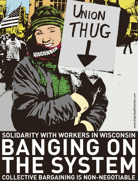
Dignidad Rebelde, USA, 2011
As a supposedly antiquated form of media, the poster is regularly pronounced to be on its last legs as a means of communication and of marginal relevance now. I have written pieces myself saying much the same thing. No one doubts that posters used to be highly effective as both advertising and propaganda, but from the moment people in wealthy economies started buying TVs and watching commercials, the role of the street poster began to decline (the billboards still flourishing like an infestation at the roadside are another matter). The arrival of digital communication and then social media appeared to leave the poster spluttering for life, and when it came to the protest poster, the prognosis looked just as gloomy. If ordinary posters aren’t much needed now, why should posters expressing dissenting views fare any better? Five or six years ago, I would have said the poster advocating a cause was barely viable.
Now I’m not so sure. Digital networks are infusing posters produced to contest an outrage or support a cause with a new lease of life. This kind of message has two places to attract attention now — out in the world and online — and the poster-making urge is benefiting from the same viral meme effect seen across our entire hyper-connected culture. Anything that happens is immediately captured on camera and uploaded, and the effect of showing these images so widely and easily is to inspire viewers who like what they see to do more of the same. Participation acts like an injectable hormone spurring yet more growth. Since the global Occupy protests, there seem to be more posters, or poster-like messages, used in demonstrations than ever.
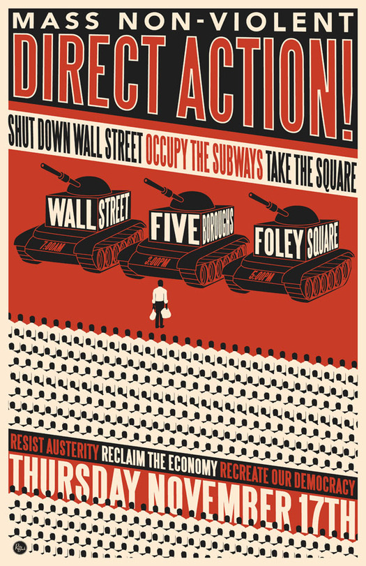
Rich Black, USA, 2011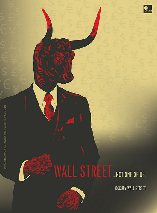
Michael Thompson (Freestylee), Jamaica/USA, 2011
Protest posters have never been an exclusively or even primarily professional design activity. Anyone with an urgent point to make and a measure of artistic knowhow could get out the scissors and take up a brush. This is even more the case today with the graphic placards often described as “protest signs” rather than posters. After protests, it has become common to see online news media running visual stories with titles such as “The 50 most enjoyably effective protest signs at Occupy protests.” Websites offer school children advice on “How to make a protest sign for a school project” and put across their legitimate point of view. Radical poster-making almost seems to be becoming a badge of good citizenship.
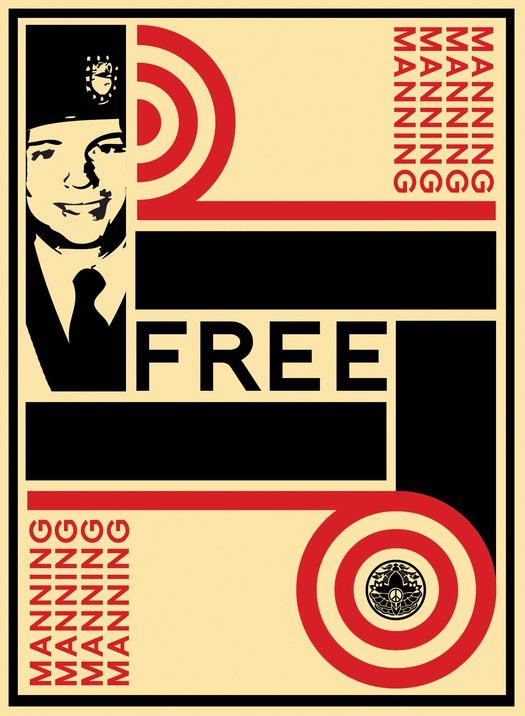
These DIY protest signs might be amateur (though that doesn’t stop them working as communication) but they remind us that posters remain a succinct, popular and powerfully immediate form of public speech. If someone feels strongly about an issue, it’s natural to try to express support or condemnation as persuasively as possible, and in public settings a well-crafted slogan or image is still hard to beat. The posters come from a seemingly irrepressible urge to broadcast a firmly held opinion using graphic resources, and they address a wide of array of issues, many of which have been, or remain, at the center of attention: global warming, Occupy, the BP oil spill in the Gulf of Mexico, the earthquake in Haiti, Hurricane Katrina, the Japanese earthquake tsunami and the nuclear disaster at Fukushima. In the past few years, passionately concerned poster-makers have given their support to innumerable urgent causes, from migrant workers, Guantanamo Bay, Palestine, women’s rights, child labor, and landmines to water wastage, nuclear power, the protection of wild life, urban farm gardens, and the plight of WikiLeaker Bradley Manning.
Eric Gulliver, USA, 2011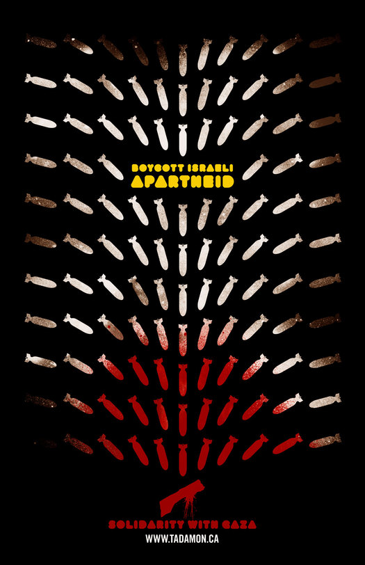
LOKi Design, Canada, 2009
As graphic communication, the most salient characteristic of these recent posters is often a surprising politeness and restraint. Twenty years ago, a volume of protest posters produced during the presidencies of Ronald Reagan and the first George Bush earned the title Angry Graphics, and the graphic styles of the work — awkward, angular, discordant and ugly — smashed home the righteous fury. Contemporary posters might be fired by angry convictions that iniquity or injustice should not be allowed to continue, and that change must happen soon, yet the images are often decorously barbed rather than manifestly disturbed. They display bright colors, serene flat surfaces, well-resolved forms, an ideal of graphic reduction, and a very contemporary polish, if not perfection, that tells of their origins on a computer screen rather than inky paper taped to a grimy drawing board. At its most considered, this fastidious graphic minimalism can be highly effective. The foetally clenched form of the dreaming child in Marlena Buczek Smith’s Haiti poster works by invoking distressing images of emaciated and vulnerable children familiar from countless news photographs. In Antonio Castro’s equally honed and incisive migrant workers poster, the spade’s shaft becomes a painfully exposed spine distorted by the demands of crushing physical labor.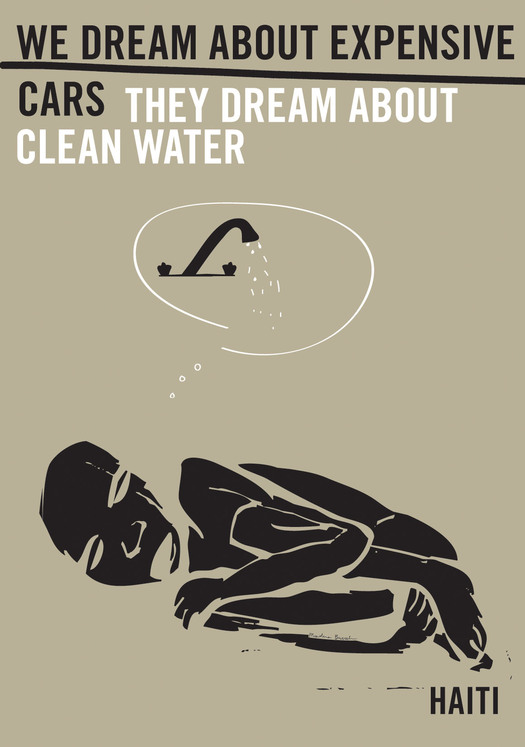
Marlena Buczek Smith, USA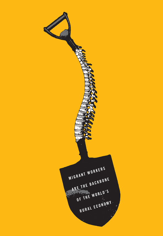
Antonio Castro, USA
The tasteful understatement of many recent posters, their reluctance to shout, perhaps reflects a deeply ingrained feeling that emphatic displays are no longer acceptable — that they run the risk of appearing shrill and dogmatic. This inhibition, born of years of affluence and complacency, when only a minority felt the urge to protest, has lessened since the global financial crisis began in 2007. The homemade protest signs show a new public willingness to speak out with vigor and wit. To find uses on the street, where the mood is increasingly frustrated, as governments seem either reluctant or powerless to act, professionally produced posters need to avoid any sense that they are aesthetic parlor games detached from the struggle. There are some marked differences between work produced for private satisfaction or for sale as a screen print, which can sometimes be overworked and effete, and work produced with the crowd, the streets and the urgency of direct action in mind. It’s understandable that graphic artists want to devise the best possible image they can, but a persuasive, easily graspable representation of the cause often has more utility.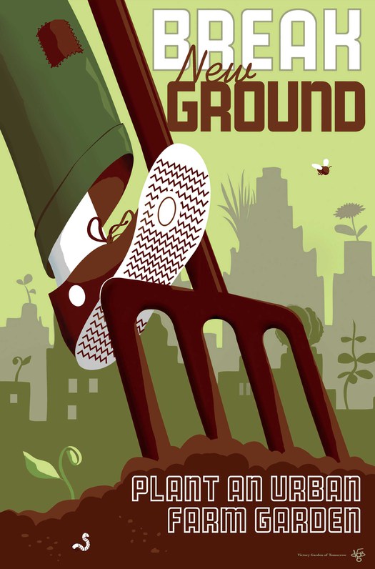
Joe Wirtheim, USA
At the same time, we should be realistic about the part that posters might still have to play. There is a tendency sometimes to judge expressions of protest and advocacy, including posters, by ridiculously overblown yardsticks. “Has anything changed?” demand the skeptics. “Because if it hasn’t, then the gesture was a failure, and making posters was misdirected energy and a waste of time.” The claim that in an age of social media posters have become redundant simply doesn’t square with the continuing enthusiasm with which they are made and put to use. The poster is clearly just one of many creative, intellectual and organizational tools in the struggle to shape public opinion and exert pressure on policy-makers grasping the levers of power that might some day lead to change. Whether held aloft in the hand at demonstrations, pasted defiantly on a wall, or circulated online by true believers, the graphic message’s modest but necessary role is to attract attention, encapsulate a burning issue, exhort, inspire and reaffirm. Despite regular predictions of its imminent demise, the committed poster shows every indication of living to fight on.
See also:
Sending Signals about Political Graphics


Comments [8]
Rick: Activist Posters ( AP) at least the great ones, have a sense of humor and in the age of twitter – you’re right — they are here to stay. On Aug 24th 2010, an (AP) went viral when it was posted on the Democratic Underground.
Who designed this simple poster in Pharaoh's Journal? (Pharaoh or Pharoah) Could it be Jay Pharoah (Jared Antonio Farrow) from SNL? You’re the design expert, but at any rate I thought you would enjoy last night’s bit (09/15/2012) on the Season Premiere of ‘SNL.’
09.16.12
10:55
09.17.12
04:49
In response to the oft-asked, "did anything change?", I think it's the wrong question. Aside from the practical purpose of many posters inciting people to attend specific events, rallies and demonstrations, these types of posters also act as a way for marginal voices to be visualised/materialised. The goal is not so much to create direct, quantitative change in policies or what not, but to maintain a strong presence of dissenting voices in our visual landscape (be it virtual or physical, in the streets). They work as acts of solidarity and encouragement for those doing the hard work of social change, and for those that might be opposed to or unaware of the causes espoused, a reminder that we are there (ie. everywhere :P).
09.18.12
07:12
09.18.12
07:12
09.18.12
09:44
Russ, yes, a lot of professionally produced posters are very image-led and illustrative. It would be good to see the sharp verbal ideas of the amateur poster signs brought into proper poster-making, with a strong and where necessary hierarchical typography to articulate them. For me, the first two posters are among the most satisfying here because they feel so connected to their causes.
Kevin, you make a key point about the posters as encouragement. People who can't see the purpose of protest and advocacy posters miss that. The "other side" reinforces its position with massive amounts of visual and media propaganda. Posters are just another way of keeping an alternative way of thinking in collective view.
09.21.12
03:23
More recently I've very much enjoyed Rick Black's work. I've made some modest contributions myself, but my favourite sign from Occupy Sydney is still the handwritten message I saw declaring that "I am 99% Human"
09.25.12
09:07
09.28.12
07:00