03.03.13
John Foster | Accidental Mysteries

The Proper Art of Writing in 1655

These over-the-top calligraphic letterforms came from a 17th century German book on the art of writing. The full title (in English) reads The Proper Art of Writing: A Compilation of All Sorts of Capital or Initial Letters of German, Latin and Italian Fonts from Different Masters of the Noble Art of Writing (Kunstrichtige Schreibart allerhand Versalie[n] oder AnfangsBuchstabe[n] der teütschen, lateinischen und italianischen Schrifften aus unterschiedlichen Meistern der edlen Schreibkunst zusammen getragen).

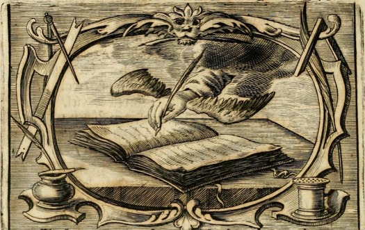
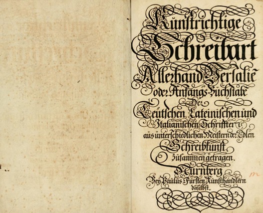
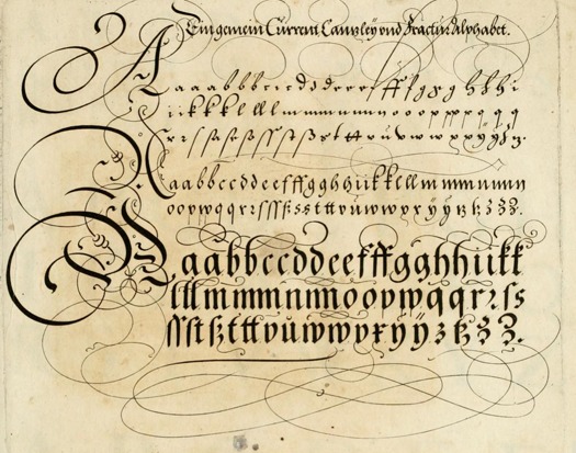
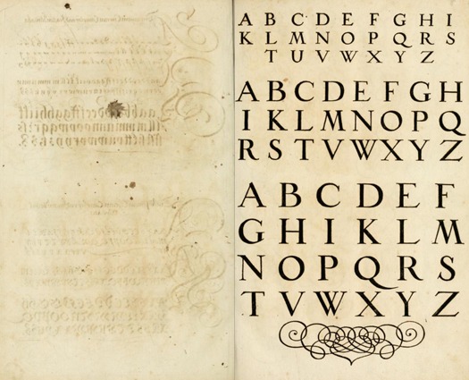
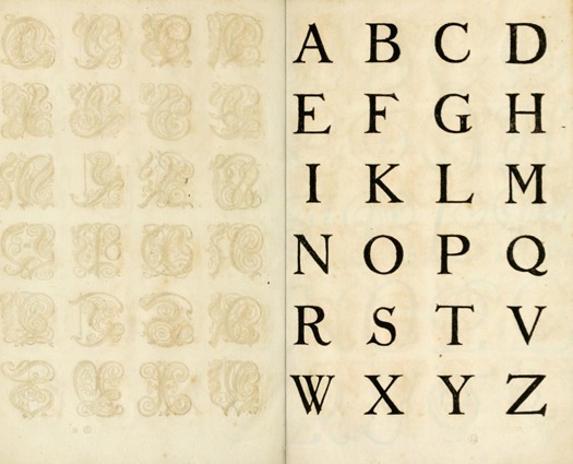
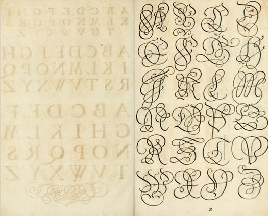
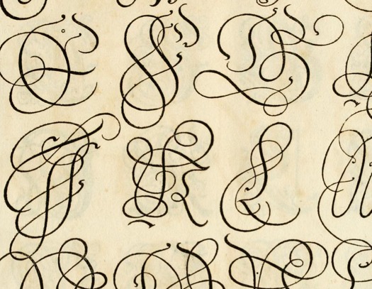
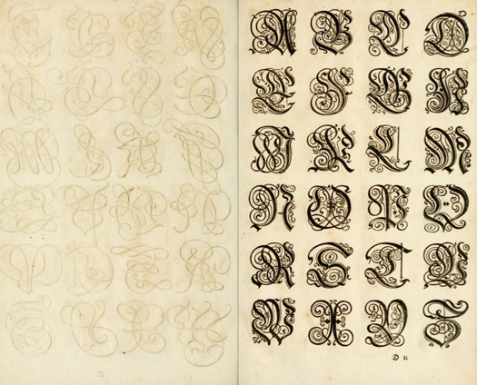
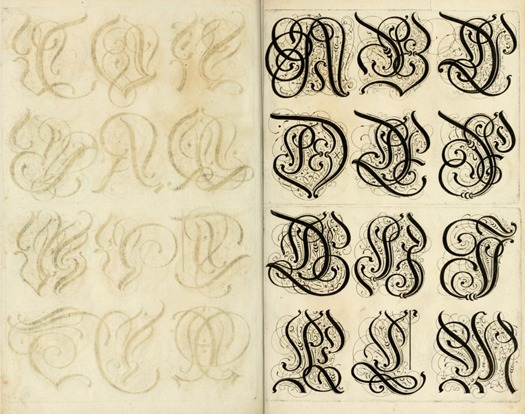
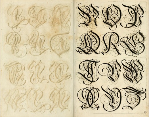
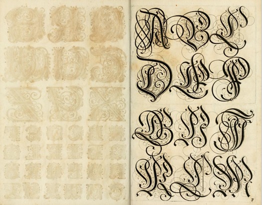
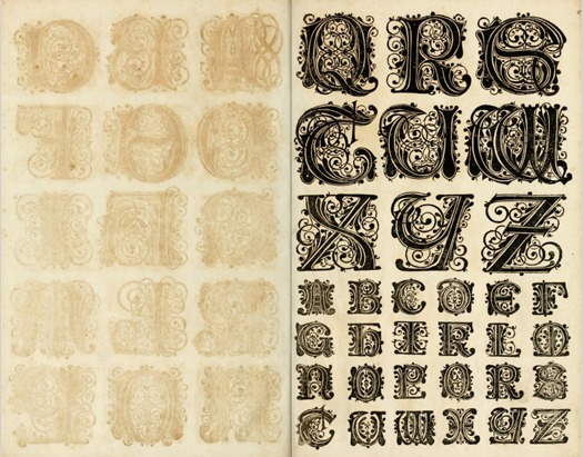
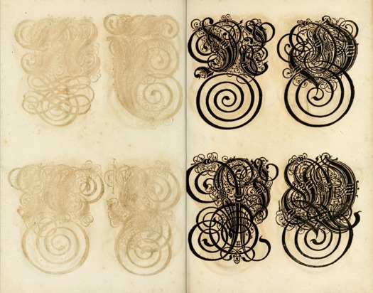
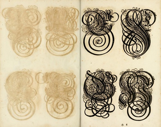
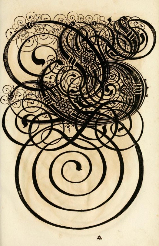
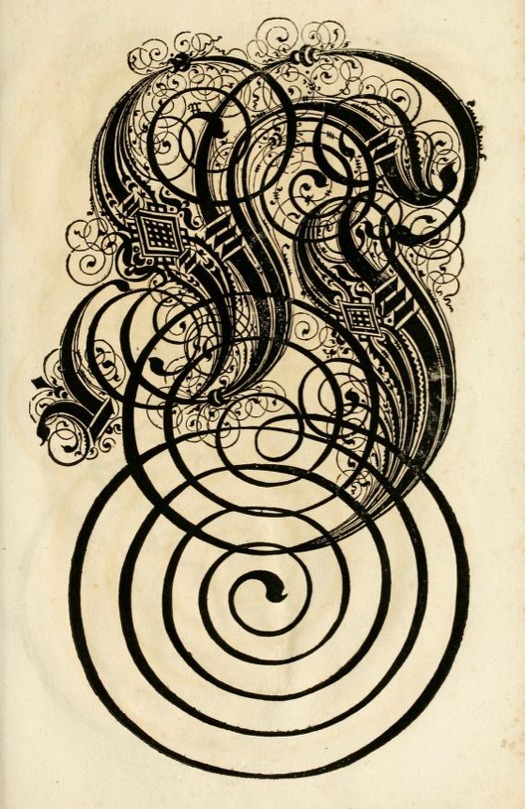
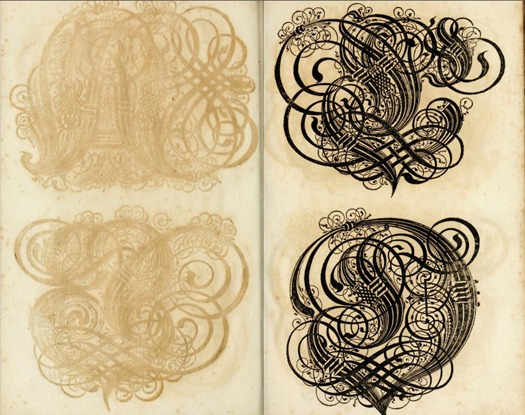
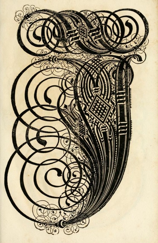
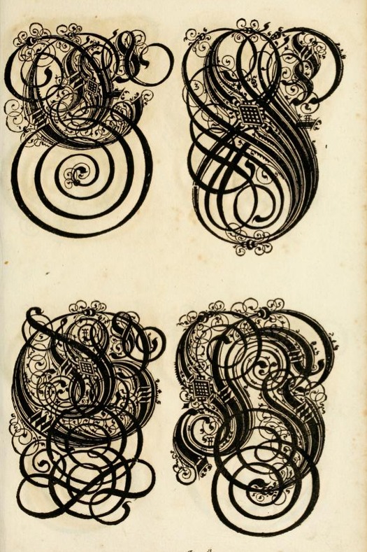
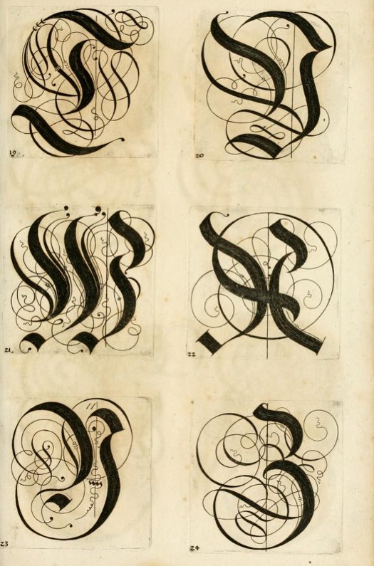
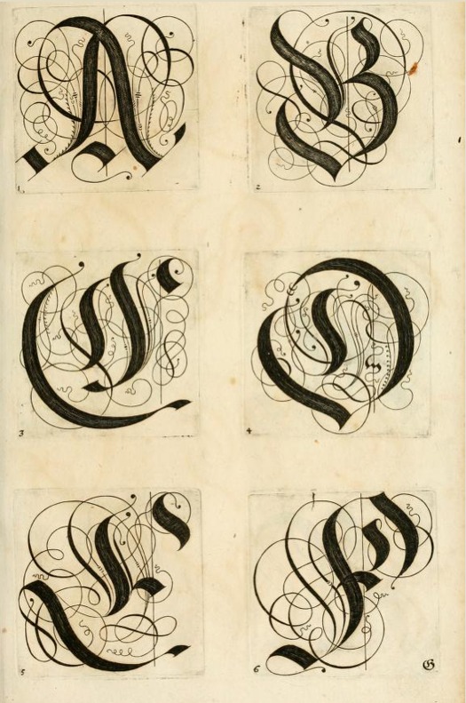
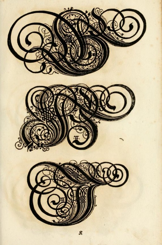
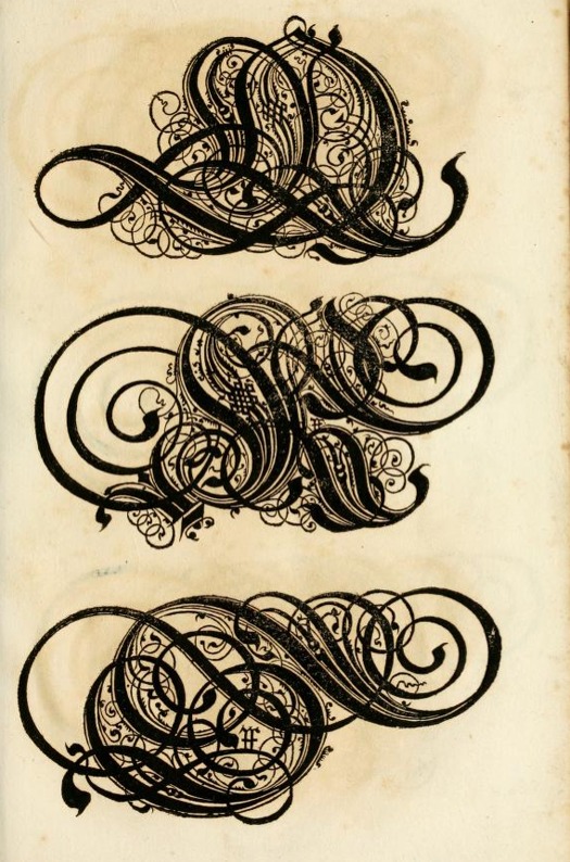
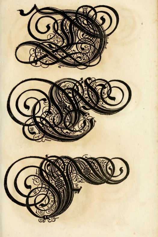
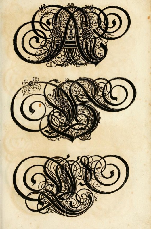
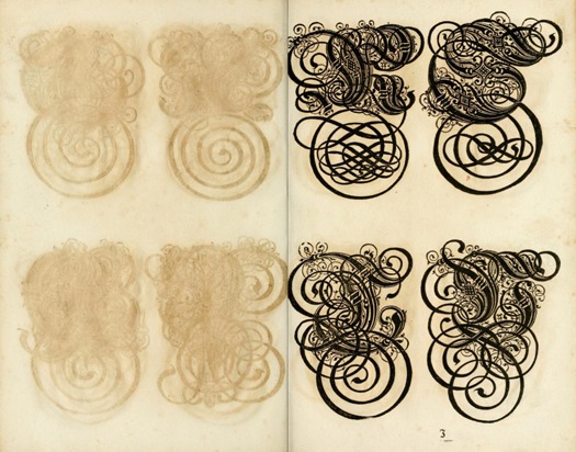
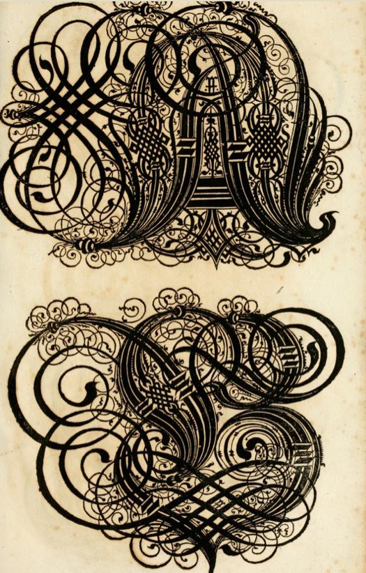
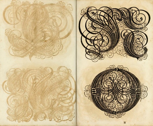
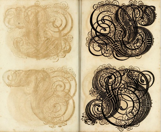
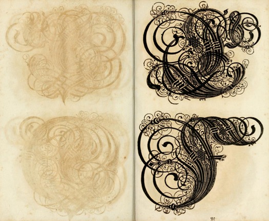
The book, which is now in the public domain, contains example after example of ornate letters, with each page a surprise in the art of calligraphic embellishment. What I love about this book is the sense that each letter (and each page of the book) appears to try and outdo the last. Also, I am especially fond of the unexpected “ghost images” that bleed through from the opposite page.

The book was first published in 1655 by Bey Paulus Fürsten Kunsthändlern daselbst in Nurnberg.

The Proper Art of Writing in 1655

The Proper Art of Writing in 1655

The Proper Art of Writing in 1655

The Proper Art of Writing in 1655

The Proper Art of Writing in 1655

The Proper Art of Writing in 1655

The Proper Art of Writing in 1655

The Proper Art of Writing in 1655

The Proper Art of Writing in 1655

The Proper Art of Writing in 1655

The Proper Art of Writing in 1655

The Proper Art of Writing in 1655

The Proper Art of Writing in 1655

The Proper Art of Writing in 1655

The Proper Art of Writing in 1655

The Proper Art of Writing in 1655

The Proper Art of Writing in 1655

The Proper Art of Writing in 1655

The Proper Art of Writing in 1655

The Proper Art of Writing in 1655

The Proper Art of Writing in 1655

The Proper Art of Writing in 1655

The Proper Art of Writing in 1655

The Proper Art of Writing in 1655

The Proper Art of Writing in 1655

The Proper Art of Writing in 1655

The Proper Art of Writing in 1655

The Proper Art of Writing in 1655

The Proper Art of Writing in 1655

The Proper Art of Writing in 1655


Accidental Mysteries is an online curiosity shop of extraordinary things, mined from the depths of the online world and brought to you each week by John Foster, a writer, designer and longtime collector of self-taught art and vernacular photography. “I enjoy the search for incredible, obscure objects that challenge, delight and amuse my eye. More so, I enjoy sharing these discoveries with the diverse and informed readers of Design Observer.”

Editor's Note: All images are copyright of their original owners.


Posted in: Accidental Mysteries, Arts + Culture, Media, Typography


Comments [2]

Beautiful. Ive never seen so many pages from this book reproduced at once.

I don't think the word "font" is correct in the translation of the title. "Schrifften" would better be translated as "scripts."

People don't write fonts.
Christopher Calderhead
03.04.13
08:15

This makes me want to go schrifften surfin'.
Daniel Green
03.06.13
12:56


Jobs | March 29