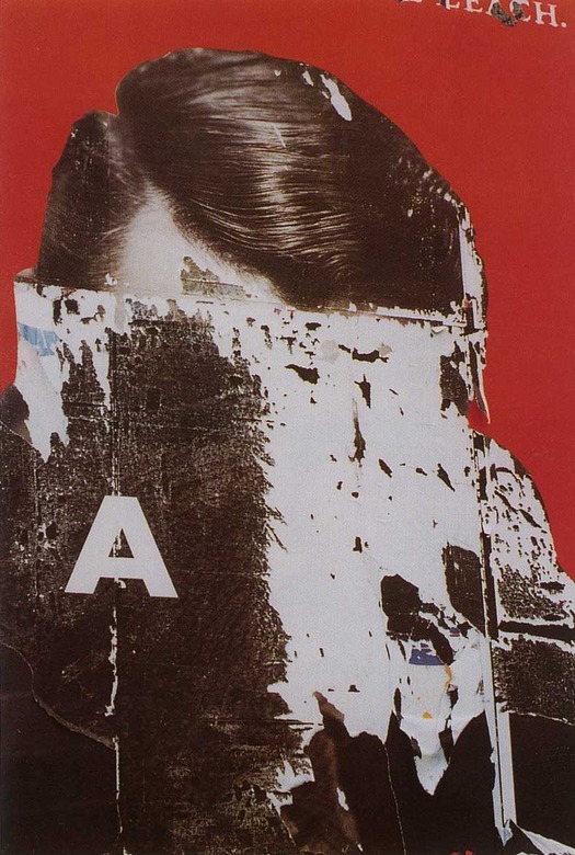
Jonathan Miller, from the book Nowhere in Particular, 1999 (photograph undated)
Jonathan Miller has an international reputation as one Britain’s most versatile figures in the arts. He qualified as a doctor, came to fame as a satirist and performer, directed a television film of Alice in Wonderland, and wrote a slim volume, sharp as a stiletto, debunking Marshall McLuhan. His 13-part TV series on the history of medicine, The Body in Question, is a milestone. In his spare moments, he has directed more than 50 opera productions in London, New York, Paris, Florence and Berlin.
What we had no way of knowing, until the publication of Miller’s book Nowhere in Particular, is that for nearly 30 years he used a cheap automatic camera to take photographs of details — “pictures of bits,” as he called them — in the street.[1] Nowhere in Particular shows dozens of images of torn, scuffed, battered, rusted, cracked and peeling surfaces. Miller describes them as “negligible things to which one would normally pay no attention at all. Nevertheless,” he continues, “these fragments and details attracted my eye and I felt the irresistible urge to record them.”
In his introduction, he draws comparisons with the scenic details painted around the year 1800 by artists who felt them worthy to be pictures in their own right. This is interesting, but gives little sense of the contemporary context for an activity that Miller seems half inclined to play down as “random scavenging.” What he doesn’t mention is the degree to which such “bits” seduced many artists, photographers and designers in the twentieth century. The torn posters on the cover of his book — one face appears almost to be dreaming the other — belong to an established, though admittedly offbeat, genre of image-making. Part of the fascination of Nowhere in Particular lies in observing this poetic way of seeing being pursued for many years, almost obsessively, by a casual, non-professional photographer with no immediate artistic use for the images in mind.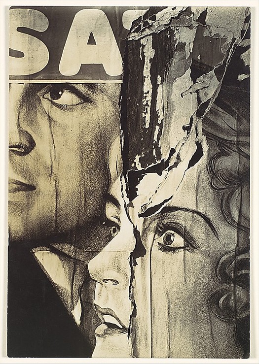
Walker Evans, Torn Movie Poster, gelatin silver print, 1931. Metropolitan Museum of Art
The American photographer Walker Evans was one of the first to focus on street posters and signs as sources of insight into the society that created them. In Torn Movie Poster, taken in 1931, the movie stars’ glamorous heads are divided by a gash that begins in the top right corner and narrows to a fissure across the starlet’s face. Evans’ tight close-up excludes most of the poster because it is the fault line destabilizing the image that he wants us to see. In Minstrel Showbill, Alabama (1936), he shows the entire poster, with some of the surrounding wall. This time, a much greater proportion has been torn away and the bricks are re-emerging from behind a patronizing scene of “comical” black folk running around a yard. The abrasions of the elements, assisted perhaps by the hands of passers-by, strip away a dubious piece of racial propaganda.
Even more significant in the evolution of this aesthetic of the “negligible” was another American photographer, Aaron Siskind — in his book, Miller briefly acknowledges an affinity with Siskind’s pictures. By the 1940s, Siskind had abandoned his early documentary approach, always notable for its attention to formal qualities, in favor of a preoccupation with flatness and surface texture usually compared to Abstract Expressionism, although Siskind’s artistic interests developed in parallel with those of painters like Mark Rothko, Franz Kline and Clyfford Still. “First, and emphatically, I accept the flat plane of the picture surface as the primary frame of reference of the picture,” Siskind wrote in 1950.[2] Despite being based on the most inconsequential subject matter, his black-and-white close-ups of rocks, sand, seaweed, paint-smeared walls, fragments of buildings, graffiti, details of decaying signs and peeling posters achieve the raw formal language and heightened expressive power of abstract paintings. In pictures such as Jerome, Arizona (1949) and Degraded Signs (1951), distressed and damaged surfaces resonate with a promise of deeper metaphorical meaning.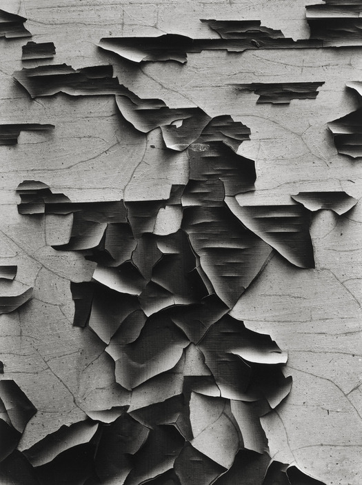
Aaron Siskind, Jerome, Arizona, gelatin silver print, 1949. The J. Paul Getty Museum
The idea that mangled street posters might be physically appropriated for artistic purposes is attributed to Léo Malet, a French poet, who was briefly a member of André Breton’s Surrealist group. In the mid-1930s, observing the processes by which pristine printed images were transformed, Malet proposed a new form of Surrealist street poetry shaped by chance. “Soon,” he wrote, “collage will be executed without scissors, without a razor, without paste . . . Abandoning the artist’s table and his pasteboard, it will take its place on the walls of the city, the unlimited field of poetic realisations.”[3] Commercial artists would supply the raw materials and passing pedestrians, aided by wind and rain, would intervene to unlock new meanings never intended by the designers, as mysterious fragments of earlier images, hidden below the top poster, were once again exposed to view.
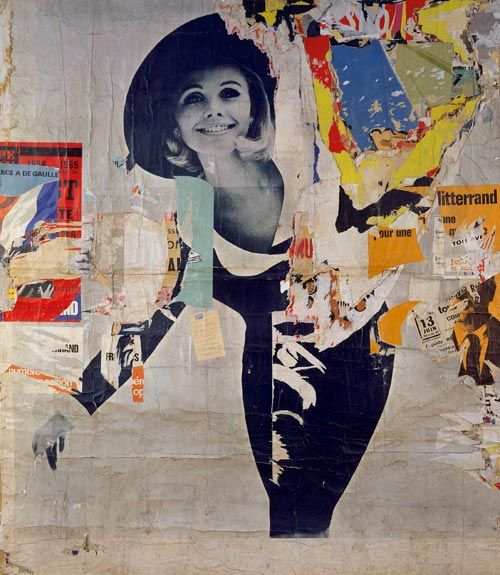
Malet’s idea of décollage remained a theory until the 1950s when two French artists, Jacques Villeglé and Raymond Hains, began, unknowingly, to put it into practice. Hains was unhappy with the black-and-white photographs he had been taking of torn posters and decided to pull down these ready-made collages and take them home. He later moved on to other forms of artistic practice, but Villeglé — a mixture of artist, collector and documentarist — stayed loyal to this way of working for his entire career. Each piece would be titled with the place of discovery, the month and year — “Windsor-Cinéma, February 1959”, “Boulevard Richard Lenoir, 22 September 1964,” and so on. Cut loose from their original poster sites, mounted on canvas and displayed in the quiet of the art gallery, they have enormous gestural energy and an aesthetic power that comes from endless, unpredictable collisions of color, ragged line, word-shape and image.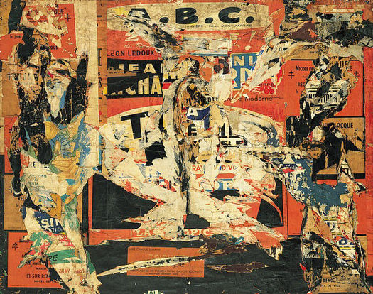
Jacques Villeglé, ABC, décollage, 4 March 1959. Centre Pompidou, Musée national d'arte moderne
To describe the random forces that brought these images into being, Villeglé coined the term Lacéré anonyme. He saw this “anonymous lacerator” as the mythic embodiment of the crowd’s anarchy and dissent as it defaced every attempt at persuasion by commercial and bureaucratic authorities. His own modest role was to act as curator and select singular specimens from the lacerator’s vast oeuvre.
Jacques Villeglé, Rues Desprez and Vercingétorix — The Woman, décollage, 12 March 1966. Museum Ludwig
For designers, the public fate of their efforts offered a spectacle both peculiar and fascinating, as dreams of abundance were reduced to images of transience and decay. In the early 1960s, while Hains, Villeglé, Mimmo Rotella, Asger Jorn and other affichistes wrenched posters from the hoardings, Herbert Spencer was documenting these chance depredations with his camera. In his pictures of “strange juxtapositions revealed through the sad ribbons of torn posters,” he set out to record the dissolution of an order he spent his days as a design consultant attempting to impose.[4] His photographs of broken shop-front lettering, scarified posters and graffiti-pocked walls disclose an urban panorama in which signs of official communication have frayed into an impromptu poetry of tattered logos, shattered copylines and stuttering letterforms. In a picture of a St. Pancras street, the one-way sign is sucked in and nullified by a churning backdrop that, if it weren’t for a Heinz label, would feel closer in mood to an Abstract Expressionist daub by Robert Motherwell than an ad.
Designers were quick to see that the street’s haphazard visual fabric could be used as inspiration for new kinds of design. In 1961, the most concentrated analysis of these possibilities came from Robert Brownjohn, an American designer then resident in London. Brownjohn’s photo-essay “Street Level”, for Herbert Spencer’s Typographica magazine, has 31 pages of his pictures taken on a single trip around the city. They catalogue irregular word spacing; missing, misaligned, eroded and overlapping letters; handwritten signs; type distorted by glass. “The things they show have very little to do with Design, apart from achieving its object,” Brownjohn notes (my italics). “They show what weather, wit, accident, lack of judgement, bad taste, bad spelling, necessity, and good loud repetition can do to put a sort of music into the streets where we walk.”[5]
By displaying professional design projects next to samples of primitive and accidental street typography, Brownjohn transformed an ad hoc way of seeing common to many designers into a manifesto for purposeful scanning of the street. In the years that followed, a “street level” sensibility and fascination with vernacular design became one of the cornerstones of experimental graphics. From the late Swiss typographer Hans-Rudolf Lutz to pop deconstructionist David Carson, designers embraced the street’s disorder as an alternative ordering principle in their work. The camera continues to be an essential tool for gathering these treasures, especially when traveling abroad. In 1991, Lutz published a photo-essay based on photographs of South American streets.[6] In some of his most arresting examples, the same found poster image of a grimacing woman in glasses is shown six times, each example subject to a different type or degree of environmental attrition.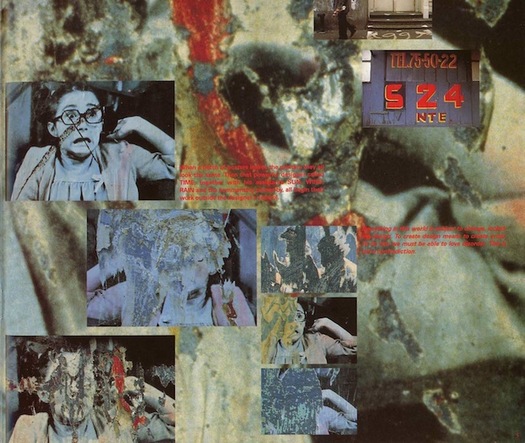 Detail from a page in “Graphic Design as a Live Art” by Hans-Rudolf Lutz, Baseline, no. 14, 1991. In one of the red captions, he writes: “Everything in this world is subject to change, including design. To create design means to create order. To do this we must be able to love disorder. This is not a contradiction.”
Carson has sometimes noted his aesthetic debt to Lutz, and in his lectures in the 1990s he showed slides of peeling posters seen on walls in Mexico and elsewhere that inspired his own typographic method. He didn’t necessarily import these images directly into his designs any more than Brownjohn and his colleagues had done 30 years earlier. Usually, it was a matter of allowing the shapes and colors to percolate in his mind, and then devising combinations of type and image with similar qualities of randomness, unpredictability and ambiguity. Brownjohn summarized the method, with laconic precision, in Typographica: “Bad word spacing can happen. Or it can be designed.”[7]
Why do images of torn posters and damaged signs exert such a powerful hold on the imagination and emotions? What quality is it that distinguishes one specimen of “chance art” — as Herbert Spencer called it — from the next? “The fact is, most of the torn posters or hand-lettered signs that I come across are not interesting,” Carson told an interviewer. “But every now and then, the elements come together in a way that I find pleasing . . . and that’s totally subjective and intuitive or my part. I’m not sure I understand myself what makes one thing visually interesting to me, while another strikes me as being just ordinary.”[8]
What is so striking about Jonathan Miller’s “negligible” images is how aesthetically resolved, how right to the eye, they seem. They are compelling as a collection, but many stand up as separate pictures. Miller and his designers have taken a number of decisions that intensify their impact. The majority are shown at the same size as the original prints and, except for a few full-bleed pages, most are surrounded by white space. There are no page numbers or captions and Miller makes no attempt to give their origins in time and location (hence the title: Nowhere in Particular), although there are sometimes internal clues. The unanticipated color changes produced by a cheap developing process — Miller, like Carson, used an ordinary snapshot service — introduce a further element of chance and level of disassociation from the original scene. “In the final outcome,” says Miller, “I preferred what I got to the picture I thought I was taking.”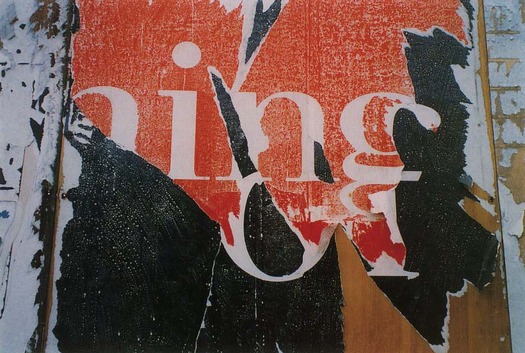 Jonathan Miller, from the book Nowhere in Particular, 1999 (photograph undated)
For Miller, these images are “abstract designs” drawn from the wreckage of real surfaces, but even at their most abstract they are still artificial constructions readable as traces of the people who made them and viewed them, an unseen but persistent presence. That they offer documentary evidence of things no longer working or wanted, of demolition and undoing, of entropy at large in the world, only adds to their poignancy (Spencer’s “sad ribbons”). Where fragments of people are glimpsed — an arm, an eye, a pair of lips —this sensation is even more acute. In one picture (see above), a man’s face has been neatly excised, leaving only an immaculately combed head of hair. Among the torn edges of his new face is the sharp form of an uppercase “A,” a visual rhyme with the triangular shape of his hairline and brow. Whoever he was, whatever he was trying to tell us, he has become “Exhibit A” in a case that will never be solved.
“Every photographed object,” writes Jean Baudrillard, “is merely the trace left behind by the disappearance of all the rest. It is an almost perfect crime, an almost total resolution of the world, which merely leaves the illusion of a particular object shining forth, the image of which becomes an impenetrable enigma.”[9]
Jean Baudrillard, Venice, 1989, from the book Photographies 1985-1998
In characteristically ecstatic language, Baudrillard comes closest, perhaps, to capturing the magnetic lure of the torn poster image. In an essay prompted by his own activities as a photographer, he reflects on the “dizzying impact” and “magical eccentricity” of the perpetual photographic detail, and on the world’s refusal to yield up its meaning in photographs. Discontinuity and fragmentation are inescapable conditions of photography, and if this is always a factor drawing us to a photograph — any photograph — then the torn poster photograph carries a double charge. In its ravaged paper surface, an inherently discontinuous medium finds a perfect, enigmatic match.
This essay appears in Obey the Giant: Life in the Image World (Birkhäuser, 2001 & 2007); it is a differently illustrated, revised and expanded version of an essay originally published in Eye, no. 34 vol. 9, Winter 1999.
See also:
Herbert Spencer and the Decisive Detail
Robert Brownjohn: Photos at Street Level
Jacques Villeglé at Pinterest
1. Jonathan Miller, Nowhere in Particular, London: Mitchell Beazley, 1999, no page number.
2. Aaron Siskind, “Credo” (1950) in Aaron Siskind: Toward a Personal Vision, 1935-1955, edited by Deborah Martin Kao and Charles A. Meyer, Boston: Boston College Museum of Art, 1994.
3. Quoted in Christopher Phillips, “When Poetry Devours the Walls,” Art in America, vol. 78 no. 2, February 1990, p. 140.
4. Herbert Spencer, Traces of Man, London: Lund Humphries, 1967.
5. Robert Brownjohn, “Street Level,” Typographica, new series no. 4, December 1961, p. 29.
6. Hans-Rudolf Lutz, “Graphic Design as a Live Art,” Baseline, no. 14, 1991, pp. 4-7.
7. Brownjohn, p. 30.
8. Quoted in Warren Berger, “What Makes David Carson Tick?” Affiche, no. 14, 1995, p. 49.
9. Jean Baudrillard, “For Illusion Isn’t the Opposite of Reality . . .” in Photographies 1985-1998, Osfildern-Ruit: Hatje Cantz, 1999, p. 131.


