If I asked you to name as many advertising mascots as possible in sixty seconds, how many could you come up with? Why not look away and and give it a try. I’d like to know how you did. I will give you the first one: the Jolly Green Giant. Go!
Last week, I was happy to interview Warren Dotz about two books that caught my eye—both having to do with his collection of advertising mascots (Meet Mr. Product: The Graphic Art of the Advertising Character and Mr. Product: The Graphic Art of Advertising’s Magnificent Mascots 1960–1985). Dotz is a collector of pop culture ephemera and the author of thirteen books on advertising, design, and commercial label art. His commentary has appeared in Advertising Age, Adweek, and the New York Times. He lives and works in New York City and San Francisco.
I am sure you have been asked before, but I think people would like to know: what were some of the earliest successful product mascots?
Given his longevity (he was introduced in 1898), mass appeal (he is internationally known), and the ability to change with the times, I would say Bibendum, the Michelin Man. When first launched, Bib was a bon vivant, monocle wearing, cigar smoking, ladies man. Over the years he’s gotten younger, stronger, cuddly, and definitely more cartoon-like. He has lasted so long because the Michelin brand has. That Bibendum is still with us in the twenty-first century is testament to the rewards of sticking with a simple yet brilliant advertising icon.
Do you know whether a company has ever introduced a new product mascot (after not having one) that turned around their company's sales?
I certainly do. Did you know that Philip Morris launched the Marlboro brand in 1924 as a women’s cigarette? Their selling point was how “ladylike” the filter was. By the 1950s the company decided to market the filter feature to men. The iconic red and white Marlboro pack was designed. Along with it came advertisements presenting a lineup of manly figures such as sea captains, construction workers, and rugged cowboys. Within a year, Marlboro's market share rose from less than one percent to the fourth best-selling brand. The cowboy became the iconic “face” of the product, the Marlboro Man.
Was there ever a product mascot that failed miserably for one reason or another?
The most curious and interesting characters happen to be the ones that were not bankrolled by major corporations. They were less “filtered” or “focus-grouped,” but they are definitely the overwhelming favorites of the designers who buy our books. There are hundreds—some modestly successful and some not.
An example of a big “fail” happened In 1985. Burger King invested $40 million in an ad campaign promoting an ad character named “Herb.” Besides having no discernible personality, nerdy Herb had no relevant message—two of the many reasons why you don’t remember him.
One of my favorite lesser-known characters in Mr. Product is Chokey the Smog Dog. I had heard he existed as part of a ’70s Keep America Clean campaign. Unlike Mr. Zip, the Litterbug, Smokey the Bear, and Woodsy Owl this American public service mascot never made the “big time.” It took me ten years to finally find his sad-eyed canine face starring at me from a matchbook cover. So he really did exist after all!
In your opinion, what are some of the most influential product mascots in advertising history?
I like to think that brand mascots exist at the intersection of business, design, modern mythology, and pop culture. The Jolly Green Giant is almost a modern day harvest god, if you think of it. In his early incarnations he represented foods that were healthful just as the Quaker Oats Man represented purity and quality. Characters like these represent a value. Some goods such as Energizer batteries take a seemingly unrelated image––the Energizer Bunny–– and make it work. It keeps going and going!
On the other hand advertisers realized early on that their character didn’t necessarily need to deliver a compelling argument; a character that people remembered fondly, that instilled warm fuzzy feelings, could be just as or even more effective. Speedy Alka-Seltzer and the Pillsbury Doughboy also extoll their product’s virtues, but we really just like how they make us feel. The list of influential characters is long. Last but not least in this brief survey is Cap’n Crunch. He’s a good example of how in the ’60s advertisers began to appeal directly to kids. Notably so because the animated bumbling sea captain and his crew of four children were conceived and designed even before the cereal was formulated for release. It’s a testament to the then flourishing power of the brand mascot.
What is your expertise in branding, Warren?
I’ve written and co-written over a dozen books on pop culture-related subjects including firecracker label art, pet food labels, Indian matchbox art, and a host of other books related to advertising icons. They’ve been published here and also in Japan where this topic of American-style kawaii continues to be very popular. I see these objects as the “the art of commerce” and as items that are often under-appreciated as they were intended to be transient.
Who was the designer for your books?
Each of the Mr. Product books took many years to produce. First we have to discover the 500 or so images. I prefer to own all the ephemera whether it is a matchbook cover, promotional brochure, sign or decal. My co-author, Masud Husain collects too, and he is a graphic designer with similar collecting interests. We can spend weeks searching for the right combination of brand mascots to perfect a two-page spread in the books. But the meticulousness pays off and our readers appreciate the presentation and the unique content.
What are you working on next?
I’m currently working on two other books on the subject of advertising design, one of them a collection of Japanese ephemera.
++
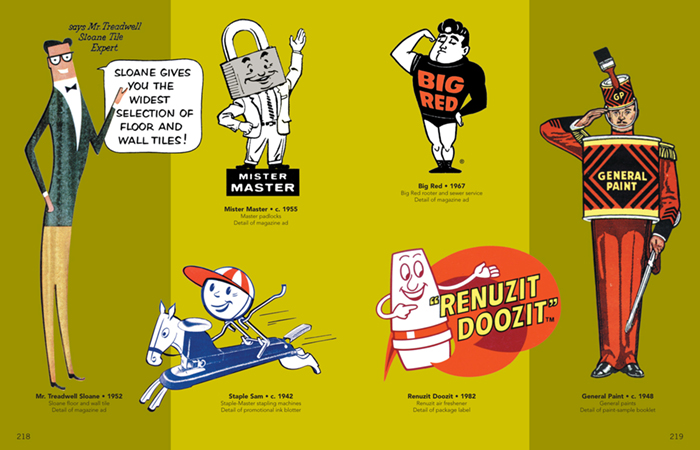
The dapper Mr. Treadwell Sloan helped you make your tile selection with “good taste.” Big Red flexed his powerful muscles. Examples of how ad characters could represent a selling point of the product or service. Other companies simply anthropomorphized their product giving them human features. Staple-Master not only transformed their stapler into a human but a race horse as well!.
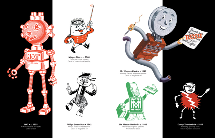
Mechanical men were a popular type of ad character in the ’40 and ’50s, often straight from the business owner’s imagination to the artist’s drawing board. As products such as watches and appliances became more complex companies gravitated toward the robot as a symbol of accuracy, strength and reliability.
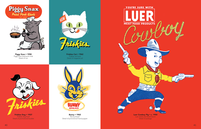
They don’t make pet food labels like this anymore. Piggy Snax is frying up some pork rinds — a bit unsettling when you think about it, but not uncommon in the world of brand mascots of the time. Chickens holding buckets of drum sticks and pigs promoting bacon were the norm.
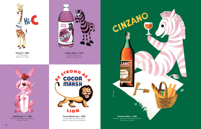
From the late '50s on, most beverages promoted for kids had their own brand mascot. Brown cows for chocolate drinks, pink bunnies for strawberry powder mixes and zebras with different colored stripes to match a multitude of flavors. Cocoa Marsh promoted their drink’s purported health benefits with a powerful lion.
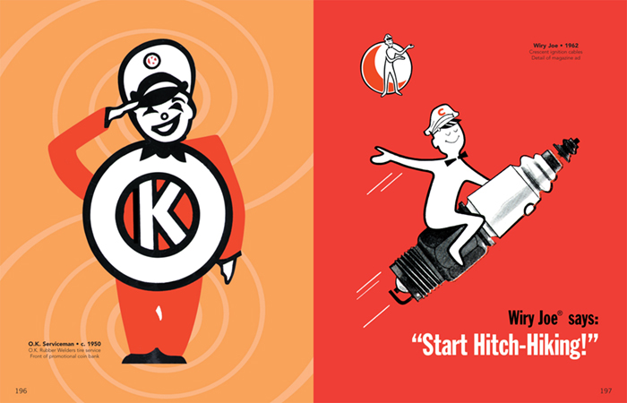
There was a time in the United States when cap-wearing servicemen filled your gas, changed your tires, and checked your spark plugs. Brand mascots for gasoline stations and automobile service parts were plentiful and delightful.
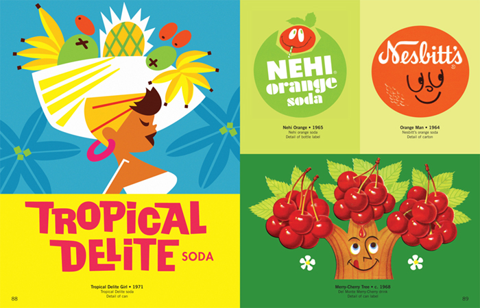
By the '60s and '70s you can see the colorful influence of cartoon animation art. Happy-faced fruits and a delightful tropical-themed soda can grace this spread. These are some of my favorite images from Mr. Product.
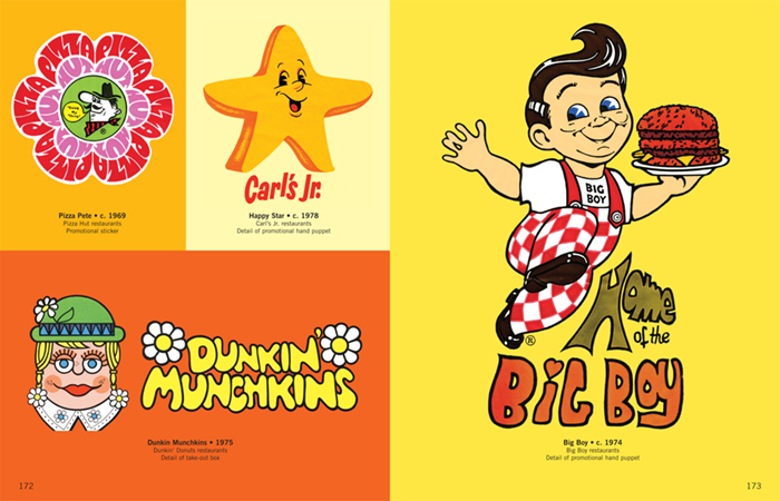
The ’60s and ’70s influenced the look of many characters. The weird but wonderful Dunkin’ Munchkins embraced the iconography of “Flower Power” as did Pizza Hut’s Pizza Pete.
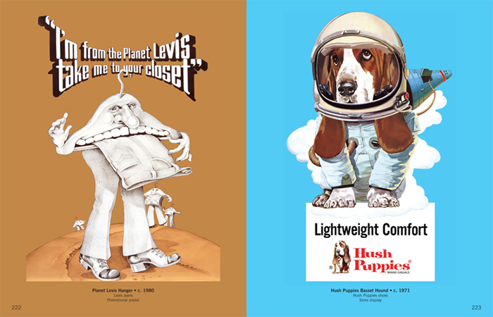
Current events such as the 1960’s Space Race sent previously Earth-bound characters like the Hush Puppies Bassett Hound skyward. Levi’s produced this bizarre poster that no doubt hung in many college dorm rooms.
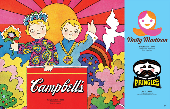
The Campbell’s Kids first appeared in 1904. Yet here they are in a trippy 1968 poster––half Peter Max and half Andy Warhol style––looking very groovy. A great example of how brand mascots can be modernized with the times.
All images and captions © Warren Dotz 2015. Images are from Meet Mr. Product: The Graphic Art of the Advertising Character and Mr. Product: The Graphic Art of Advertising’s Magnificent Mascots (1960–1985)