Architect Don Wall curated Italian-born Paolo Soleri’s 1970 retrospective of his radical architecture at the Corcoran Gallery of Art in Washington, D.C.. Arcosanti, as originally designed by Soleri, was intended for 5,000 people; it was located near Cordes Junction, about 70 miles (110 km) north of Phoenix, Arizona, and was a magnet for many idealistic artist/designers who joined the building teams. The goal of the project was to provide a model that can demonstrate Soleri's concept of Arcology, a new combination of architecture in sync with ecology — a forerunner of today’s environmental sustainability movement. Because the exhibit was going to travel to the Whitney, to Chicago, Berkeley, and other cities, Praeger Publishers knew there would be a guaranteed audience. When they asked if Wall, who never designed a book before, would do the book he said “sure” and went to a local bookstore “to buy a $2 paperback on how to make a book.” His volume, Visionary Cities: the Arcology of Paolo Soleri (1971), in the tradition of Quentin Fiore’s books for Marshall McLuhan, became a radical departure for book design of the era and helped define Soleri as an influential experimental architect. Steven Heller has admired and studied the book for ages. This was the first time he had an opportunity to discuss the design with Wall.
Steven Heller: You are an architect not a book designer, so how did you come to design a book on Paolo Soleri and what inspired the manner in which you designed it?
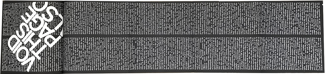
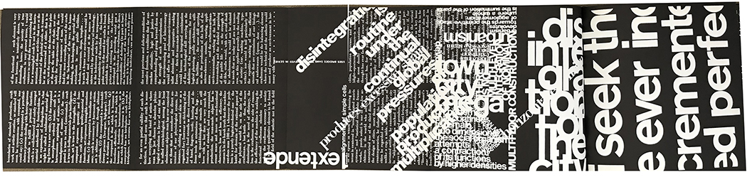
Don Wall: My architectural training in the 50s at University of Manitoba involved solving design problems, anything from an embassy in India, to a chair, to uniforms. I treated the book as a manipulable thing, not unlike a cup. The origin of my approach to the book was due, in part, to the first lecture I heard by Prof. Jim Donohue. He talked about how the front elevation of Rietveld’s Schröder House remained compositionally balanced when rotated in space. Rietveld introduced the idea of non-gravitational architecture by removing architecture from the ground plane. Likewise I wanted to remove the book from the belly as ground plane for it being read. Consequently, there’s no single directionality. To read it you have to rotate the book vertically, horizontally, not just once or twice, but continually. At one point the pages fold-out to six feet long, increasing its three dimensionality as an object existing in space.
SH: How much input was there from Soleri himself?
DW: None.
SH: I know he was a cult-like figure with followers coming to the desert to work with him on his projects, were you one of those followers?
DW: I was not a follower, nor an apprentice. My first contact with Soleri was in 1968 when I spent a week and a half with him and his family at their Cosanti residence in Arizona. Walter Hopps, the Corcoran director, sent me there to oversee progress on the models and drawings for the exhibition. My next contact with Soleri was in 1970 when he was installing the work in the Corcoran galleries. At one point we disagreed on how the scroll drawings should be displayed. I had remembered watching him work at Cosanti on these beautiful drawings, some 60 feet long. The disagreement became more than quite heated. Hopps told me he had no choice but to terminate me as curator, two weeks before the opening.
SH: The book is a reflection of the period -- the late 60s and early 70s. Typographically, it combined a curious midcentury modern aesthetic (Helvetica and Bodoni type and high contrast imagery) with a post-dada/futurist and "underground" press anarchy. Was this on your mind when you began to design?
DW: Insofar as anarchy is concerned, the book was intended to be a response to the era in which it was being designed …. the Vietnam War, the assassination of Martin Luther King Jr., the nationwide riots….. the real time video clips of the war …..I would look out my office window and see Washington burning, the sky aglow in red….the army bivouacked outside the architecture school. I lived those days of social turmoil. The art world was also in upheaval. There was a lot of anti-traditionalism happening in those days. While the New Modernism in graphic design was coming out of Boston, blueprints of Archigram’s projects were being circulated via underground networks throughout schools of architecture, including illustrations of Walking City with text “walking” around the images. I listened to The Beatles’ Revolution 9 over and over. Their introduction of multi-sourced “sound montage” into music, free of lyrics, suggested the same could be done in the book but with “type montage” continuing page after page, free of narrative. With all that happening around me, I couldn’t do a traditional book. I had to find a way to transfer the ferment of the day into designing Visionary Cities. The epoch, to me, was a time in America having an unconcluded future, marked by an uncontrollable present, with uncertainty everywhere in evidence. It galvanized me to attempt to do likewise: to create a book having an unconcluded future, possessing a seemingly uncontrollable present, with uncertainty everywhere in evidence.
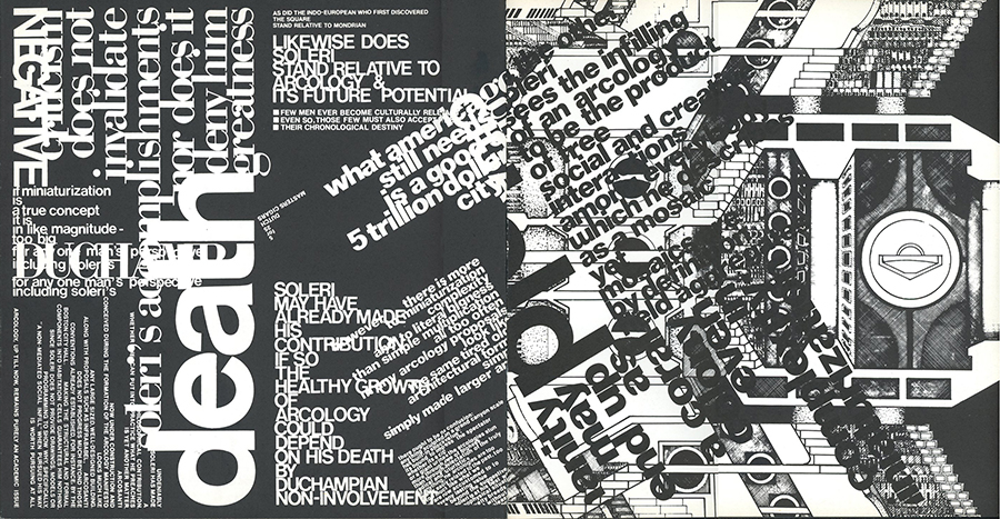
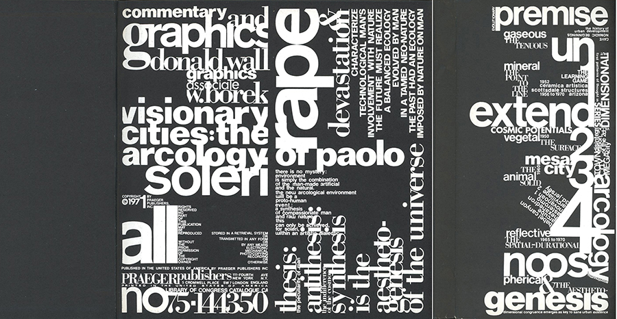
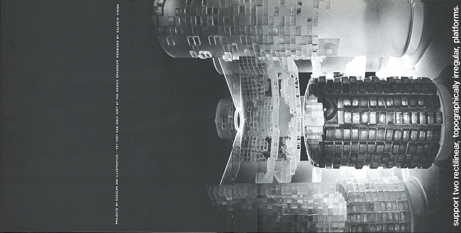
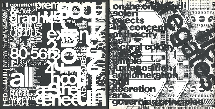
As to why the use of Bodoni and Helvetica, I thought that Bodoni was visually lyrical because of the serif mode, and for this reason seemed appropriate for commentary text from a critic. Helvetica, by contrast, being without serif, I regarded as non-personal, lacking inflection, appropriate for fact-based biographical data. The Bodoni and the Helvetica were conceived as two “voices” engaged in discourse. The use of high contrast photography was totally accidental. Since the arcology models were all made of plastic, they were photographed in a dark room with a light source to illuminate the plastic, resulting in high contrast images. This became the impetus for creating a book that was basically black. Without the photographs provided by the apprentices there would be no Visionary Cities.
SH: The smashing together of type was an outcome of phototypesetting and a breaking of the classical traditions. How did you accomplish this look? Press type? Typositor?
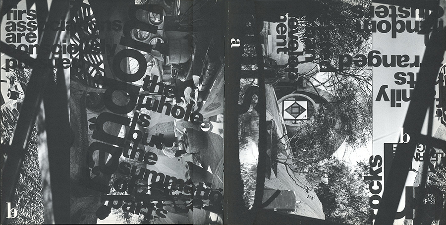
DW: Hundreds of sheets of press-type of black and white lettering were used, ranging from 6pt to 144pt. The routine was simple. For instance, pin down a photo of an Arcology, overlay it with a rigid plastic sheet, then start applying press-type, letter by letter as words, phrases, positioning them horizontally, vertically, diagonally, or any which way, all done by hand with a burnisher. Adding more text, or changing from white to black press-type, required another plastic sheet to be overlaid, and another if necessary, sometimes reaching five levels deep. Obviously text that was commercially typeset was excluded from this process, except for a few instances. The layering of text took place generally without any pre-planning. Just start on one page, then see where it goes. Process was product. Must have spent hundreds of hours applying the letters with the utmost of exactitude. Kind of insane to do a book this way. As much as I’ve always admired Dada and Futurist typography, the immediate source of superimpositioning was Rauschenberg’s 1964 sculpture entitled Shades which was made of interchangeable Plexiglas panels with lithographed images from newspapers and magazines.
SH: How would you say that the book design represents both Soleri's work and the aesthetics and politics of the period?
DW: The book contains illustrations of each period of his work, his writings, augmented by a critical essay on the Arcology thesis. Since the writings elaborate in some detail his castigating views concerning the ecological and social blight being incurred by an architecture of urban sprawl, that would have been sufficient. Instead the book’s main interest lay in exploring the relationship of wordtypographia and the genesis thesis underpinning Soleri’s Arcology.
SH: Did you have any pushback on the design direction from the publisher?
DW: The contract I signed with Praeger gave me total control over all text, imagery, layout and design of the book which, according to my editor Brenda Gilchrist, they’d never done before. When I brought the dummy sheets to New York for review with Brenda and the publisher, I did get resistance from some of the staff. The sales people said the book was not sellable because nobody’s going to take a book with an 8 page foldout and read it on the subway. The technical staff said you can’t do all those foldouts like that. I said, Why not? You take the signatures. You glue one foldout to one signature and another foldout to the adjacent signature. The publisher turned to them and asked if it was possible. They said, “Yes….we suppose so. But we’ve never done that before.” The publisher said, “Do it. I want this one for the Frankfurt Book Fair.”
SH: Did you design any books subsequent to this one?
DW: I haven’t designed any other books since Visionary Cities. I edited a book on the painter Gene Davis in 1975. I’m working on two books now, “Revisiting Dennis Oppenheim” and “The Back Story to the Making of Visionary Cities.”
I would like to mention that certain aspects of Visionary Cities appeared earlier in the boxed catalogue entitled Documenta which the Corcoran published for the Soleri Retrospective. This was a 10”x10”x11” cardboard box that contained 16 scroll drawings stacked in an eggcrate, on top of which sat an 84 page booklet. Also in 1970 Praeger published an interim softcover version of Visionary Cities.
SH: Other than its status in design history as representing expressionistic book typography, what do you think is the most important (or innovative) aspect of the book?
DW: When I wrote Visionary Cities, books on architecture were mainly a compilation of photographs of buildings, elevations, floor plans, perhaps accompanied by a critical essay. The format was traditional and standard: text, illustrations with captions underneath. Visionary Cities threw all that out. At first reading the book seems rife with arbitrarily placed lettering. Fragments of words, snippets of commentary appearing everywhere resulted in visual litter. Some photographs may not have been captioned, or the captions often were shoved into a corner of a page in a font so small it verged on the insignificant. Often illustrations were accompanied by superimposed text that obliterated, seemingly without cause.
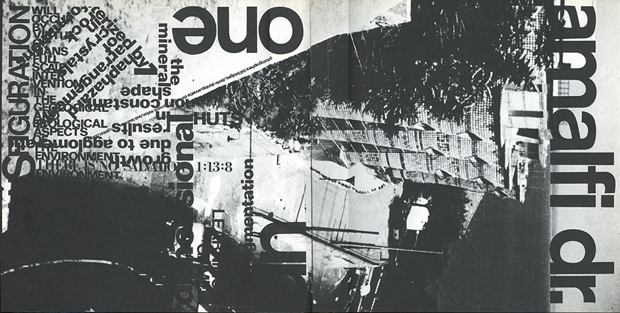
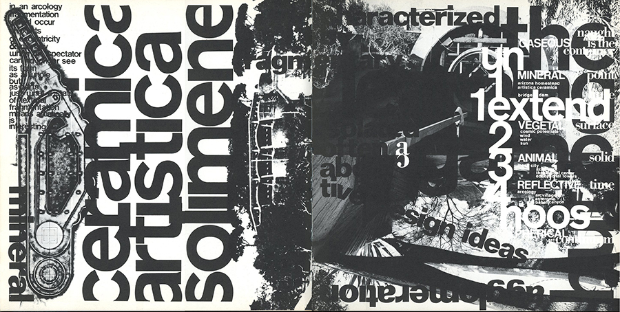
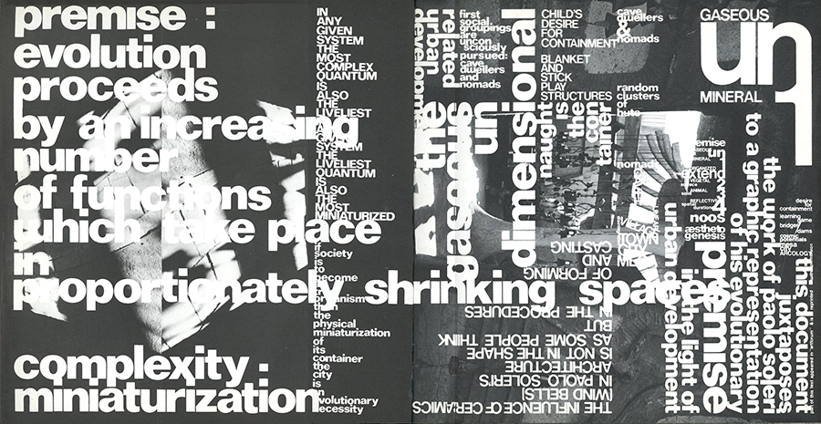
To understand why all this is happening, it is critical that a reader must understand, even at a cursory level, the role of the invented genesis thesis extracted from Soleri’s writings, one that postulates the evolution of mankind’s consciousness, stage by stage, and how his architecture exemplifies each stage of evolution. In terms of design, the genesis thesis organizes the entire book …. from layout strategy, to editing and sequence of content, the visual and conceptual composition of each page, to exploring subject matter as wordtypographia. I transposed the thesis graphically into a half-page format. It begins with the word “premise” and outlines the evolutionary stages of mankind’s consciousness. Each stage describes an architecture that correlates factually and philosophically with the genesis thesis. The first stage is the gaseous Undimensional, followed by the 1 Dimensional Extended expressed in his bridges, which in terms of book design allowed “extension” to be manifested by a foldout 30” in length. The 2 Dimensional involves the “Cosmic Potentials” that harness alternative energy produced by the sun and wind. Mesa City, being a transition from the 2D to the 3D, is simulated by a foldout out 80” in length, reinforcing the 1 Dimensional Extended. This substantiates further the book’s identity as an object in real time and space. The genesis graphic occurs some seventeen times over the run of the book. Each time new information is either added, deleted, or undergoes emphasis. Understanding the genesis thesis is cumulative. It reaches a graphic complexity in the 3 Dimensional Arcology.
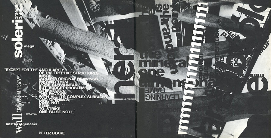
However, to validate the genesis thesis, the book had to include what was happening in the Undimensional. But Soleri didn’t do an architecture that correlates to the chaotic Undimensional. The problem was solved by taking photographs of his Solimene Ceramica Factory in Vietri sul Mare, Italy, on top of which was superimposed type of all sizes, fonts, densities, positions, legibility, fragmentation, to induce a visual sense of chaos. Also a seemingly irrational intrusion occurs by the numeral 1 repeated 22 times at an angle, charging across from one edge of the page to the other, further adding to the sense of the chaotic. Since 1 reappears throughout the book, it raises the question: “Why does an attribute of one of the stages appear in another stage?”
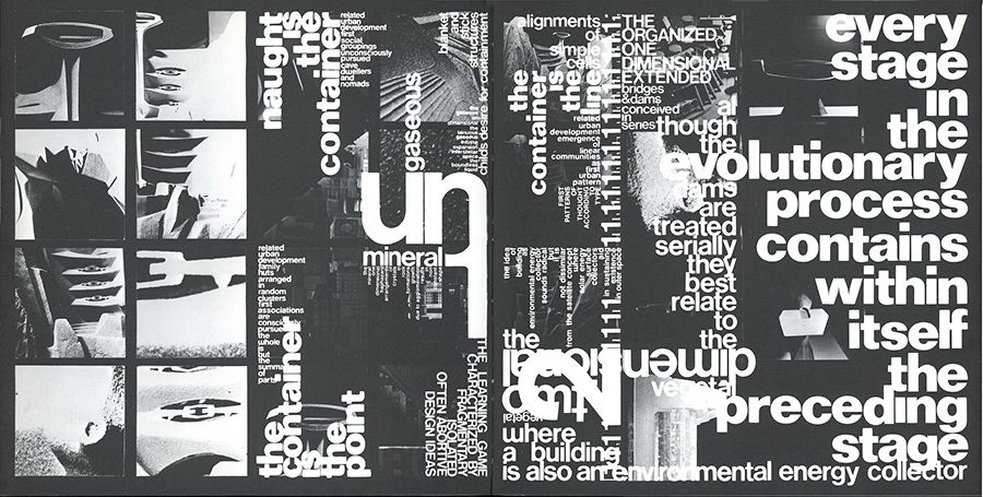
The answer, according to the genesis thesis, is: Every stage in the evolutionary process contains within itself the preceding stage. And so… visual chaos came into existence, like sin, destined to be present at every stage of evolution, including the Arcological. This dictum of absorption of each stage into the next culminates by the end of the book in a frenzied montage of disputing commentary.