Illustration for New York, Christoph Niemann, 2005
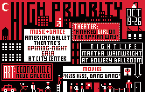
Every week, the editors of New York magazine identify five upcoming "can't miss" activities in the magazine's back-of-the-book listings section. And every week, New York's design director, Luke Hayman, and art director, Chris Dixon, select a designer to create "High Priority," a typographic illustration using these five selections.
The rules are simple. The illustration is 4.4 inches high by 6.875 inches wide; it has to include the five events, the dates of the week, and the words "High Priority;" and it can only use two colors, red and black. The designer gets the text late on Thursday, provides a sketch late on Friday, and the finished artwork by the end of the day on the following Monday. The result runs at the start of the listings section in the issue published the following week. This exercise, with its prescribed limitations and one-swing-and-you're-out intensity, is as close as the graphic design world gets to an Olympic event.
Since Hayman and Dixon started "High Priority," over 60 designers, from the legendary to the up-and-coming, have taken the challenge. The list is amazing: it includes Pierre Bernard, Laurie Rosenwald, Allen Hori, Neville Brody, Marion Deuchars, Fernando Gutiérrez, Barbara deWilde, Vince Frost, Julian Morey, Jonathan Hoefler, Ellen Lupton, Martin Venezky, Alexander Gelman, Bob Gill, Milton Glaser, Barbara Glauber, Chip Kidd and Todd St. John, to name just a few. And every week, the readers of New York get to see the same old problem solved a brand new way.


Comments [28]
03.30.06
10:02
03.31.06
01:03
03.31.06
09:12
03.31.06
10:10
03.31.06
11:32
03.31.06
12:07
03.31.06
01:57
And so on to the Stephen Doyle question. Stephen's always been an individual and often has strongly held, independent views on design and other matters. And I say that as a friend.
Actually it would be unfair to place the blame for this anomaly solely on Stephen. He was one of the first designers invited to participate and the brief was still in formation. The Red-Black vs. 4-color issue may have been unclear. And for the record, we did run it in its full 4-color glory as we were too scared to ask Stephen to change it.
Luke and Chris
03.31.06
01:58
Not a bad one in the bunch! great stuff.
you should do a book of the eventually. if so,
change Doyle's to black/ red in process... for consistency
03.31.06
02:45
without a doubt this is one of the finest collections of superb, contemporary graphic design works i have seen on-line for a while, and a not a common opportunity at all for remote readers like myself (Jerusalem :] ) to witness such wealth.
I really hope the directors do plan on publishing a compilation of these...
03.31.06
03:07
03.31.06
04:50
03.31.06
05:59
Impressive and encouraging.
Thanks!
04.01.06
04:00
04.01.06
12:12
BTW, aren't there plans to exhibit these at Cooper-Hewitt?
04.01.06
01:07
i thoroughly enjoyed this post.
thank you all all all...
all.
04.01.06
06:32
15 and 45 are broken links. Is this just me?
04.02.06
06:29
We've been getting some compaints about those two links for certain browsers. It seems to work fine in Safari but I've noticed the problem in IE.
We're working on the problem, but for now the way to hack around it is to go here for image number 16 and to go here for image number 46. You should be able to click through normally in between.
Sorry for the inconvenience and enjoy the show.
04.02.06
06:38
04.03.06
02:13
04.03.06
02:59
04.03.06
03:54
04.03.06
04:40
I though the High Priorities would run out of steam long ago. I'm happy to see that it hasn't. And can't we credit it with spawning the new treatment for Safire's Times page? By the way, my favorite innovation of Luke's has been the use of Karen Caldicott's busts. Though they appeared here and there before --they never got the chance to speak like this.
04.09.06
08:14
04.12.06
03:49
04.19.06
11:35
Creative Excellence from all the participants!
But I was wondering, is it an open competetion or is it commisioned?
Really good post.
11.10.06
03:40
11.10.06
06:12
01.18.07
03:32