Abbott Miller, Illustration for The New York Times Book Review, 2006
This essay was originally published on December 20, 2006, and appears in the new essay collection, Now You See It and Other Essays on Design, available November 7, 2017, from Princeton Architectural Press
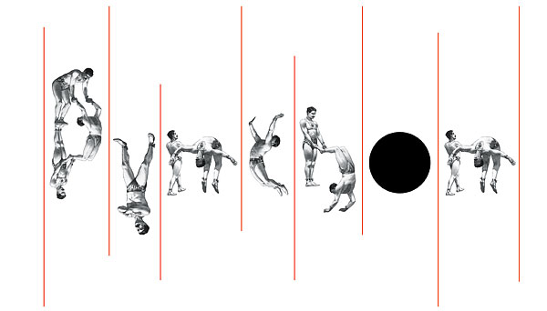
A few Sundays ago, I opened up The New York Times and was pleasantly surprised to find an illustration by my partner Abbott Miller on the front page of the paper's Book Review section. I hadn't seen it in process in the studio; so much work happens here that I see a lot of it only when the rest of the world does. I liked it. It was cool-looking, enigmatic. Ten vaguely Victorian-style illustrations of acrobats, precise vertical red hairlines, and a Baldessariesque black dot. What did it mean? Who knew. I gave it a long look and then turned to the rest of the paper.
I admired the illustration again when I read the section more carefully, including "Dream Maps," Liesl Schillinger's review of Thomas Pynchon's sprawling new novel Against the Day. Schillinger was largely positive ("his funniest and arguably his most accessible novel"), which was interesting to me since many of the other reviews I had read were mixed, to say the least. I looked at the other reviews, and the rest of the paper, and put the whole thing aside.
A few days later, I was taking a stack of newspapers out to the curb for recycling. The Book Review was on top. I put the bin down, glanced one last time at Abbott's illustration, and then I saw it at last: PYNCHON.
Did you see it all along? Good for you. Me, I felt both dumb and pleased: dumb that I had missed it for so long, and pleased that I had finally unlocked the puzzle, and in the nick of time, too, with the recycling truck just a few hundred feet up the block. A few days later, I had a chance to talk to Nicholas Blechman, the accomplished designer who recently replaced the legendary Steven Heller as art director of the Book Review. I complimented him on the illustration and asked if I was...well, stupid: did everyone else see the "trick" right away?
Nicholas seemed to be ready for the question. "When I got the illustration," he said, "I called up Abbott and asked if he intended to make it any easier to read. He told me, no, that he liked it as is." Nicholas then showed it to his editor, who had no trouble reading it: PYNCHON. Just to make sure, the editor showed it to some others; again, no problem. And so it ran, to confuse and delight me and, I suspect, a few others out there.
Editors, as many designers know, tend to be rather literal when it comes to illustration. So I was surprised — as perhaps, was Nicholas — that such an oblique image was approved without protest. Do editors deserve more credit for visual adventurousness than they usually get?
Not necessarily. What was happening here was something else, something that Elizabeth Newton would understand. As graduate student at Stanford University, Newton conducted a series of experiments that she described in her 1990 dissertation, "Overconfidence in the Communication of Intent: Heard and Unheard Melodies." Her experiment was described like this in the Stanford Social Innovation Review:
[College students were asked] to participate in an experiment in one of two roles: "tappers" and "listeners." Tappers received a list of 25 well-known songs and were asked to tap out the rhythm of one song. Listeners tried to guess the song from the taps. The tappers reported that they could clearly "hear" the lyrics and complete musical accompaniment as they banged away. When they were asked to predict how many songs listeners would guess, they predicted 50 percent. However, listeners heard only a series of seemingly disconnected taps. Indeed, of all the songs tapped out, listeners correctly guessed only 3 percent.
The conclusion? If you already know the answer, you tend to underestimate the difficulty of the question. When you tap out the rhythm of "Happy Birthday" while the melody plays in your head, it sounds clear as a bell. To a listener, however, you're just banging away with neither rhyme nor reason. Once you know something, it's hard to remember what it was like not to know it. Blechman's editors already knew what Miller's acrobats were doing: they were illustrating Liesl Schillinger's review of Against the Day. They saw Pynchon because they were looking for him.
Business consultants have come to call this phenomenon "the curse of knowledge," and it's central to the challenges that designers face with their clients. This is as common at the highest levels of corporate identity strategy as with a single commissioned illustration. As Chip Heath and Dan Heath explain in the December 2006 issue of Harvard Business Review, "Top executives have had years of immersion in the logic and conventions of business, so when they speak abstractly, they are simply summarizing the wealth of concrete data in their heads. But frontline employees, who aren't privvy to the underlying meaning, hear only opaque phrases." (Of course, sometimes those abstractions summarize not a "wealth of concrete data" but recycled bromides and muddy thinking, and frontline employees know bullshit when they hear it.)
The curse of knowledge is especially true when the subject is logo design. In this case, context is everything, and some designers are clever enough to create what might be called a preemptive context. Take Lucent Technologies, for instance. Their 1995 logo, a scrawled red circle created by Landor, was unveiled to employees as the Innovation Ring. Now, there's no such thing, of course, as an innovation ring, and if there was, there's no reason to think it would look like the Lucent logo. This is simply a construct that was invented, with appropriate supporting rhetoric ("a continuous cycle of discovery, creativity and knowledge") to preempt not just blank stares but other possible interpretations which might include, say, A Red Doughnut Drawn By A Small Child. Now, after ten years of quite respectable performance, the Innovation Ring is being retired as its owner merges with Alcatel. The new logo? Not just some scribbles in a purple circle! Think of it instead as The Infinity Circle, representing "endless possibilities for the future of the combined company, and its commitment to being a strong, stable and enduring ally for our customers around the world." Now that the melody's implanted in your head, you presumably will be better equipped to follow the tune.
It's easy to dismiss this as facile salesmanship; I've come to appreciate it as a useful way to manage the curse of knowledge. Yet sometimes clarity is not just elusive but downright impossible. And every once in a while, it may not even be desirable. " 'The fascination of what's difficult,' to steal from Yeats, is what first drew readers to Pynchon's novels," notes Schillinger in the review of Against the Day that was illustrated by those mysterious acrobats. The gap between seeing something and not seeing it can be narrowed but never entirely closed. There are pleasures to be had in making the leap across.


Comments [22]
VR/
12.20.06
01:32
I think this points out another lesson of certain types of design, which is that sometimes much of a work's success depends on the audience's engagement with it. They must interpret it themselves in order to really see it, finding a place to locate it in the context of their pre-existing visual universe. The audience, in a sense, "completes" the work that we've begun as designers. The most artful designs—though not always the most useful—are left open for their audiences to finish.
I also see that our clients are often burdened by the "curse of knowledge," thinking everyone will see what has been and continues to be obvious to them. Persuading them that our lack of understanding is somehow an advantage to aiding their communicative efforts has been difficult, though I continue to believe it to be true. This is the first I've ever read about it in just this way, however, and that, I think, makes this quite a valuable post.
12.20.06
01:41
I've actually started to collect these covers. He's doing some crazy work over there. i understood this to be his first cover, with brian rea (akak: grady white) doing illustration honors (has Heller's Goldstoin essay too), then the Pynchon piece thereafter. Last week had Erik T Johnson (an old roommate of mine) and Niemann truckin' the entire load. It's a great start for Nicholas. He deserves a helluva lotta praise for all those annonymous election maps that go uncreditted. One night Jon Stewart held one up on tha Daily Show and said (paraphrased) "I wouldn't know what the hell was going on if it werent for these crazy maps"
I wouldn't either. THanks Blechman. Congrads on the award too!
12.20.06
02:49
12.20.06
03:52
And holy crap! What about this last issue and the armies of circles and lines and arrows by Nicholas? WOW.
12.20.06
04:21
letterforms from people? much less so.
12.20.06
05:04
I didn't see it until I went back and looked at it.
12.20.06
05:29
I remember seeing this and showing my wife. We both liked the illustration but didn't read Pynchon.
I like it so much better now.
12.20.06
08:14
Nice use of the baseline!
12.20.06
10:49
I think you are confusing two different areas of interest here, analogic letterforms (therefore analogous design in general) and the rethorical fields. The first can be part of the latter, but as for a study I wouldn't compare the infusion of theory on a logotype as common ground for understanding with the possibility of design to refer to something else visually, as significance and not significate. They are actually on the opposite sides. More, I think, to put down crudely, people related to writing will use, and they are more exercised in this, their analogic way of seeing, relating everything to letters, as their primary system, their language. Differently from designers. This I believe is the context we should regard at to better understand reactions to a certain (printed or not) matter
12.21.06
04:46
12.21.06
07:40
Yes there are historical precedents, however, would you defend to the same degree of such non-legibility as the Abbott version?
12.21.06
09:53
I had picked up on the phenomenon of the "curse of knowledge" a few times but never took the time to look into it. Good to see it's not just me.
12.21.06
10:01
12.21.06
01:05
12.21.06
04:54
I also agree with the assessment between "tappers" and "listeners" and the "curse of knowledge". So many times I thought the work I had completed would be easily understood because it made perfect sense to me.
It is kind of like watching a basketball game and then having someone point out the squeaks that the sneakers make on the floor. You never notice at first, but once it is pointed out, you can't stop hearing it. Try it next time you are watching a game on TV.
12.21.06
04:55
And until I pointed this fact to you. You haven't noticed it.
12.21.06
06:10
I didn't see it, but really like the illustration. I vaguely felt it was encoding something, but I was reading it wholly as a picture.
I would like to think that the illustrator/art director purposefully presented the art with it's 'answer' while showing it for review, thus ensuring no confusion, and its ultimate approval! What a win!
That dot; it's a departure. Why not some bodies there, too? It's like an attention magnet, just in case your mind was getting too close to the truth...SNAP!
Wonderful solution, all around.
12.21.06
06:21
12.24.06
03:23
PYNCH . N
or it could have been
PUNCH . N
Now, why would you wanna punch the letter N ..!??!
I got to know it was pynchon when i went through
the whole write-up. It was interesting being able to stretch my brain as i was looking for something to pre-occupy my time while researching.
Now i'm off to sleep.
12.25.06
01:13
Lookup Sir Ken Robinson. It is very interesting, if we are searching for something, we will find it. Statistics are used this way as weapons of proof.
Rishi D
12.26.06
12:43
03.08.07
07:25