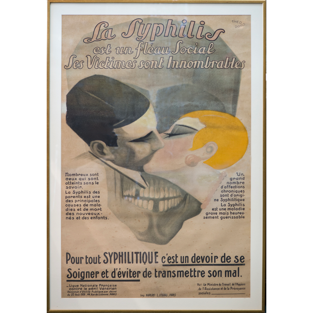
Theodoro, La Syphilis, circa 1926
I grew up surrounded by pictures of drama and terror and death. Our house was filled with oversized, captivating posters like the one above, in which fear and frolic were provocatively conjoined through pictures and words. That they were propaganda was meaningless to me: after all, I was a child, with no money or independence or power of my own, so exercising any suggested behavior prompted by a poster’s message was out of the question. (Though surely the implied cautionary tale — become sexually promiscuous and you will contract syphilis and die — could not have been lost on my well-intentioned parents.) Still, these great big confabs of massive typography and layered image were the visual hallmarks of my immediate orbit, literally flanking my passage from the reliable safety of home to the untold mysteries of the outside world, and providing what I would later come to realize was my introduction to graphic design.
Much later, as a graduate student of graphic design, in the late 1980s, I was exposed to the parameters of what design was and could be, and here, my struggle to reconcile form with emotion was hopelessly stalled. While I begrudgingly acknowledged the value of my formal education, such aesthetic orthodoxy was, frankly, anathema to me. How, after all, could you make design that communicated to human beings and deliberately drain it of all human content?
I have spent a good part of my adult life trying to answer precisely this question.
When I was a student, the prevailing wisdom maintained that the true power of design lay in chiseling it down to its purest form: it was only when it was unencumbered by sentiment that design could truly deliver on its modernist promise. To inject personal voice was to deviate from this no-nonsense objective, and one was best advised to resist such subjective impulses. Better to hone your craft and minimize your imprint, remove yourself from the work and focus on the most salient, most germane form your message could and must take. The designer’s mission was simple: to create the simplest, most harmonious, most neutral form, thereby enabling communication to the widest possible audience.
Oddly, none of us dared challenge this hypothesis because it was widely assumed that our design ancestors had struggled nobly against years of oppression to drag themselves out of the murky propaganda brought about by war and commerce and decoration and, God help us, commercial art. We were the lucky survivors. Now: go fill your three-haired paintbrush with Plaka, and shut up.
It bears saying that most, if not all of my teachers had come of age in Europe, during that post-war period when the profession privileged clarity above all else. As the chosen disciples of this noble tradition (descendants of the Bauhaus, the Künstgewerbeschüle and Black Mountain College, those pioneers who brought graphic design to America) they dutifully adhered to a don’t-rock-the-boat view of design education — indeed, of design itself. And here, the general perspective was one that privileged rigor over voice, seeking the most reductivist solutions to life’s most complex problems.
This never sat well with me. It occurred to me then, as it does now, that life’s most complex problems are the same: war is war, death is death, the world evolves but the basic problems do not essentially change. That styles come and go is a given (Victor Moscosco's 1960s civil rights protest posters were as visually representative of the generation in which they were published as is the one I'm about to reveal from 1915) but how is it that sometime between the Summer of Love and Hurricane Gilbert, an entire generation of designers virtually abdicated responsibility where the true representation of human experience is concerned? And that we were encouraged to do so in the name of design?
The book I published late last year could most certainly never have been produced twenty years ago, when there was little if any support, let alone tolerance, for the value of human narrative in the context of graphic design. Yet to look at this poster — published in 1915 by the Boston Committee on Public Safety, following the sinking of the Lusitania — is to wonder how it was ever possible to imagine design in the absence of such fundamentally personal stories. The image was based on a widely circulated news account from Ireland about the tragedy, which claimed the lives of more than one hundred Americans. “On the Cunard Wharf lies a mother with a three-month-old child clasped tightly in her arms. Her face wears a half smile. Her baby’s head rests against her breast. No one has tried to separate them.”

Fred Spear, Enlist, 1915
No one has tried to separate them, indeed: nor did the artist, Fred Spear, attempt to separate image from sentiment, news from art, form from content. It remains even now a chilling and unforgettable picture — a mother and her child, swept into sudden death — which, in conjunction with the single word, creates a message of ferociously simple impact.
Some years ago, I asked my students if graphic design ever made them cry. Particularly with regard to graphic design that lived online — where the cacaphony of competing messages makes a single, immersive experience unlikely — was such a thing even remotely possible?
And why, they countered, was this a goal?
The goal, I explained, was to join the manufactured thing — graphic design as an external representation of something else — to the world of the living. The goal was to connect, to enlighten, to more deeply understand, and how can you act if you can’t remember? You remember when you feel something, like I felt terror as a child in a world of public health posters. But as much as I was haunted by them, I was mesmerized by their beauty, their theatricality, their humanity — and that memory has never left me. Who among us does not hope to create work with such indelible, lasting power?
This all bears repeating now, at a time in which so many designers are engaged in addressing design for the public good — design that is sustainable, meaningful, socially relevant — because how can you achieve any of this if you don't engage at some fundamentally human level, a level where memory and feeling are as valued as form and execution?
I write this now at the risk of exposing myself to personal attack: nostalgia is now as it has always been, a bad thing in design. At its best, it's redundant. (At its worst, it's kitsch.) But the opposite is equally vexing, because design that caters to designers, or design that privileges novelty over reality, or design that ignores its basic constituents — design for social change is, after all, design that must be socially relevant, and that means design for and about real people — is just as problematic as design that celebrates modernist ideals in the name of neutrality. Design that strives for neutrality, that seeks to extinguish its relationship to the human condition, risks removing itself from the very nucleus of its purpose, which is, yes, to inform and educate — but also, to enchant. And at the end of the day, we succeed in this effort by being honest: we’re not graphic designers but people who make graphic design. Which means that first, we’re people: people who pay taxes and raise children and read newspapers and vote. People who eat and sleep and argue and question. People who laugh. People who remember. People who even, occasionally, cry.


Comments [56]
08.03.09
09:18
08.03.09
09:32
08.03.09
10:30
08.04.09
12:04
08.04.09
12:19
And on a related note, it goes great with Rachmaninoff’s Elegie in E Flat Major.
08.04.09
12:19
The year I was born my parents purchased a log cabin in the woods by a field on little hill road in New Hampshire. Our neighbor was a New York Art Dealer who owned a beautiful white house that had fabulous view of a nearby lake in the valley. The lady that had owned the small cabin before my parents, had decorated it with some large French travel posters from the 1930’s or earlier. The posters were color lithographs and were beautiful. When looking closely at the posters you could see the splatter of lithotine, the grain of the blue stone that produced the impression on paper and the emotion of the artist’s hand.
Thank you. CWS
08.04.09
06:33
08.04.09
08:24
08.04.09
10:03
I struggle every day with expressing my own "self" within the design I am making for others. I am sure like me, most of you have an inner desire to create. That this creation is not just something we do... but actually is somehow connected to our inner-self. To me the act of design is just as natural as breathing, and just as important to my overall health and well-being.
We, as a group, need to understand obvious expressions of who we are cannot be included in someone else's message. (But inherently are included because no matter if you are the designer or the viewer you always bring your own emotional baggage to the table when ever interacting with any object or person.) Unless you pick your clients that match your political/social beliefs, you will most likely work on something that you deem somewhat irrelevant to society at large - its just par for the course at this moment.
If we can't be worried about our own expression - then we should be worried about how people see the expression we are creating for our client on a level higher than - well will they recognize this brand? Or does this say expensive?
Let us challenge ourselves to design to a higher level based on human interaction, sustainability, and emotional response. Let us not "dumb down" imagery or information to the lowest common denominator.
Let us just not be people - but people who design for people... not consumers.
08.04.09
10:54
I'm simply surprised that such an article as this can be written without referring to Sagmeister's much-quoted aim, and either making an explicit claim that its premise is different from his and/or that he has been a failure either at expressing the sentiment or acting upon it.
I know that this exposes me to personal attack as a cold-hearted buzz kill...unless this article is meant simply as a comforting feel-good and not a critical statement of some kind.
08.04.09
11:00
Incidentally, I don't think touching someone's heart is the same as a feel-good piece. I don't believe that is, or ever was, Stefan's aim. Nor is it mine.
08.04.09
11:28
With the Lusitania poster, it seems the lesson for designers is to not step on or distract from the emotion the event itself evokes. I immediately think of the graphic outpouring in the wake of the 9/11 attacks, and my own mixed feelings about much of it.
08.04.09
01:18
There's always been an emotional discontinuity between "design" and "art," and I too have been fascinated over the years with both how to bridge the gap and why it exists in the first place. As much as I like working with, and in, "design," I'm finding the constrictions and limitations to be a serious impediment in my own "art."
Given the choice, I think I'd pick emotional (not Céline-Dion-esque emotive) "art" anyday.
Cheers!
08.04.09
02:13
This very thing has been on my mind lately and I admit that I wish to be lumped into the group of "so many designers ... engaged in addressing design for the public good — design that is sustainable, meaningful, socially relevant". Regardless, one experience in particular has me wondering about what that means exactly:
I received a rather personal email from a woman who'd purchased one of my posters. She told me about a recent, life changing event and how the poster touched her on such a deeply personal level that she felt the need to see it everyday. By the end of the email I felt as if I couldn't breathe. It left me wondering about the difference between design and art. More pointedly, the difference between design affecting the surrounding world in a general way or affecting one person in an immediate personal way. Maybe its the work that can accomplish both that really holds the key?
08.04.09
03:20
The call to action Jessica gives here is as relevant as it ever was: be human. Be real. Feel deeply. It might sound like the stuff of "think positive!" bumper stickers, but so what? There's nothing cheesy about that. Dance like no one's watching and love as if you've never been hurt while you're at it. These are important things to keep in mind and in your heart.
08.04.09
03:33
This touches on a subject that most designers, even those of us that strive to create works for the public good need to keep reminding ourselves of, that we are human and the consumers of our work are ultimately human. Our clients are also human, but their desires are sometimes in conflict with their humanity; profit, sales, and marketshare do not often inspire sentimentality or a good cry. The benefits and features of a contemporary campaign for a telecom provider, call coverage, rollover minutes and price points lets say, are at odds with the classic campaign for Ma Bell that urged customers to reach out and touch someone. Even though both campaigns objective was to spur greater sales.
Objectivity vs. humanity is an age old conflict in the design profession. Thanks for reminding me where I stand.
08.04.09
04:58
08.04.09
07:18
As I read it, and viewed your examples, I wondered how much of the human connection in modern and contemporary design is lacking because of the methods and materials used.
The "Enlist" image by Fred Spear is a painting and the physical process of its making--the tactile response of the artist to the paint and surface in the act--is apparent in the result. As such it conveys the artist's felt and human response to his subject.
So much design today is done using computers and subsequently viewed on computers. The result is that technology directs and dominates craft and its "flattening" effect is inserted between the artist/designer/subject and the audience.
As design moves further away from print another level of craft--human touch and emotion--is removed from the process.
08.05.09
08:51
08.05.09
09:06
Great stuff, lady! Guess we'll all have some time to cry eventually. Even Chuck.
VR/
08.05.09
02:47
VR/
08.05.09
07:38
08.06.09
03:01
08.07.09
11:17
08.08.09
07:49
The objective/subjective debate is a worm-hole that cannot be so succinctly resolved. If objectivity is thought to be a more "true" representation of an idea (as it is intended to be devoid of a presence or entity other than the communication), how then are we to address culture? I can certainly see the value in a designer attempting to distance his/her own bias, but bias and emotion should not be confused. Really, the goal of design is to be both objective and subjective, appropriately reacting to the needs of the communication. What is more true than visually speaking in the same language as culture would expect? William Dwiggins and David Carson have the same message!
Bringing up the web debate was a nice touch to the article. As an educator, I see the 18-25 year-old zeitgeist. And it is really not about a precise identity anymore. It is very face value and ephemeral. The design from these students reflects this. My question is: is the real problem with emotion in design really about being an intrusive voice or more about the absence of personal identity associated within an increasingly ephemeral culture?
As, the wormhole opens... Thank you again. Hope I didn't stray.
08.09.09
03:30
08.11.09
08:37
I have even seen intros for MTV that provide emotional depth. We don't need a retreat into maudlin classicism - that's just taste.
08.11.09
09:46
08.13.09
10:40
08.13.09
12:09
08.13.09
02:33
08.14.09
11:29
08.16.09
04:49
I'm still awed and have feelings from graphics designs I saw as a child myself.
It's wonderful when a design can instill such things.
Thank you for sharing.
08.16.09
06:21
08.17.09
02:14
08.17.09
11:41
08.18.09
10:04
08.18.09
11:59
april
08.18.09
03:25
08.18.09
04:43
A mexican teacher, from Iberoamerican College, was all about rethoric and semiotics (like an "old school" thinker kind of guy), but then he started to discuss that none of this approaches to visual communication work if we don't reach any of the 3 following points (better if we hit the three of them!):
1. Emotion
2. Beliefs
3. Culture (in a Seth Godin's tribe, kind of way)
But, what amazed me, and I remembered it when I read this awesome article, was that emotion itself can't do anything at all. What would be the purpose of crying if it doesn't provoke anything at all afterwards? Emotion without aim is like a racing car without the wheels: It may roam, but it won't make you (or anyone) move anywhere.
I do agree that the "no-emotion" approach is lacking a lot in our age and the "one-size-fits-all" mentallity is getting tired and old.
I look forward to see more thought provoking articles from you, Jessica! Great article!
08.20.09
11:49
But an old piece of printed ephemera, and even scrap of wallpaper, might do this, by evoking lost experience, vanitas or, in the case of the wallpaper, the sense that it bore witness to all the human scenes enacted in the room it once decorated, long gone. Mute witness.
We’ve most of us been in the vicinity of high emotion and tears at a crit, where one’s work — the distillation of possibly hundreds of hours of attention and struggle — is displayed. And I can remember emotions, if not tears, in the mastery (or so I thought it) over recalcitrant textual and other materials, once wrestled into order (possibly pre computer).
There’s the work that sees the light of day despite and because of all that conspires against it : deadlines, vague clients, miracles performed by strippers, the production crew, typesetters (photo, lead, etc etc), etc. The crazy thing is that once the thing is done : produced, there’s no sign of tears whether of joy or agony.
In one of her “Reflections on The Ephemeral World” over a year ago, Jessica wrote about Ladislav Sutnar’s mechanicals, their evidencing process, even and literally layers of process. I think those mechanicals, and the photo offset publications they stood behind, also represent a kind of triumph over entropy. I love now to look at evidence of, and even handbooks about, the processes of the pre-digital, offset printing world : mechanicals and comps, done with stat cameras, rubylith, presstype and dummy type, ruling pens, technical pens, plaka etc etc., festooned with registration and crop marks, not to mention rubber cement. All of this adds up to rehearsals and offstage business of the ephemeral performance that the printed result becomes. (Those handbooks, by the way, are very cheap at present!)
Of course, their works, and perhaps it is a tendency of the modern, hide the lost labor. Scaffolding-like mechanicals are long gone. Comps are long gone, unless stored in archives where we can appreciate their heroic aesthetics. Now there’s no backstage, at least none that we can see or understand.
Something here about graphic design now as a noun, or even a verb, but rather performance.
08.21.09
10:36
Graphics creation is not an easy job so we have to concentrate when creating any good graphics.
09.10.09
02:04
Like someone mentioned before, the Bedington ad is unlikely to make us cry because it seems manipulative. However, other ads may evoke more than they intended. Playing with anything that has larger meaning than the one we are assigning to it will always have that effect. It is dangerous in a sense. Like turning loose a cat to catch a mouse, but forgetting that cats are more than just mouse catchers.
An image may just be intended to sell cans of soup, but if it uses an iconic image of a household that resembles one we once knew, it can make us cry. What the ad is saying might not have any real meaning or value in and of itself, but what it references often does.
Which honestly kind of makes the point of this article seem moot to me. It's like asking "can trees make us cry" or " can Tupperware containers make us cry." Yes, hypothetically, but so can anything. I understand the need to challenge formalistic standards and show that beauty and tangibility have a place in design, but it is fairly obvious that if you do use them, these things touch us as individuals.
10.12.09
06:18
12.06.09
12:55
This quote from the article is great one. I believe it’s reflective of the main goal of graphic design. Some of the "best" works were confrontational or might have been so random, but if there's something the viewer can connect with, even in the slightest way it improves ones design immensely. However, sometimes being so random or "in left field" with one's design can help draw attention to it or create a buzz.
Graphic design doesn't have limits except the ones we impose. Yet, for most of us or those trying to get recognized or produce profit most times have to find the balance between trying to inform and educate, but also enchanting our viewers or audience to want more.
01.21.10
12:30
I only wish I could write as fearlessly and tactfully as you just have.
I am following your written works and have recommended you to some of my colleagues in design who often " don't / cant seem to get" my opinion!
03.17.10
03:58
I think Courtney H said it best, "Design is nothing without emotion whether its an artist's personal expression or the viewer's personal reaction. Without emotion all you have is a dull, forgettable piece."
04.21.10
11:34
First of all, this debate is not about whether or not graphic design can make you cry, its about what it is that creates a memorable, emotive response to graphic design, and how is it attainable?
Some argued that design must have some sort of hand-crafted, or personal touch in order to evoke emotion. However, in the age of digital media where everything appears computer generated, is this emotional response to the "personal touch" no more than simple nostalgia? The computer brings about limitless options, but at the same time limits the perceived quality of the work. Strange...
A few responders brought up the point that design is often created with the sole purpose of creating an emotional response, however it is all too often plainly visible, and it feels manipulative. Therefore, manufactured emotions are ineffective at best, maybe even offensive.
If a design must be well crafted, with personal touch, and a genuine message to be memorable, then how do we know that it actually creates an emotional response with the viewers? This brings up a third, and very vital point. The way that someone is affected by a piece has as much to do with that individual as does the content of the design itself. Then, no matter how well you know your target audience, there is no way to tell how a single person will react. It is because of this unknown factor that what may be readily dismissed by one person will capture another's attention.
Sure graphic design can make you cry, but no one knows how to achieve this, and no one knows why.
04.22.10
07:45
Thanks for sharing.
06.17.10
12:12
One of my questions is how does design communicate emotion?
We know art and design can elicit emotion (that's why we have aesthetics). How do the marks made on paper effectively communicate emotion and meaning? Certainly they must, for design and art mark the styles and fashions of the time. Are not all human messages layered with emotion of some form? Is our ability to read visual signals somehow innate? For understanding visual signals IS cultural to be sure.
I am completing my PhD in Design Communication wherein my dissertation explores design and emotion. I welcome discussions at [email protected]
06.26.10
03:12
07.05.10
01:32
08.05.10
08:39
09.04.10
01:24
Great piece. Thanks for sharing
08.25.11
12:49
If our work can't make people cry, we should give up graphic design and become "bankers" "clerks" or "accountants", though that may make them cry too but for totally different reasons.
04.11.13
03:25