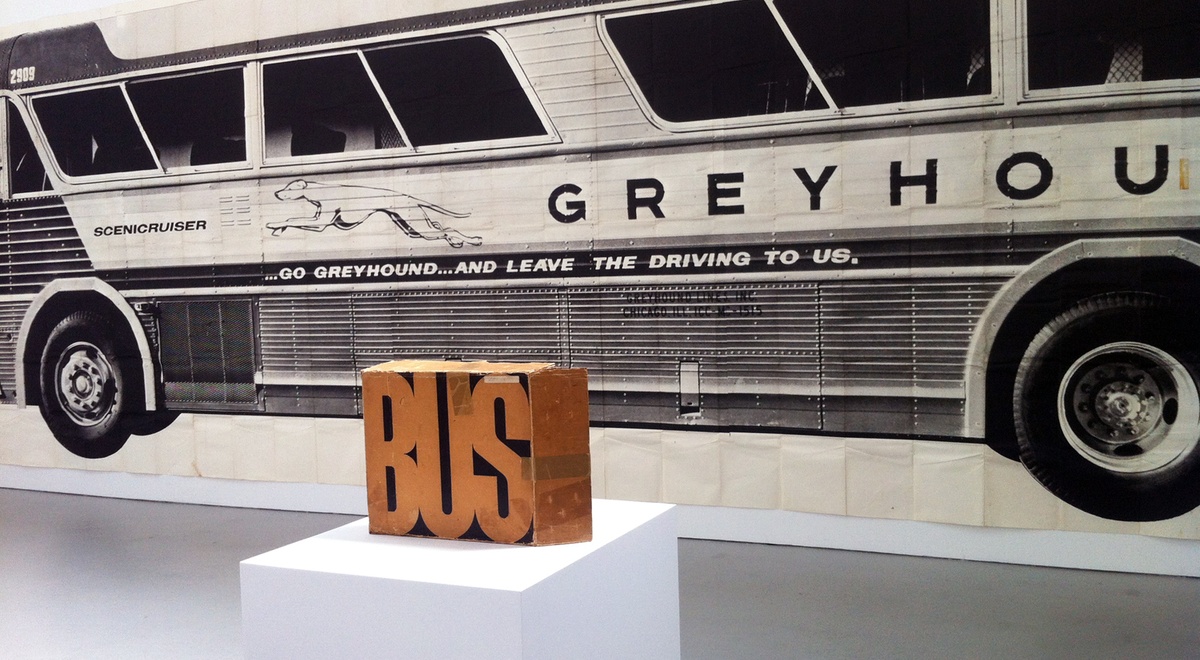
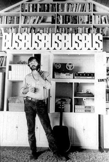
Bus, Mason Williams, 1967. As displayed at the Museum of Contemporary Art, Los Angeles, 2007
Editor's Note: This essay was originally published in April, 2008. It is included in our anothology Culture is Not Always Popular: Fifteen Years of Design Observer out this fall from MIT Press.
So, it’s 1966 and two guys are hanging around their Los Angeles apartment, musing about the sort of things that people mused about in the Sixties. “Isn’t it strange that folks can look at an image of a really big thing reduced in the pages of a magazine, and take it for granted that it’s real? But what if that little reduction of the real thing actually materialized? Like what if a 6-inch long bus suddenly appeared at the curb? Wouldn’t they be amazed?”
The aesthetic philosophers in question were the artist Ed Ruscha and the artist/comedy writer/composer/performer Mason Williams, perhaps most famous for his hit guitar composition, “Classical Gas.” Fellow emigres from Oklahoma, where they had met in fourth grade, Ruscha and Williams occasionally cooked up and produced collaborative projects, most notably The Royal Road Test (a spiral-bound book that documents, in forensic fashion, the throwing of a Royal typewriter out the window of a moving automobile, and its aftermath, published in 1967).
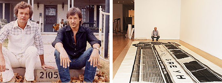
LEFT: Mason Williams (left) and Ed Ruscha (right), early 1960s. RIGHT: Mason Williams during installation of Bus, MoCA, 2007
Though this conversation seems redolent of a variety of deadpan humor of the period (in the same category as Steve Martin’s trademark line, exhaled hoarsely after a deep inhale, “Lets get smaaaaaaaaall”), Mason Williams went to work; and the result was Bus, a full-scale (10’3.5” x 36’2”) reproduction of a 1960s era Greyhound bus, printed in an edition of 200, then folded down and packaged in a box. Bus is an inversion of the question that inspired it, since instead of making a reduction replace (and perform) as the real thing, Williams just confronts us with a big halftone copy of the real thing at real scale. This now extremely rare print was recently on view at the Museum of Contemporary Art in Los Angeles, in an exhibition of works donated to the museum by the artist Michael Asher, and those lucky to see it were quite fascinated by all of the issues dredged up by this strange and humorous work. The joke of Bus is in the wacked-out proportion between the (obvious) amount of processing needed to deliver the image, versus the amount of actual information delivered. It’s “low-res” taken to an extreme: the mechanical reproduction is unavoidable, and yet there’s that big old bus, two out of three dimensions confronting reality, and you know exactly what you are looking at, despite all that is missing.
While Bus veers and crashes right into absurdity, it is exactly at the level that Mason Williams could deliver; other ideas that he had, such as a attempting to make a one-to-one reproduction of the Empire State Building, or a (comparatively modest) tugboat just could not be realized. But the bus was do-able, though the process to make the print in the days before digital imaging and large scale ink-jet printing was daunting. Williams commissioned the Los Angeles photographer Max Yavno to shoot the bus on a 4 x 5 negative; a 16 x 20 print was then sent to a company in Florida where the full-size image was divided into sixteen segments and printed onto billboard paper. It’s clear that Williams didn’t fully anticipate what he had gotten himself into: he asked for the 200 copies to be delivered to his apartment in Hollywood, and ended up with a 5’ x 7’ pallet of paper weighing over a ton sitting in his driveway. Then, he had to face the problem of collating and taping together the sixteen sheets for each print. It was a big challenge just to find a place to tape the sheets together — a tennis court didn’t work because the sheets kept blowing around. He finally found the upper floor of a folk club in Glendale that was just about a foot-and-a-half larger than the entire print itself; and four-and-a-half miles of double-stick tape later, he had an edition.
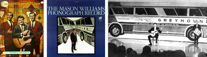
Smothers Brothers songsheet; Mason Williams album cover; Mason Williams and Tommy Smothers on "The Smother Brothers Comedy Hour," February 17, 1967
Bus had a peculiar existence: it was immediately exhibited at the Pasadena Art Museum, and a few months later it was included in the Word and Image exhibition of posters curated by Mildred Constantine at the Museum of Modern Art (where there is a picture of people doing graffiti over it at the opening). It was used as a stage backdrop for Williams playing guitar on “The Smothers Brothers Comedy Hour,” where he was a writer for the show; it also appeared on one of Williams’ album covers. Greyhound proudly published it in their corporate magazine in 1970 (including pictures of Mason Williams on tour with his band in a bus, of course). In 1967, Life magazine staged a photograph of Bus in front of Radio City Music Hall (punching holes through it for “passengers” to stick their heads through); the article, called “The Great Poster Wave,” featured all the major San Francisco psychedelic poster designers, including Peter Max. That Bus, despite its gargantuan size and tiny print run, was also deemed disposable enough to destroy for a party or a photo shoot might have had to do with the fact that Williams was selling them for only $35 apiece. He figured that each copy took 9 hours to make, and clearly the Sisyphean production of ordinary commercial graphics at Kmart prices was part of the weirdness of Bus.
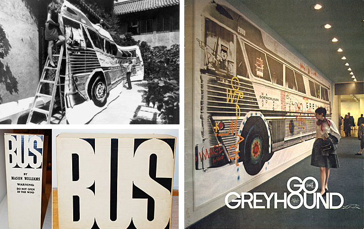
Bus during installation at Pasadena Museum of Art, August 1967; Cover, Go Greyhound, 1970. Photograph of installation of Bus at the Museum of Modern Art, 1968
The eccentric charm of Bus is its absolute connection to the time and place of its making. Los Angeles was the location of Warhol’s first gallery show, an exhibition of Campbell soup cans at the legendary Ferus gallery in 1962. The soup cans were (literally) larger than life, as are product names in the photographs and early paintings of Ed Ruscha (one canvas of 1962 featuring a very large Spam logo is even titled Actual Size). Sister Corita was making her inspirational silkscreens (and staging Mary Day parade/happenings) out of appropriated shards of advertising typography and copywriting right in the neighborhood where Ruscha and Williams lived. The city was awash in oversized “pop” advertising attached to the movies, scattered amongst the somewhat crappy, first generation commercial buildings that sprawled along the boulevards of Los Angeles: the same gasoline stations, apartments, parking lots and facades of the Sunset Strip documented so literally by Ed Ruscha in modestly-scaled (yet revolutionary) books that he began to publish around 1963.
When Mason Williams made his edition of Bus in 1967, he didn’t stop with the production of the image as a poster: he took one more counter-intuitive step and had each gigantic poster folded down and packaged in a box. Working with two friends who found a prototype for a sort of enlarged document storage box, he had the box designed with the title “BUS” on one side, and a deadpan description of the process of producing it printed on the other side. (Including the instruction “Warning: Do Not Open in the Wind,” a tip learned the hard way by Williams.) The funny thing about the packaging of the poster into the box is that it does solve the problem of how to handle and distribute the edition. At the same time, it makes the bus poster even more improbable than it already was: the idea of stuffing full-scale reality into the box is what turns the poster into a crazy hybrid of a book and a spectacle, and the folding and (perhaps) re-folding of it into a communal performance piece. (Though most owners of Bus never got that far: Michael Asher confessed to never opening it in all the years he owned it, fearing the consequences of having to get the poster back into the box, and finding it satisfying enough [as he put it] “just knowing that I had a bus in a box.”)
Bus was a stunt, a wacky rejoinder to Ruscha’s books like Some Los Angeles Apartments (1965) or Every Building on the Sunset Strip (1966). The ordinary commercial printing standards accepted by Ed Ruscha for his cataloging of the quotidian (scaled down into the pages of a small book) are misunderstood by Mason Williams in a Smothers-Brothers-esque, slightly brain-addled way: “oh, man, you mean you didn’t mean billboards?” And instead of the low-key elegance of Ruscha’s books (not quite “book” enough for the Library of Congress to accept them for their collection, at first), you get 10 pounds and 7 ounces of ordinary commercial printing delivering the same everyday world at full-scale: Bus is heavy, in more ways than one. It’s true that Mason Williams’ confrontation with the super-sized print predicts, maybe unintentionally and in a completely sideways manner, the obsession with the reality of the landscape at 100% that characterized the work of some American minimalist/conceptualist artists, such as Robert Smithson or Michael Heizer, just a short time later. Reality was a big issue in the Sixties, and while some of it is dead serious and driven by philosophical inquiry, Bus is the literal poster child for the flip side of that inquiry — the uncanny surrealism of everyday life. Standing in front of Bus forty-one years after its making, one can still feel the buzz of ideas swirling around it, enhanced by the humor and energy embodied by the unlikeliness of its production, presentation and scale. Those of us who design printed things that are meant to reproduce and preserve a moment in time at any size can only hope that our efforts are as 100% fine as the Bus in the box.
Mason Williams at home, June 1969
The author wishes to thank Mason Williams and the Museum of Contemporary Art, Los Angeles for their permission to reproduce pictures of Bus. Complete caption and credits are as follows: Mason Williams, Bus, February 24, 1967. Silkscreen, edition 174/200. 123 1/2 x 434 in. (313.7 x 1102.4 cm). The Museum of Contemporary Art, Los Angeles. Gift of Michael Asher. Photo credit: Brian Forrest.


Comments [18]
04.07.08
03:40
Now, enjoy this video of Williams performing Classical Gas with what appears to be a full symphony orchestra. Hard to imagine after reading this that it wasn't all some kind of ironic goof (especially the puffy shirt), but like the poetry, I took it all quite seriously at the time.
04.07.08
06:13
04.07.08
08:40
I hate to get all pretentious (sorry, James Puckett!), but at some point I was reminded of a short story in which Jorge Luis Borges writes about a city map that is drawn at a scale of 1:1.
04.08.08
02:15
"I have a map of the United States...actual size. It says, 'Scale: 1 mile = 1 mile.' I spent last summer folding it. I also have a full-size map of the world. I hardly ever unroll it."
(enjoyed the article very much)
04.08.08
12:18
VR/
04.08.08
01:16
04.08.08
03:07
For what it's worth, The Royal Road Test, which is mentioned here, is currently on view, at the Art Institute of Chicago as part of the lovely exhibit Ed Ruscha and Photography. The book has a hole drilled it and is hung from the wall (or ceiling) in a gallery full of similar books hanging from similar wires.
While I'm at it: next to the Ruscha exhibit, in that pathetic little hallway where they usually stick random pieces of furniture or architectural miscellany, the AIC recently opened its first exhibit solely dedicated to graphic design, a small but well executed show dedicated to Graphic Thought Facility.
04.09.08
11:48
04.10.08
02:36
04.11.08
01:23
Who didn't want one? How did he distribute? It was made affordable to a SoCal niche. That seems like an important part of this work and I would be interested... right?
04.11.08
01:54
I was reminded, too, of how Rosenquist's paintings were hung at the Guggenheim so that you could see them from far enough away to appreciate their homage to billboards...
04.11.08
04:25
I was reminded, too, of how Rosenquist's paintings were hung at the Guggenheim so that you could see them from far enough away to appreciate their homage to billboards...
04.11.08
09:12
04.12.08
12:55
04.12.08
05:29
the same one that was in the 1968 exhibition
at Moma curated by Mildred Constantine for
WORDS AND IMAGES? In my archive I have
a photo of the bus with designers applying
their own marks with brush and paint spray.
The photo includes, Arnold Saks, Milton Glaser
and myself. Mildred Constantined asked me
to post this. elaine lustig cohen
04.18.08
08:12
Yes, the picture of "Bus" on the cover of the Greyhound magazine is the copy installed at MoMA during Mildred Constantine''s show.
I would never have guessed that Glaser, Saks and you were graffiti artists! i am also curious if that graffiti'd copy was re-folded and kept in MoMA's collection...
04.21.08
01:24
04.25.08
03:29