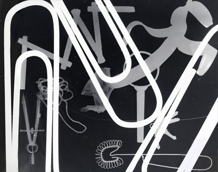
Herbert Matter, Photogram produced at Yale School of Art, 1981
Over a quarter of a century ago, I stood with a scattering of students in the smallest of darkrooms, huddled by an enlarger on whose surface sat a variety of extraneous objects. The room was silent, save for the occasional puffy breath of our professor, whose graceful hands rearranged things — a kitchen whisk here, a banana peel there — while we looked on, utterly captivated.All at once there was a sudden burst of light exposure, before the room was once again bathed in total darkness. We listened as a sheet of photographic paper was pulled from beneath its impromptu still-life. Ever silent, our teacher escorted the paper through its solemn bathing ritual — from developer to stop bath to fixer — before clipping it with a clothespin onto a thin wire suspended over our heads.
He switched on the safelight as we gazed, transfixed, at the picture magically appearing before our eyes. “And so, you can see,” he began, in halting, heavily-accented English, “zees is how vee make za photogram.”
He looked at us all with a little half–smile. “Again?”
The ash from his ever-present cigarette floated onto the floor, as another sheet of paper was extracted from its thin Ilford box, and the process repeated itself, over and over and over. There was no talking. There was no discussion. There was only this kind of silent, impromptu shape-shifting, as our teacher positioned a series of inanimate objects and we looked on, studying his every move.
His name was Herbert Matter. He was a designer and a photographer, a teacher and an artist, a disciple of Alexey Brodovich, a friend to Alberto Giacometti, and a man even the ornery Paul Rand described as possibly the least pompous person on the planet. Matter, who died in 1984, was a professor at Yale for more than 20 years.
At the time he taught me how to make a Photogram, he was 74 years old.
It was an extraordinary thing to sit there and watch this magical process, though in truth it wasn’t until many years later that I realized what a critical moment this was for me personally, because it marked my true initiation into something which was, at the time, acutely foreign to me: the language of abstraction.
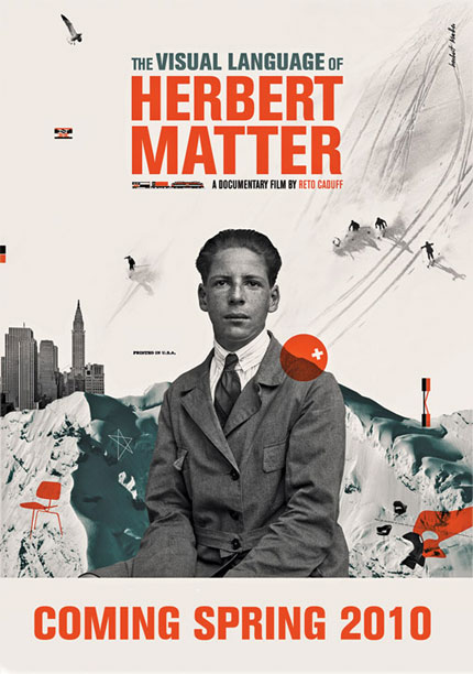
Poster designed by Chistiana Couceiro for the new documentary, The Visual Language of Herbert Matter
As a concept (let alone as a formal objective) abstraction was, back in those days, something of an albatross. We were taught to look, really look, and then to look some more — and it was this discipline, this ineffable scrutiny that framed our lives in the studio, where studies in composition taught us to identify and resolve asymmetrical relationships with ruthless objectivity. And so, we studied composition and letterform, book design and poster design, all of it rather vaguely governed by this unspoken adherence to a kind of modernist dogma that had filtered down from our faculty, many of them Swiss, most of them schooled in the geometric rationales of strict Bauhaus ideology. These pedagogic principles were framed by a kind of rigor which I will to my dying day associate with all that is perhaps comically Swiss: our work was disciplined and restrained, balanced and neutral. This was the fundamental institutional zeitgeist, and the work we produced was, not surprisingly perhaps, suitably analytic and hard-edged. Still, there remains a kind of improbable beauty in this kind of work, and as a testing ground for understanding the fundamentals of design as a formal language, it proved an excellent foundation for study. Fun, however, it wasn’t.
Curiously, while we were expected to hone our ability to engineer form, there was a sort of implicit assumption that we were expected to keep to the plan — a plan that only accepted certain kinds of form as, well, plausible. Just as we availed ourselves of a rather classical, even restrictive menu of typefaces to work with, so, too, were our compositional impulses expected to remain in check. If we were to divest ourselves of such notions, we were counseled to proceed with extreme caution, for to deviate from the canon was to give way to a kind of random, willy-nilly world of questionable outcome. And that was not graphic design.
Until those photograms came along, I had no idea that abstraction could literally make my pulse race. I came from a family of collectors and historians, where there was (still is) a premium on logic and narrative and clear communication. The idea that something gestural could, at once, infiltrate your brain with one story and whimsically attack your other senses with another was simply astonishing to me. How, after all, could you explain it? How could you define it? And how, in all honesty, could you possibly teach it?
I was mesmerized by photograms not only because the objects in play were real and recognizable, but because of the way they behaved, a series of oddly disenfranchised shapes that challenged the eye and by conjecture, the mind. They were dynamic, these images — compositionally irregular and physically compelling, with shadow where line should have been, and tricky overlapping edges making you rethink what, for example, constituted a foreground? Lines brushed against dots, which read as musical notes dancing across the surface of the paper. There were infinite shades of grey, and the possibility for even more, but more spectacular still than any of this was the fact that these fractured forms were incapable of duplication: they were one-offs, idiosyncratic and mysterious and unique. They couldn’t be codified because they possessed no intrinsic code. Unlike the principles which had come to define my design education, the photogram comprised no such rules, and inhabited a space with no clear definition, no certain boundaries.
I was in love.
Of course, although it would take me a long time to realize it, abstraction had everything to do with graphic design, but it was — and is — hard won. Having spent the first half of my life struggling to free myself from the constraints that constitute “good” design — the legibility and clarity of intent, the consistency that by definition embraces, say, responsible communication — I now find myself more and more drawn to the mystery of abstract form because, in the end I suppose, it is more haphazard and unpredictable, more organic and emotional, more human and, to me at least, more a reflection of a kind of basic, if complex, human truth. (Life is messy. So is abstraction.) When I look at the photograms we made that day, I remember all over again why I became a designer. And I owe it all to a soft-spoken, Swiss teacher of mine, who showed me that principles are not the same as rules; that two dimensions can so easily gesture to three; and that even though what we make as designers is by definition meant to be duplicated, we need never, ever, ever repeat ourselves. Which is a lesson that, even now, bears repeating.
A new documentary, The Visual Language of Herbert Matter, celebrating the life of Swiss-born designer Herbert Matter will be released early next year.


Comments [19]
10.28.09
12:42
10.28.09
02:06
And thank you for another great post ... a lesson worth repeating, indeed.
10.28.09
02:14
I only wish we today's students could have some of those darkroom photogram experiences. This is one of many examples of things you can not make or replicate in Photoshop.
10.28.09
03:43
Makes me wish I'd kept all my photograms from high school. My favorite was of freshly cut grass. Silly me, I thought darkrooms would be around forever.
10.28.09
06:33
10.28.09
10:55
Since then, MANY other people have confirmed the fact that Hitch ALONE directed the scene and have repudiated with FERVOR Bass' claims. To me, there are few things more repugnant than someone taking credit for the brilliant work of another person. Bass is an ass and in my mind has destroyed his reputation and his legacy with this inanity.
I'm sick and tired of people attempting to spin and equivocate Bass' claim. I've heard it all. Some people say, "Oh, what Bass meant was that he directed the 'theme' with his storyboards. Or he means "direction" in that his storyboards established the direction of the scene. CRAP! Bass is attempting to take credit for one of the greatest - if not the greatest - scene in cinematic history. CRAP! Bass DID NOT direct the shower scene and he DIDN'T EVEN do the storyboards for the scene - Hitch made that clear in his interview with Truffaut. He didn't do the storyboards for the scene and he COULDN'T have directed the shower scene, because he wasn't Alfred Hitchcock. It's that simple.
Something else that pisses me off is people that begrudge Hitchcock's accomplishments because of the fact that he was rich, famous and enjoyed the spotlight. I can't stand people that are so small that they can't handle the fact that Hitchcock was the master, and deserves that praise. The problem is that HE WASN'T appreciated as the master until much, much later in his life. He was scorned as simply a director of little suspense films, and the Cahiers du Cinema were ridiculed as absurd for taking him so seriously. It wasnt until Truffaut's interviews and subsequent book that the public finally took him seriously. He never won an Academy Award, though his film Rebecca won Best Picture and his actors, designers and others were nominated and won. What is worse is, Hitch ALWAYS lauded his collaborators! HE worked with the same people all the time and he treated them with GREAT respect.
Hitchcock alone directed the shower scene. He is the greatest director that ever lived. He deserves that praise and NO ONE is going to come along and STEAL his accomplishments, let alone a jealous, wannabe directors such as Bass. No spin, no bullcrap is going to change that. There IS NO preponderance of evidence by historians that Bass directed the scene, that is CRAP. EVERYONE that is still alive confirms the fact that Hitch and Hitch ALONE directed the scene. THE END. There is no consensus among the historians that Bass directed the scene, that is garbage. It doesn't matter anyway, because - as I've said - those alive dispute *utterly* the notion that anyone other than Hitch directed the scene: Herbert Coleman, Janet Leigh, Peggy Robertson and others all held press conferences or in spoke with zeal in interviews that Bass was off his nut. Bass needs to be hung up by his thumbs, wherever he now exists in the nether regions.
Again, apologies to you Jessica and Design Observer for diverting attention from this article, I just had to comment. Thank you.
10.29.09
01:38
See page 56 of Typographic Communications Today.
Here is the link to the commentary from A Communication Primer
The symbol - the abstracting of an idea, communication at once anonymous and personal. Personal because of the countless individuals that created its form, each one who in his turn added something good or who took something bad away. Anonymous because of the numbers of individuals involved and because of their consistent attitude. These are examples of communication of an idea through symbols.
But there can also be communication through symbols to an idea, as in the burnt offering or in the flame of a candle. The use of flame as a transmitter in the communications channel is probably as old as man's first fire. It stands for all the wonder and mystery of forces beyond man's knowledge.
The storm warning flags are part of a long, evolutionary tradition of symbols, but their beginnings were probably in basic reactions to colour and form, basic enough to make their communications carry beyond the barriers of language and custom.
But symbols also change and evolve. Some methods of transmitting messages rapidly become symbols, then pass into obscurity to become readable only to the anthropologist, while other symbols of communication remain.
10.29.09
06:04
My favorite Herbert Matter moment came not as a student of studio photography. He was charming, but as he made photos in front of us, I wished he were more, well, scrutible, if that’s a word. I wanted him to point out what he was looking at, and why he was doing what he was doing when, for example, he subtlety adjusted a light. Perhaps if English weren’t the language required he would have said more. Or perhaps he thought we’d engage and use our eyes more if we were forced to figure it out ourselves. Whatever the motivation, the method didn’t work for me.
Anyway, once launched in my career and working for the Vignellis, I got the assignment to art direct and Herbert the assignment to photograph a new chair Massimo and Lella had designed…with the beautiful but skittish Vignelli Siamese cat lounging on the seat. As I remember, setting up the shot and adjusting the lighting was a snap. Getting the cat to cooperate was another matter entirely. It didn’t want to be touched, let along sit in the chair. The studio was large and the damn cat kept as far from the action as possible. Herbert quietly let me know our odds were low, and that drugging was the common method in shooting a cat if you wanted it to “cooperate”. A quick call confirmed that the Vignellis would not cooperate with that particular standard industry practice. So we turned off the photo lights, retired to the furthest corner, and chilled for quite some time.
I am convinced that Herbert, through some combination of great karma and quiet willpower, enabled what happened next. The cat walked over to the set, leapt up onto the chair, and settled in for a nap in the most photogenic pose possible. My favorite moment came: a brimmingly joyful exchange of glances combined with a recognition that we weren’t home free yet. We waited some more to let the cat settle in to its nap. I held my breath. Herbert slowly and gently made his way to a photo light and…eased the switch on. Light jumped but the cat didn’t stir! Another glance exchanged. Then Herbert sloooowly switched on the other lights one-by-one, and sloooowly made his way to the 4 x 5 camera, and got his first shot. A final glance exchanged, and a thumbs up. I resumed breathing. He then silently slipped the two-sided film cartridges in and out of the camera, and slid each light barrier out of the way, and got some more. It was a wrap, a victory in the face of very long odds, and the end of a gentle, joyful afternoon with such a gentle and joyful man.
10.29.09
07:16
Joanne Kaliontzis:
Students CAN have these kinds of experiences with Photoshop! Try putting a kitchen whisk and a banana peel on a flatbed scanner and see what emerges. Digital processes allow us countless ways to make imagery and experience magic very similar to the photogram process. Just last night I put a faded kodachrome slide from 1953 (of grandparents I never knew) in my brand new slide scanner. Seconds later an image of them--digitally repaired and looking like it was shot yesterday--appeared on my screen. It completely knocked my socks off. The possibilities of this technology are endless. I can't help but believe that if Matter were around today, he would be enthusiastically embracing Photoshop and using it to teach his students in much the same way he used photograms while Jessica was a student.
10.29.09
12:33
10.30.09
05:06
While I'm not sure if I'll ever be satisfied with my own work, it is nice seeing people I look up to having gone down the very same path I currently struggle with.
As always, thanks for your honesty and sharing Jessica.
10.30.09
05:50
Yes--- I do scanning experiments with my class --but they are not Photograms. Believe me there are a lot of old processes that I don't miss --like spending hours with the stat camera. I love the endless possibilities with photoshop ---but you can't make photograms with it. One classroom alternative that I have had some success with is making them with cyanotypes.
10.30.09
08:24
If it were in a movie, I bet Saul Bass would do a great job directing that scene.
I love the immediacy and simplicity of the photogram process.
11.04.09
12:07
11.04.09
02:15
I believe Matter had left the Eames Office long before Primer was shot. I'm guessing someone mistakenly heard that he had photographed things for them (which he did, famously, for the Arts and Architecture issue in the mid 40s(?) that was devoted to their chair designs) and got the projects confused.
By many accounts it was also Matter that taught Ray Eames the notion of scaleless montages to complement her already great knowledge of abstraction. Both Matter and his wife were influential on the Eames for the few short years (year?) they lived in Los Angeles together.
11.05.09
03:18
Congratulations Jessica on your D&D 2009 Stars of Design Award for Graphic Design your teachers would be proud of you.
11.22.09
10:52
12.08.09
04:57
SEO Company
02.10.10
06:41