The best graphic design teacher is over 100 years old, a brilliant story-teller, and still dances on air. So who is this mystery person?
Well, the teacher is actually a textile.
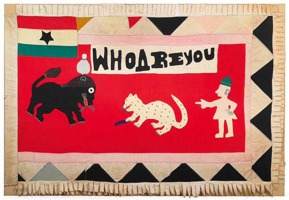
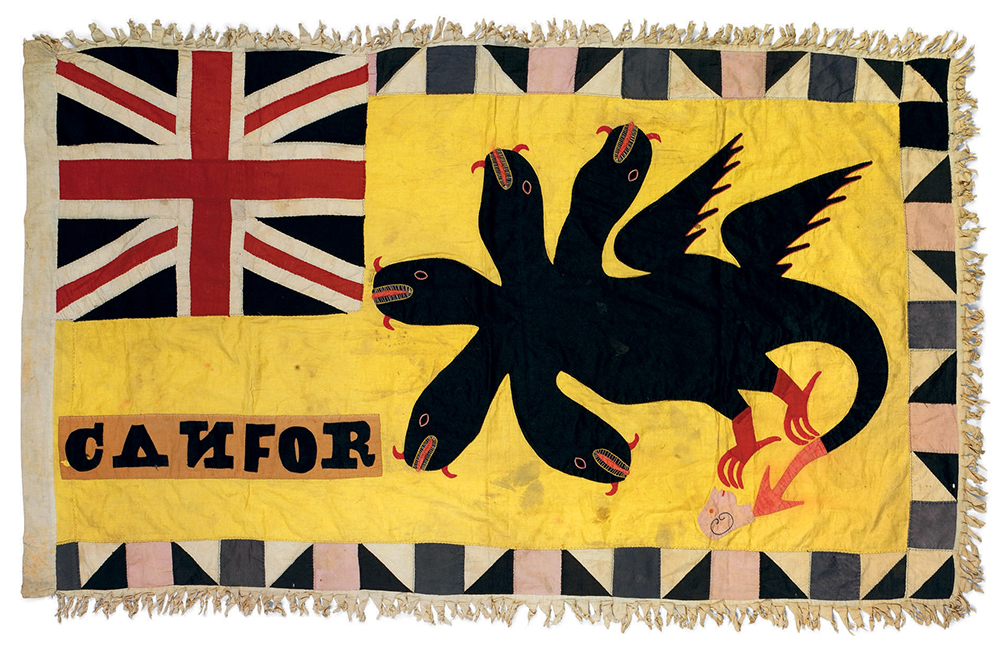
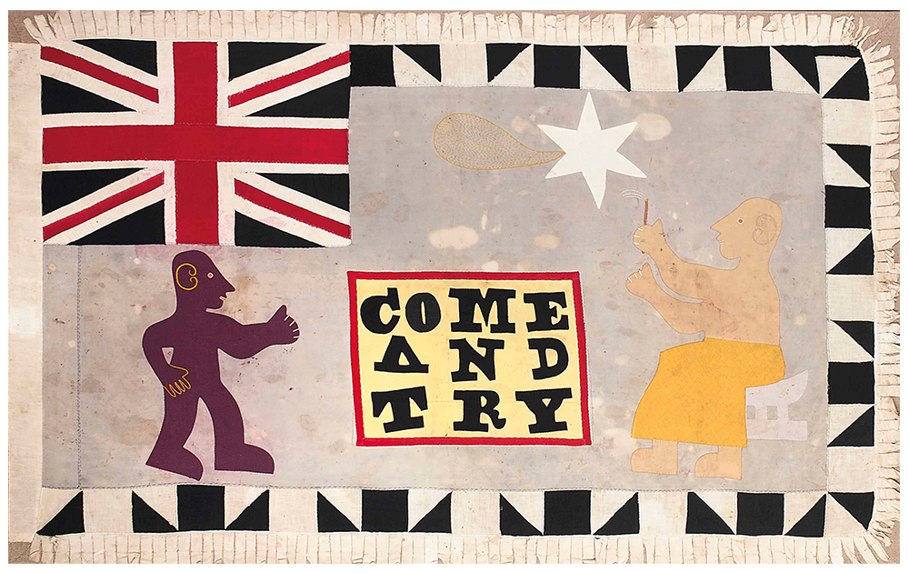
Introducing Asafo Flags — visual inspirations from the once Gold Coast, now present-day Ghana. They represent Asafo military companies. Asafo meaning “war people,” these flags depict company insignia from different Fante states (and factions) along the coast.
These are amazing, animated objects — flown in protection of a territory or danced in celebration of a culture, in order to enhance “the power of the spirit.” And that spirit is alive in its brilliant visual language. Whales, planes, scorpions, and the like — used in “powerful narratives” to instruct, inspire, or incite. Their “colors and symbols” are “always site specific” indicating to any designer that these flags, these frankaa, are also identity systems. This is why I write.
I’ve learned about Asafo Flags from a scholarly team of artists and art historians: Eric Appau Asante, Kofi Adjei, Gus Casely-Hayford, Corey Ross Doran, Silvia Forni, Baba Isaaka, and Karun Thakar. But what seems to be missing from their discussions, from my quick assessment, is that these objects are not just sophisticated art, but dynamic design.
Simply put, Asafo flags represent the finest example of 20th century graphic design: innovative symbol sets, complex narratives and expressive typography.
But what really attracts me to them is a paradox. You see it’s in the companies’ alliance with the British, this mixture of cultures, this conflicted partnership — and how that translates to visual form — which captivates me so.
History advances through hybrids. And this alliance, this mixture of national symbols and “local motifs” has actually produced new forms. New ideas. New typography.
Take for example a stylized Union flag pared down to its essence, into Fante style; or notice the dappling of a leopard made simply (and brilliantly) from appropriating patterned textile; or behold a plane taking flight due to the shape of its wings (it’s a bird!).
What looks like improvisation is actually precise form — compositions made from sewing templates. Here, we’re witnessing history lessons in the making, quite literally, as this art practice retains a cultural process, a cultural memory.
And the hybrid text is irresistible.
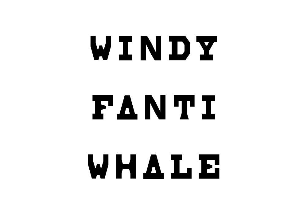
Sometimes there’s a nod to mechanical typography — slab serif, tapered serif, sans serif — reflecting the influence of imperial printing. Other times, there’s the presence of hand-lettering — the cursive, the gestured, the straight-lined — all speaking Akan in the dialect of an artist's hand.
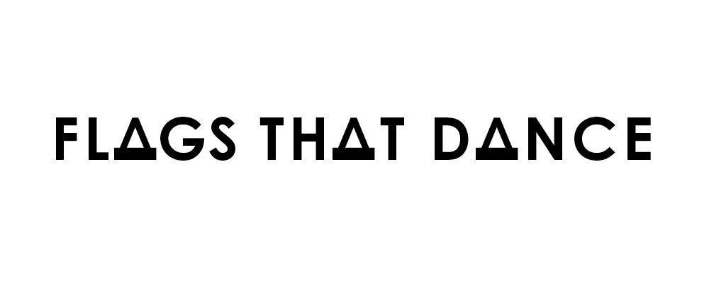
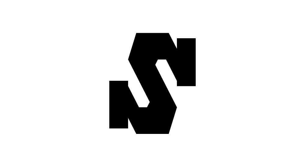
Characters mix and match. Letterforms integrate with symbols then animate (see the number 2 below swimming with the whales!). Each letter, each stroke, sewn with surprise.
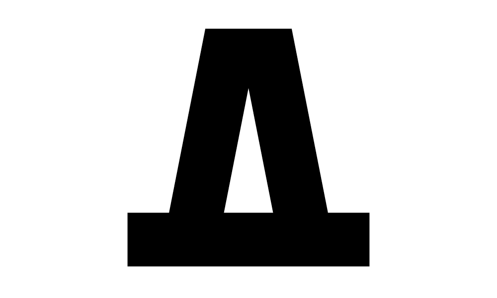
And look at those As! Have you ever seen anything like them?

© Karun Thakar
So how could this design-practice, this dynamic history and its learning potential not seed a new project in Type 2? Therefore, for two weeks, our students were taught by the genius of Fante artists — as they made modular typefaces based on inspiring Asafo letters.
What they came up with will amaze you:
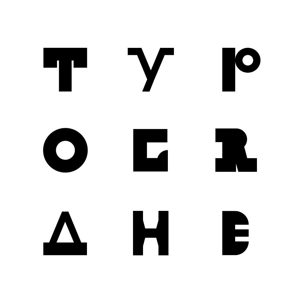
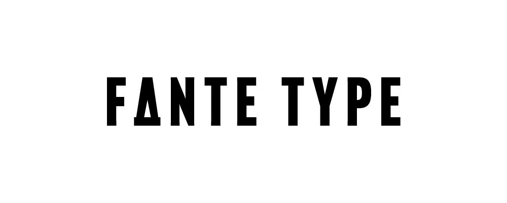
Designs by Julia Kindle (TYPOE); Emily Dinh (GR); Juliette Good (A); Ben Kaynor (H)
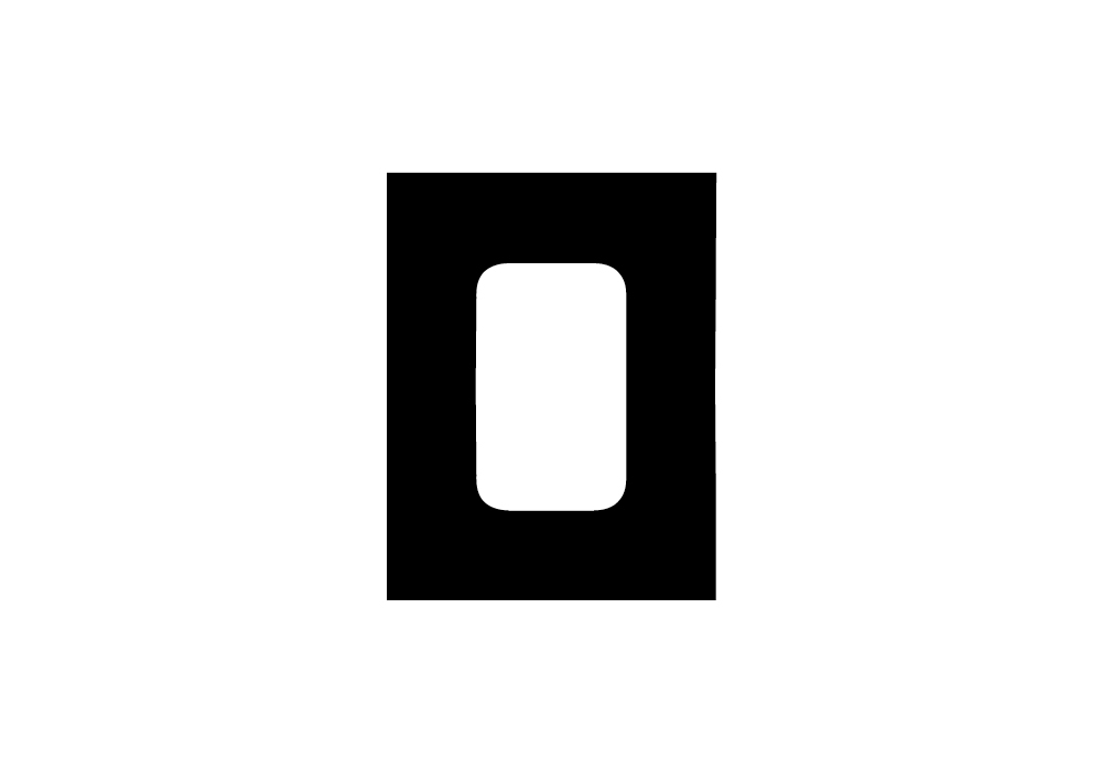
Design by Madalyn Kramer
Title wall prototype by Julia Kindle
Design by Ben Kaynor
Font by Ben Kaynor
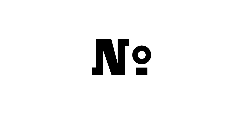
Designs by Katie Weyrich (N) and Julia Kindle (O)
Design by Abby Conrad
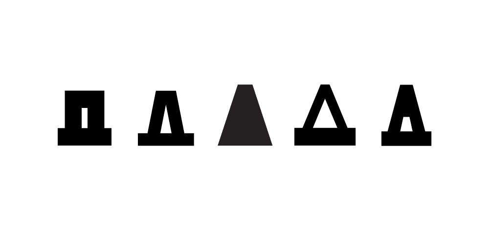
From left to right: Designs by Emily Dinh, Madalyn Kramer, Katie Weyrich, Julia Kindle, and Ben Kaynor
Title wall design by Abby Lee
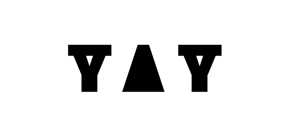
Font by Katie Weyrich (YAY) (A is an alternate character)
The more you learn about the spread of printing, the more you realize that it was (partly, mostly) a vehicle for imperialism. Given this, it’s interesting to reframe Continental typography (Caslon, Bodoni, Trajan, etc.) as a visual manifestation of empire. It’s also interesting to note the “three to 400 years” of African flag artistry, and the development of that symbol system, as perfecting, spreading, another type of language.
What happens when these two artistries combine? What more is revealed? What more is learned? And when will such hybrid typography — and hybrid history lessons — better inform the design classroom, and the design canon?
Only type will tell.
This work is part of an ongoing Type project collection on Instagram @university_of_type.


.jpg?mode=max)